Filter Settings
When any filter is added to the dashboard, the “Filters Settings” pane will become active to allow the user to manage the different settings of the added filter(s).
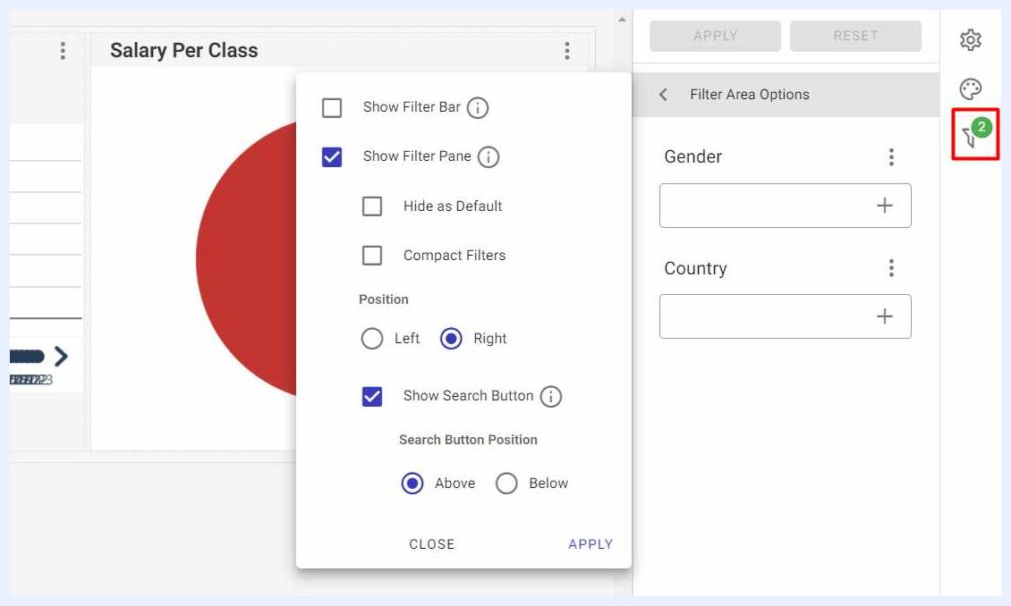
Filter Area Options
The options available in this section allow the user to manage the way the added filters shall appear on the dashboard PG for end-users as below:
Show Filter Bar check box: if selected, the added filters will appear to end-users (View mode) as a bar at the left-top corner of the dashboard screen.
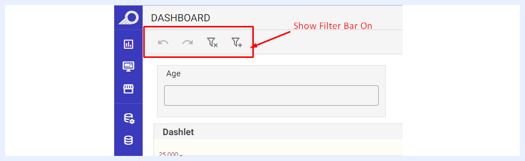
How Filters Appear as Filter Bar for End-Users
Show Filter Pane check box: if selected, the added filters will appear to end-users (View mode) as a pane at the right side of the dashboard.
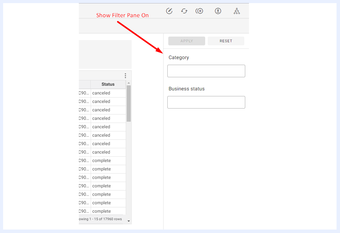
How Filters Appear as Filter Pane for End-Users
Hide As Default check box: when filters are set to be displayed as a “Filter Pane”, the pane can be hidden as a small filter icon to allow end-users to show the filter pane or hide it.
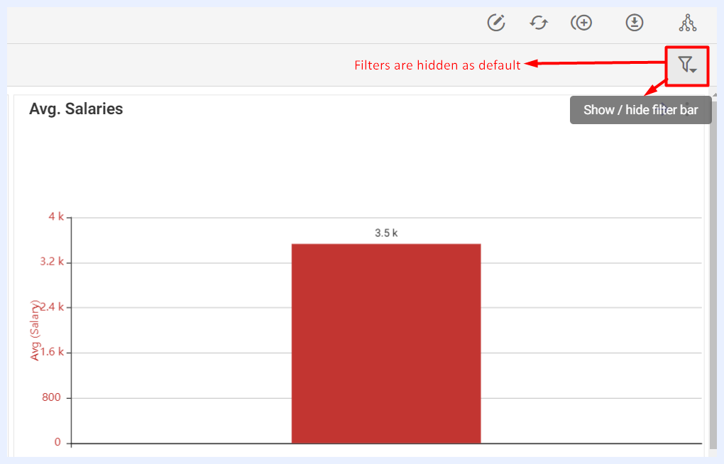
How the Filter Pane is Hidden for End-Users
Compact Filters check box: when filters are set to be displayed as a “Filter Pane”, each filter in the pane can be compacted and its contents can be opened through its drop-down menu.
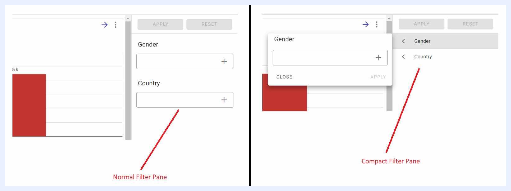
Filter Pane Position (Left/Right) radio buttons: when filters are set to be displayed as a “Filter Pane”, the designer user can choose where it will be displayed on the dashboard.
Show Search Button check box: using this feature, you can determine whether the APPLY and RESET buttons for the filters will be visible and whether they shall appear above or below the filter area.
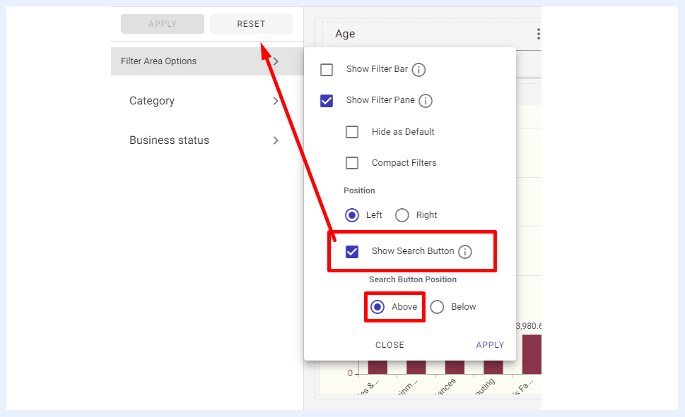
Filter Settings Configuration
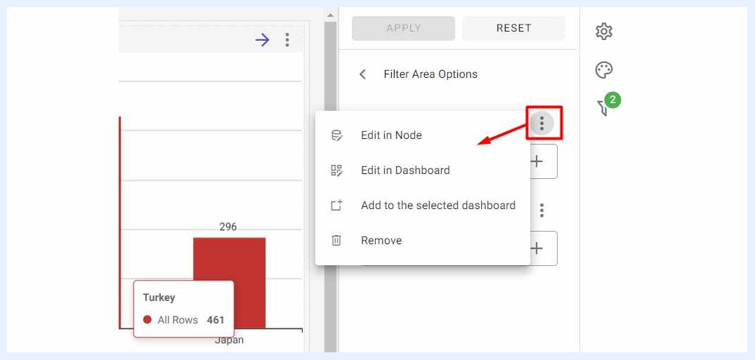
Through the available options in the ellipsis menu of the added filter, the user can manage the filter settings as below:
-
Edit in Node: to open the node edit window for the filter in the relevant view and change its settings.
-
Edit in Dashboard: to edit the dashboard’s filter settings in the window that opens such as hiding the filter, making it mandatory to be filled/selected, set default values to it, reverse it, give it a different name/alias, assign help text (hint) to it, determine its input type and so on. Date filters support a Date Period input type with one-click shortcuts for Years, Quarters, Months, Weeks, and Days. A selected period can be locked to "Current Period" so the filter automatically updates as time passes. The same date dimension can also be added as a filter multiple times, enabling complex logic such as filtering within a year but excluding a specific week.
-
Add to the Selected Dashboard: when selected, the filter will be moved from the filter pane to the dashboard’s PG as an element added to the dashboard whose location, size and styling can be adjusted as desired.
-
Remove: to remove the filter from the dashboard.
Note
When a filter is added as an element to the dashboard rather than in the filter pane, its properties and formatting can be managed as in “Element Properties and Layout Settings” section.