Dashboard Settings & Configuration Panel
Settings Options
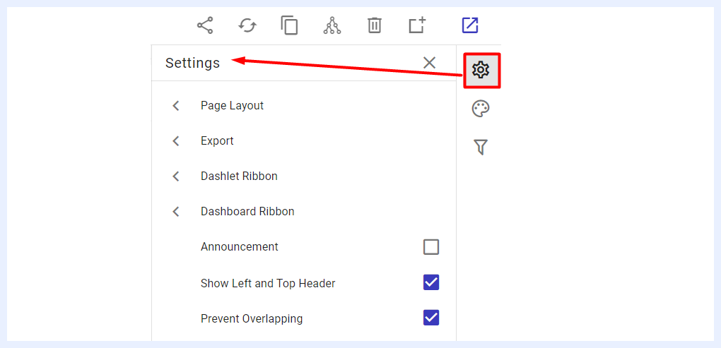
The Settings panel, accessible by clicking the settings icon at the top-right corner of the dashboard in “Edit” mode, allows configuration at both the dashboard and dashlet levels. On the dashlet level for example, two key settings options are available in the list: Export Options for Dashlets and Dashlet Ribbon.
When the settings icon is clicked, a slide-in list appears with options like Page Layout, Export, Dashlet Ribbon, and Show Left and Top Header. Clicking any option opens a side window to set the details of the selected option.
Page Layout Settings
When selecting “Page Layout” from the Settings panel, a side window appears, allowing the user to choose from five layout types to adjust the arrangement of dashlets and visualizations on the dashboard.
Dynamic Width and Height: this layout is the default that is set when creating a new dashboard. It is the most common and appropriate for many dashboards as it allows using proportion and relative sizing to display differences in data and placing charts and components in a flexible way. It is also the appropriate layout type for mobile devices as it allows the dashboard to work in harmony with different devices and browsers. If another layout is more suitable to your analysis and design needs, you can change and choose from the other available four options below.
Fixed Width: when selected, it allows the user to set a specific pixel value for the width while the height adjusts dynamically. This layout option can be useful in situations where you want to ensure that the width of a dashboard or webpage remains consistent regardless of the size of the screen or device being used to view it. It can also be useful if you want to control the placement and alignment of elements on the dashboard. By specifying a fixed width, you can ensure that different dashlets and visuals are always positioned in the same place relative to each other, which can help to make the dashboard easier to read and navigate.
A4 Portrait: when choosing this layout type, the dashlets and dashboard components will automatically fit within an A4 portrait page size. The designer can relocate and resize as desired but within the same paper size borders, and can add a custom header and a custom footer to the resulting layout easily and quickly through various formatting options. This layout type is most appropriate for dashboards that will be printed out as a hardcopy report.
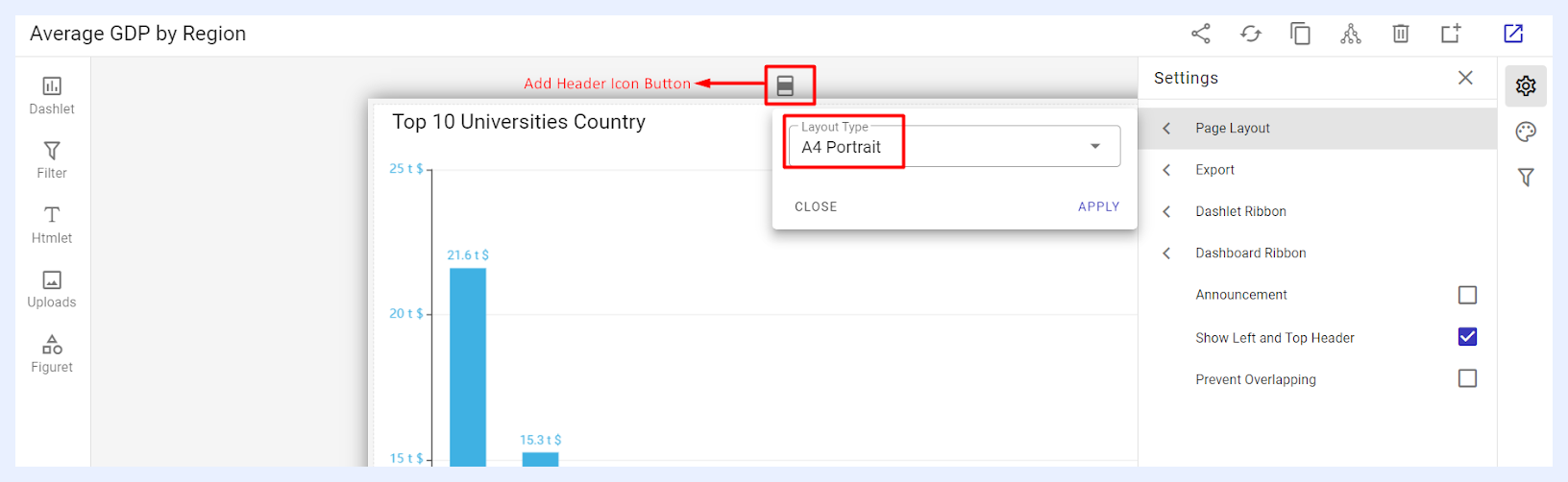
A4 Landscape: similar to the A4 Portrait option, when choosing this layout type, the dashlets and dashboard components will automatically fit within an A4 landscape page size, with options to relocate and resize the elements, in addition to adding a custom header and a custom footer to the dashboard design. It would be the best choice for presentations and for displaying the dashboard on screens in meetings.
Fixed Width and Height: when selected, it allows the user to set specific pixel values for both the width and height of the dashboard. This layout option ensures that the dashboard is always displayed at the same size regardless of the size of the screen or device being used.
Export Options Settings
“Export” options: this feature lets you choose which export options will be available to end-users for both the dashboard and its dashlets. You have the ability to customize the options and select which ones you want to make available. For instance, if you do not want end-users to have the ability to print out the dashlet, you can remove that option from the list of available export options. Similarly, if you do not want end-users to be able to export the dashboard as an email message, you can deselect that option. By customizing the export options, you can control the ways in which users are able to interact with and share the content of your dashboard.
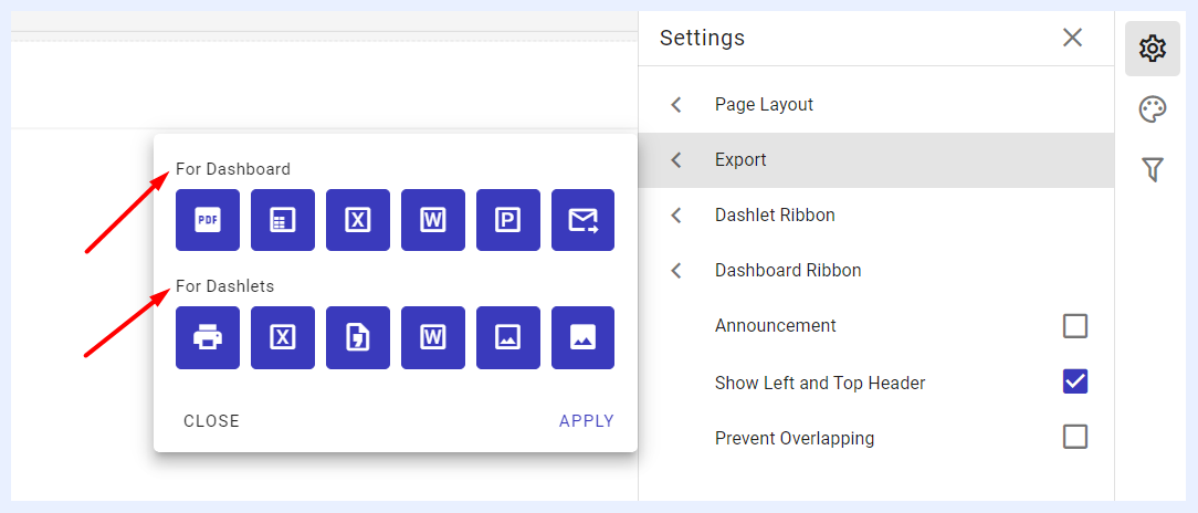
- For Dashboard: the available sharing and export options are PDF file format, PDF (with tables), Excel file format, Word file format, Presentation (PPT file format), and a PDF file sent to e-mail.
- For Dashlets: the available sharing and export options are Print out, Excel file format, Word file format, CSV file format, PNG image file and JPEG image file.
Ribbon Settings
1 “Dashlet Ribbon” options: this feature lets you choose which quick actions that end-users can apply on the dashlets of the relevant dashboard and how those actions shall appear on the dashlet ribbon.
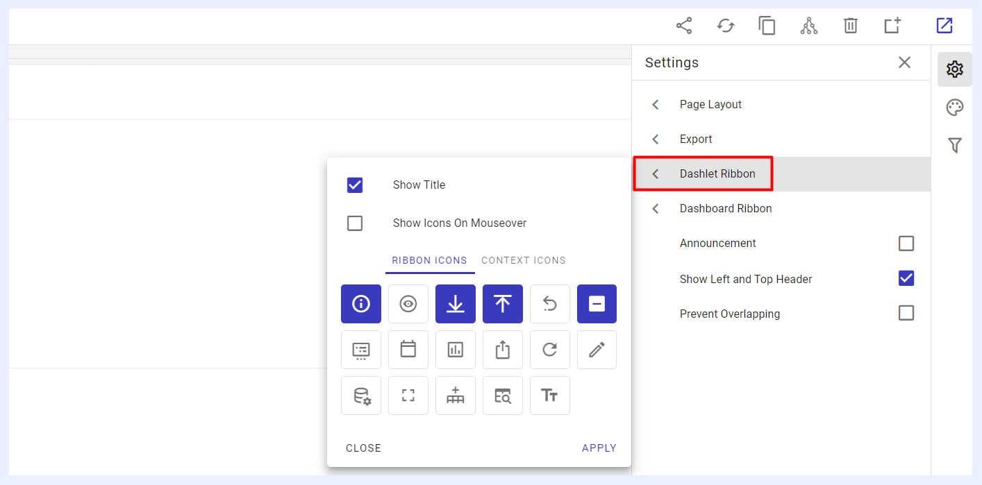
- Show Title check box: when checked, the dashlet titles will be visible at the left-top corner of each dashlet.
- Show Icons On Mouseover check box: when checked, the selected dashlet icons (whether set to appear as context icons or a ribbon) will become visible and selectable only when you hover your mouse over the dashlet area.
- RIBBON ICONS tab: the icons selected through this option will appear on the dashlets as a ribbon next to each other at the right-top corner of the dashlet. End-users can simply click on them to apply the relevant action.
- CONTEXT ICONS tab: the icons selected through this option will appear on the dashlets as a hidden list under the dashlet’s ellipsis menu located at the right-top corner of the dashlet. End-users can simply click on the ellipsis menu and select the relevant action.
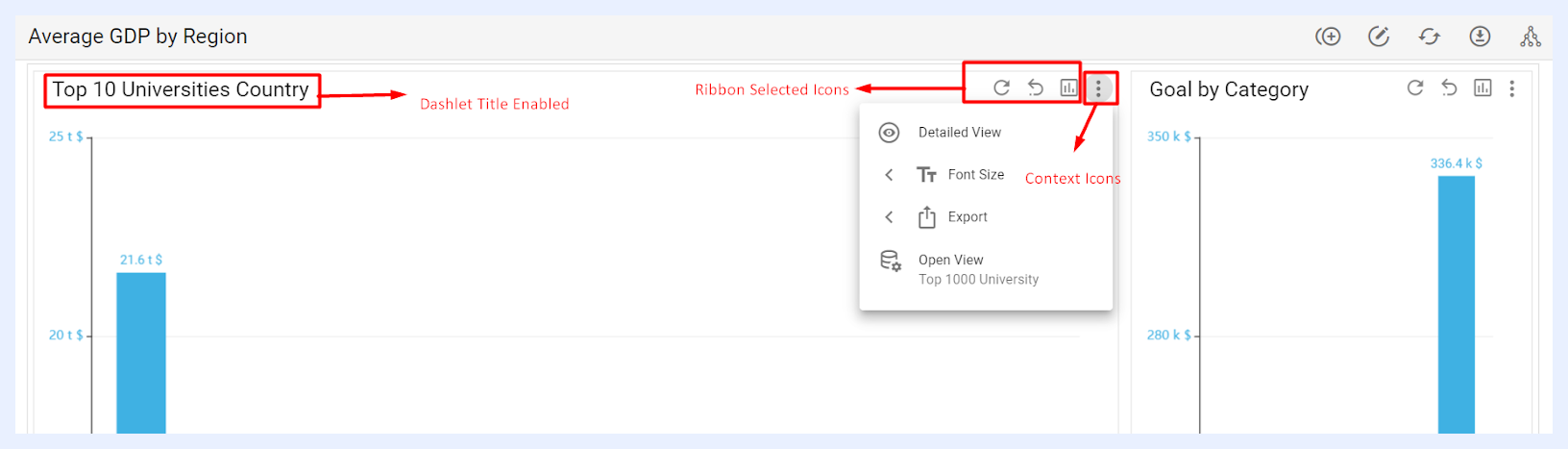
How ‘Dashlet Ribbon’ Settings Appear on each Dashlet for Dashboard End-Users
Note
You can select the same action icon to be displayed as either a Context Icon or a Ribbon Icon. This means that when an icon is selected in one tab, it will be automatically deselected from the other tab.
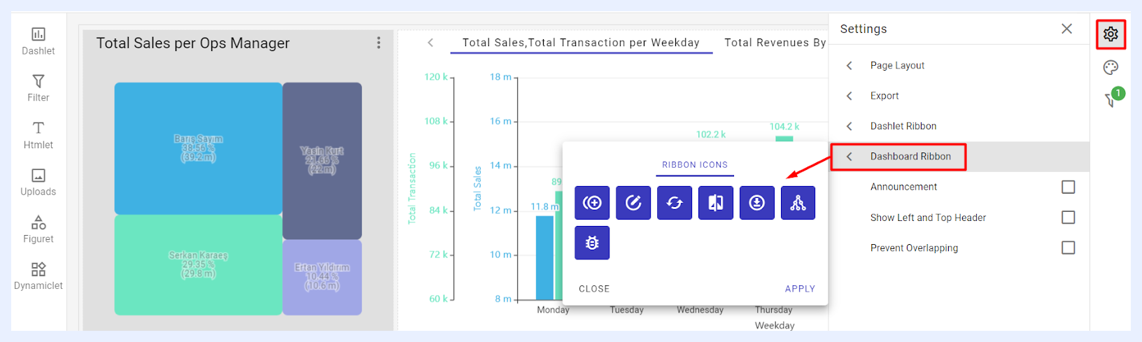
2 “Dashboard Ribbon” options: this feature allows Designer users to select which quick actions will be available for end-users. These actions appear as a ribbon at the right-top corner of the dashboard. The available icons, such as Clone, Edit, Refresh Data, Theme Selection (for Showcases), Export, and Meta Info, can be configured based on user permissions and needs.
Other Settings
1 “Announcement” check box: when checked, a pop-up window opens, allowing the designer to enter an announcement title and message using the Editor. Once the user clicks the APPLY button, the announcement will automatically appear as a pop-up to all end-users viewing the dashboard. End-users must click OK to close the message. This feature helps ensure important updates are seen directly on the dashboard without relying on external communication methods.
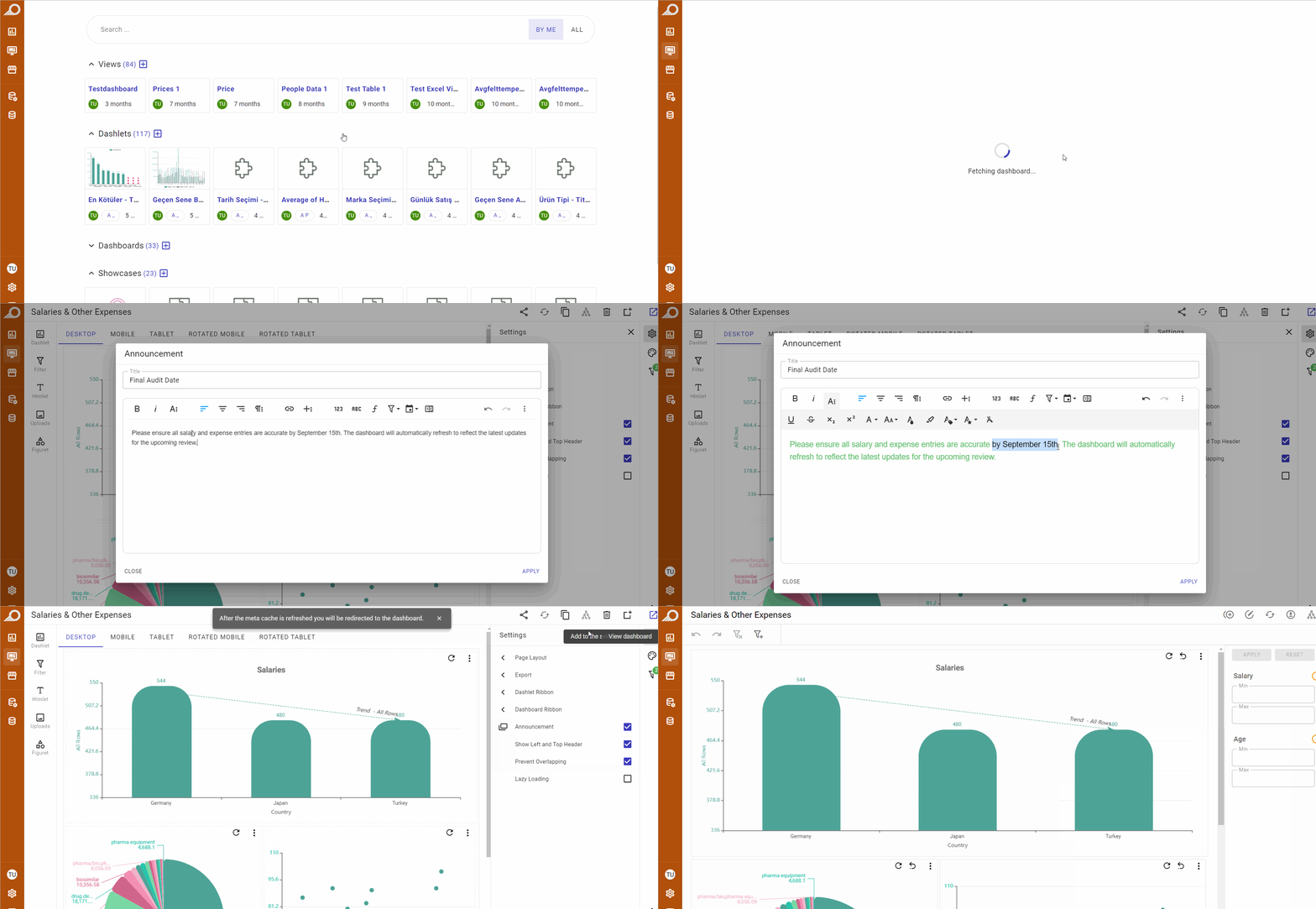
2 “Show Left and Top Header” check box: when checked, the title of the dashboard will be visible to end-users at the left-top corner of the dashboard. Additionally, the “Navigation Sidebar Menu” will be visible at the left side of the dashboard window.
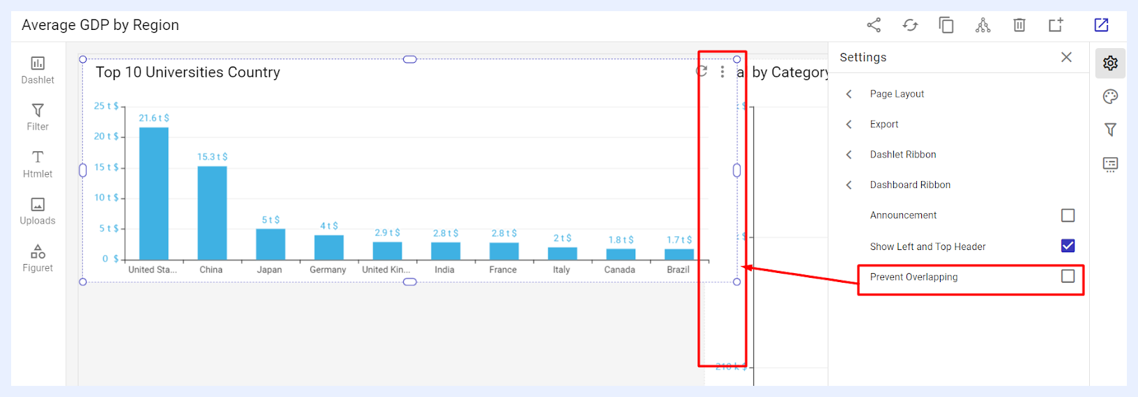
3 “Prevent Overlapping” check box: when checked, it allows you to avoid overlapping and prevent your dashlets and widgets (other dashboard elements) from being stacked on top of one another. Conversely, without this feature, such stacking is possible.