Creating Forms
How to create a 1-Dimensional Form?
1 Select the Create New Form tab to open the “Create New Form” window.
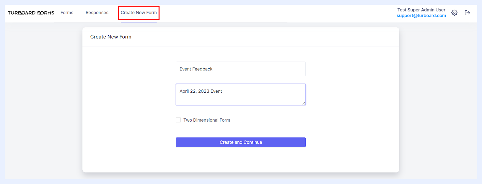
2 Enter the desired form name into the “Title” field.
3 Optionally, you can add a description or informational text in the “Description or information text” multi-line field. This description will be displayed beneath the form title for respondents and will also appear as a tooltip when users hover over the form title on the main “Forms” listing page.
4 Click the Create and Continue button. This action will bring you to the form creation main window.
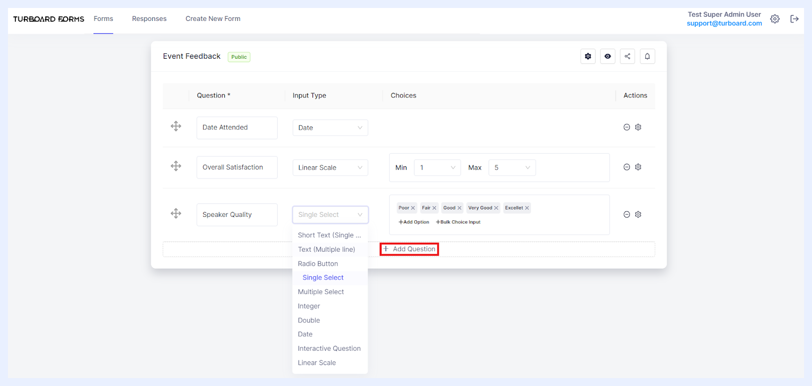
5 Begin designing your form by adding the necessary questions (fields to be completed and answered) using the + Add Question button and determine the details of each added question as below.
1-Dimensional Fields Settings & Options
“Question” text field: this is where you input the wording of your question – think of it as the prompt that guides the respondents on what information you're seeking from them.
“Input Type” drop-down list: choose the type of response format you'd like to use from the dropdown list. Each type is suited for different kinds of answers:
- Short Text (Single Line): ideal for concise answers, like names or titles.
- Text (Multiple Line): use this for longer responses, like feedback or descriptions.
- Radio Button: lets respondents choose one option from a set of choices displayed in the form as radio buttons.
- Single Select: offers a dropdown list of options, of which only one can be chosen. You can specify these options in the “Choices” field.
- Multiple Select: a dropdown list, but respondents can select multiple options from the choices you determine in the “Choices” field.
- Integer: to allow for whole number answers.
- Double: for answers with decimal values.
- Date: if selected, respondents will be presented with a calendar from which they can select a date.
- Interactive Question: you can select it when you need answers from a predefined set of options. The name of the dropdown list and its options are previously set up in the “System Settings and Administration” section under the “Interactive Questions” tab. All the added “Interactive Questions” will become available as a list for the admin user to choose from.
- Linear Scale: allows for rating-style answers.
“Choices” Field: Activated when an “Input Type” that needs further specification is chosen. For instance, if you opt for “Linear Scale”, you'll specify the minimum and maximum values of the scale. Similarly, for “Radio Button”, you'll list out the potential choices for respondents.
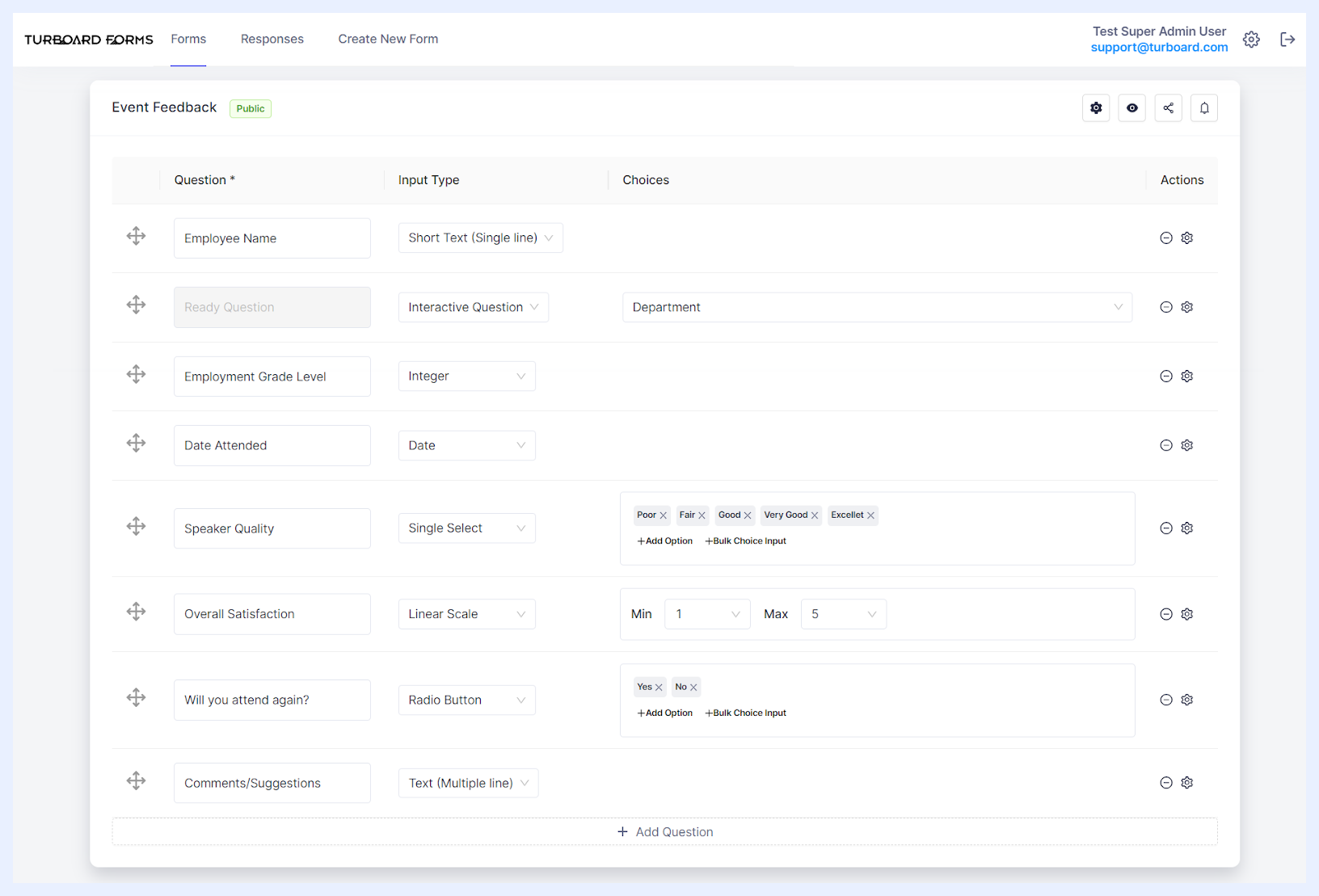 Setting up Different Input Types & Choices for Form Questions
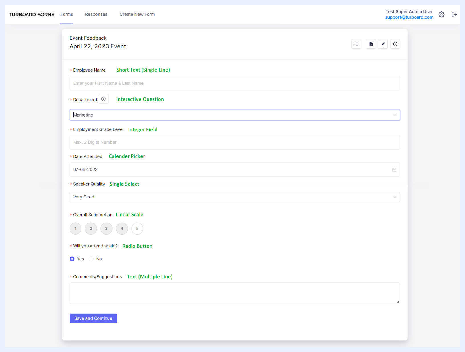 How Questions Appear to Respondents According to Input Types & Their Choices
Additional Question-Level Settings & Options
| Question-Level Actions & Options Explained | |
|---|---|
| Reordering Questions: | Click on the icon and use drag-and-drop to rearrange the sequence of questions as desired. |
| Deleting Questions: | To remove a question, simply click on the respective icon. |
| Accessing Question Settings: | Click on the designated icon to open the “Question Options” side panel, where you can adjust further settings for the selected question, as detailed below. |
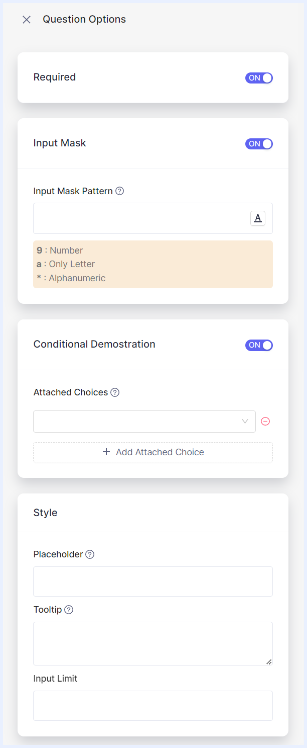
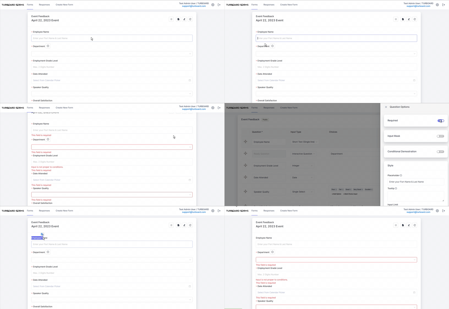
Required: by default, when you add a question, the “Required” option is activated. This ensures that respondents must answer or complete this field. Should they attempt to submit the form without addressing this mandatory field, a prompt will appear with the message “This field is required,” preventing form submission until the requisite information is provided. If you wish to allow respondents the option to leave the question unanswered, simply toggle this setting to “Off”.
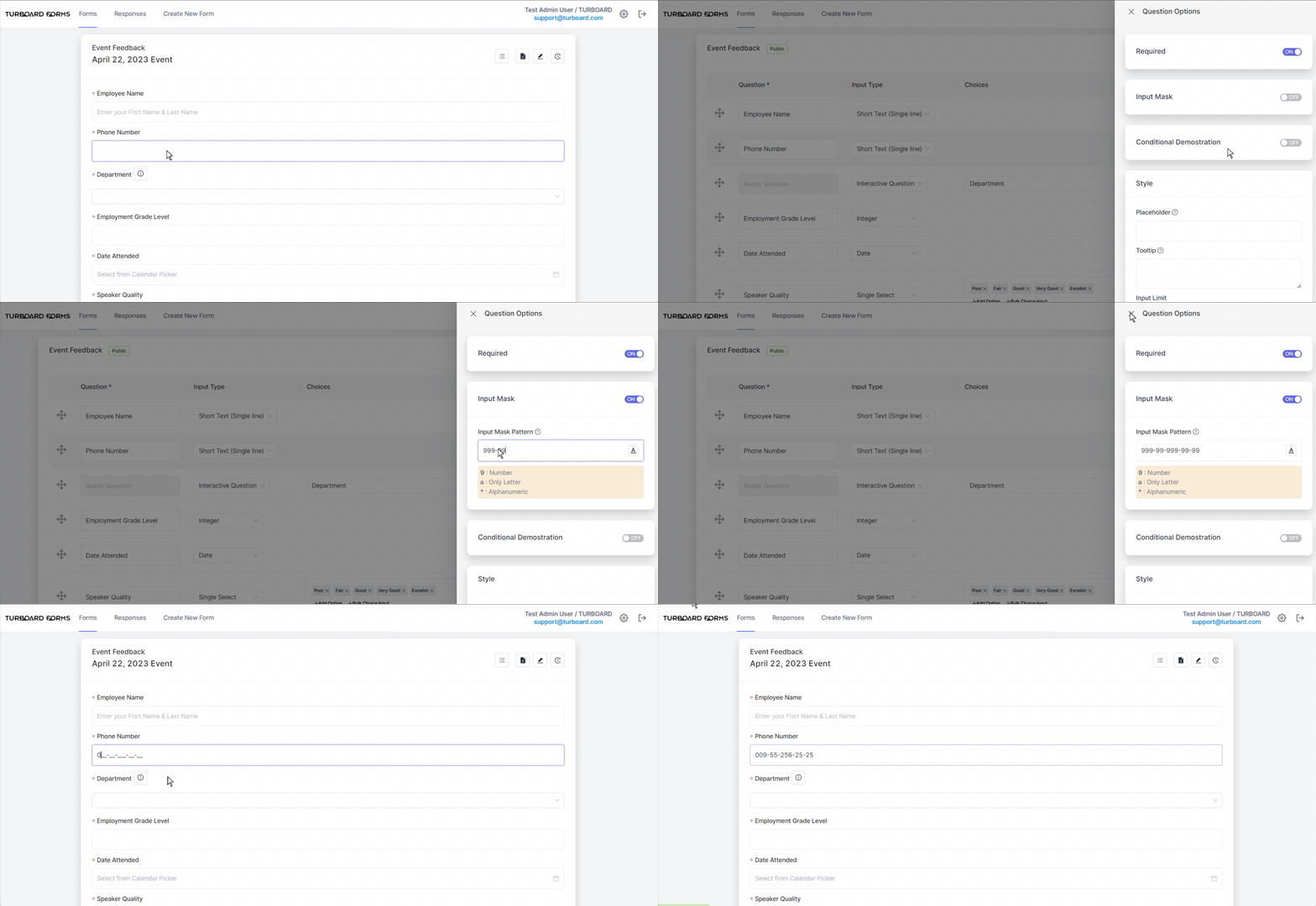
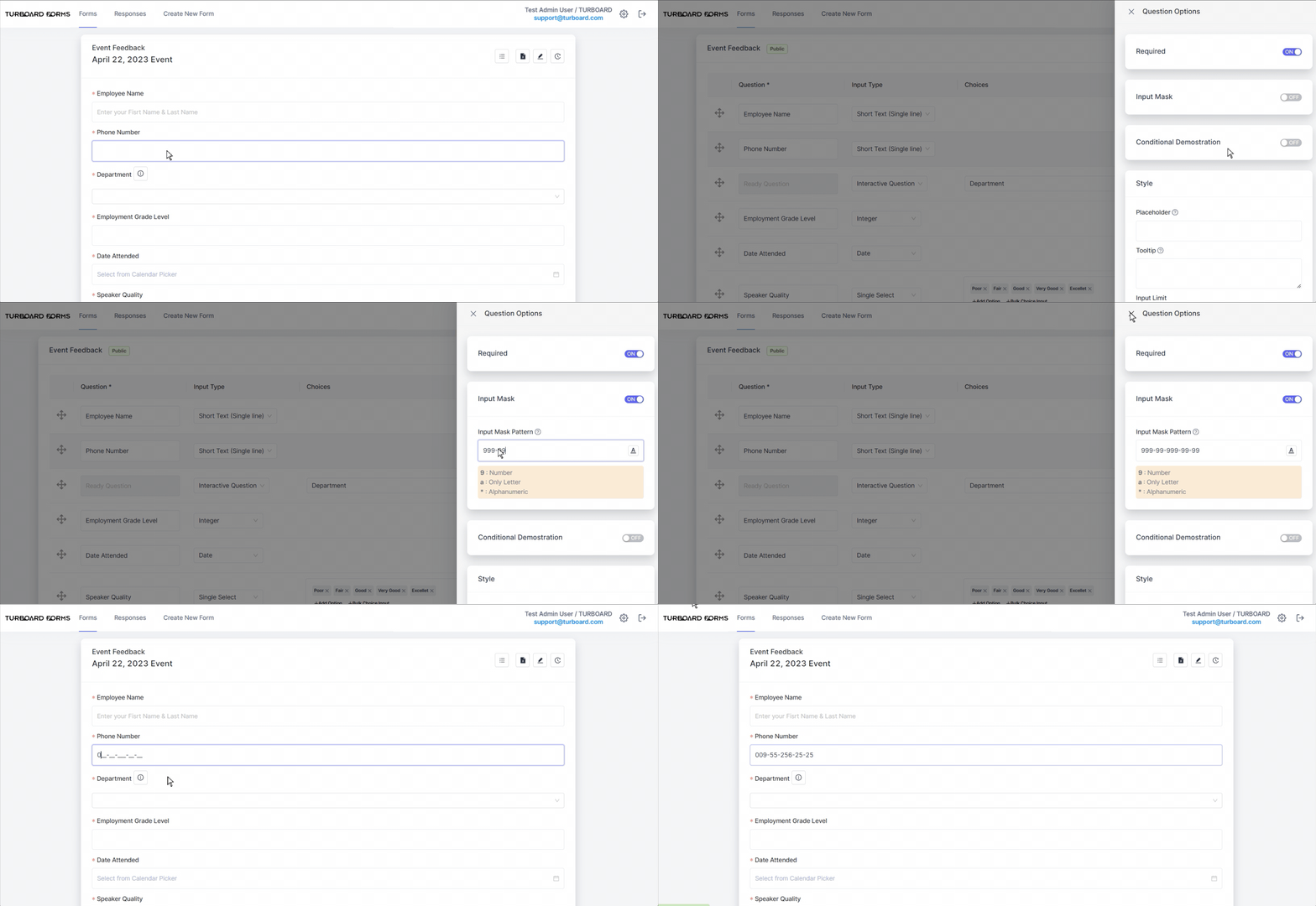
Input Mask: available only for the “Short Text (Single Line)” input type, this feature allows you to specify the format in which the response should be entered. An input mask is a guideline that ensures data is entered consistently. For instance, if you want phone numbers to be entered in a particular format, you can set an input mask for that pattern.
Conditional Demonstration: when activated, this option hides the question initially. The question will then appear based on specific conditions related to responses from another question.

Style: allows you to customize your question's appearance and behavior using these settings:
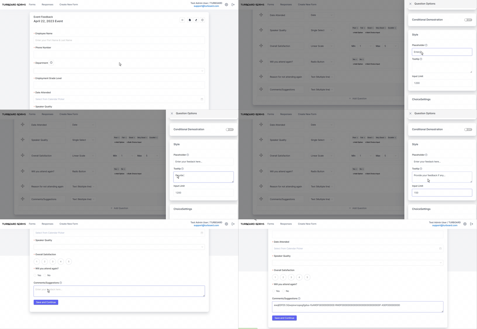
- Placeholder: displays a brief hint in the input field before respondents type in their answer. This text gives a suggestion about the expected response format or nature.
- Tooltip: the text you enter here is a brief explanatory note that emerges when respondents hover over the question icon next to the question. It's intended to provide additional clarification or context to guide users in answering the question correctly.
- Input Limit: applicable to input types where answers aren't predetermined, this limits the number of characters a respondent can input. If an answer surpasses this threshold, a notification message will appear to respondents. In multi-line fields, respondents are prevented from typing beyond the limit.
Note
Any additions, modifications, or updates made to the form, its details, or its questions' settings will be instantly saved and automatically reflected for the respondents to view.
How to create a 2-Dimensional Form?
1 Select the Create New Form tab to open the “Create New Form” window.
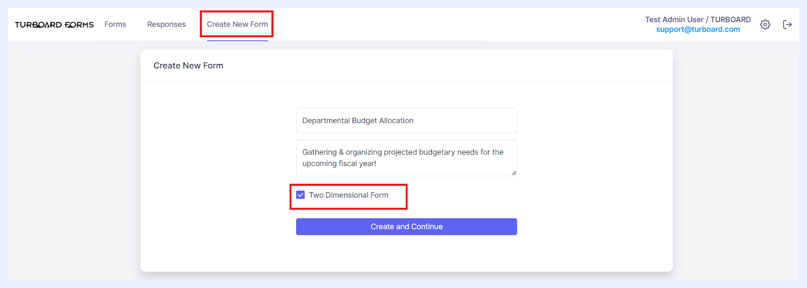
2 Enter the desired form name into the “Title” field.
3 Optionally, you can add a description or informational text in the “Description or information text” multi-line field. This description will be displayed beneath the form title for respondents and will also appear as a tooltip when users hover over the form title on the main “Forms” listing page.
4 Tick the “Two Dimensional Form” checkbox.
5 Click the Create and Continue button. This action will bring you to the form creation main window.
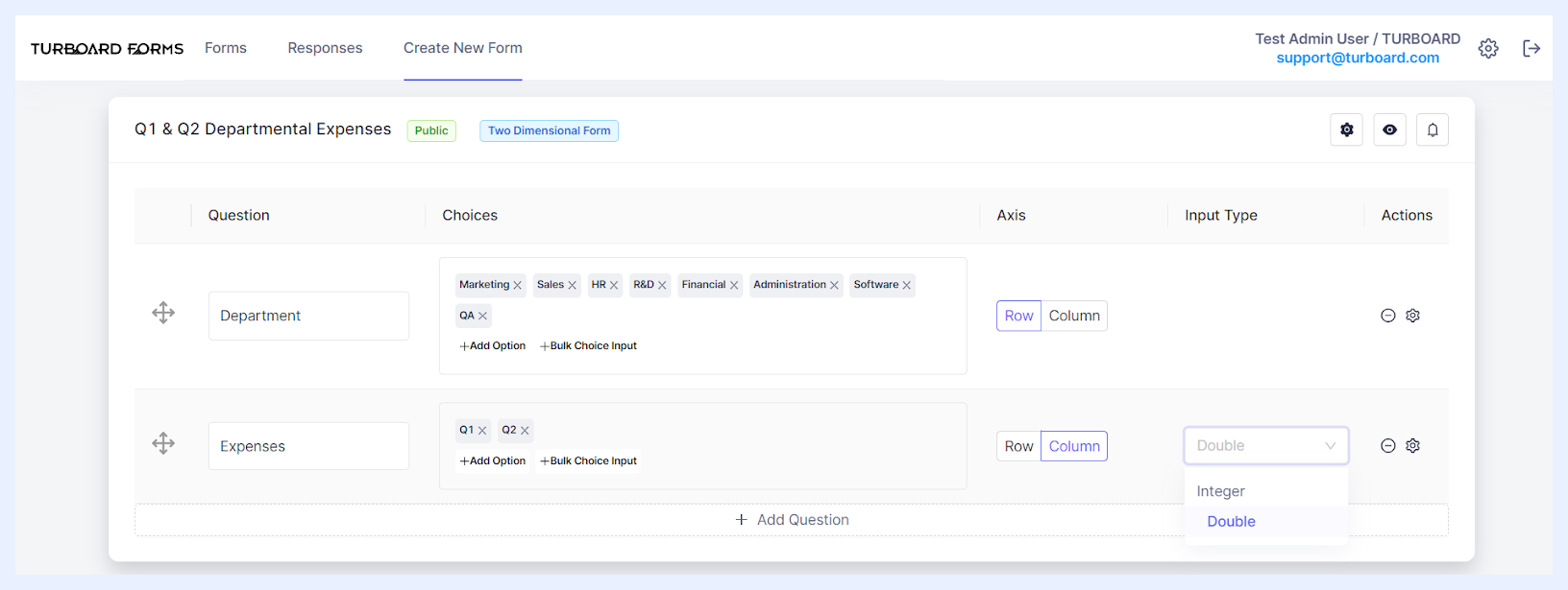
6 Begin crafting your form by adding the necessary rows and columns. To do this, click on the + Add Question button and determine the details of each added element as below.
2-Dimensional Fields Settings & Options
“Question” text field: enter the primary title or label of the data you wish to collect. Think of this as the main topic or theme. Respondents will enter data related to this question under specific sub-categories (or choices) that you set.
“Choices” Field: this feature allows you to detail or specify aspects pertaining to the primary question. For a row-oriented question, every choice you enter signifies a separate row beneath the main question label — the same principle applies for columns. As an example, if your principal query is “Expenses”, choices could include intervals like “Weekly”, “Monthly”, or “Annually”, or specific categories such as “Office”, “Cafeteria”, or “Auditorium”. Depending on the “Axis” selection below, these choices will be organized as rows or columns. Respondents are then tasked with providing values for each designated choice. When you add a choice to the form, clicking on it will prompt a color picker pop-up, enabling you to modify the background highlight color for that specific choice.
“Axis” Field: decide how you want your data label (question) and its choices to appear in the form:
- Row Option: if chosen, the main question acts as the primary label for the row. The choices become sub-labels (second level labels). Only note that if one choice is set, it will become the main row label.
- Column Option: if selected, the main question and its sub-categories (choices) will be column headers. Below these headers, respondents can enter numerical values.
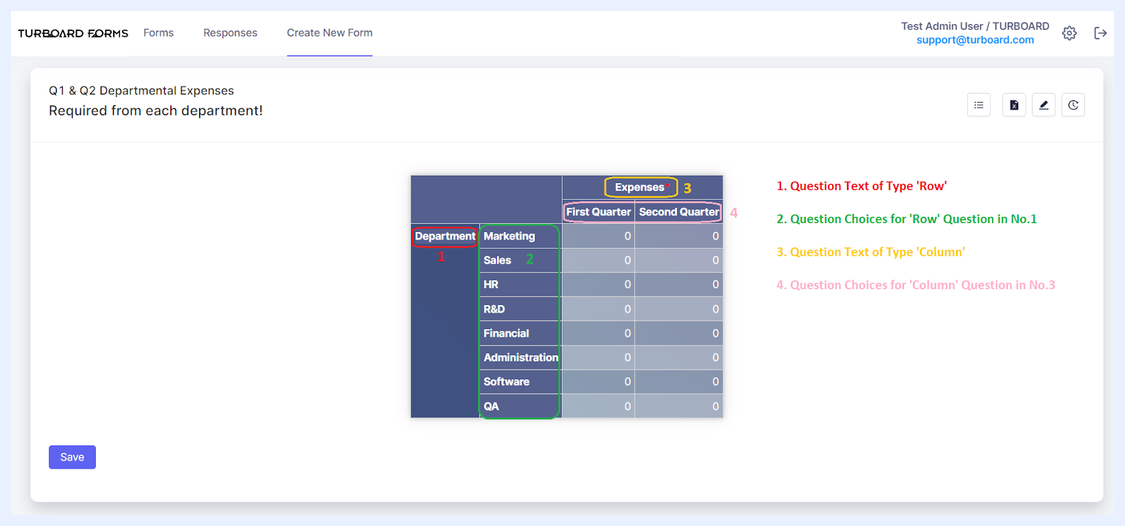 Questions Details as applied on the Form Answer Mode
“Input Type” drop-down: when a “Column” is set in the Axis field, this option gets activated. It lets you specify the kind of number respondents can enter: either “Integer” to allow for whole number answers, or “Double” for numbers with decimal values.
Additional Question-Level Settings & Options
| Question-Level Actions & Options Explained | |
|---|---|
| Reordering Questions: | To adjust the sequence of rows and columns, simply click on the designated icon and drag to your preferred location. Rows shift vertically based on their new positions, while columns realign from left to right. |
| Deleting Questions: | To remove a question, simply click on the respective icon. |
| Accessing Question Settings: | Click on the designated icon to open the “Question Options” side panel, where you can adjust further settings for the selected question, as detailed below. |
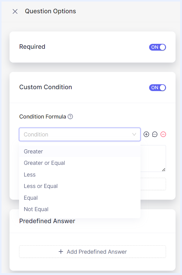

Required: this feature designates certain columns as compulsory for respondents to complete. By default, it's toggled to “On”, signified by a red asterisk adjacent to the column label in the Form Answer window. While respondents might leave the corresponding values empty, they can still submit the form.
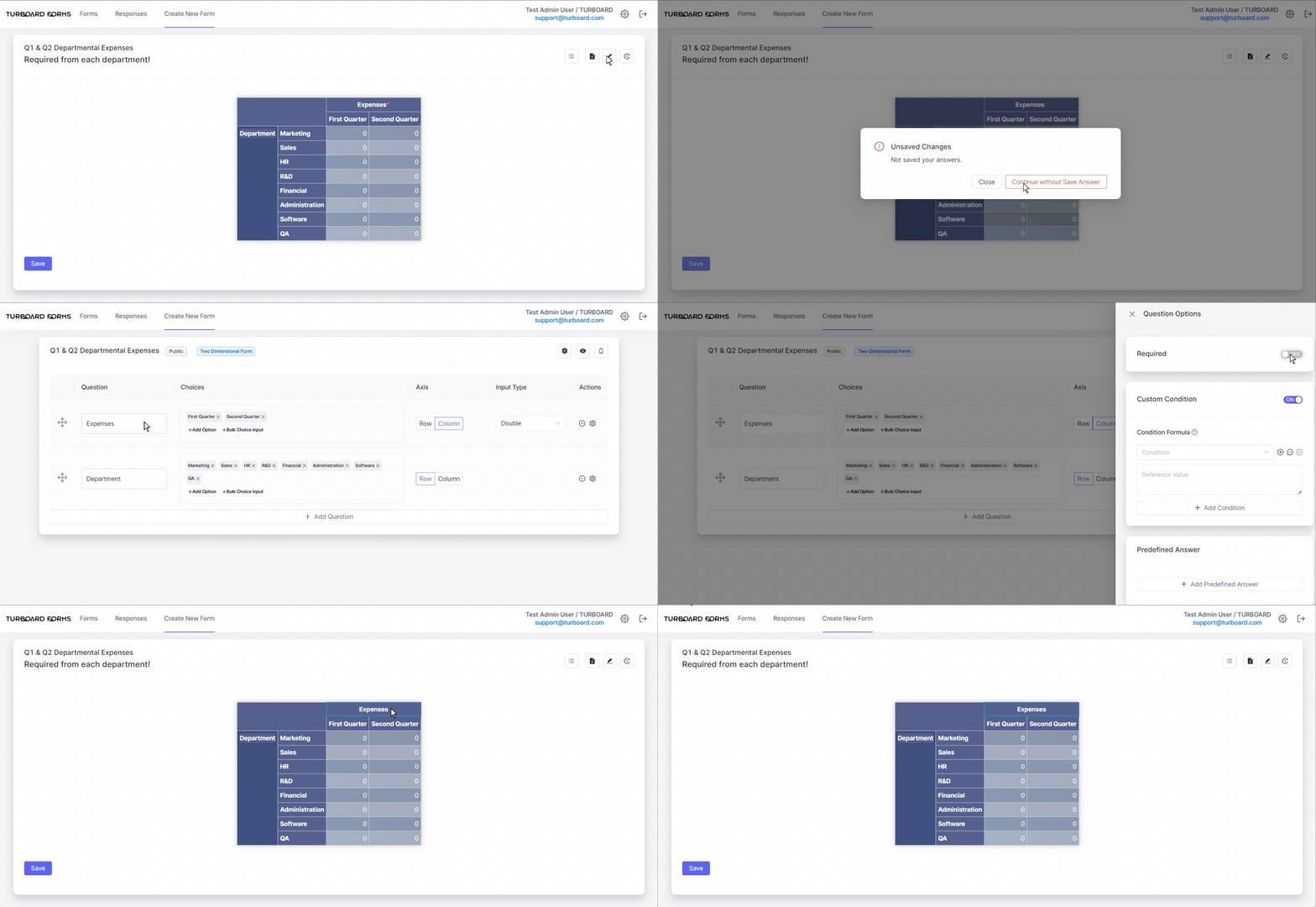

Custom Condition: to ensure data consistency by setting specific conditions for input values. Use the + Add Condition button to choose a criterion from: Greater, Greater or Equal, Less, Less or Equal, Equal, Not Equal. Then click on the Add Condition icon to reference values from other questions, making your form dynamic.
Additionally, if a respondent’s entry doesn't meet the set condition, prompt an error notification. This can be customized by entering a message in the “Error Message” pop-up that appears when you click the Message icon. For instance, if you wish for a value in one field to always exceed the value in another, this feature facilitates that verification. At any time, you may remove the condition that you set through the Remove Condition icon.
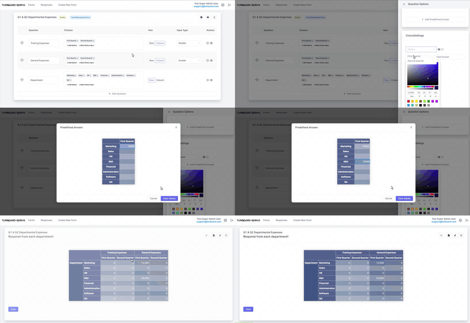
Choice Settings: utilize this feature when your form questions have predefined answer options. It enables you to assign a default value, which will be automatically populated in the relevant data cells for the corresponding row and/or column.
Note
Any additions, modifications, or updates made to the form, its details, or its questions' settings will be instantly saved and automatically reflected for the respondents to view.
Once you've set up your form questions and their configurations – whether for your 1-Dimensional form or 2-Dimensional form, you can adjust the main settings of the form, such as its publication date, expiration date, designated respondents, and more. Detailed explanations of these options are provided in the “Managing Forms” section.
Also note that anytime you need to make changes or updates to your form questions and their settings, you can easily do so by selecting the “Edit” option from the ellipsis menu located next to the form in the “Forms” Tab listing.