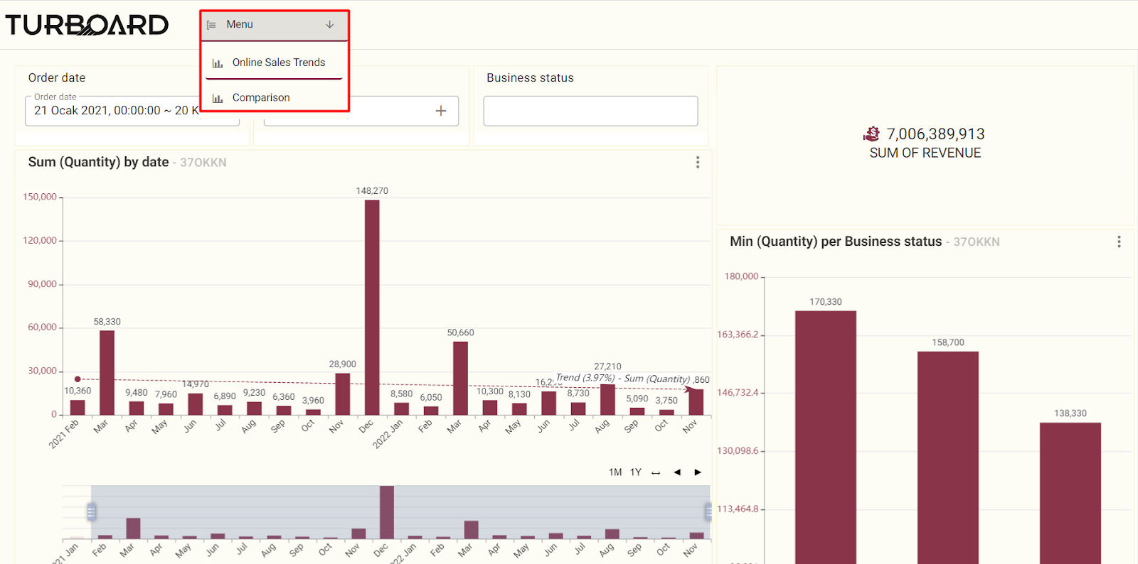
Managing Showcases
Upon successful creation of the showcase, its “Edit” window will open automatically with four main sections in order to allow the user to manage its settings and features as needed.
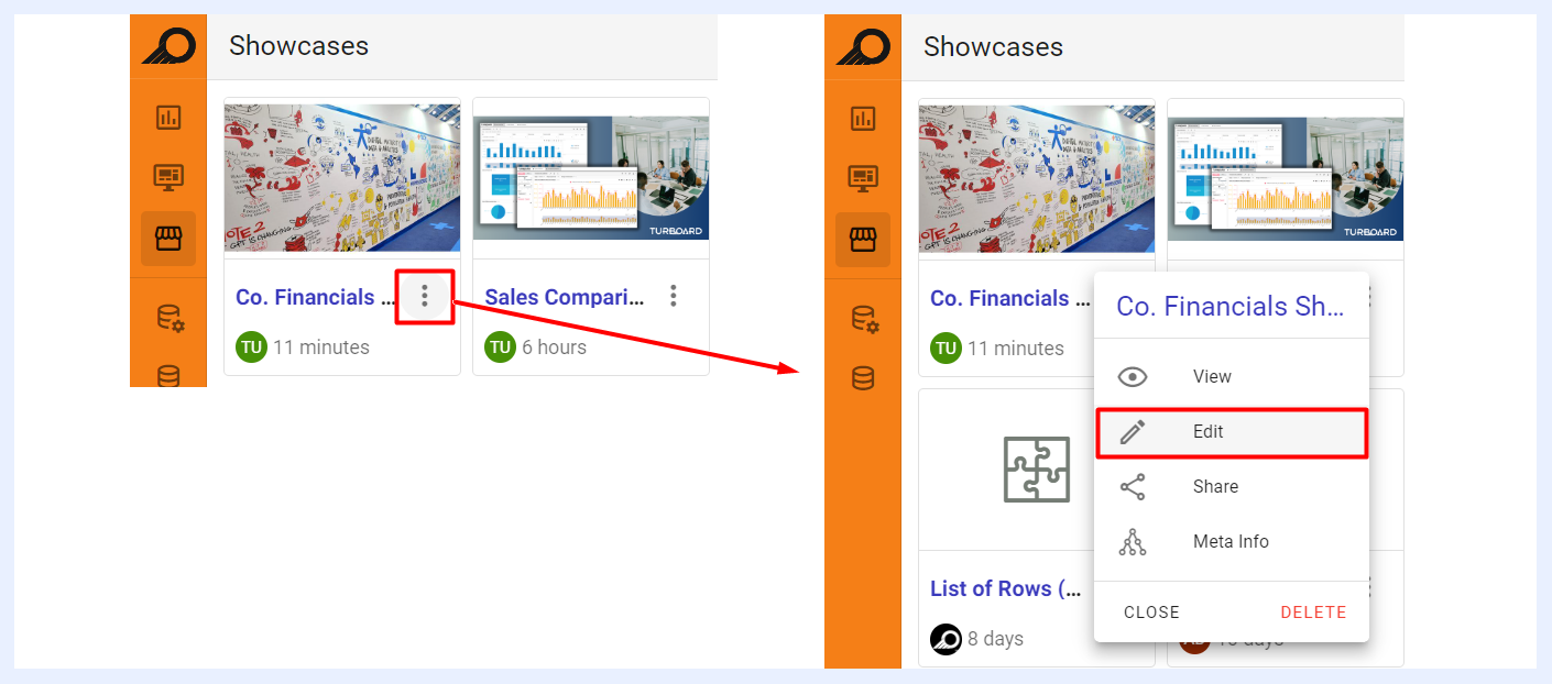
Additionally, a showcase can be edited anytime by selecting the “Edit” option from the showcase ellipsis menu in the showcase’ listing window.
Showcase Title & Details
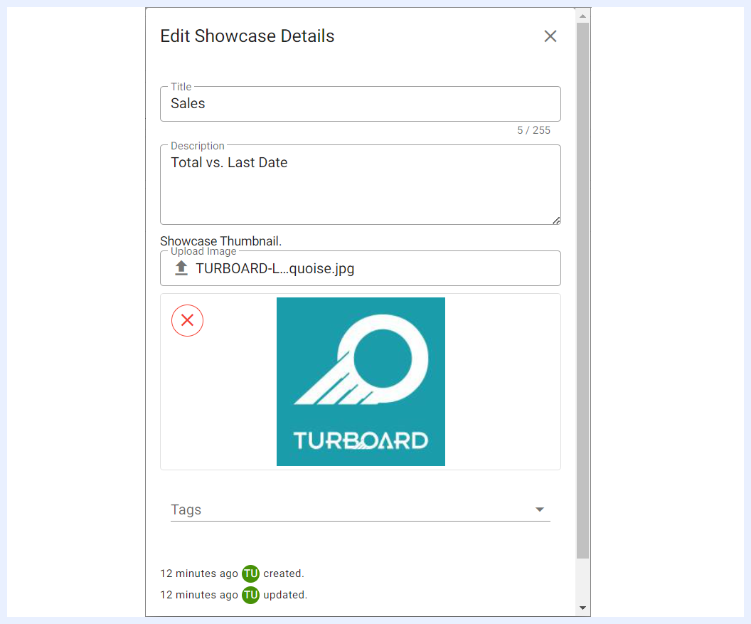
The showcase title and details can be edited/changed by clicking on the “Edit Showcase” icon available at the Quick Actions Ribbon. Or, alternatively by clicking on the title of the showcase > Edit option. An overlay window will open to allow the user to:
- Change the name of the showcase in “Title” field,
- Add/Edit the “Description” of the showcase,
- Add/Edit the “Tags” of the showcase,
- Assign a “Thumbnail” to the showcase (image file format) and/or change it. The thumbnail will appear on the Showcase card in the showcase view listing page.
Quick Actions Ribbon
At the top-right side of the showcase “Edit” window, several icons are available to apply general actions on the showcase.

| Showcase Quick Action Icons Explained | |
|---|---|
| Change theme: | to modify the color palette and overall appearance of the showcase and use a different theme than the default applied for TURBOARD's general elements and designs. This customization option allows you to create a unique visual style for the selected showcase only, while other showcases in TURBOARD will continue to use the default theme. |
| Edit Showcase: | to change the name of the showcase in the “Title” field, add/edit the “Description” of the showcase, add/edit the “Tags” of the showcase, and/or assign a “Thumbnail” to the showcase. |
| Share: | to share the showcase and make it available to either for public or with defined user(s) and/or group(s). When a showcase is shared with “Can View” privilege, shared users will only be able to view the showcase. When it is shared with “Can Edit”, shared users can apply changes to the showcase settings as well (open its “Edit” mode). This option can also be accessed from the showcase ellipsis menu in the showcase’ listing window. |
| Refresh dashboard and dashlets data cache: | to update the data displayed on all the dashboards of the showcase and their components (dashlets) by reloading the temporary storage location (cache) where data is stored. |
| Share meta info: | when clicked, a pop-up window opens listing the related data source(s), the view(s) of the dashlets added to the relevant dashboards, in addition to the dashboards that this showcase depends on. This option can also be accessed from the showcase ellipsis menu in the showcase’ listing window, namely the “Meta Info” option. |
| Remove: | to delete the showcase. |
| View showcase: | to view the resulting showcase (View mode) and how it will be displayed for end-users. |
Showcase Items
Each dashboard or group of dashboards (menu) under the showcase is called a “Showcase Item”. The dashboards that were added by the designer user when creating the showcase will be listed in the main “Edit” window of the showcase under “Showcase Items”. The user can apply several settings and changes to the showcase items as below:
| Showcase Item Actions Explained | |
|---|---|
| Add a New Showcase Item: | to add more dashboards to the showcase, either individually or as grouped menus. |
| Edit dashboard: | to open the “Edit” window of the dashboard. |
| Disconnect: | to remove the dashboard from the showcase. |
| Drag Item: | to rearrange the order of the dashboards and relocate them within a showcase and manipulate their hierarchical order by clicking and dragging the items to a new location. |
| Change Icon: | by clicking on the icon of a menu or a dashboard, which is located on the left side of the menu item, the user can modify it and select a different icon than the default/previous one. |
Editing Showcase Items

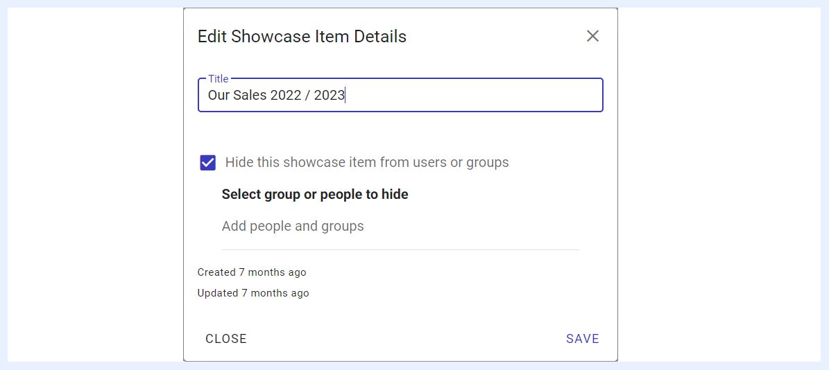
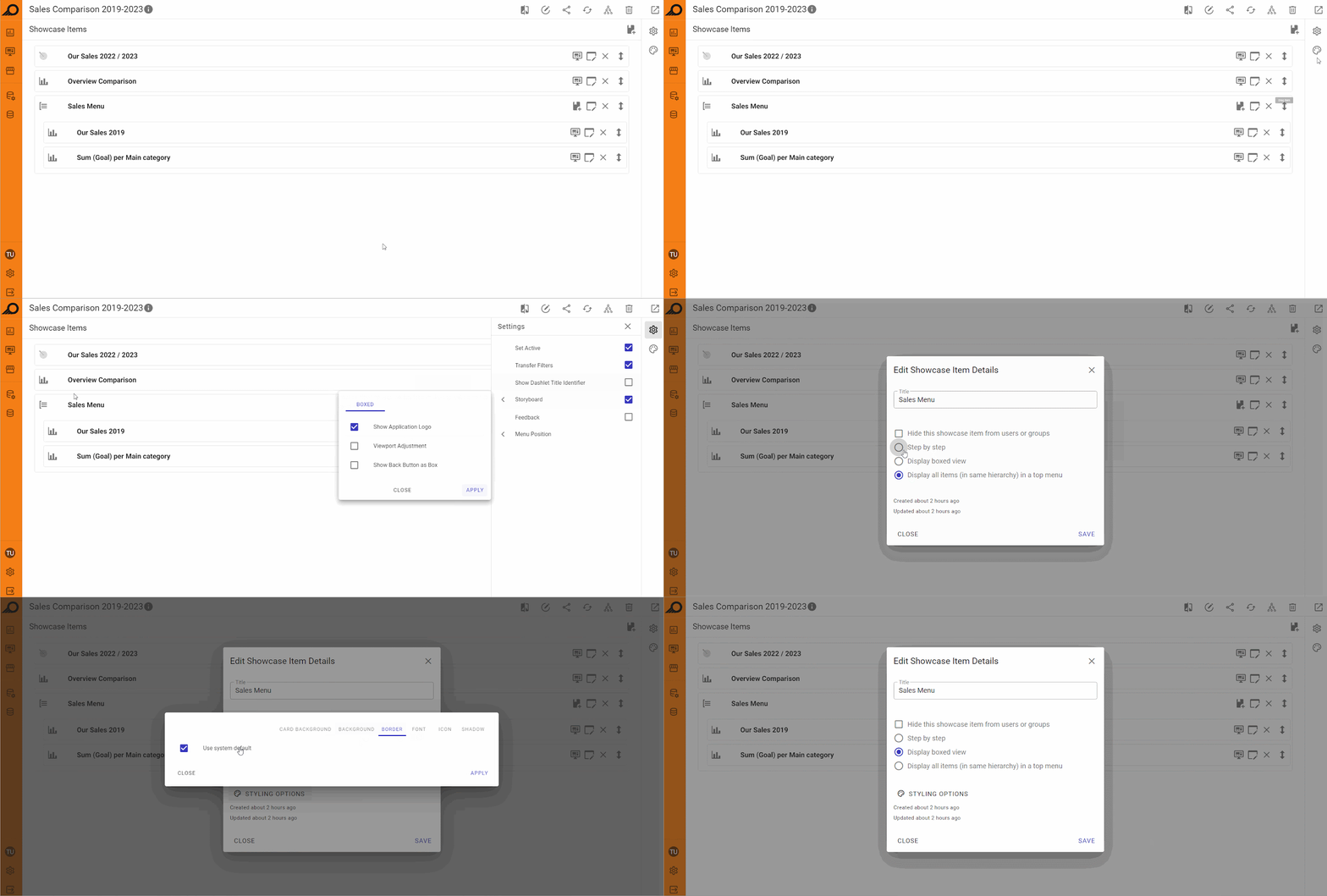
When you click on the “Showcase Item” title, you can directly rename it, or click the Edit icon to apply the following:
- Change the name of the item (whether a dashboard or a menu) in “Title” field,
- Hide the dashboard from specific users and/or groups, or change the users and/or groups that the showcase will be hidden from them.
Storyboard Menu Display Options
When dashboards are added as menu items and set to display as a “Storyboard”, the designer user can customize the way they will be displayed to end-users and their locations on the showcase as below. This means that these options (radio buttons) will only appear when “Storyboard” check box is selected in “Settings Panel” for “Menu Items”.
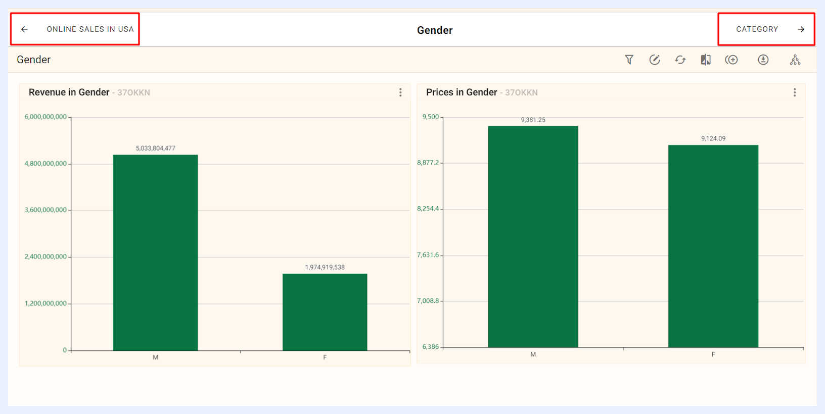
“Step by step” radio button: when selected, will display the dashboards under the relevant menu one after another as tabs on the top of the showcase. The tabs will be displayed in the same hierarchical order that they were added, and users can navigate between them using left and right arrow buttons. This option allows users to view multiple dashboards one at a time in a step-by-step fashion.
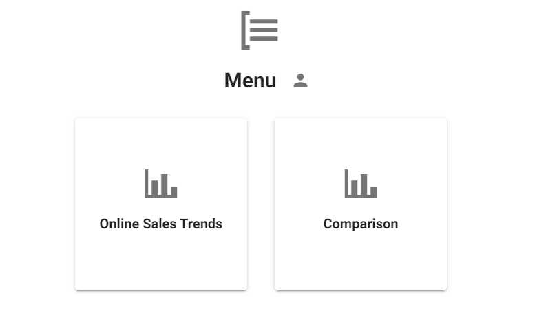
“Display boxed view” radio button: when selected, will display the dashboards under the relevant menu as boxes or cards instead of tabs. This allows users to see a summary or preview of each dashboard before selecting the one they want to open. The boxes or cards may contain information such as the menu title, the dashboard's title and its icon as a thumbnail image. Users can select the required dashboard by clicking on the corresponding box or card. This option is useful when users have multiple dashboards and need a visual representation of each one to quickly select the one they need.
“Display all items (in same hierarchy) in a top menu” radio button: when selected, the dashboards under the relevant menu will be displayed as tabs on the top of the showcase as a sub-menu or drop-down menu.