Pivot Tables
Nodes Pane
When the pivot table is created, its default rows and columns appear as determined in the “Default Datacells” section in the related “View”. The user can change them as desired from the “Nodes Pane” as below.
“ROW DIMENSIONS” Pane
“ROW DIMENSIONS” pane lists all the nodes of type “Dimension” as set in the related view. When a dimension is selected in this pane by clicking on the + icon, its values are sorted (drilled down) as rows. You can change the name of the added dimension (on the PT level only and will not affect its name as a node in its view) through its ellipsis menu > “Change Alias” option. Additionally, you can edit its settings directly in the related view through “Node Settings” option.
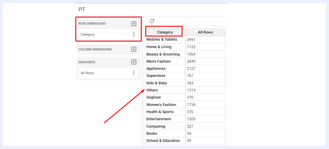
“COLUMN DIMENSIONS” Pane
“COLUMN DIMENSIONS” pane lists all the nodes of type “Dimension” as set in the related view. When a dimension is selected in this pane by clicking on the + icon, its values are sorted (drilled down) as columns. You can change the name of the added dimension (on the PT level only and will not affect its name as a node in its view) through its ellipsis menu > “Change Alias” option. Additionally, you can edit its settings directly in the related view through “Node Settings” option.
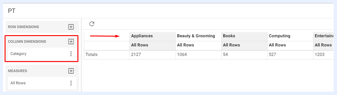
“MEASURES” Pane
“MEASURES” pane lists all the nodes of type “Measure” as set in the related view. When a measure is selected in this pane by clicking on the + icon, its values are displayed in the table. You can edit and configure the settings of the added measure(s) through its ellipsis menu as below:
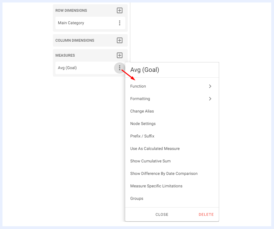
Function, Formatting, Change Alias, Node Settings, Prefix / Suffix, Use As Calculated Measure, Show Cumulative Sum, Show Difference By Date Comparison, Measure Specific Limitations: these settings and features are also applicable to the measures in chart dashlets and are explained in their relevant sections.
Groups: this feature allows you to group 2 or more measures together under any name of your choice. You can add any number of group names then locate the required measures under them.
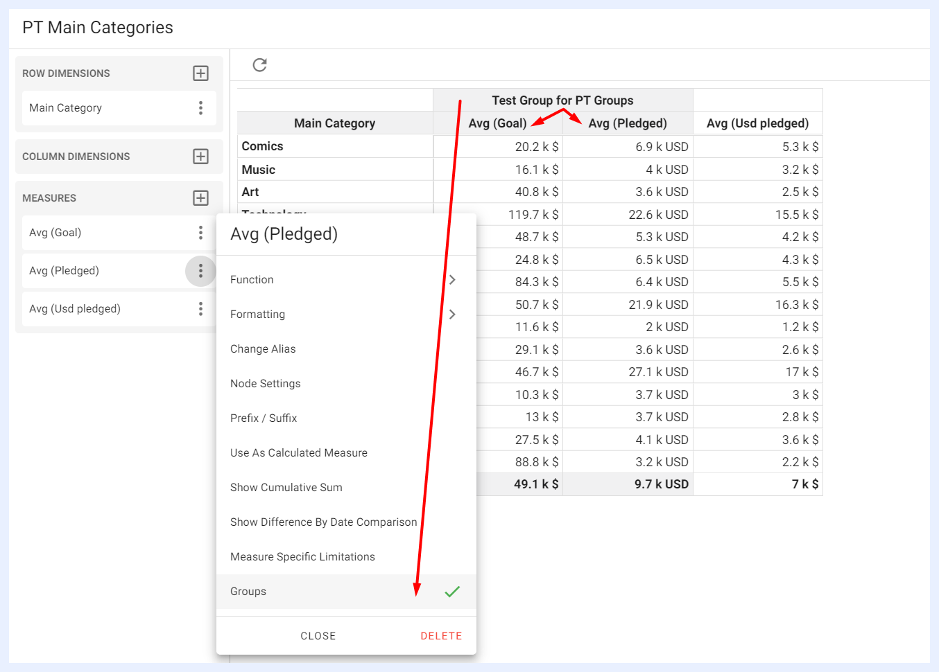
“DATACELLS” Pane
“DATACELLS” pane Lists all the nodes that were assigned as “Default Datacell” in the related view. If none were assigned, the user can manually add the required datacells to the table through the + icon. Datacells’ settings can be adjusted from the ellipsis menu for the selected datacell. The available settings depend on the datacell type (whether a measure or a dimension).
Settings Panel
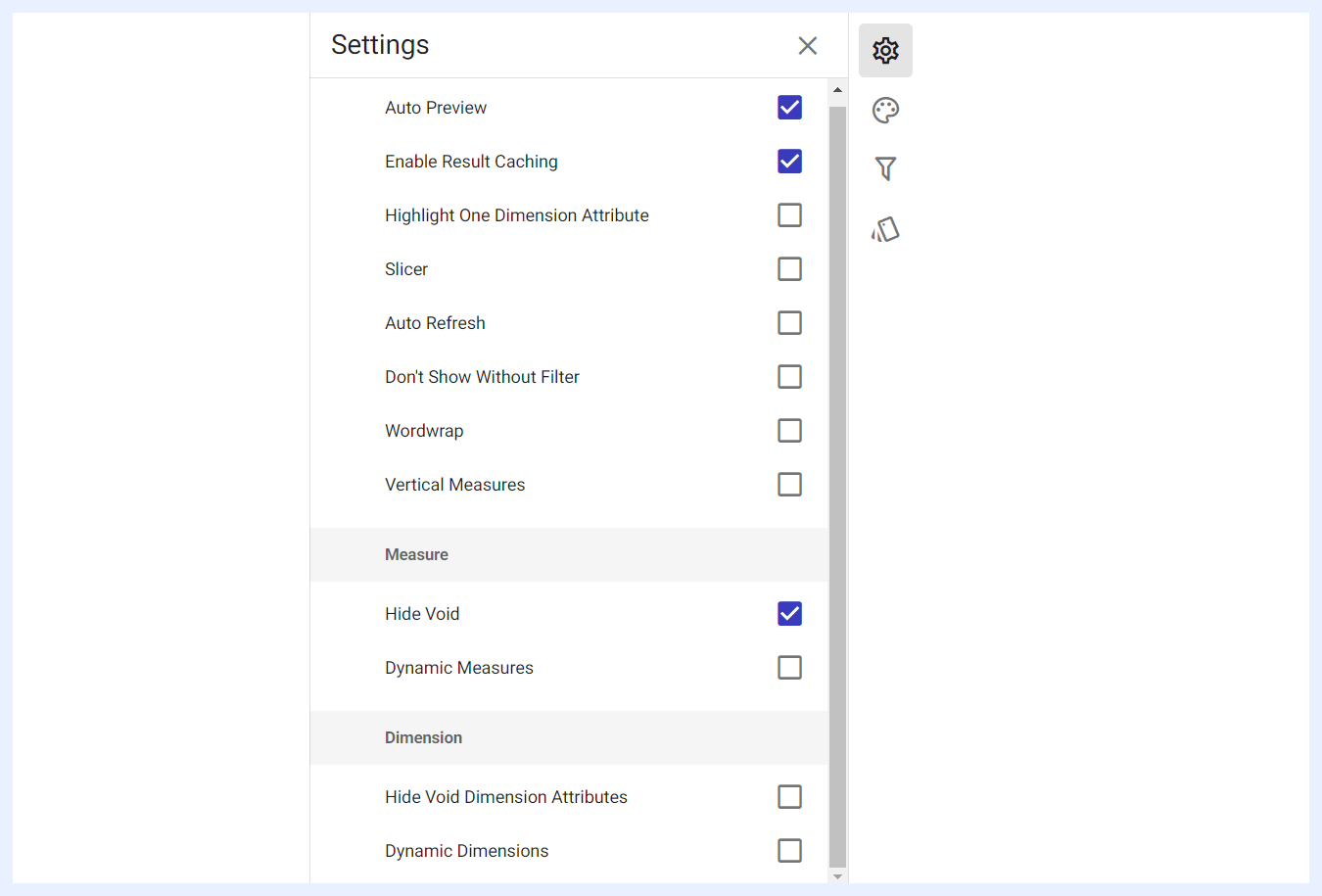
Auto Preview, Auto Refresh, Don’t Show Without Filter, Enable Result Caching, Slicer, Hide Zero Valued Dimension Values, Dynamic Measures, Hide Void Dimension Attributes, and Dynamic Dimensions: these settings and features are similarly applicable to the settings in chart dashlets and are explained in their relevant sections.
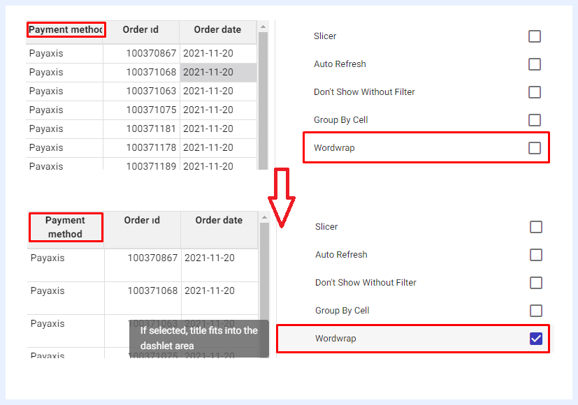
Wordwrap: if the titles of the columns are too long to fit within the space allotted for them or your table contains long column headings, you can enable this feature to have them automatically adjusted to fit within the column width.
Preserve Line Breaks: when Wordwrap is disabled, this option respects explicit line breaks within the source data (such as multi-line addresses or lists) while truncating long unbroken text with an ellipsis to keep rows compact and readable.
Freeze Columns: the first 1, 2, or 3 columns in default datacell pivot tables can be frozen so they remain anchored on the left side of the table during horizontal scrolling, making it easier to track row context in wide multi-column layouts.
Column Manager Visibility: designers can control which columns appear in the Column Manager for end-users. Unchecking "All Columns" allows hand-picking exactly which columns are available. Columns can also be organized into logical named groups displayed in a tree view, enabling end-users to add entire groups of related columns in bulk.
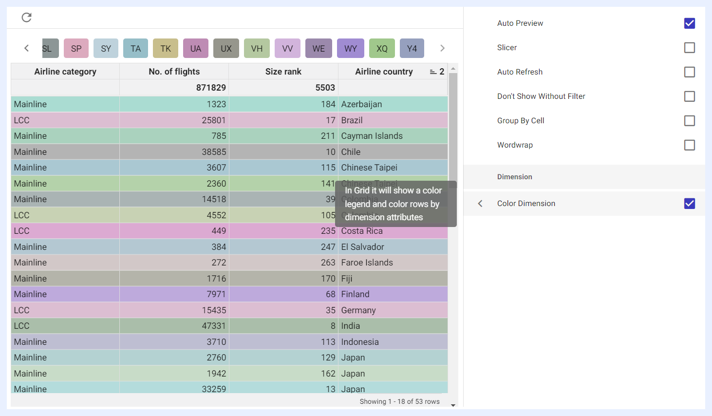
Color Dimension: when enabled by checking its check box, the rows of the table will be presented in various colors based on the attribute of the dimension, and a legend indicating the colors will appear at the top of the table.
Highlight One Dimension Attribute: when selected, an overlay window will open allowing users to select a dimension and display it differently in the pivot table. This can be achieved through various means, such as a different color, font style, or background highlight, making it stand out from other attributes.
Vertical Measures: when enabled by checking its check box, it displays measures in a vertical list.
Styling Panel
Pivot tables’ styling and general appearance can be manipulated according to the designer’s preferences. They are set according to the default styles and themes of TURBOARD but can be changed through the available options as below.
These styling settings can be used to improve the readability and visual appeal of a table, making it easier to understand and analyze the data presented in the table. Table formatting is an important aspect of data visualization and presentation, as it can help to highlight important information and make it stand out from the rest of the data.
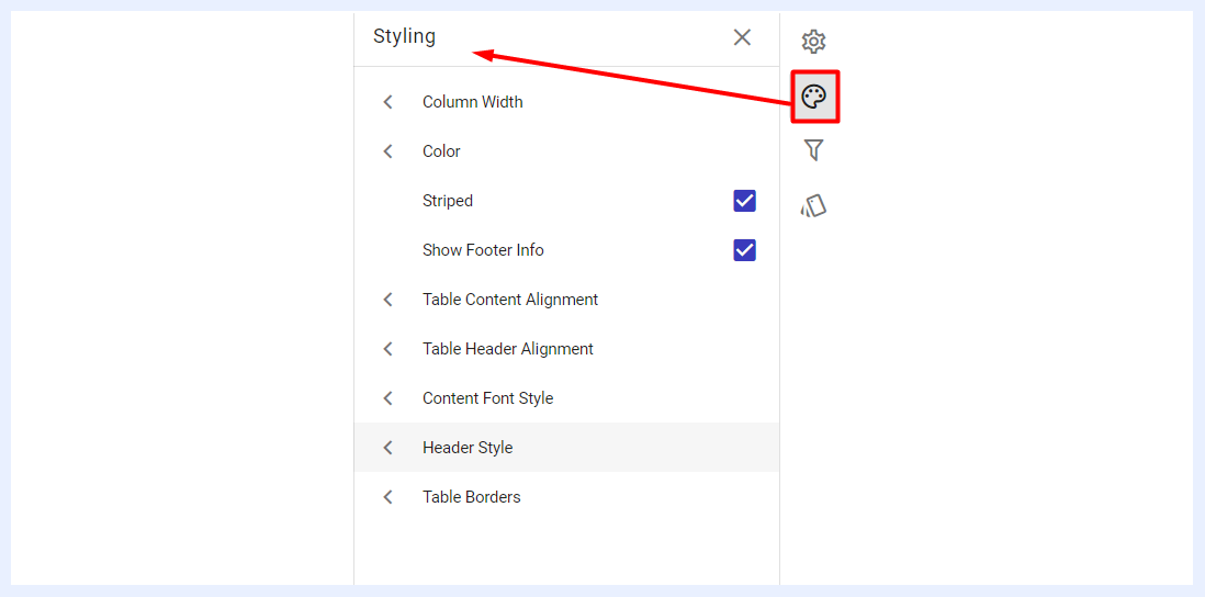
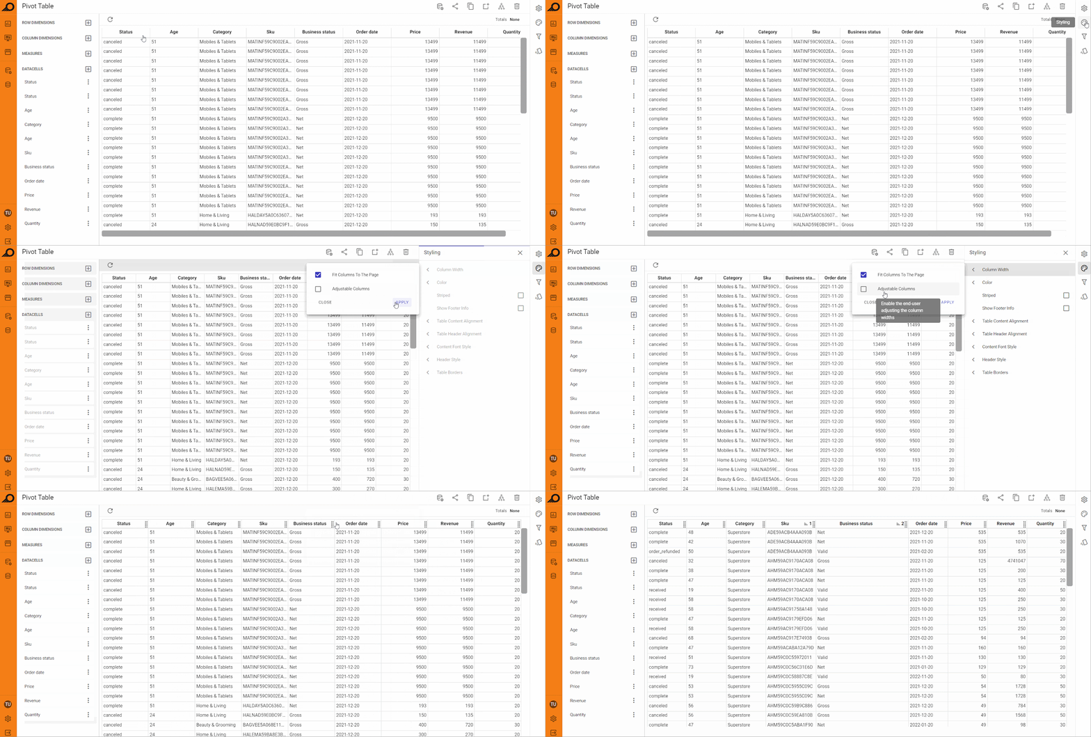
Column Width: the width of the columns in the table can be adjusted according to the user’s preferences. The table’s total width can be adjusted to automatically fit the page width. If this option is disabled, it may cause the table to be wider than the screen, and the user may need to scroll horizontally (left and right) to view all the columns in the table. Columns can also be made adjustable in which viewer users or end users can manually manipulate their width if needed in the relevant dashboards.
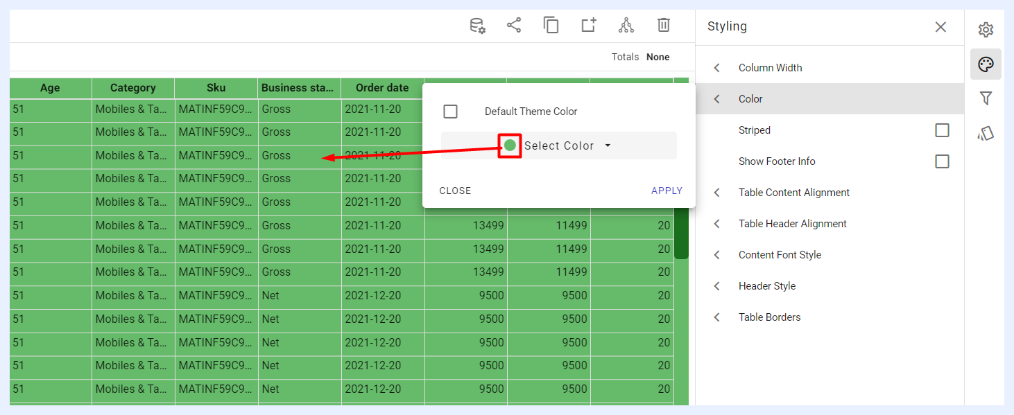
Color: users can adjust the color of the rows’ backgrounds in a table to any color they choose. By default, Pivot Tables in TURBOARD use white backgrounds for unstriped tables, and white and gray for striped tables. However, by selecting the “Color” option, you can choose a different color from a color picker or enter a specific color code to apply a custom color to the row backgrounds.
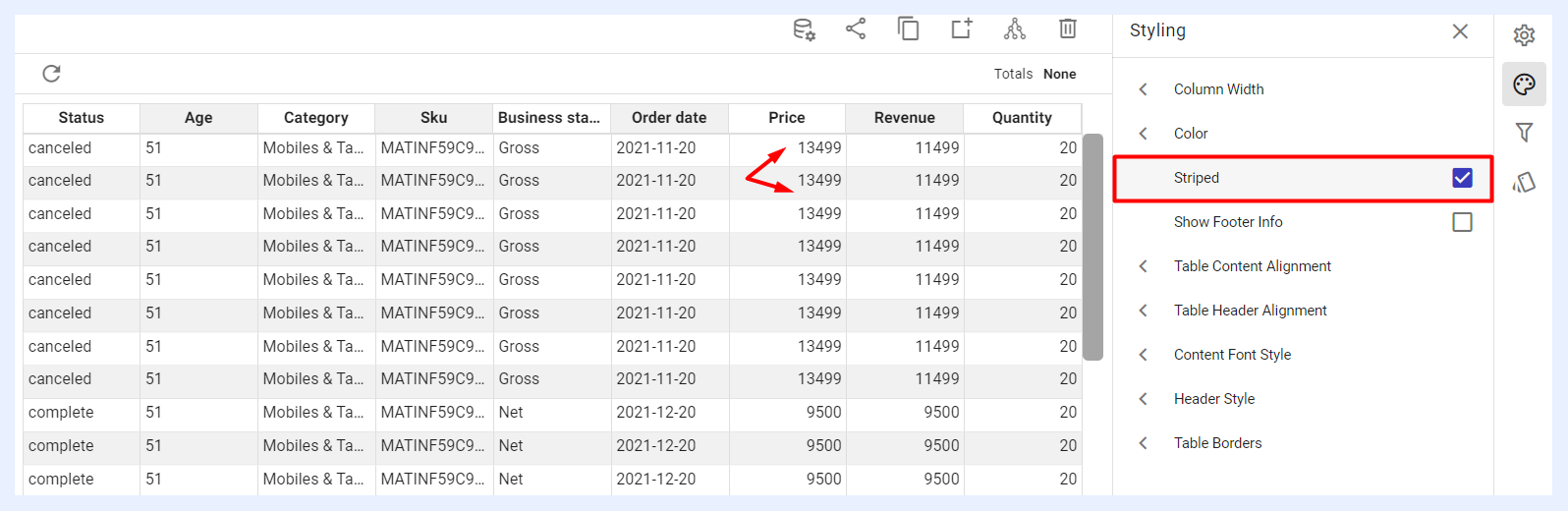
Striped: when enabled by checking its check box, the rows of the table are displayed in alternating colors, creating a zebra-like pattern. For example, one row may be shaded in light gray, while the next row is left unshaded, and the row after that is shaded in light gray again. This alternating pattern makes it easier to read and differentiate between rows, especially when dealing with large amounts of data.
Caption label (optional)
Table Content Alignment: the alignment of the content of the table can be changed by selecting from the following choices: Left, Center, or Right. A fourth option is available in which datacells containing text content can be left-aligned, while those containing numeric data can be right-aligned.
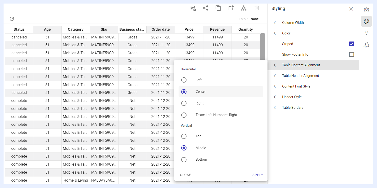
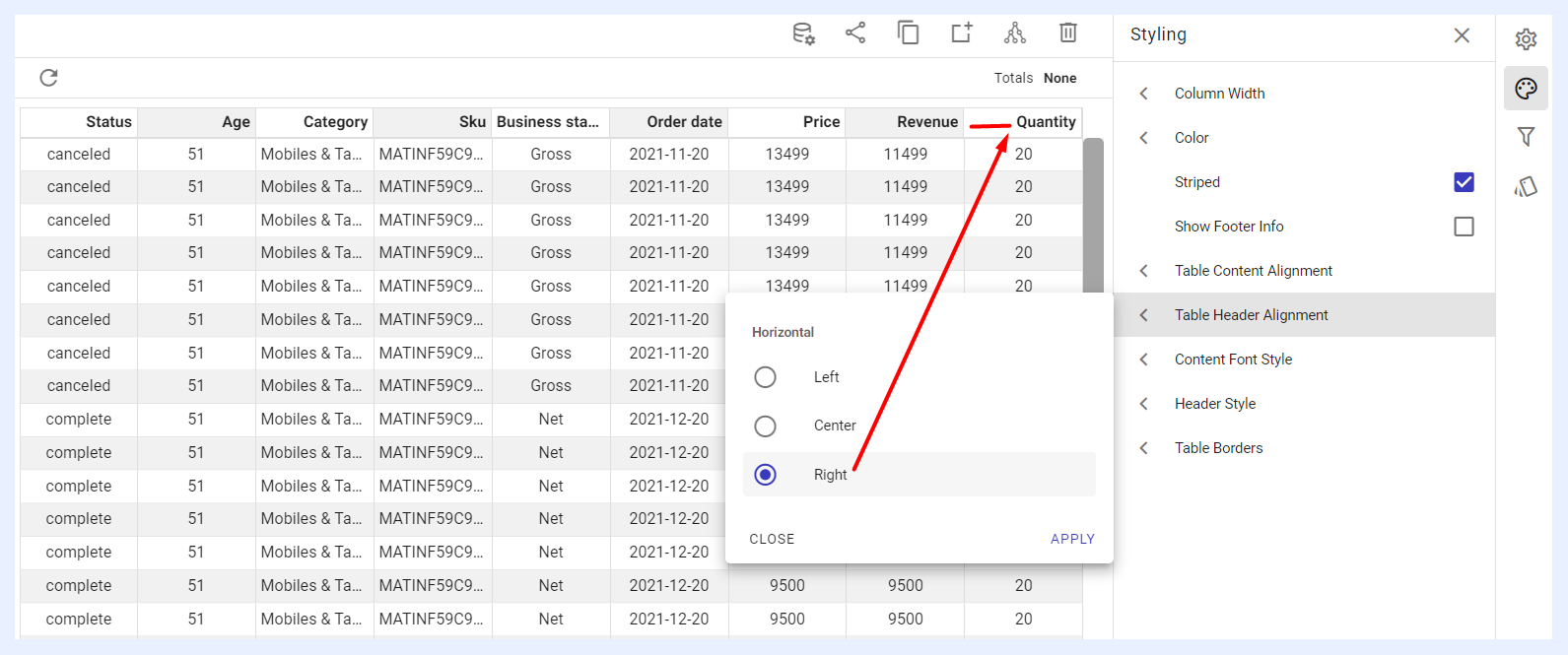
Table Header Alignment: the alignment of the table header can be adjusted by selecting from the options of Left, Center, or Right.
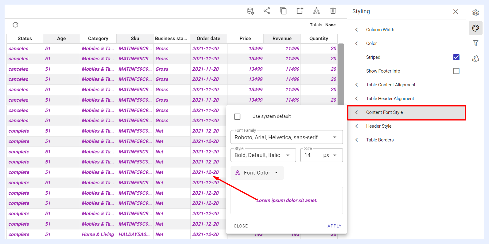
Content Font Style: the font style of the table content can be customized by choosing a different size, color, or type of font other than the default ones.
Header Style: the table header font can be customized by choosing a different size, color, or type of font other than the default ones. Additionally, the header background color can be customized as desired.
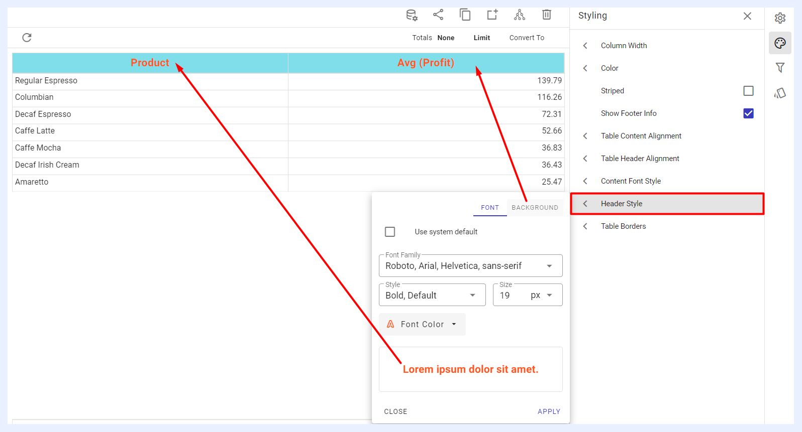
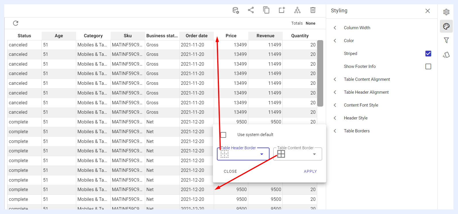
Table Borders: users have the option of adjusting the borders of the table, including those of the header row and content rows, according to their personal preferences.
Filters Panel
“Filters” panel contains all the nodes that were assigned as filters in the related view. The user can configure the settings of any selected filter as in this link.
Conditional Formatting Settings
Conditional formatting is used to easily highlight certain values in the dashlet or make particular cells in pivot table dashlets easy to identify. End-users will easily notice the difference between rows in the PT using this feature.
The user can either change the default formatting (font, color, icon) on a whole measure(s) level, or according to specific thresholds and intervals determined for a selected measure(s).
In the second case, the visual appearance of the measure (text colors, background colors, icons) changes automatically for the cells that contain values which meet those thresholds.
Applying Conditional Formatting on a PT Dashlet
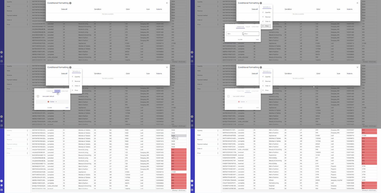
How to apply conditional formatting on a PT dashlet?
1 Click “Conditional Formatting” icon from the configuration panel at the right.
2 In the overlay window that appears, click + icon next to “Conditional Formatting” window title.
3 Select the required measure and determine its threshold (“Min” and “Max” value ranges), determine your preferred colors, icons and fonts.
4 Click ADD button.
Conditional Formatting for Pivot Tables