Geographical (GIS) Dashlets
Nodes Pane
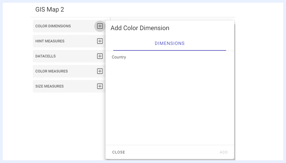
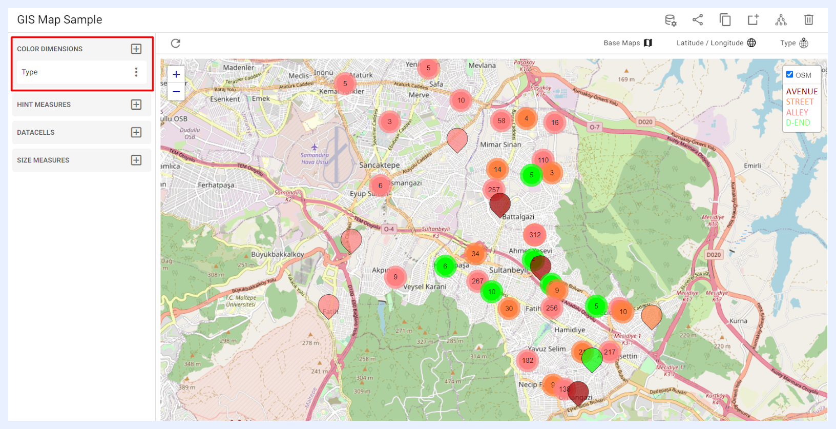
1 “COLOR DIMENSIONS” pane: lists all the nodes of type “Dimension” in which the user can find and select the dimension node they wish to display on the map, each distinguished by unique pin colors. Once a dimension is selected, its color legend can be viewed under the “Layer Control” icon located at the top right corner of the map. If needed, users can rename a dimension specifically for the map dashlet without altering its node name in the main view, by accessing the ellipsis menu and choosing the “Change Alias” option. Additionally, the user can edit its settings directly in the related view by clicking “Node Settings” option.
2 “HINT MEASURES” pane: when a measure is added as a “HINT MEASURE”, it will appear inside the tooltip of the map pins when the user hovers over the map’s measures, providing additional information about the data being displayed. These hints can be selected/added through the + icon > selecting the required node from its related tab > clicking ADD button. Available measure types are as below:
-
“MEASURES” tab which lists all the nodes of type “Measure” as set in the related view.
-
“EXPRESSIONS” tab which lists all the expressions that were added using SQL to the view as virtual measures.
-
“DIM COUNT” tab which allows for the addition of unique variables or dimensions that can be used as measures to display data.
3 “DATACELLS” pane: lists all the nodes of type “Data Cell” in the related view from which the user can manually add the required ones to the map through the + icon.
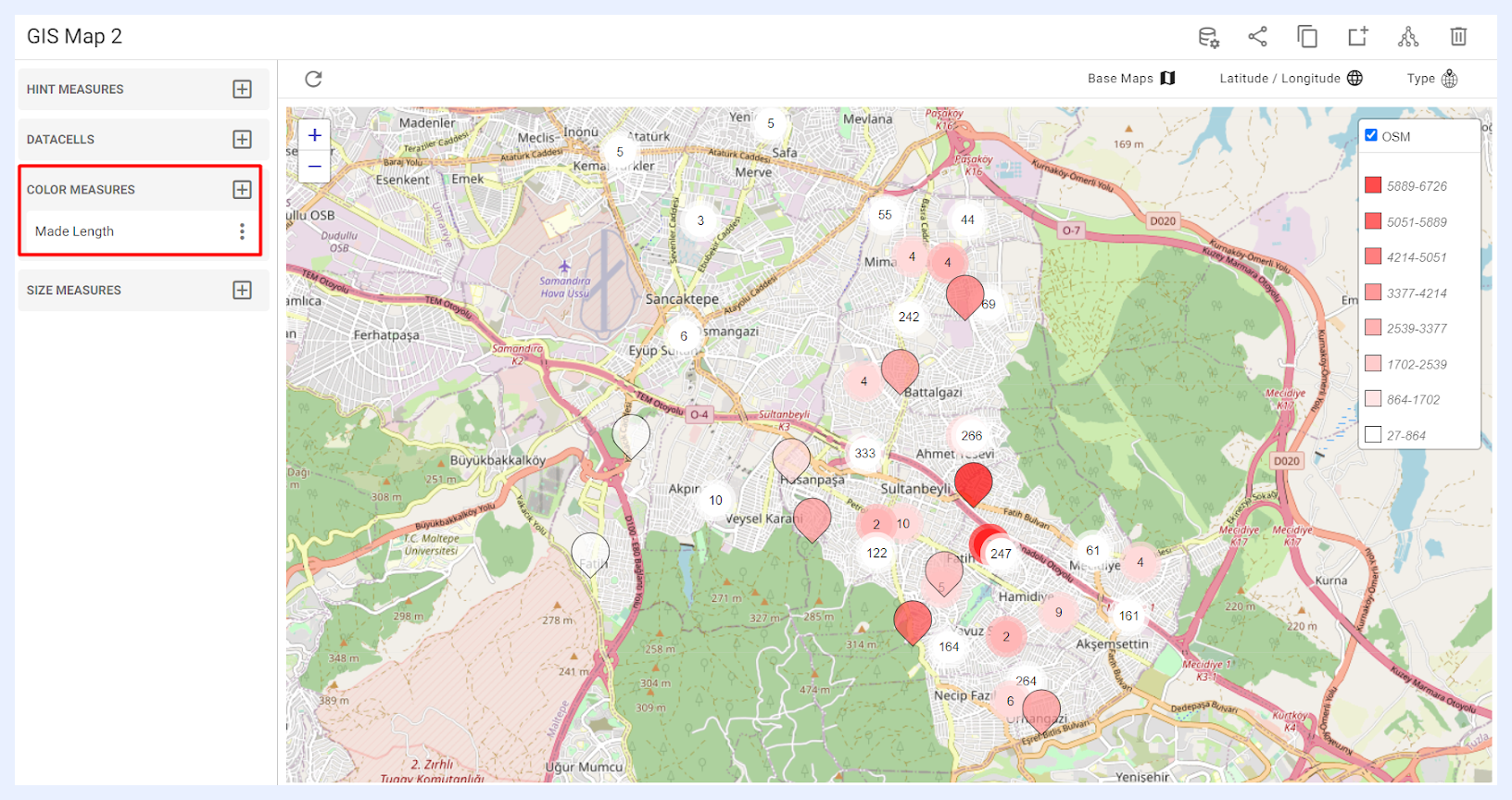
4 “COLOR MEASURES” pane: lists all the nodes of type “Measure” in which the user can select the required ones to be added to the map and visualized in different pin colors. Once a measure is selected, its color legend can be viewed under the “Layer Control” icon located at the top right corner of the map. Note that color nodes can be added to the map either as “COLOR DIMENSIONS” or “COLOR MEASURES”. If one type is added, the other will be disabled.
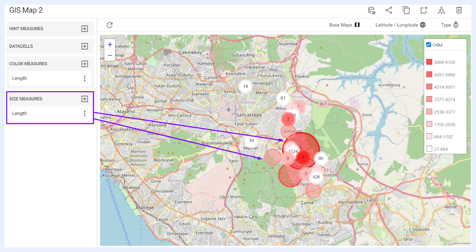
5 “SIZE MEASURES” pane: when a measure is added to the map from this option, its value will be displayed visually as pins and data points of varying sizes with larger points indicating larger values and smaller points indicating smaller values. The user can add any node of type “Measure” or an expression that was added using SQL to the view as a virtual measure. To do so, click the + icon > select the required node from its related tab > click ADD button.
Note
When creating a Geographical (GIS) dashlet, it is important to select a data view that includes at least one field of a geospatial type or that contains latitude and longitude information. Without this information, the dashlet will not be able to fetch or display any data.
Measures Settings and Preferences
When a measure is added or aggregated in a dashlet – whether as a “COLOR MEASURE”, a “HINT MEASURE”, or a “SIZE MEASURE”, its settings, functions, and features can be managed from the ellipsis menu associated with that selected measure.
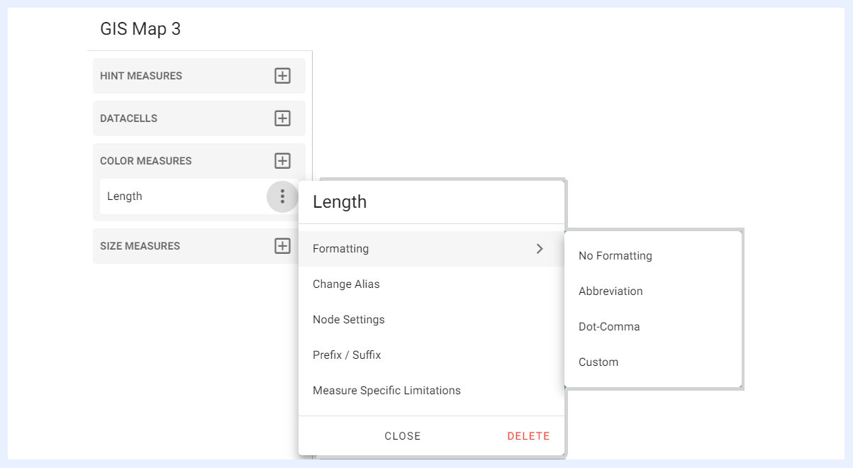
Formatting, Change Alias, Node Settings, Prefix / Suffix, and Use As Calculated Measure: these settings and features are also applicable to the measures in chart dashlets and are explained in their relevant sections.
Settings Panel
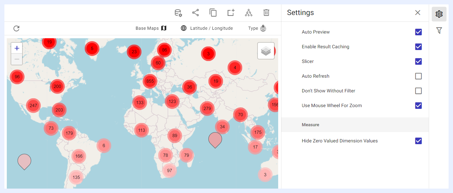
Auto Preview, Enable Result Caching, Slicer, Auto Refresh, Don’t Show Without Filter, and Hide Zero Valued Dimension Values: these settings and features are similarly applicable to the settings in chart dashlets and are explained in their relevant sections.
Slicer: when enabled, GIS maps support an enhanced filtering mechanism that lets users choose from available data fields to act as the filter, even if that field is not a visible measure in the dashlet, turning the map into an interactive control panel.
Server-Side Aggregation: for very large geospatial datasets, the server returns aggregated clusters instead of rendering individual data points that would slow down the browser. As users zoom in, clusters break down progressively to reveal finer detail, supporting hundreds of thousands of data points without performance degradation.
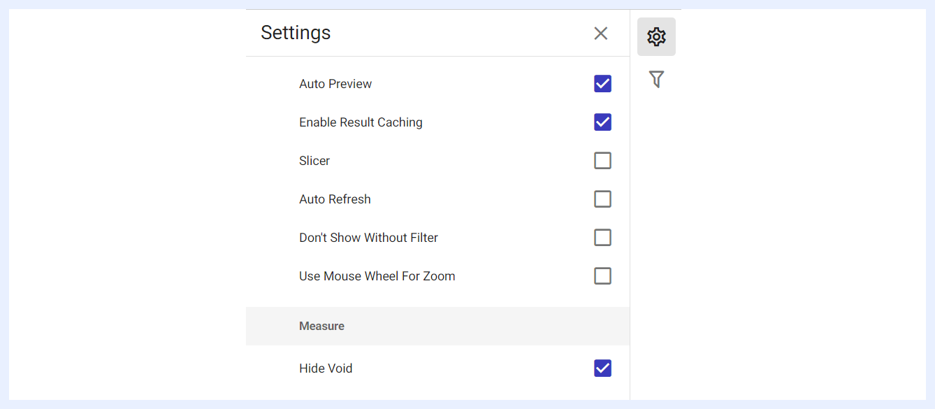
Non-Default Heatmap Radius: this feature applies to maps of type “Heat Map” where the user can change the default radius for its area coloring. If a larger radius was chosen, the heat map will consider a wider area around each data point, which will result in more intense coloration (usually red) in areas where there is a high density of data points. Conversely, a smaller radius means that the heat map will only consider a smaller area around each data point, which will result in more isolated clusters of colored dots. The default radius is 15, but it can be adjusted to fit the specific needs of the data visualization.
Use Mouse Wheel For Zoom: when enabled by checking its check box, dashlet users will have the ability to zoom in or out of the map by scrolling the mouse wheel, in addition to using the standard + and – buttons available on the map.
Filters Panel
“Filters” panel contains all the nodes that were assigned as filters in the related view. The user can configure the settings of any selected filter as in this link.
Dashlet and Playground Toolbar

Type: the geographical type can be directly changed from a “Clustered Pin Map” to a “Heat Map” and vice versa. Each provides different visualization features. Click here to learn more.
Latitude / Longitude: opens the View Edit window for the related Latitude and/or Longitude fields to allow the user to make any necessary changes on the node settings.
Base Maps: base maps are sometimes needed for adding multiple GIS maps as overlays on top of each other to allow further analysis. For example, you can overlay a map of population density on top of a map of land use to analyze how population density relates to land use patterns. All available base maps will be listed in Base Maps overlay window from which the designer user can select and add them as layers within the GIS dashlet.
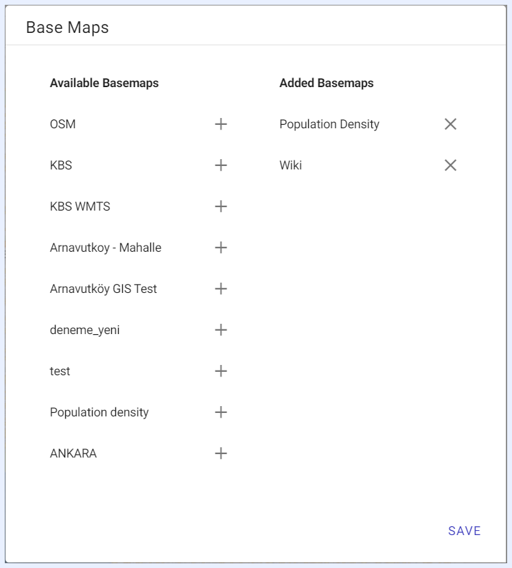
Once base maps are added to the dashlet, it allows end-users to toggle and use these layers according to their analysis requirements and personal preferences.
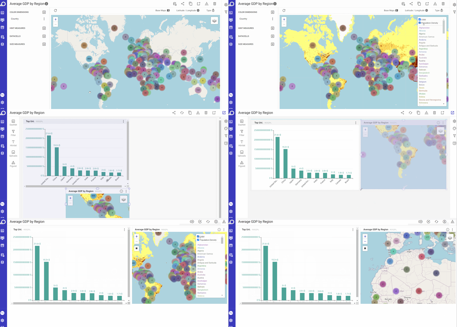
Base Maps Utilization for End-Users
Note
Base maps are configured and added to TURBOARD from “Administration” > “Maps” > “GIS Maps” option.