Regional Map Dashlets
Nodes Pane
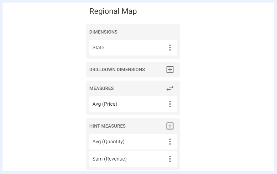
“DIMENSIONS” Pane
“DIMENSIONS” pane lists all the nodes of type “Dimension” and assigned as “Territory” in which the user can select one dimension to be visualized on its related regional map (SVG). When a territory dimension is added, the user can change its name (on the map dashlet level only and will not affect its name as a node in its view) through its ellipsis menu > “Change Alias” option. Additionally, the user can edit its settings directly in the related view by clicking “Node Settings” option. If more than one dimension of type “Territory” is available at the dashlet’s view, the selected dimension can be changed through the Change Dimension arrow icon. When synonyms are defined for a location (for example, “U.S.”, “USA”, and “United States”), measures are aggregated (summed) across all defined synonyms and the official map label is displayed consistently.
“DRILLDOWN DIMENSIONS” Pane
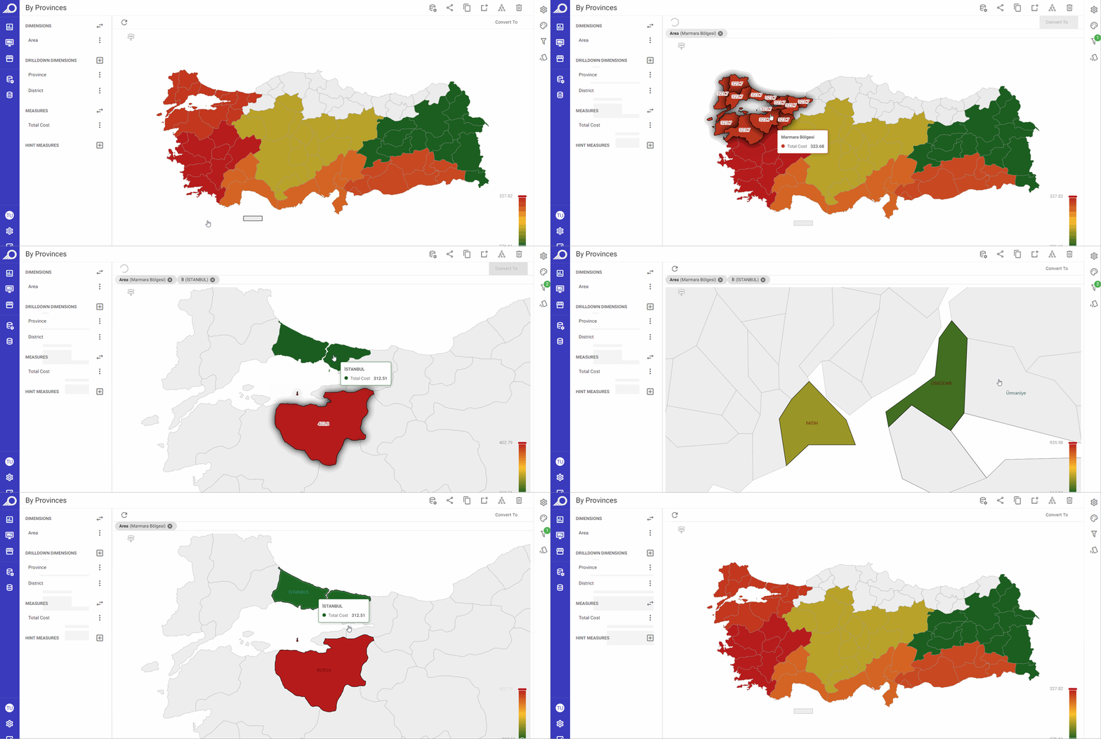
“DRILLDOWN DIMENSIONS” pane lists nodes of type “Dimension” and assigned as “Territory” other than the main selected dimension, and when a dimension is added under this option, the map will update to show and drilldown the data for the selected dimension.
“MEASURES” Pane
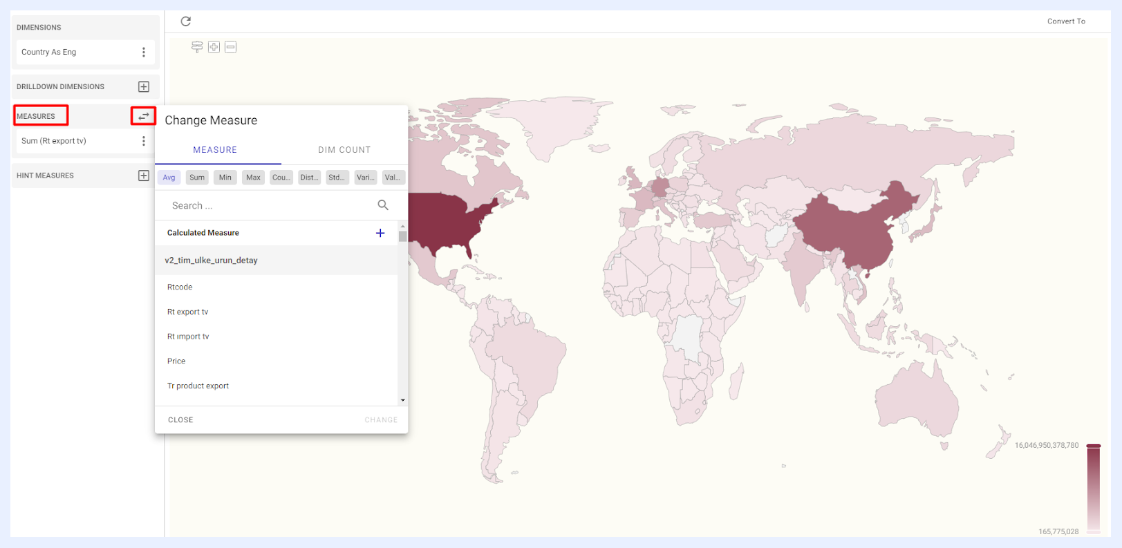
“MEASURES” pane lists all the nodes of type “Measure” as set in the related view from which the user can select one measure to be displayed on the map. The selected measure can be added or changed through the Change Measure arrow icon > selecting the required node from its related tab > clicking ADD button. Available measure types are as below:
“MEASURE” tab which lists all the nodes of type “Measure” as set in the related view.
“EXPRESSION” tab which lists all the expressions that were added using SQL to the view as virtual measures.
“DIM COUNT” tab which allows for the addition of unique variables or dimensions that can be used as measures to display data.
“HINT MEASURES” Pane
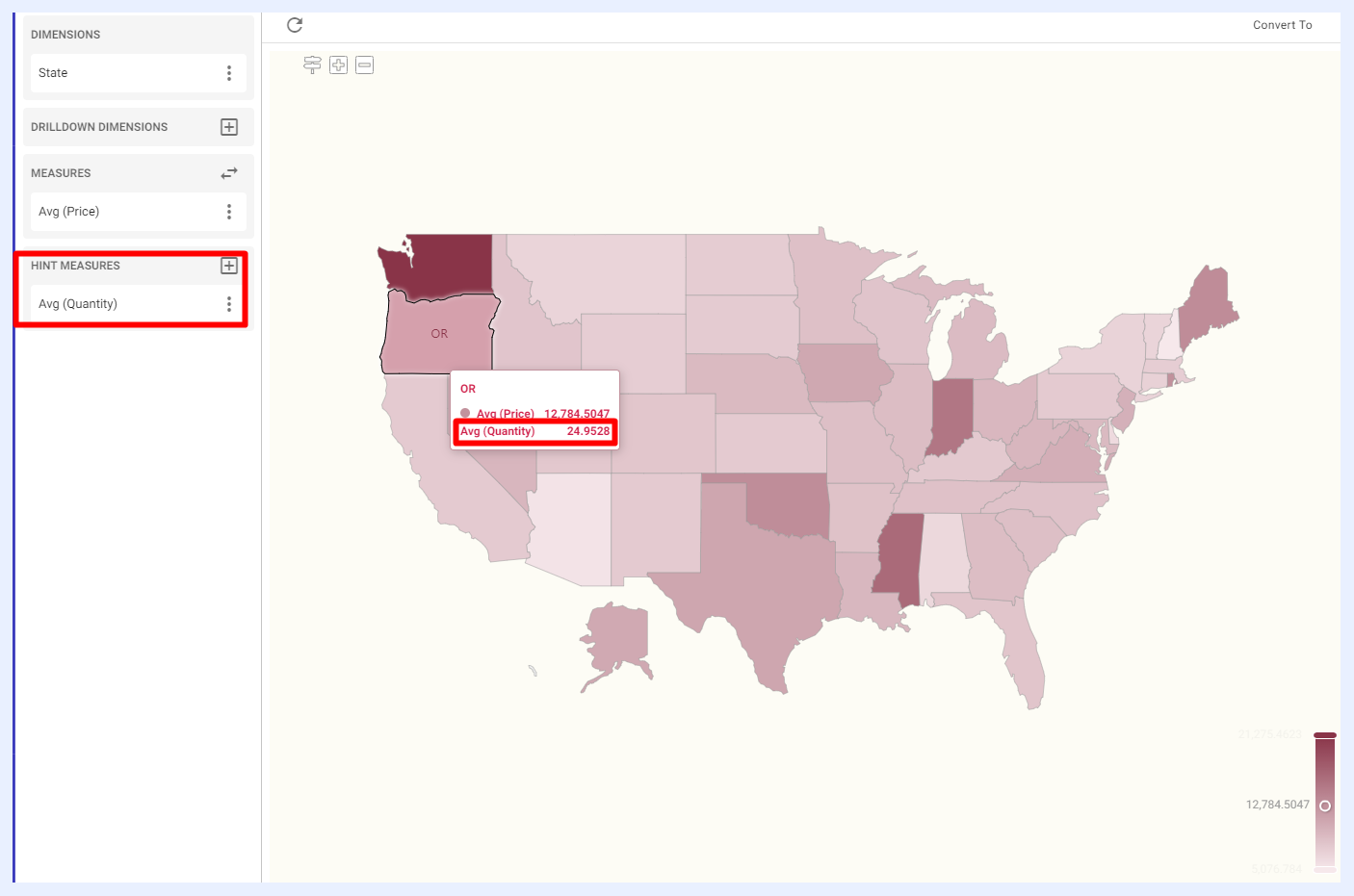
“HINT MEASURES” pane lists all the nodes of type “Measure” other than the main selected measure. When a measure is added as a “HINT MEASURE”, it will appear inside the tooltip when the user hovers over the map’s territories, providing additional information about the data being displayed. These hints can be selected/added through the + icon > selecting the required node from its related tab > clicking ADD button.
Measures Settings and Preferences
When a measure is added or aggregated in a dashlet – whether as a “MEASURE” or as a “HINT MEASURE”, its settings, functions, and features can be managed from the ellipsis menu associated with that selected measure.
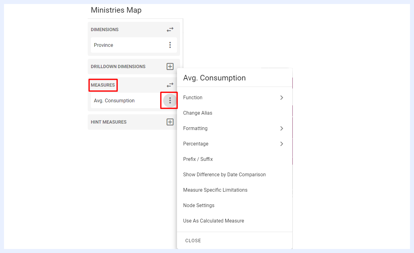
Function, Change Alias, Formatting, Percentage, Prefix / Suffix, Show Difference By Date Comparison, Measure Specific Limitations, Node Settings, and Use As Calculated Measure: these settings and features are also applicable to the measures in chart dashlets and are explained in their relevant sections.
Settings Panel
Auto Preview, Enable Result Caching, Slicer, Auto Refresh, Dynamic Measures, Motion Dimension, and Dynamic Dimensions: these settings and features are similarly applicable to the settings in chart dashlets and are explained in their relevant sections.
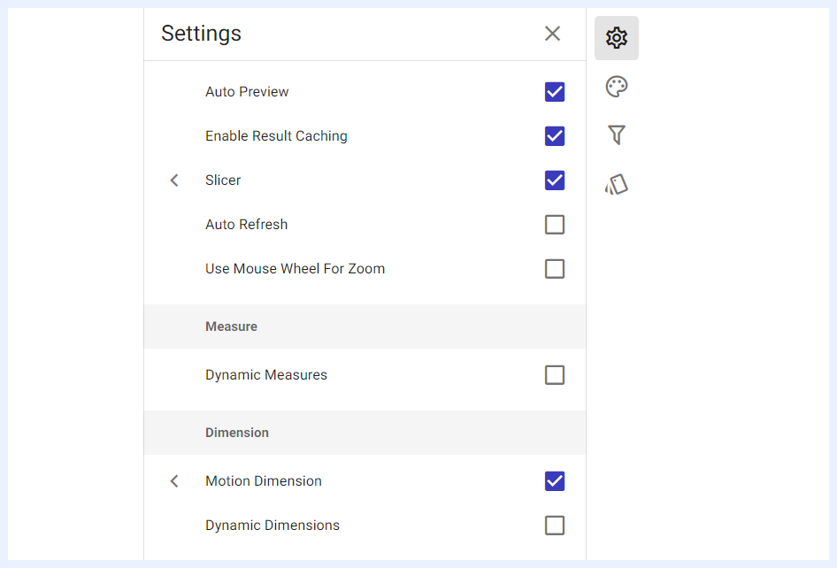
Use Mouse Wheel For Zoom: when enabled by checking its check box, dashlet users will have the ability to zoom in or out of the map by scrolling the mouse wheel, in addition to using the standard + and – buttons available on the map.
Styling Panel
Regional maps’ styling and general appearance can be manipulated according to the designer’s preferences. They are set according to the default styles and themes of TURBOARD but can be changed through the available options as below.
These styling settings can be used to improve the visual appeal, readability and accessibility of the map, making it easier to understand and analyze the data presented. It can also help emphasize certain information or organize data in a way that makes it easier for users to understand. You can also use your custom colors and styles to help reinforce your brand identity and ensure that your dashboard looks cohesive and professional.
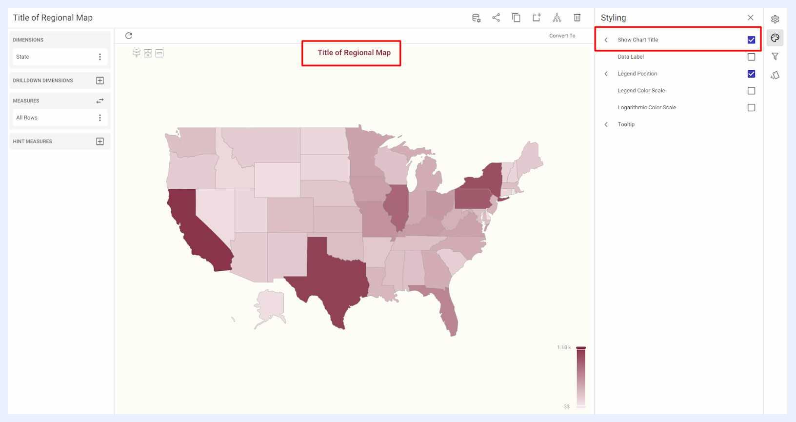
Show Chart Title: when enabled by checking its check box, the dashlet name will be displayed at the center-top of the map in which the user can adjust its formatting and styling (font type, size and color) as desired.
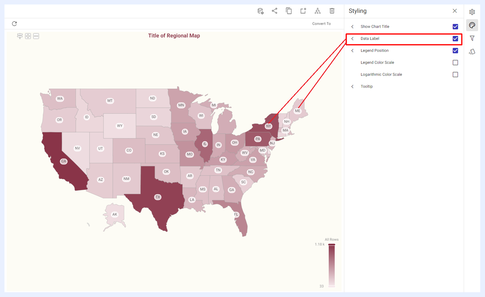
Data Label: when enabled by checking its check box, the user can display labels for the map dimension, measure values, or both. These labels can be customized in terms of their font type, size, color, label background, border, and similar styling options.
Legend Position: when enabled by checking its check box, it allows the user to customize the position and styling of the map's legend. The legend can be displayed either horizontally on the left, right or center of the map, or vertically at the top, middle or bottom of the map. Its orientation can be displayed vertically or horizontally. Furthermore, users can adjust the font styling of the legend, including the font type, size, and color, as per their preferences.
Legend Color Scale: when enabled by checking its check box, it allows the user to adjust the color gradient used in the legend of a map (which represents the range of values for the selected measure). This feature allows the user to adjust the color of the legend by selecting one to three color scales, with the maximum color representing the highest value and the minimum color representing the lowest value.

Logarithmic Color Scale: when enabled by checking its check box, the legend color scale can be changed into a logarithmic one where the color of the measure is determined by its logarithmic value rather than its linear value. This can be useful for visualizing data with a wide range of values because it can compress the range of colors used to represent the data, making it easier to see variations in the middle and lower ranges. However, it's important to note that the logarithmic color scale cannot be applied if the data being used has negative numbers.
Tooltip: when enabled by checking its check box, it allows the user to customize the appearance of the tooltips that are displayed when hovering over elements on the map. The user can adjust the font, background, and border colors, as well as the overall style of the tooltips according to his/her preferences.

The Different Styling Options for Regional Maps
Filters Panel
“Filters” panel contains all the nodes that were assigned as filters in the related view. The user can configure the settings of any selected filter as in this link.
Conditional Formatting Settings
Conditional formatting is used to easily highlight certain values in the dashlet or make particular data points on the map easy to identify. End-users will easily notice the important areas on the map when using this feature.
The user can either change the default formatting of the labels’ font and region colors on the whole measure level, or according to specific thresholds and intervals determined for the selected measure.
In the second case, the visual appearance of the data labels and region colors changes automatically on the map for the cells that contain values which meet those thresholds.
Custom labels can be written for each condition in the map's legend. Uncheck "Use Default Title" in the conditional formatting settings to replace the auto-generated label (for example, Sales > 50,000) with a more meaningful business term (for example, High Performing Region).
Applying Conditional Formatting on a Regional Map Dashlet
How to apply conditional formatting on a regional map dashlet?
1 Click “Conditional Formatting” icon from the configuration panel at the right.
2 In the slide-out menu that opens, click + ADD NEW CONDITION button.
3 In the overlay window that opens, select the required measure and determine its threshold (“Min” and “Max” value ranges).
4 Determine your preferred label fonts and region colors in “LABEL FONT” and “REGION COLOR” tabs.
5 Click ADD button.
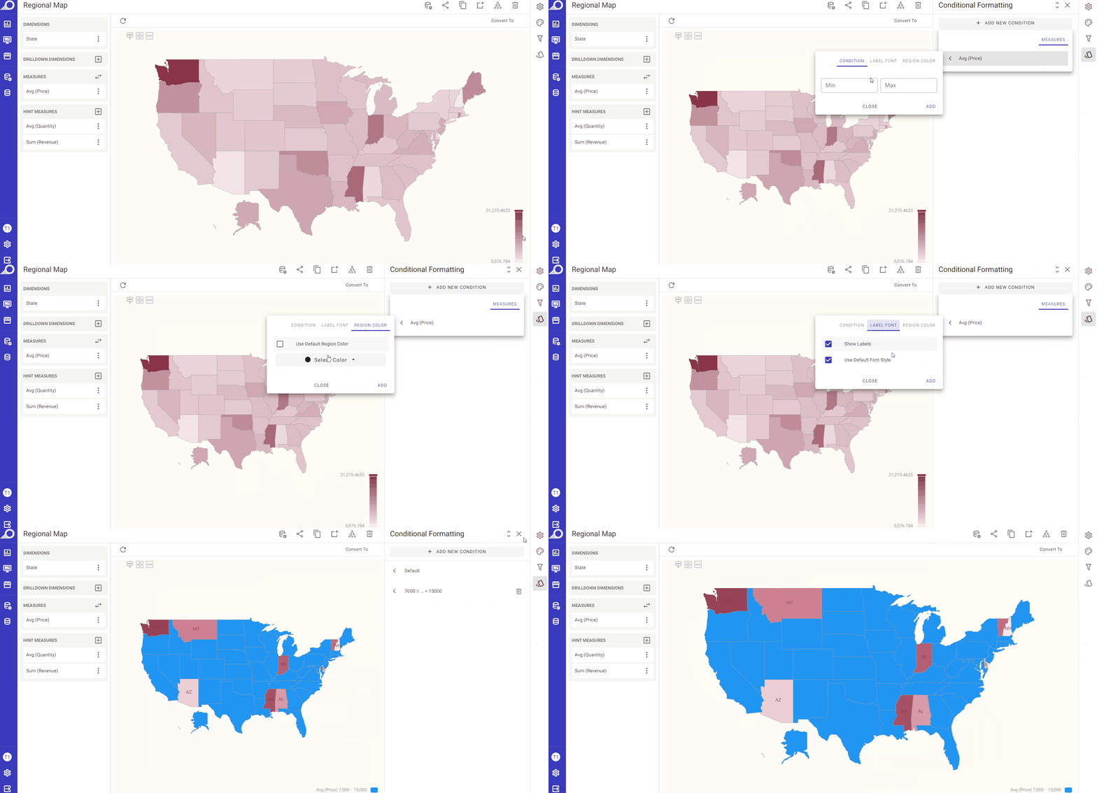
Conditional Formatting for Regional Maps