Settings & Styling Panel
Settings Panel
The settings panel in the showcase provides various options to customize the display of dashboards and improve user experience. Users can hide a showcase from other users, choose the location of showcase items, apply filters to multiple dashboards, display unique dashlet codes, and enable storyboard navigation for a sequential view of dashboards.
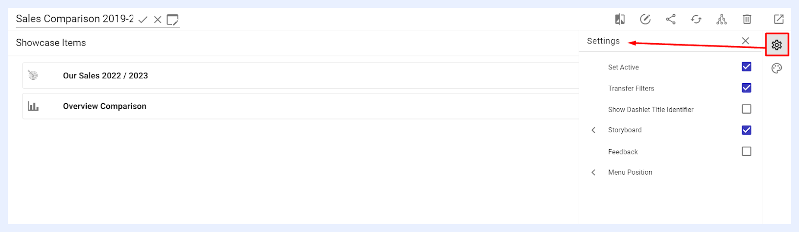
“Set Active” check box: this feature controls the showcase's visibility to other users. When activated, the showcase is accessible to users it's shared with. If deactivated, the showcase becomes hidden from all end users. Notably, making a showcase inactive does not limit users' ability to view its dashlets and dashboards when shared as separate visualizations or when these elements are included in other active showcases.
“Transfer Filters” check box: when checked, it enables the filter applied in one dashboard to be applied to all other dashboards. This means that if you add a filter to a dashboard within a showcase, that filter will automatically apply to all other dashboards within the same showcase.
Radio-type filter widgets can be configured with Navigate on Click — when a user selects a value from the widget, they are automatically taken to the next dashboard in the showcase with that filter value applied.
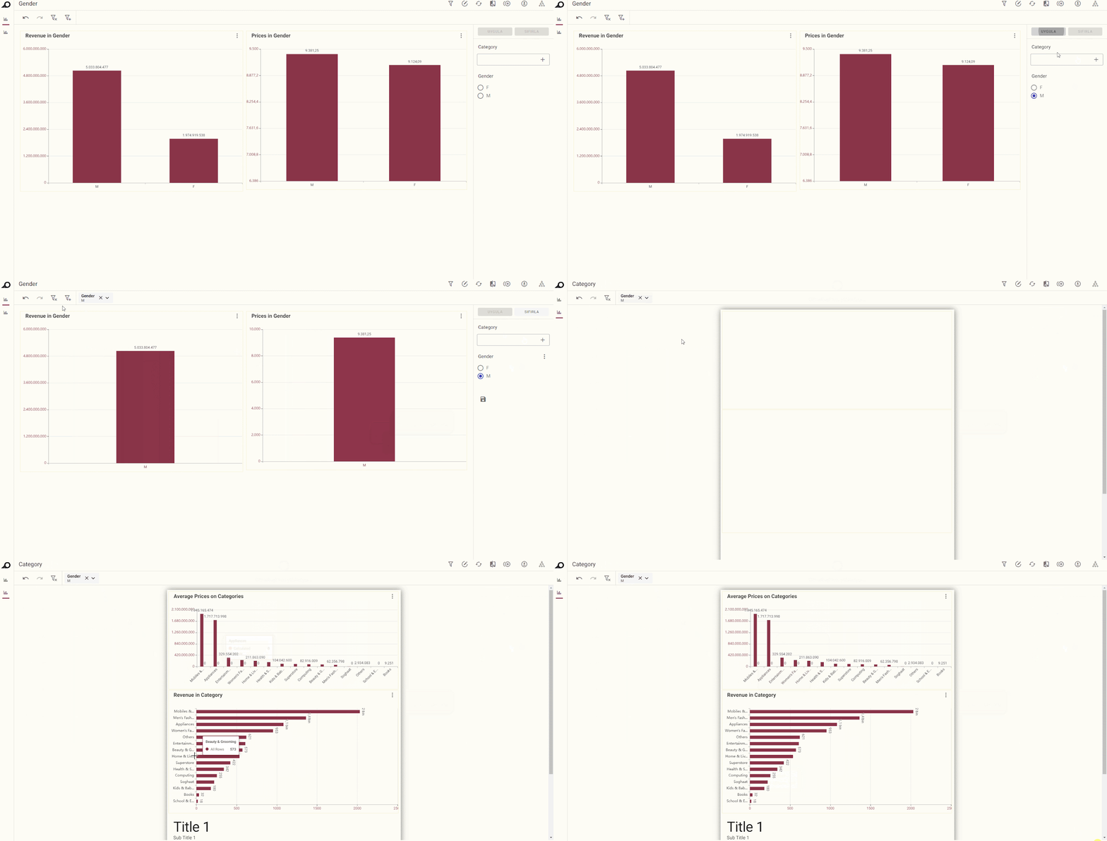
Effect in Showcase “View” Mode when “Transfer Filters” is applied
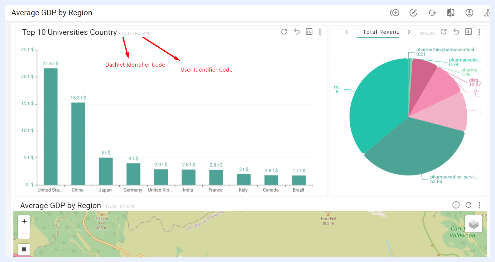
“Show Dashlet Title Identifier” check box: when checked, a unique code assigned for each dashlet namely “Dashlet Identifier” will appear on all the dashlets next to their titles in the relevant showcase at user-end side (showcase “View” mode). This code along with the User Identifier Code helps tracking user activities.
“Storyboard” check box: when selected, dashboards and menu items in the showcase are displayed as boxes or cards instead of tabs or menus. Users navigate through Previous/Next arrow buttons at the top of each dashboard. Designers can adjust the following settings:
“Show Application Logo” check box: shows or hides TURBOARD logo (the application logo as set in Administration >> Logo and Branding) at the top-left, which directs users to the main Showcases page when clicked.
“Viewport Adjustment” check box: when selected, when selected, allows users to choose between two display options: Fit, which arranges all boxes in a single line, or Overflow, which moves any excess boxes onto additional lines, providing flexibility in how the showcase items are displayed on the screen.
“Show Back Button as Box” check box: displays the “Back” button as a box, placed at the top of the showcase, replacing the previous arrow.
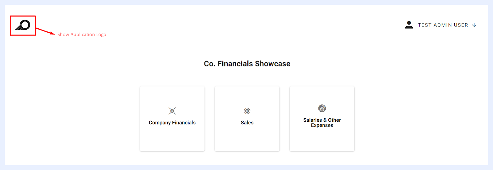
Effect in Showcase “View” Mode when “Show Application Logo” is applied
Note
When “Storyboard” option is enabled, the “Storyboard Menu Display Options” become available for each menu item, with the default option to display all items in a top menu. These options can be adjusted in the menu item's edit window.
The Storyboard option can be useful in showcases when you want to present a series of dashboards in a specific order or sequence, such as when you are giving a presentation or demonstrating a workflow. It helps you to present your data in a more organized and meaningful way, making it easier for your audience to understand and follow the story that you are trying to tell.
“Feedback” check box: when selected, an icon appears on the showcase's quick action ribbon, allowing end-users to send feedback. The feedback message is sent to an email address configured in the backend system settings, determined by TURBOARD client. Upon clicking the feedback icon, end-users can write a message in a pop-up window and click the SEND button. The feedback is sent as a no-reply email, including a link to the showcase where the feedback originated.
A Notification Bell icon is also available in the showcase ribbon in view mode. It tracks and summarizes recent changes to the showcase, including dashlet and dashboard additions or removals and filter and measure modifications. Changes are displayed with relative timestamps and can be filtered by Today, Last week, or Since last login.

“Menu Position” options: when selected, it allows the user to set the location of the showcase items relative to the main showcase screen. The dashboard menu/tabs can be displayed either at the top or in the left upper corner of the showcase. When positioned in the left upper corner, the user can choose between showing the full menu or hiding it until hovered over, where only the menu icons will appear until the mouse is placed over them.
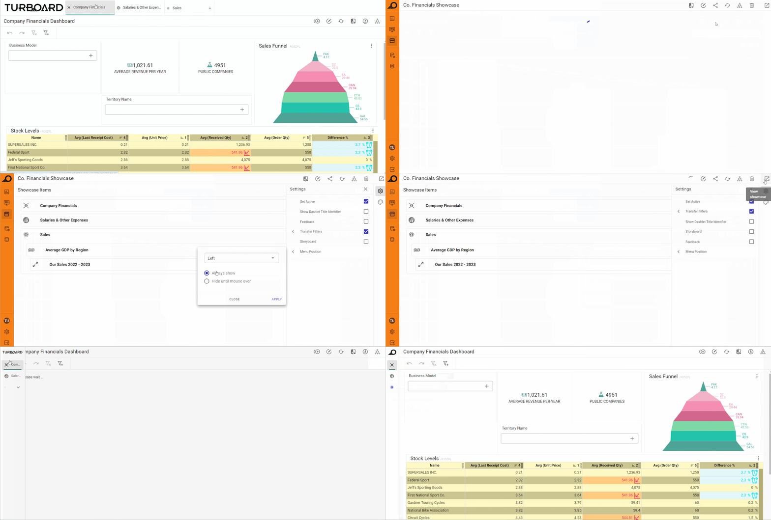
How “Menu Position” is changed from “Top” to “Left” with “Hide until mouse over” option
Styling Panel
The Styling Panel allows designer users to customize the appearance and layout of showcase menus, including the top menu, sub-menus, and selected menu items. Designers can adjust menu fonts (type, size, color, and style), shadows, borders, background colors, divider colors, and menu heights. All these options are initially set to “Use Default” with checkboxes. When deselected, additional fields appear, enabling further customization of each styling aspect.
If the “Show Back Button as Box” setting is enabled (as described in the Storyboard settings), designers can also customize its appearance. Options include modifying the card background, border width, color, radius, font design (color, size, type), and the icon size and color. This allows full control over how the back button integrates visually with the rest of the showcase.