Info Cells & Gauge Dashlets
Nodes Pane
In dashboards, info cells and gauges are commonly used to give a quick summary of a key metric or performance indicator. As a result, they typically display only one measure at a time, which is the intended key metric. However, info cells have the capability to display multiple measures simultaneously, whereas gauges are limited to displaying only one measure at a time.
To accommodate this, the “Nodes Panel” of an info cell or gauge dashlet will only display the “MEASURES” pane, allowing the user to easily select the required measure(s) to display on the dashlet.
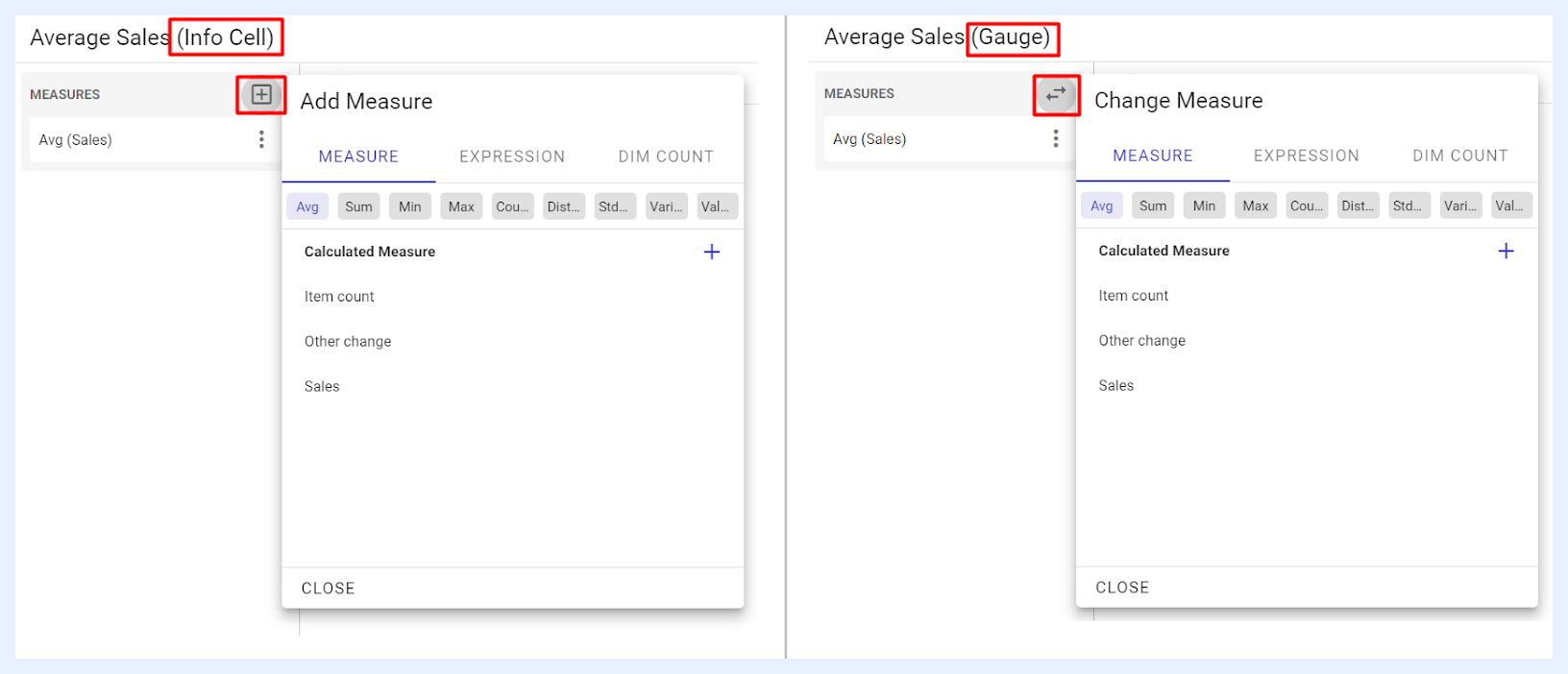
The user can add/select the required one(s) by clicking + icon located next to the pane > selecting the required measure from the related tab > clicking ADD button (for info cells) or CHANGE button (for gauges).
“MEASURE” tab lists all the nodes of type “Measure” as set in the related view.
“EXPRESSION” tab lists all the nodes of type “Expression” to allow for the addition of any added expression to be used as measures to display data.
“DIM COUNT” tab allows for the addition of unique variables or dimensions that can be used as measures to display data.
Measures Settings and Preferences
When selecting a measure to be added or aggregated in a dashlet, its settings, functions, and features can be managed from the ellipsis menu associated with that selected measure.
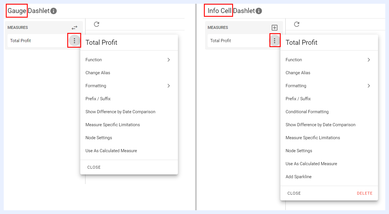
Function, Formatting, Change Alias, Node Settings, Prefix / Suffix, Use As Calculated Measure, Show Difference By Date Comparison, Measure Specific Limitations: these settings and features are also applicable to the measures in chart dashlets and are explained in their relevant sections.
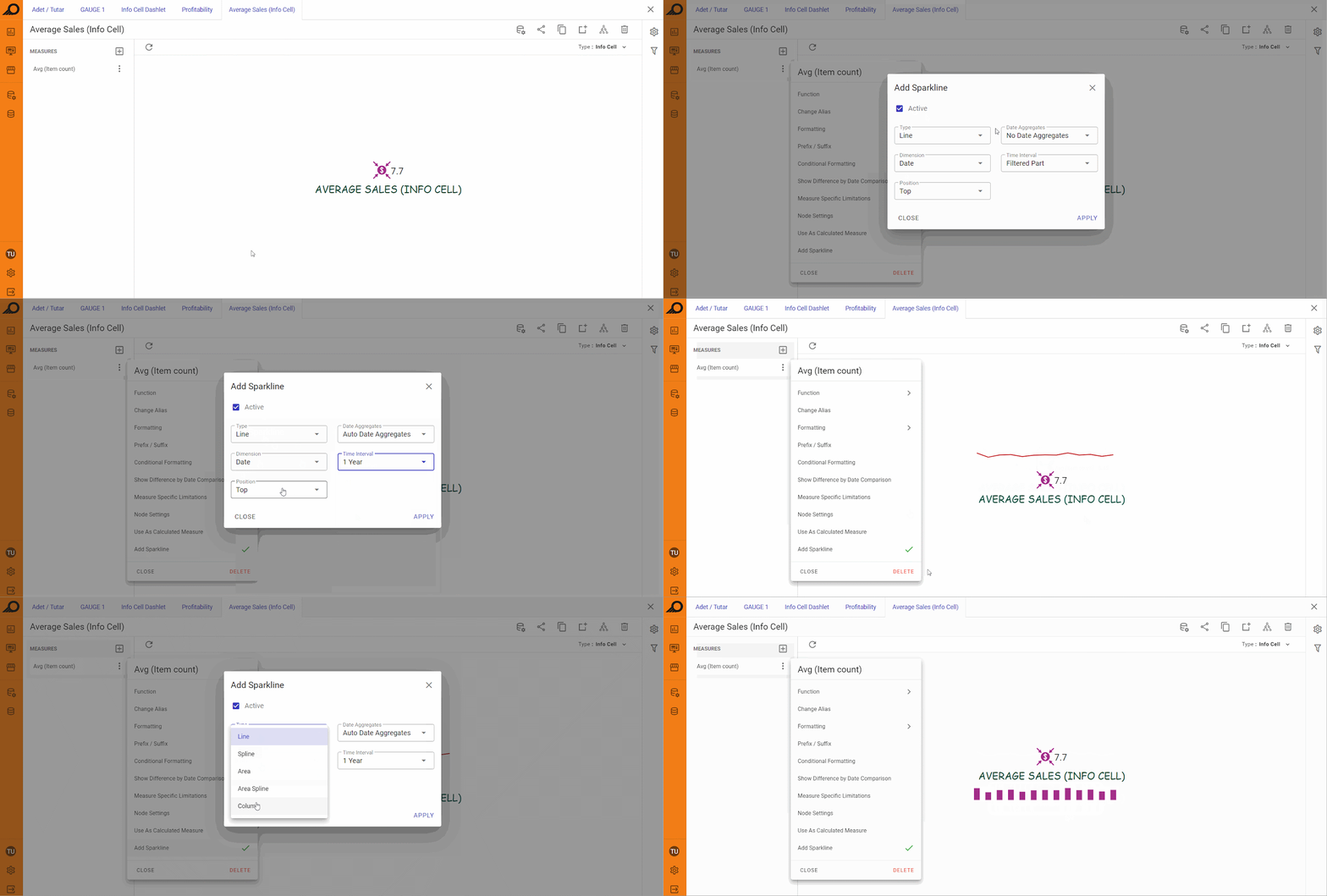
Add Sparkline: this feature allows including a small line chart that shows the trend of the metric being displayed in the info cell over a period of time. It helps provide additional context and insight into the metric being displayed, showing how it has changed over time and whether it is trending upwards, downwards, or remaining stable. The designer can choose the time interval, date aggregation type, the dimension used for trending, sparkline type (Line, Spline, Area, Area Spline, or Column), and its location within the info cell (Top or Bottom).
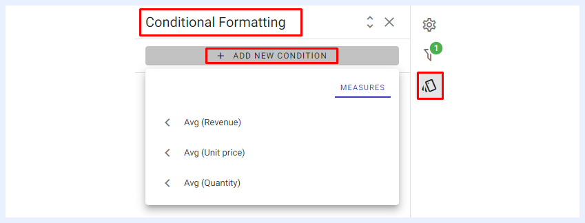
Conditional Formatting: when selected, it opens the “Conditional Formatting” pop-up window, allowing the user to either edit the formatting and layout of the info cell elements or add conditions to display data based on specific thresholds and intervals for the selected measure(s). If the displayed value in the info cell meets the defined conditions, it will automatically update according to the layout and design settings chosen by the designer.
Settings Panel
Auto Preview, Enable Result Caching, Auto Refresh, Don’t Show Without Filter, and Dynamic Measures: these settings and features are similarly applicable to the settings in chart dashlets and are explained in their relevant sections.
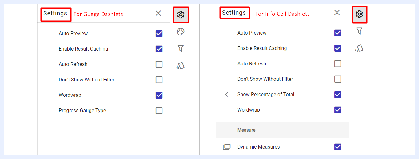
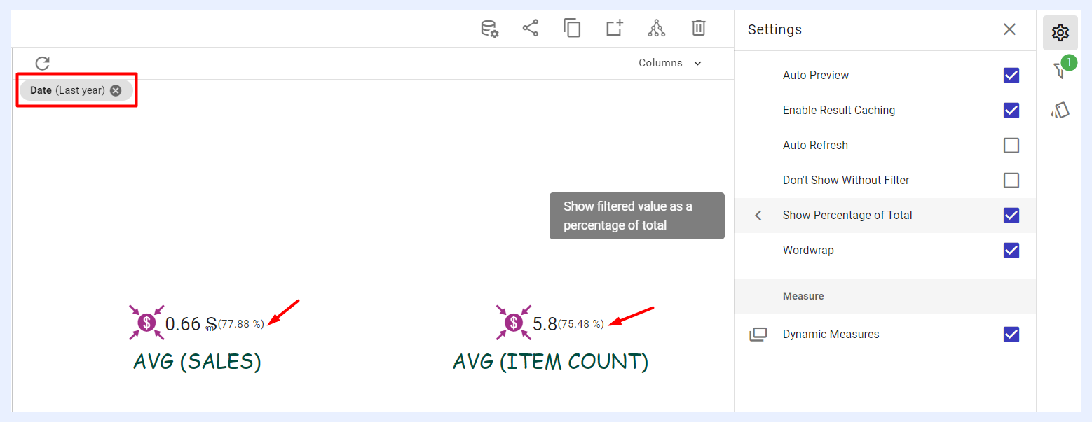
Show Percentage of Total: this feature is available for info cell dashlets only, and allows to display the percentage of the measures added to the Info Cell according to the applied filter. For example, if a date filter is applied, It will display the percentage of the values within that specific date range as compared to the overall total of the dataset. This percentage would be displayed in parentheses with a percentage sign at the end of the relevant info cell. This feature helps users understand the relative importance of the filtered data compared to the entire metric.
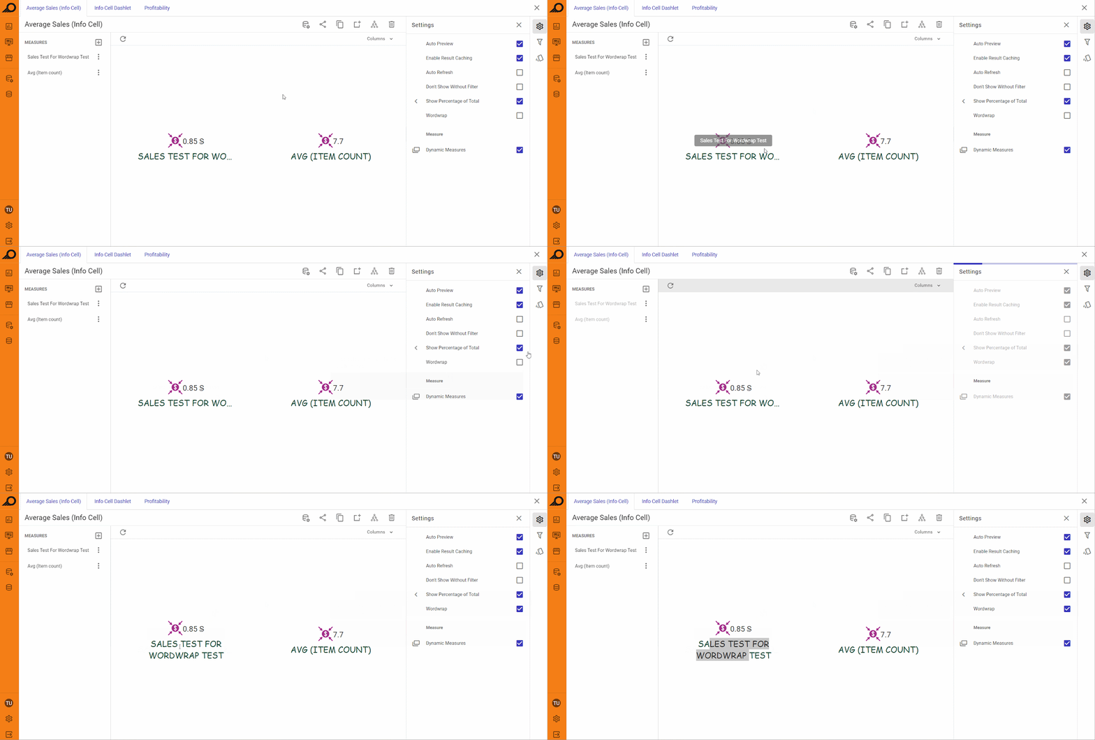
Wordwrap: if the title/s of the info cell and/or gauge dashlets are too lengthy to fit within the space designated for them, you can enable this feature to adjust them automatically, so that they fit within the allotted width of the title area.
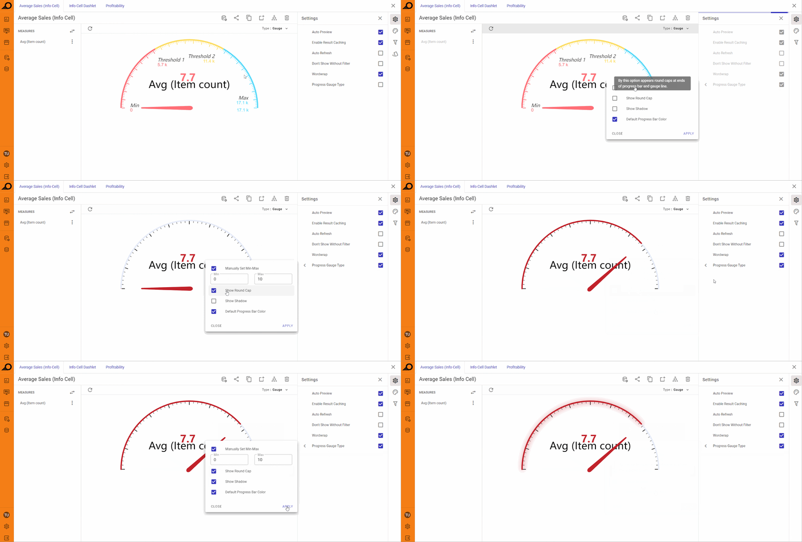
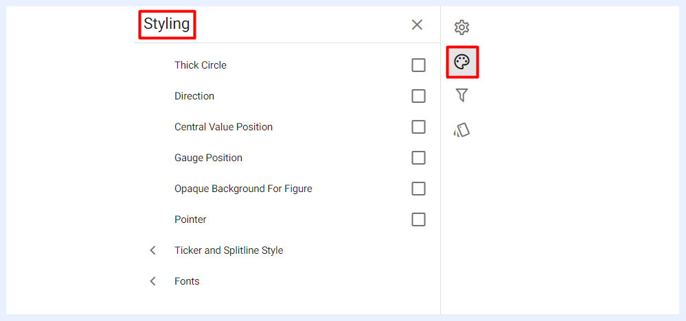
Progress Gauge Type: this feature is exclusive to gauge dashlets and enables users to customize the progress gauge to their liking. It offers various options such as manually setting the minimum and maximum values for the progress gauge (start and end values), displaying a shadow around the gauge bar, altering the color of the progress bar, and displaying round caps for the gauge bars instead of straight lines. Circle Thickness can be adjusted using a continuous slider ranging from 5 to 120 under the Styling panel for both standard and progress gauge types. The thickness value scales responsively as the dashlet is resized.
Styling Panel
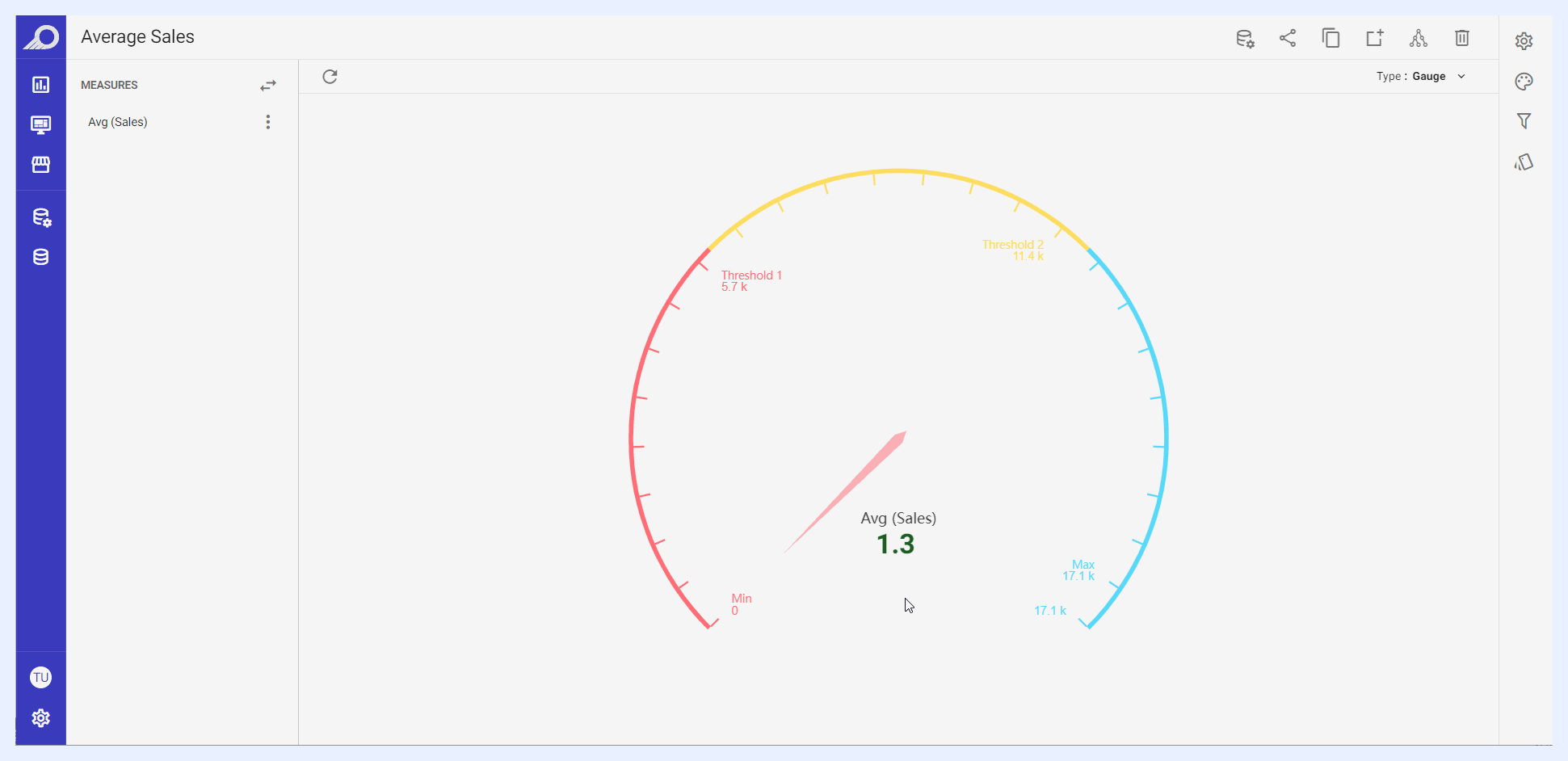
The styling and appearance of Gauge dashlets can be customized through the “Styling” panel to meet the designer's preferences. These dashlets can be modified using various customization settings to enhance their visual appeal, legibility, and accessibility, making it easier for users to analyze and comprehend the data presented.
By default, Gauge dashlets inherit the styles and themes of TURBOARD. However, users can adjust the styles, colors, and themes to suit their specific needs. These customization options can be used to highlight specific information, organize data in a way that facilitates comprehension, and improve the overall user experience.
As for Info Cell dashlets, their styling and appearance settings can be adjusted through the “Conditional Formatting” panel.
Customization Options for Gauge Dashlets
The customization options for the elements of Gauge dashlets include:
-
Adjusting the position of various elements, such as the gauge and central value, horizontally and vertically in relation to the dashlet area.
-
Adjusting font style, size, and color for different texts and fonts, including central value and its labels, dashlet title, radial value labels, and threshold labels.
-
Adjusting shapes and styles of various elements, such as circle thickness, orientation, direction, start/end angles, ticker and split lines' position in relation to the circle, and pointer style and shape.
-
Showing/hiding different elements, including dashlet title, central value labels, radial value labels, and threshold labels.
-
Adjusting the background style for the figure on the central value.
Filters Panel
“Filters” panel contains all the nodes that were assigned as filters in the related view. The user can configure the settings of any selected filter as in this link.
Conditional Formatting Settings
Conditional formatting is used to easily highlight certain values in the dashlet or make particular values easy to identify. End-users will easily notice the difference between the visualized values using this feature.
For Gauge Dashlets, they intend to show the progress towards a goal with each segment or zone on the progress bar representing a different range of values. Therefore, gauge thresholds and intervals are automatically displayed and formatted. The user however can change them or add more within the overall value of the intended goal/progress.
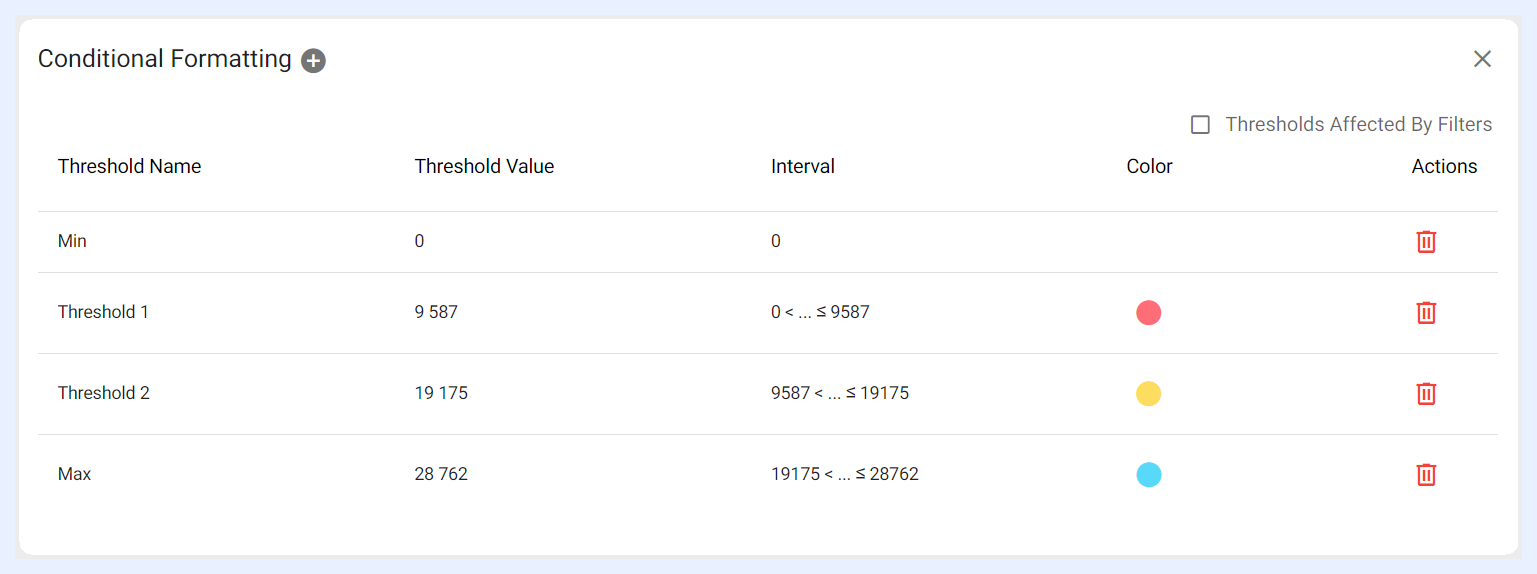
As Info Cell Dashlets on the other hand allows displaying several measures on the same dashlet, the user can either change the default formatting (font, color, icon) on a whole measure(s) level, or according to specific thresholds and intervals determined for a selected measure(s).
In the second case, the visual appearance of the measure displayed on the info cell dashlet (text colors, background colors, icons) changes automatically for the data cells that contain values which meet those thresholds.
Info Cells with More than 1 Measure
The gauge and info cell dashlets are designed to provide a quick summary of a key metric or performance indicator, typically represented by a single measure. This means that the gauge and info cell dashlets can be easily switched with each other. The Type option, located on the Dashlet and Playground Toolbar, can be used to convert a gauge dashlet into an info cell and vice versa, as long as the info cell has only one measure, similar to the gauge.
However, if an info cell has multiple measures, the Type option will be replaced by the Columns option. This allows users to arrange the displayed measures in a columnar position for easier organization and readability.
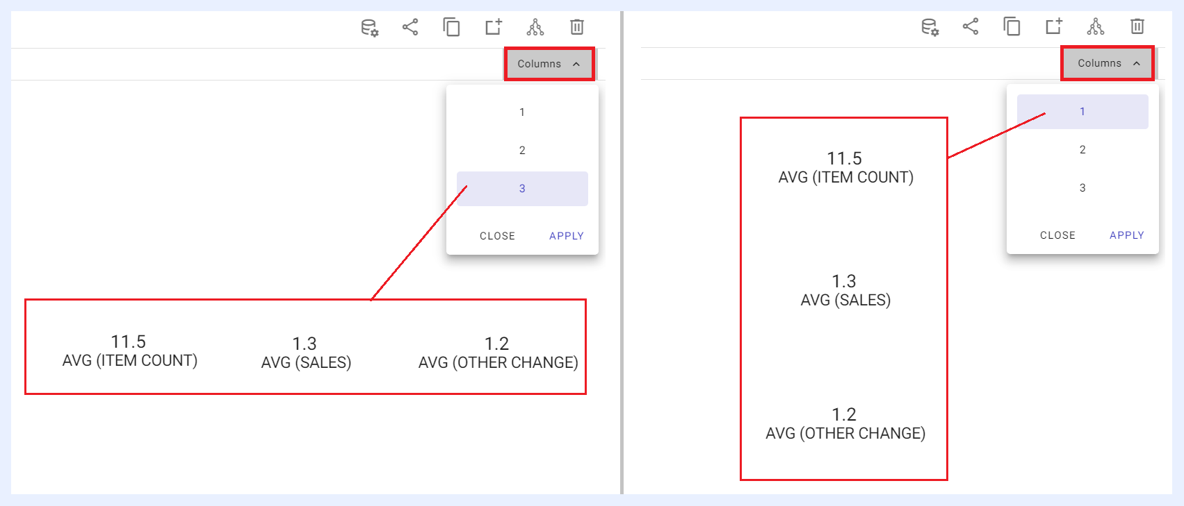
In case the user removes or deletes the additional measures from the info cell, the Columns option will be replaced with Type again, enabling the user to convert the cell into a gauge if needed.