Dashboards
Dashboards General Features
A “Dashboard” is a collection of dashlets. It is a container consisting of multiple dashlets that provides you with a centralized view of information and insights in real-time or for recently updated data and allows for quick filtering and querying of the data. It is basically the end-user interface where the selected dashlets are gathered together to tell a story.
Dashboards are customizable, which makes data interpretation easy, increases efficiency, and enables collaboration.
Designer users can choose from a variety of different layouts to create their dashboard.
Dashboard formatting can be customized, and elements such as HTMLets, images, figures, and other visual and informative components can be added.
Filters and merged filters can be added, and their location on the dashboard can be determined.
Designers can determine what end-users can view on the dashboard, as well as what actions they can perform. This includes the ability to export the dashboard into external files, the type of files that can be used, and the action icons that can be seen and clicked on for the dashlets that are added to the dashboard and on the dashboard level as well.
How to Create a Dashboard?
1 From the “Navigation Sidebar Menu” > Go to Dashboards > click + Create New Dashboard.
2 An overlay window will open. Give a name to your dashboard in “Title” field.
3 If needed, enter a “Description” for the dashboard and/or a “Tag” in the relevant fields. Tags are useful for organizing and searching for content, as they allow you to quickly filter and find items that have been labeled with the same tag. When you label dashboards with specific keywords or terms, it will help find them grouped upon “Search” in their view listing main page.
4 Click CREATE button. Your dashboard will be created and opened with its playground so you can configure its settings.
5 Start by adding the dashlets that you want to your dashboard by clicking Show Dashlet List button > Clicking on the required dashlet > the dashlet/s will be added automatically upon click. If there are numerous dashlets listed, you can utilize the search function to find the specific ones you need.
6 The design (location and size of the added dashlets) can be manipulated by moving each dashlet or resizing it with the mouse.
7 Other options are available to add components (other than dashlets) to the dashboard, and to change the default settings of the dashboard. Those options are demonstrated in “Managing Dashboards” section.
Note
All the dashlets that will be added and gathered in the new dashboard must be prepared/created in advance.
Creating a Dashboard from Imported File
In TURBOARD, users can export (through “Share” option) any TURBOARD element, starting from views, dashlets, dashboards and up to a whole showcase into an external file (a “.tur” custom file format specific to TURBOARD application) compressed inside a (.zip) folder.
This allows users to replicate such elements – instead of creating them from scratch, applying their analysis to another data source, and/or copy some elements into another TURBOARD environment – through importing the same file into TURBOARD again.
For dashboards in TURBOARD, when IMPORT FROM FILE option is used, this allows you to:
-
Create a new dashboard for a different data source as a replica of another dashboard available at another data source. As you may prepare a dashboard with several custom filters, stylings, various components and elements, the “Import” feature allows replicating all such user-defined settings automatically and connecting them to another data source without the need to set them manually again in a similar new dashboard.
-
Another use case for this feature is to allow you to analyze historical data and compare it with the latest data if your historical data is stored in another data source or database.
-
It also allows you to copy a dashboard into another TURBOARD environment.
One condition is required to complete the creation successfully: the data tables in the new data source must have the same name and structure (fields/nodes) of those in the exported view file.
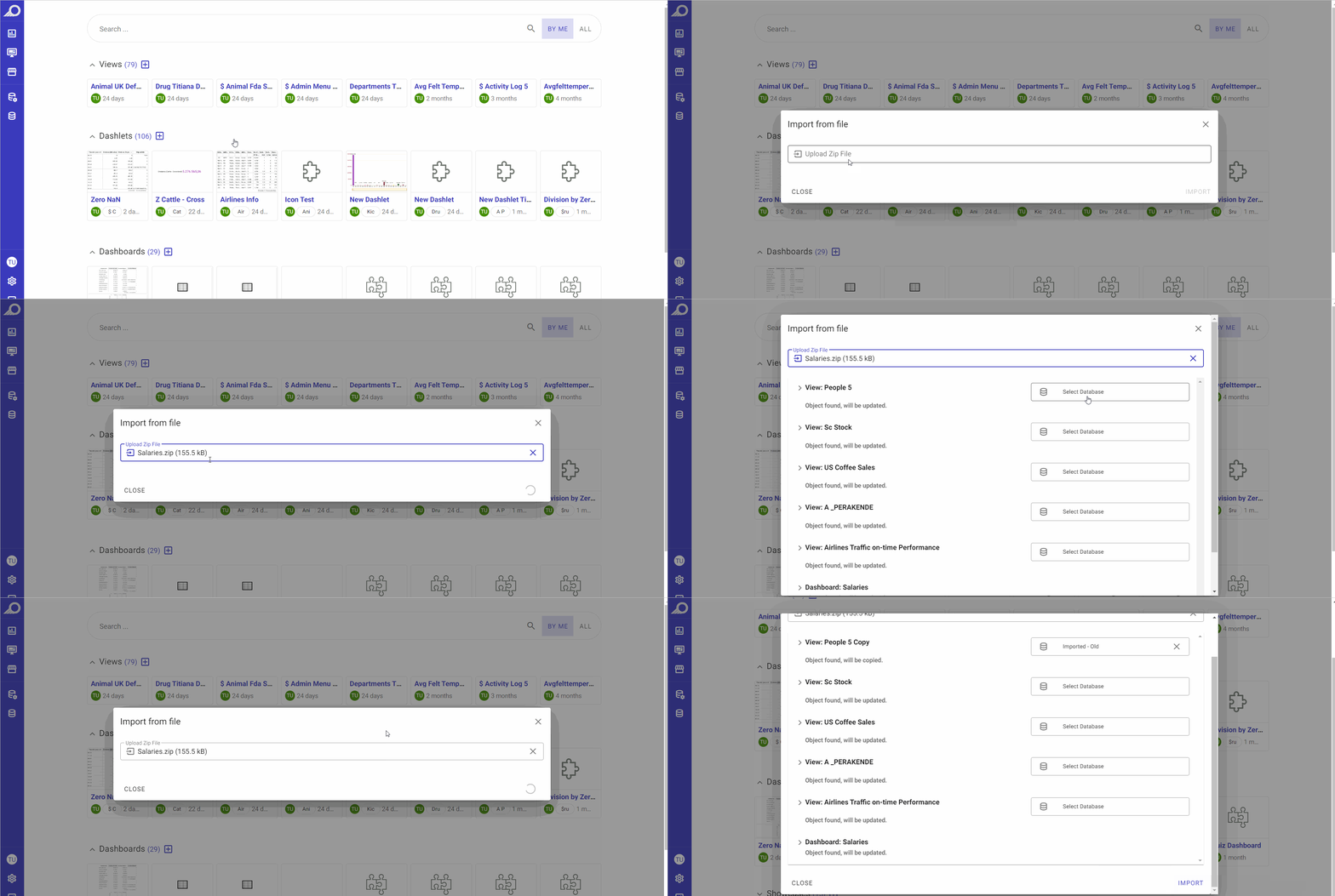
1 Go to Dashboards > + Create New Dashboard > click IMPORT FROM FILE option.
2 Upload the exported (.zip) folder that contains the “.tur” custom file. TURBOARD will automatically detect the tables, the data, the dashlets and the dashboard structure in the file and will apply them to the new dashboard. The structure and the detected elements (view elements, dashboard elements, etc.) will be listed in the overlay window.
3 From the Databases drop-down menu (Select Database), choose the target data source that you want to link the created dashboard to. All the data sources that are added to TURBOARD will be listed in the menu.
4 Click IMPORT button. The new dashboard will be created and connected to the target data source.
Managing Dashboards
Dashboard Playground Sections
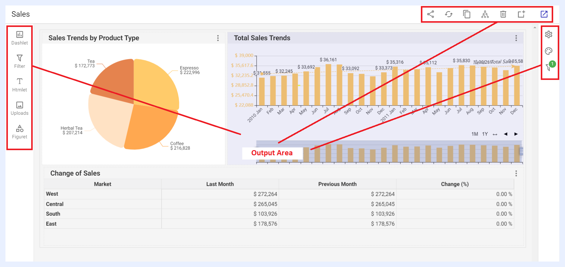
The page where the dashboard is configured (add/edit mode) is called the playground (PG) in our terminology and it consists of various controls and panels to allow configuring the design, components and settings of the dashboard. These are:
Output Area
The output area is the result of the added components of the dashboard. It interactively responds to the designer's selected settings and configurations. The components in the Output Area can be relocated and resized by moving each component (whether for example a dashlet, an Htmlet or a filter) or resizing it with the mouse.
Quick Actions Ribbon
At the top-right side of the dashboard’s add/edit window, several icons are available to apply general actions on the dashboard.

| Dashboard Quick Action Icons Explained | |
|---|---|
| Share: | to share the dashboard and make it available to either for public or with defined user(s) and/or group(s). When a dashboard is shared with “Can View” privilege, shared users will only be able to view the dashboard. When it is shared with “Can Edit”, shared users can apply changes to the dashboard settings as well. This option can also be accessed from the dashboard’s ellipsis menu in the dashboards’ listing window. |
| Refresh dashboard and dashlets data cache: | to update the data displayed on all the dashlets of the dashboard by reloading the temporary storage location (cache) where data is stored. |
| Copy: | to duplicate and copy the dashboard with the same settings and/or components but under a different name, where you have the option to open it in the current window or in a new tab/window. |
| Share meta info: | when clicked, a pop-up window opens listing the related data source/s, the view/s and the dashlets that the dashboard depends on. This option can also be accessed from the dashboard’s ellipsis menu in the dashboards’ listing window, namely the “Meta Info” option. |
| Remove: | to delete the dashboard. |
| Add to the selected showcase: | to add the dashboard to an existing showcase by selecting the required showcase in the overlay window that opens then clicking ADD button, or to add it to a new showcase through + CREATE A NEW SHOWCASE button that is available in the same overlay window. |
| View dashboard: | to view the resulting dashboard (View mode) and how it will be displayed for end-users. |
Components Addition Panel
The left-side panel consists of a number of icons made available for designer users to add various components to their dashboards.
When a component is added to the dashboard PG from the panel, its location and size can be adjusted using the mouse. Its settings and design (styling) can be configured through the Dashboard Settings and Configuration Panel.
Adding Dashlets to a Dashboard

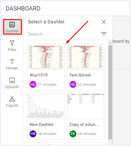
When clicked, a sidebar window will open listing all the created and/or shared dashlets with the user. Users can add any dashlet to the dashboard by simply selecting it from the list, and it will be automatically added without requiring any additional steps. If there are numerous dashlets listed, you can utilize the search function to find the specific ones you need.
Adding Filters to a Dashboard

When clicked, a sidebar window will open listing all the nodes of type “Filter” for all the added dashlets in the dashboard. This allows users to select and add any filter they need, enabling them to drill down and limit visualizations by different sizes and dimensions.
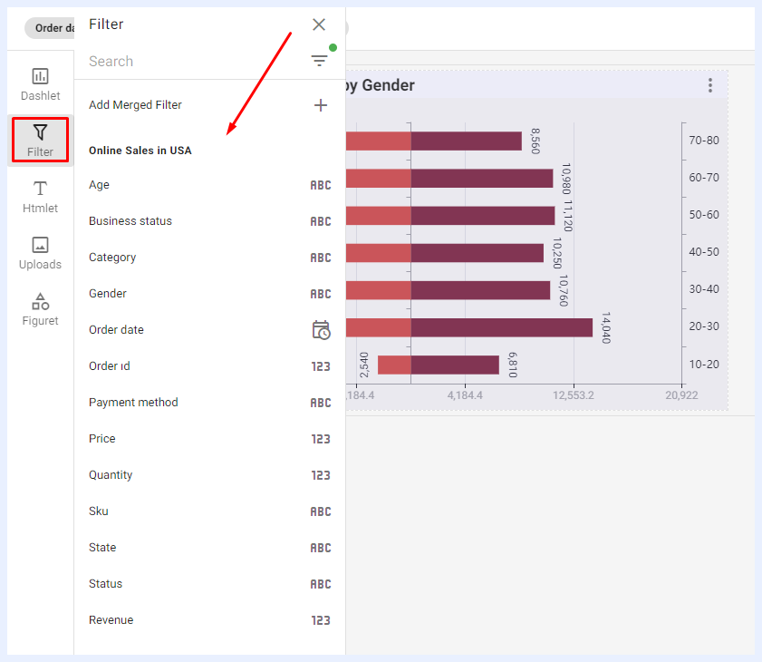
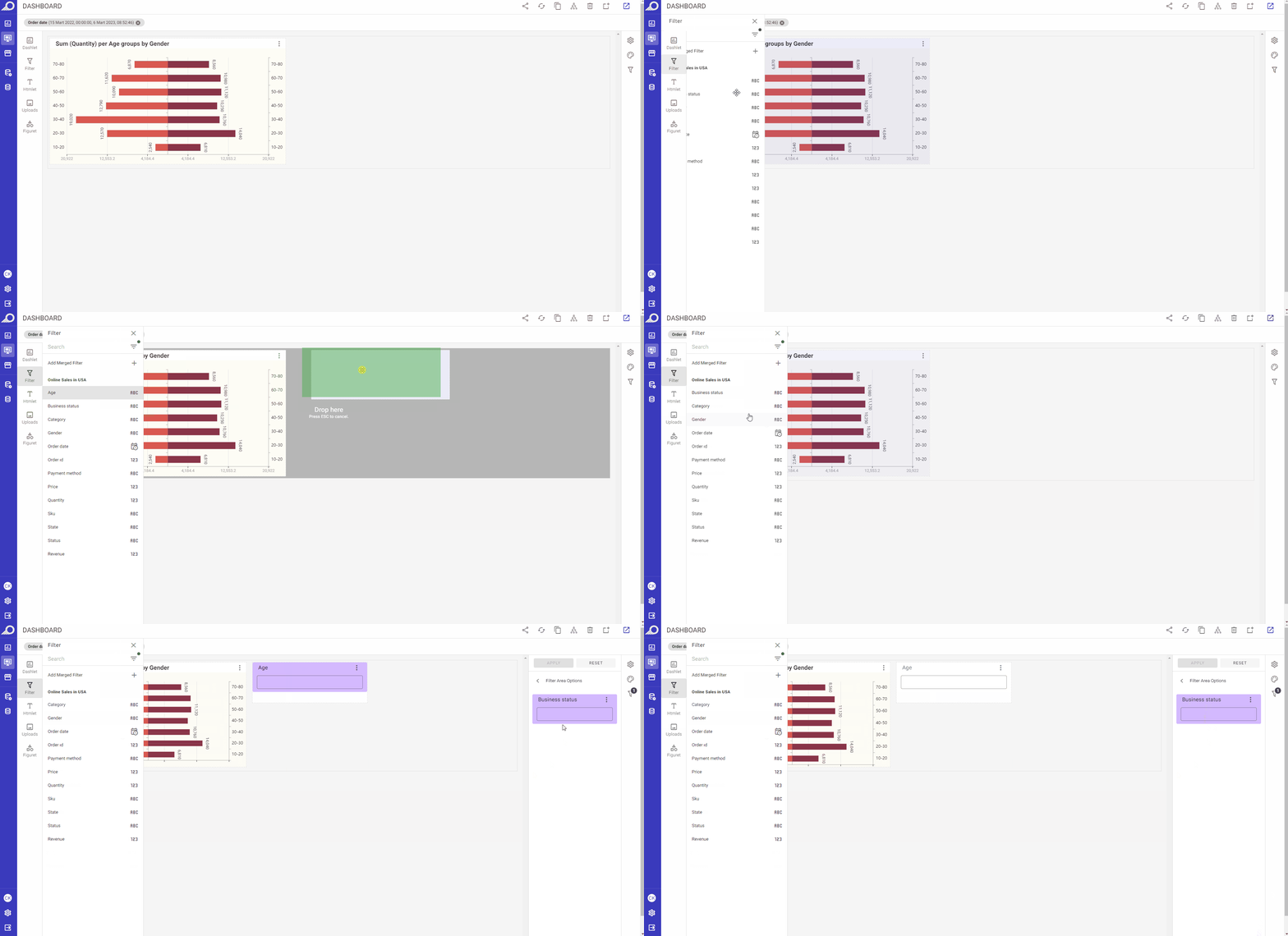
Fixed Filters on the Right-side Pane: when a filter is clicked from its sidebar menu, it will be directly added to the right-side filters’ pane.
Custom Filters on Dashboard PG: Users can easily add custom filters to the dashboard playground area by dragging and dropping the selected filter from the sidebar window. This feature provides users with the flexibility to manage the filter's location and size to achieve their desired design and formatting options.
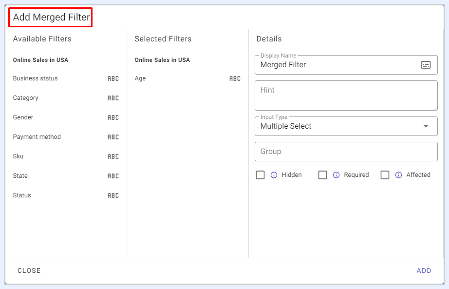
Merged Filters: using this feature, users can combine multiple related filters into one single filter. This allows users to apply a set of filter criteria to the dashboard simultaneously, simplifying the filtering process and improving dashboard interactivity. By using a merged filter, users can control and adjust multiple filters at once, making it easier to refine and analyze data based on specific requirements or criteria.
Adding HTML Components to a Dashboard

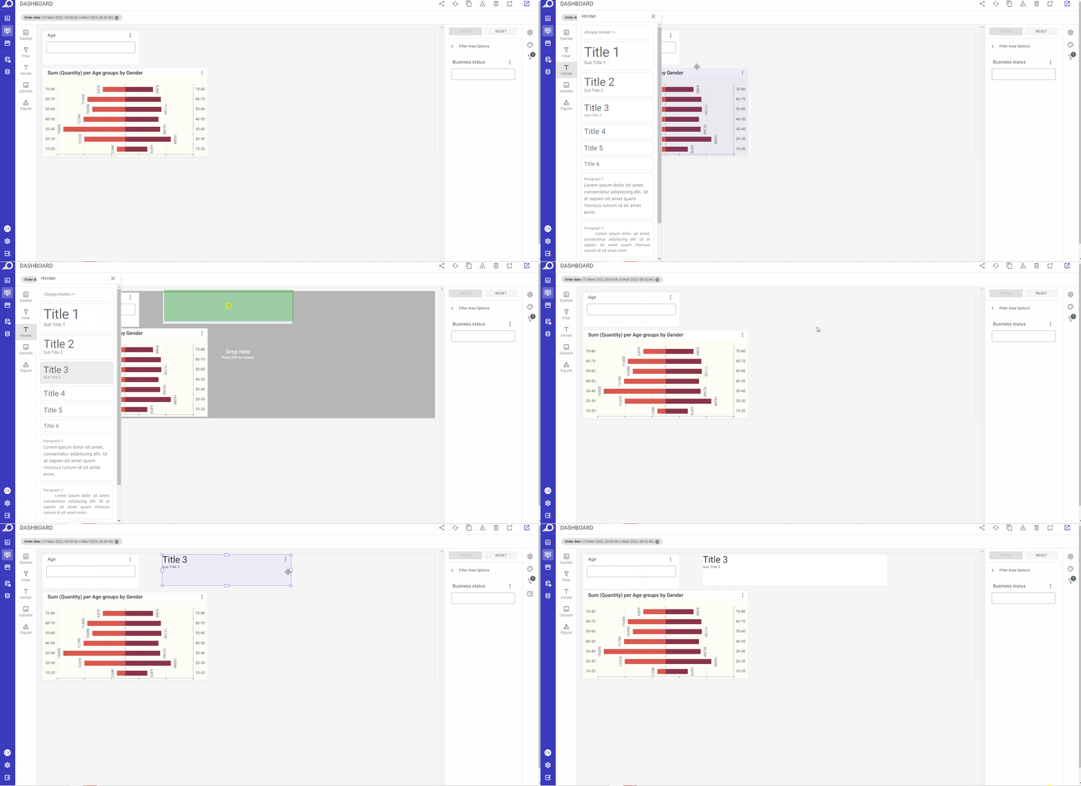
When clicked, a sidebar window will open to allow the user to add HTML components to the dashboard. Users can either click on the required HTML style to add it directly to the dashboard or drag and drop it to the desired location on the dashboard's PG. Once an Htmlet is added, users can access the right-side ellipsis menu and select their preferred option to edit or manage the added component as needed.
Properties option: when selected, the “Htmlet Properties” options for the added Htmlet will open at the Dashboard Settings and Configuration Panel. Users can change/manage the settings, styling and formatting of the Htmlet as needed.
Edit Content option: when selected, it allows users to modify and enhance the HTML content they've added to the dashboard. When this option is selected, the HTML editor will open, providing users with a variety of tools to add and edit HTML elements such as URL links, images, dynamic dates, filters, formatted texts, and more. The HTML editor window includes a range of formatting and styling options, enabling users to customize the appearance of the HTML content to suit their specific needs.
Duplicate option: when selected, a duplicate copy of the Htmlet component will be directly added to the dashboard.
Adding Visual Components to a Dashboard

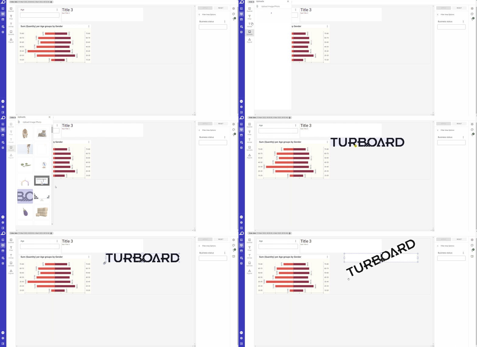
When selected, it enables users to add visual components, such as images or photos, to the dashboard. There are two ways to use this feature:
Firstly, users can choose images or photos from TURBOARD's library. The library contains a collection of visual assets that users can select from and add to their dashboards as needed. These assets are already optimized for use on the dashboard and are designed to be visually appealing and effective.
Alternatively, users can upload their own image files from their computers. This allows users to use their own images or photos, which may be more relevant or appropriate for the dashboard's content or purpose. Uploading images from your computer can be done by clicking the Attach icon available at the left-top corner of the “Uploads” side window. Once uploaded, the images can be added to the dashboard using the drag-and-drop feature or by selecting the image from the library.
Incorporating Visual Elements from the Library into a Dashboard

When selected, a library of patterns, symbols, images, special characters and other visual elements can be added to the dashboard.
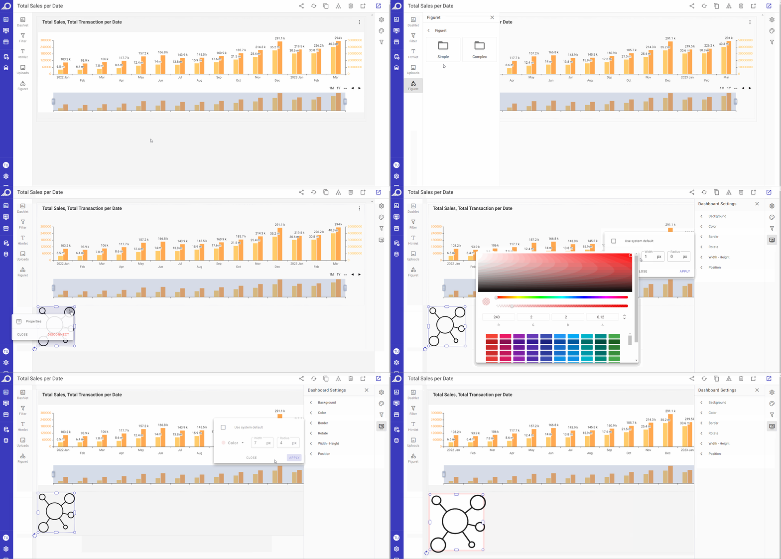
Customizing Dashboard Elements and Components
You can customize any element added to the dashboard, including dashlets, Htmlets, figurets, filters, or other types of elements, by selecting it with the mouse and using the following options:
Drag-and-drop the element to change its location or place it where desired on the dashboard.
Resize the element using the mouse and adjusting the borders to achieve the desired size.
Adjust the properties of the element by accessing the right-corner ellipsis menu and selecting the “Properties” option.
Remove the element from the dashboard by accessing the right-corner ellipsis menu and clicking DISCONNECT button.
These options allow for easy and efficient customization of elements on the dashboard, ensuring that the dashboard is tailored to meet the specific needs and preferences of the user.
Dashboard Settings & Configuration Panel
Settings Options
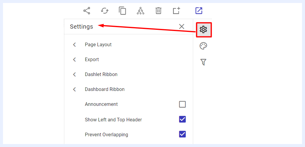
The Settings panel, accessible by clicking the settings icon at the top-right corner of the dashboard in “Edit” mode, allows configuration at both the dashboard and dashlet levels. On the dashlet level for example, two key settings options are available in the list: Export Options for Dashlets and Dashlet Ribbon.
When the settings icon is clicked, a slide-in list appears with options like Page Layout, Export, Dashlet Ribbon, and Show Left and Top Header. Clicking any option opens a side window to set the details of the selected option.
Page Layout Settings
When selecting “Page Layout” from the Settings panel, a side window appears, allowing the user to choose from five layout types to adjust the arrangement of dashlets and visualizations on the dashboard.
Dynamic Width and Height: this layout is the default that is set when creating a new dashboard. It is the most common and appropriate for many dashboards as it allows using proportion and relative sizing to display differences in data and placing charts and components in a flexible way. It is also the appropriate layout type for mobile devices as it allows the dashboard to work in harmony with different devices and browsers. If another layout is more suitable to your analysis and design needs, you can change and choose from the other available four options below.
Fixed Width: when selected, it allows the user to set a specific pixel value for the width while the height adjusts dynamically. This layout option can be useful in situations where you want to ensure that the width of a dashboard or webpage remains consistent regardless of the size of the screen or device being used to view it. It can also be useful if you want to control the placement and alignment of elements on the dashboard. By specifying a fixed width, you can ensure that different dashlets and visuals are always positioned in the same place relative to each other, which can help to make the dashboard easier to read and navigate.
A4 Portrait: when choosing this layout type, the dashlets and dashboard components will automatically fit within an A4 portrait page size. The designer can relocate and resize as desired but within the same paper size borders, and can add a custom header and a custom footer to the resulting layout easily and quickly through various formatting options. This layout type is most appropriate for dashboards that will be printed out as a hardcopy report.
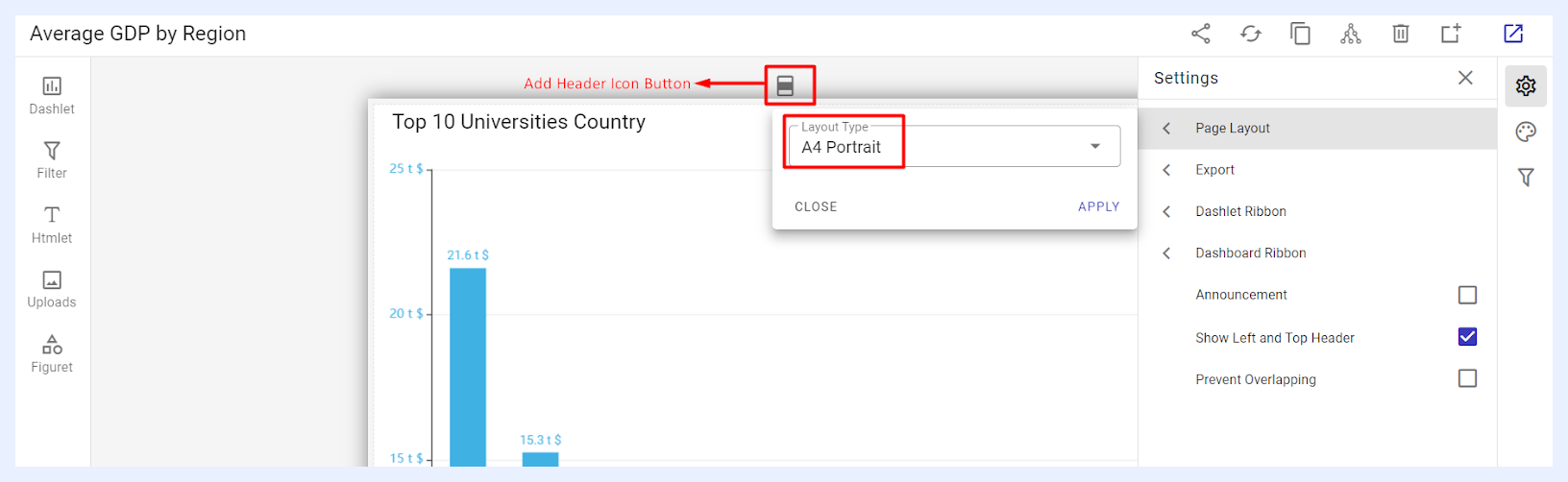
A4 Landscape: similar to the A4 Portrait option, when choosing this layout type, the dashlets and dashboard components will automatically fit within an A4 landscape page size, with options to relocate and resize the elements, in addition to adding a custom header and a custom footer to the dashboard design. It would be the best choice for presentations and for displaying the dashboard on screens in meetings.
Fixed Width and Height: when selected, it allows the user to set specific pixel values for both the width and height of the dashboard. This layout option ensures that the dashboard is always displayed at the same size regardless of the size of the screen or device being used.
Export Options Settings
“Export” options: this feature lets you choose which export options will be available to end-users for both the dashboard and its dashlets. You have the ability to customize the options and select which ones you want to make available. For instance, if you do not want end-users to have the ability to print out the dashlet, you can remove that option from the list of available export options. Similarly, if you do not want end-users to be able to export the dashboard as an email message, you can deselect that option. By customizing the export options, you can control the ways in which users are able to interact with and share the content of your dashboard.
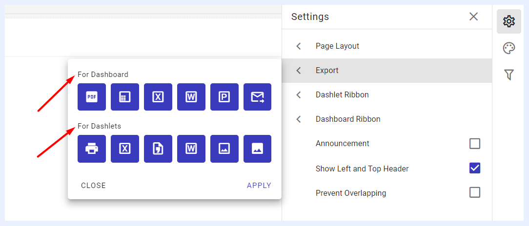
For Dashboard: the available sharing and export options are PDF file format, PDF (with tables), Excel file format, Word file format, Presentation (PPT file format), and a PDF file sent to e-mail.
For Dashlets: the available sharing and export options are Print out, Excel file format, Word file format, CSV file format, PNG image file and JPEG image file.
Ribbon Settings
1 “Dashlet Ribbon” options: this feature lets you choose which quick actions that end-users can apply on the dashlets of the relevant dashboard and how those actions shall appear on the dashlet ribbon.
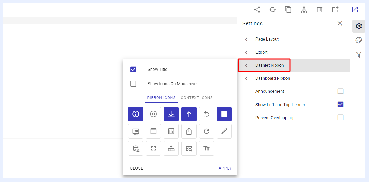
“Show Title” check box: when checked, the dashlet titles will be visible at the left-top corner of each dashlet.
“Show Icons On Mouseover” check box: when checked, the selected dashlet icons (whether set to appear as context icons or a ribbon) will become visible and selectable only when you hover your mouse over the dashlet area.
“RIBBON ICONS” tab: the icons selected through this option will appear on the dashlets as a ribbon next to each other at the right-top corner of the dashlet. End-users can simply click on them to apply the relevant action.
“CONTEXT ICONS” tab: the icons selected through this option will appear on the dashlets as a hidden list under the dashlet’s ellipsis menu located at the right-top corner of the dashlet. End-users can simply click on the ellipsis menu and select the relevant action.
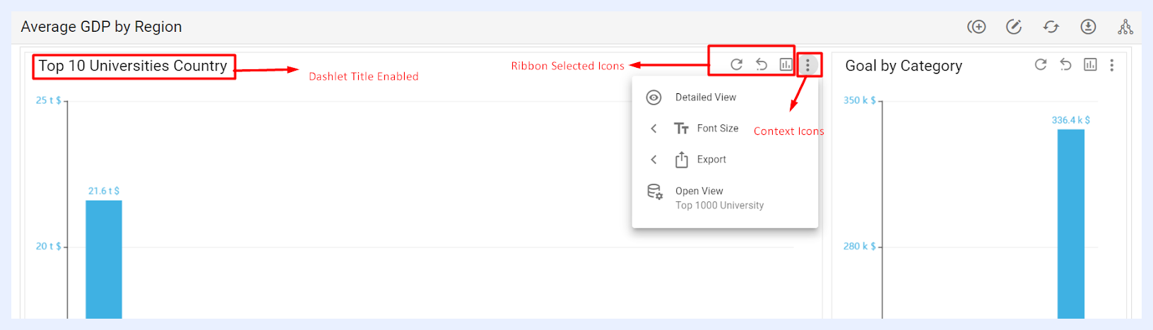
How ‘Dashlet Ribbon’ Settings Appear on each Dashlet for Dashboard End-Users
Note
You can select the same action icon to be displayed as either a Context Icon or a Ribbon Icon. This means that when an icon is selected in one tab, it will be automatically deselected from the other tab.
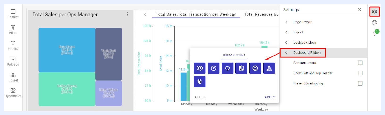
2 “Dashboard Ribbon” options: this feature allows Designer users to select which quick actions will be available for end-users. These actions appear as a ribbon at the right-top corner of the dashboard. The available icons, such as Clone, Edit, Refresh Data, Theme Selection (for Showcases), Export, and Meta Info, can be configured based on user permissions and needs.
Other Settings
1 “Announcement” check box: when checked, a pop-up window opens, allowing the designer to enter an announcement title and message using the Editor. Once the user clicks the APPLY button, the announcement will automatically appear as a pop-up to all end-users viewing the dashboard. End-users must click OK to close the message. This feature helps ensure important updates are seen directly on the dashboard without relying on external communication methods.
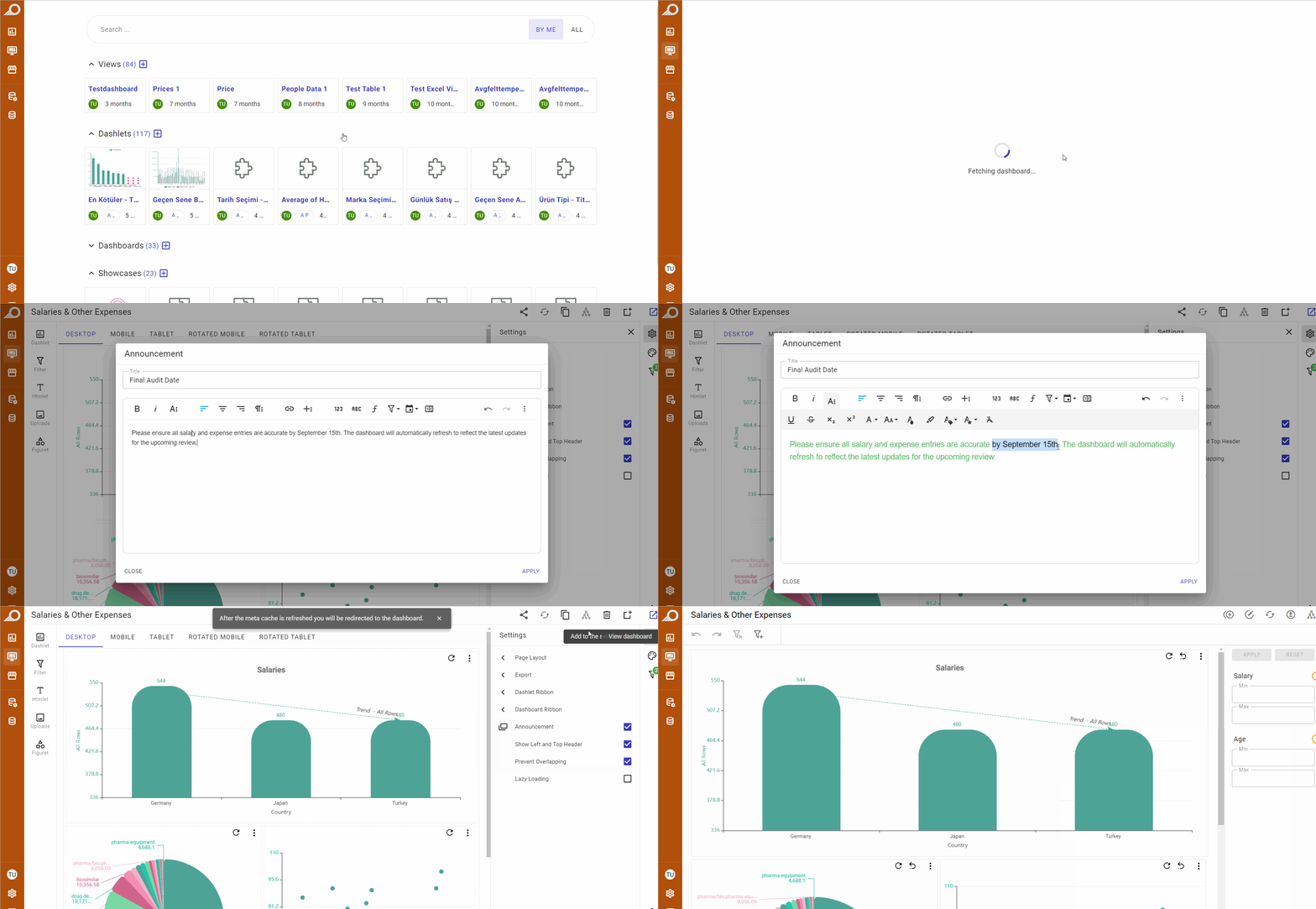
2 “Show Left and Top Header” check box: when checked, the title of the dashboard will be visible to end-users at the left-top corner of the dashboard. Additionally, the “Navigation Sidebar Menu” will be visible at the left side of the dashboard window.
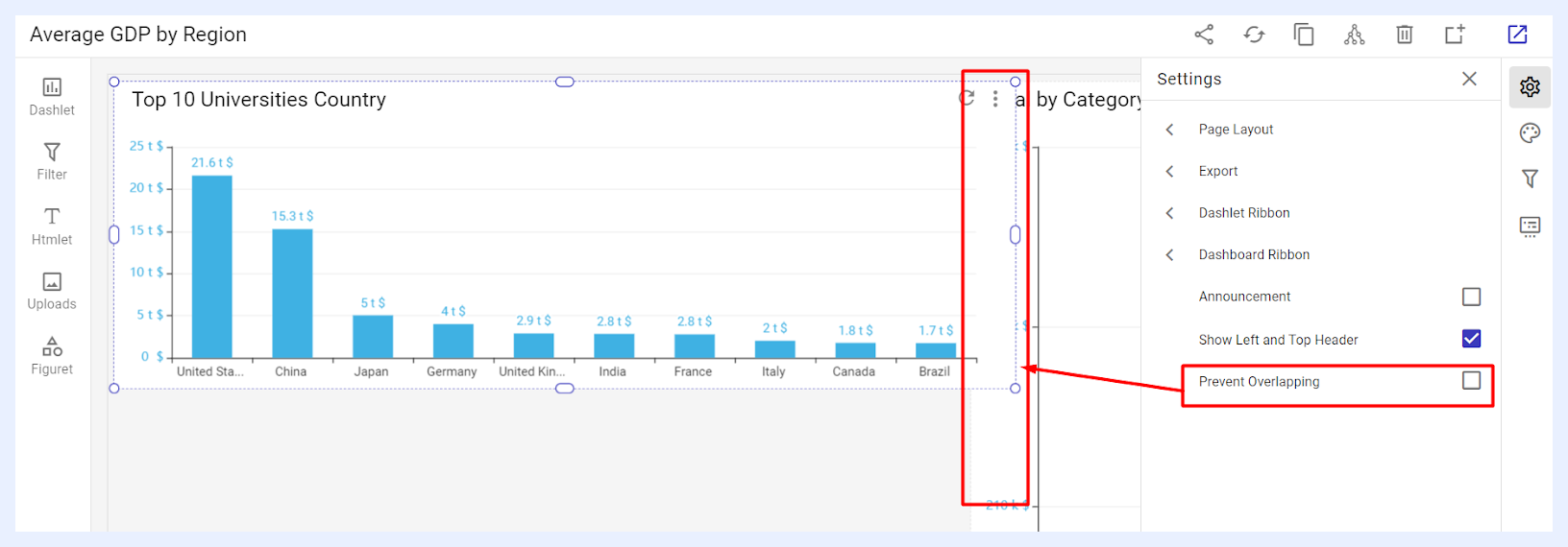
3 “Prevent Overlapping” check box: when checked, it allows you to avoid overlapping and prevent your dashlets and widgets (other dashboard elements) from being stacked on top of one another. Conversely, without this feature, such stacking is possible.
Styling
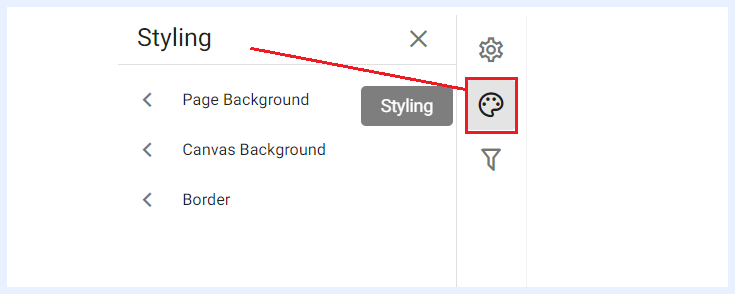
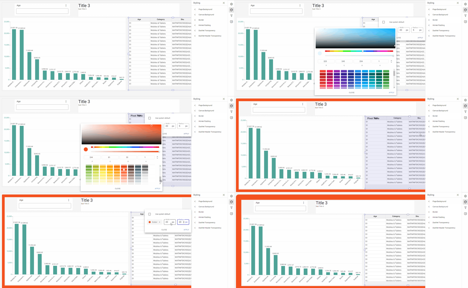
“Page Background” options: you can use this feature to customize your dashboard's background by selecting from different options available. You can choose to use the system default, have a transparent background, apply a solid color, or upload an image or photo from your computer.
“Canvas Background” options: you can use this feature to customize the canvas background by selecting from different options available. You can choose to use the system default, have a transparent background, apply a solid color, or upload an image or photo from your computer. The canvas background is the area within the dashboard where you create and place visualizations or other elements. The dashboard background, on the other hand, refers to the entire background of the dashboard, including the canvas area and any space around it.
“Border” options: using this feature allows you to customize your dashboard by adding a border of any color, and adjust its thickness and the sharpness of its corners as per your liking.
Filter Settings
When any filter is added to the dashboard, the “Filters Settings” pane will become active to allow the user to manage the different settings of the added filter(s).
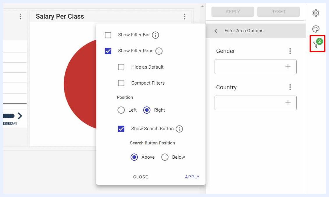
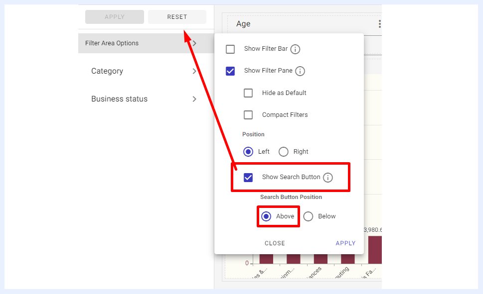
Filter Area Options: the options available in this section allow the user to manage the way the added filters shall appear on the dashboard PG for end-users as below:
“Show Filter Bar” check box: if selected, the added filters will appear to end-users (View mode) as a bar at the left-top corner of the dashboard screen.
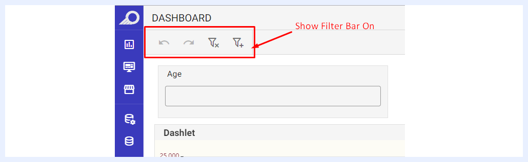
How Filters Appear as Filter Bar for End-Users
“Show Filter Pane” check box: if selected, the added filters will appear to end-users (View mode) as a pane at the right side of the dashboard.
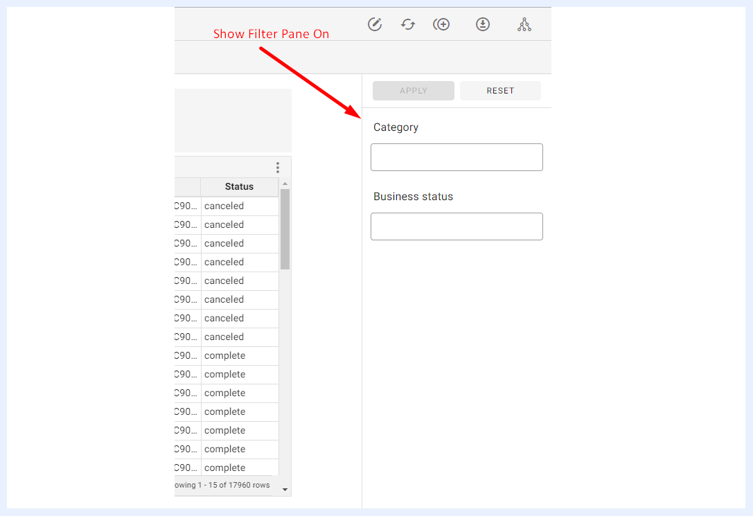
How Filters Appear as Filter Pane for End-Users
“Hide As Default” check box: when filters are set to be displayed as a “Filter Pane”, the pane can be hidden as a small filter icon to allow end-users to show the filter pane or hide it.
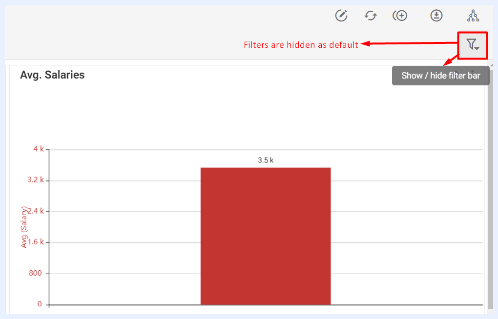
How the Filter Pane is Hidden for End-Users
“Compact Filters” check box: when filters are set to be displayed as a “Filter Pane”, each filter in the pane can be compacted and its contents can be opened through its drop-down menu.
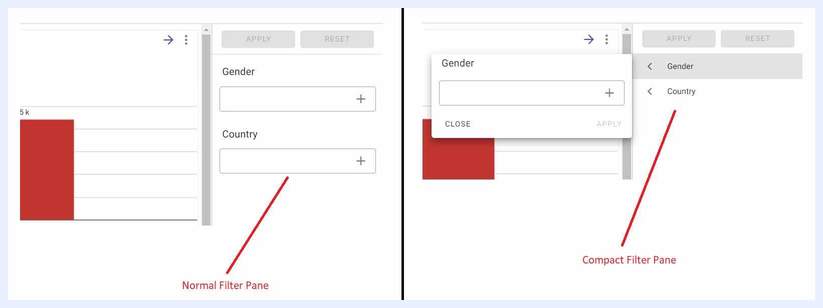
“Filter Pane Position (Left/Right)” radio buttons: when filters are set to be displayed as a “Filter Pane”, the designer user can choose where it will be displayed on the dashboard.
“Show Search Button” check box: using this feature, you can determine whether the APPLY and RESET buttons for the filters will be visible and whether they shall appear above or below the filter area.
Filter Settings: through the available options in the ellipsis menu of the added filter, the user can manage the filter settings as below:
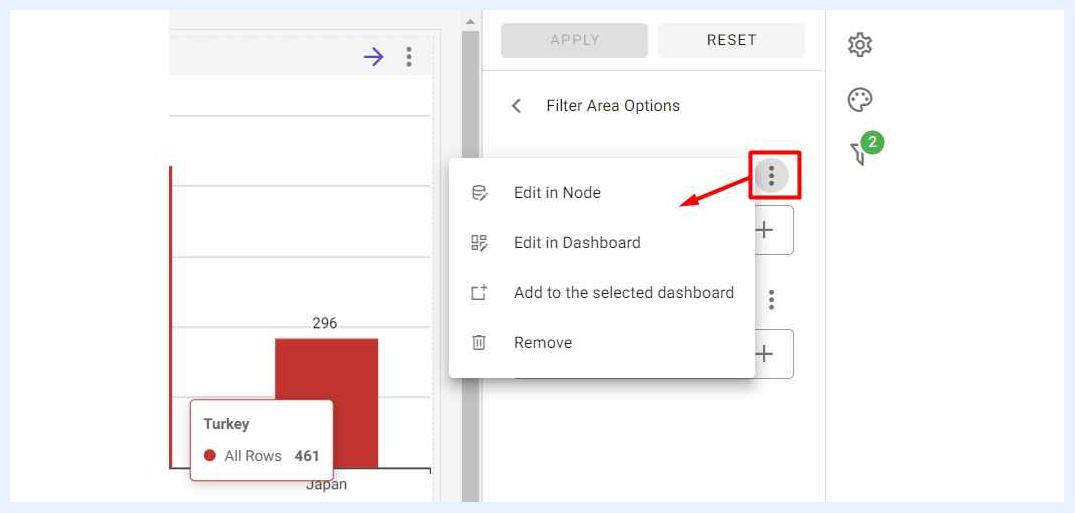
Edit in Node: to open the node edit window for the filter in the relevant view and change its settings.
Edit in Dashboard: to edit the dashboard’s filter settings in the window that opens such as hiding the filter, making it mandatory to be filled/selected, set default values to it, reverse it, give it a different name/alias, assign help text (hint) to it, determine its input type and so on. Date filters support a Date Period input type with one-click shortcuts for Years, Quarters, Months, Weeks, and Days. A selected period can be locked to "Current Period" so the filter automatically updates as time passes. The same date dimension can also be added as a filter multiple times, enabling complex logic such as filtering within a year but excluding a specific week.
Add to the Selected Dashboard: when selected, the filter will be moved from the filter pane to the dashboard’s PG as an element added to the dashboard whose location, size and styling can be adjusted as desired.
Remove: to remove the filter from the dashboard.
Note
When a filter is added as an element to the dashboard rather than in the filter pane, its properties and formatting can be managed as in “Element Properties and Layout Settings” section.
Element Properties and Layout Settings
As a designer user, you can customize and adjust the layout, styling, and formatting of any element added to the dashboard (including dashlets, Htmlets, figurets, filters, or other types of elements) through the Box Style & Layout pane. This pane can be accessed by selecting the ellipsis menu on the right corner of the element or by selecting the element directly in the dashboard “Edit” window.
The available options vary depending on the element type. For instance, when a figuret or image is selected, additional settings like adding a clickable link, adjusting padding, rotating the element, etc. are available.
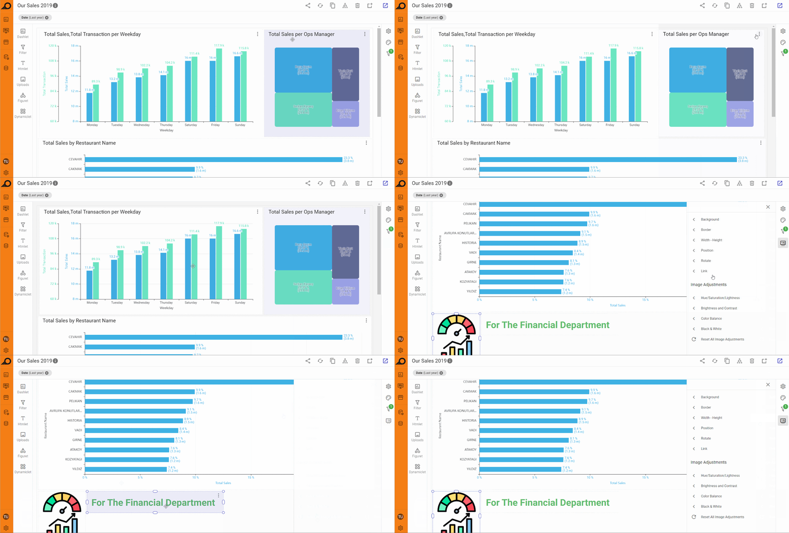
1 “Position” options: this feature allows you to specify the exact position of the selected element by entering specific units in steps, instead of relying on drag-and-drop. Each step corresponds to a dynamically adjusted unit based on the browser or screen width, ensuring that the element’s position is consistently aligned across different devices. This provides more control over the precise placement of elements within the dashboard.
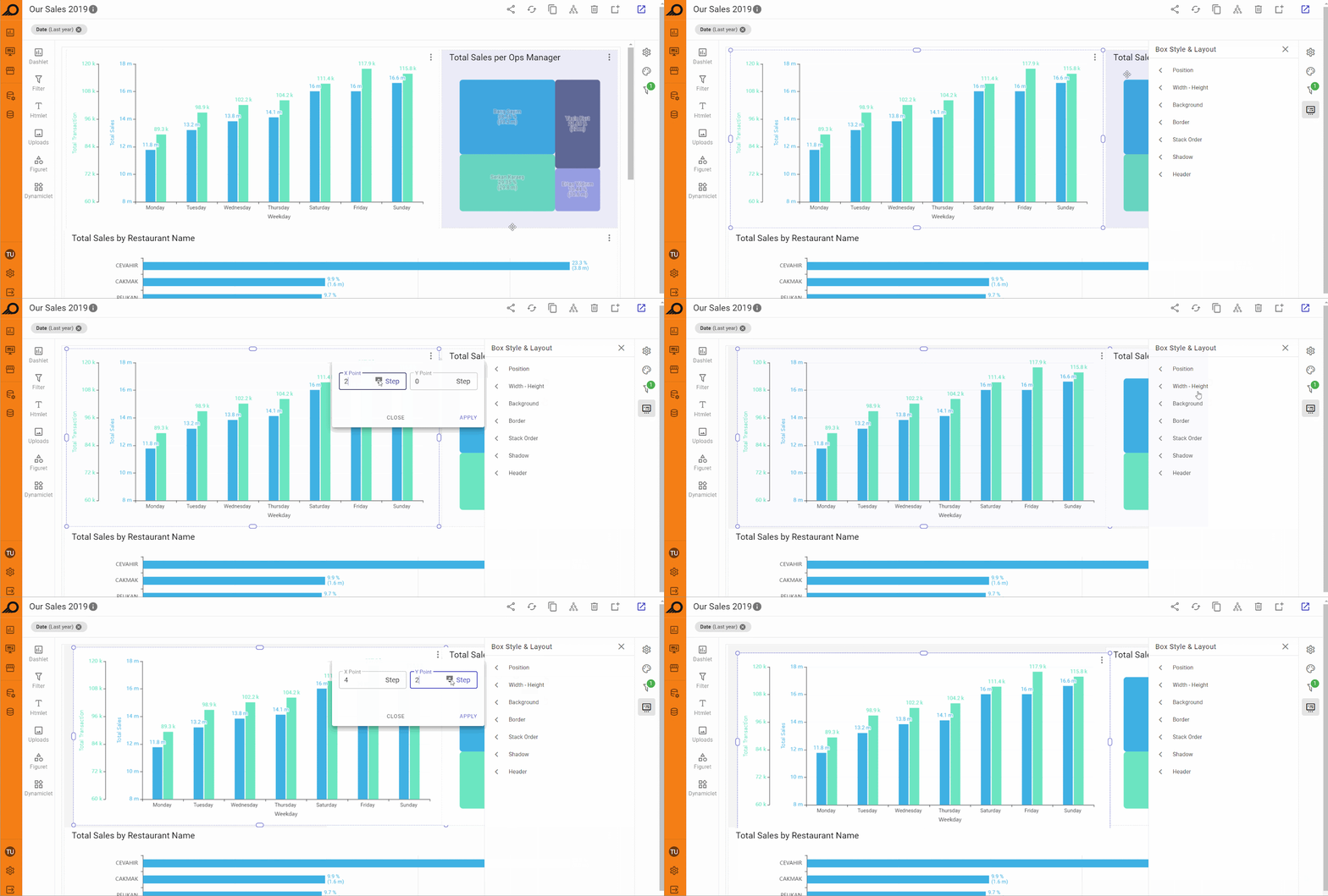
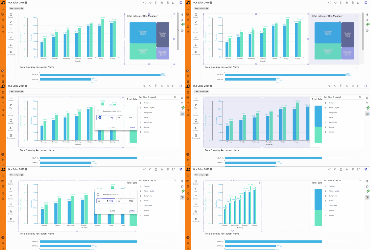
2 “Width - Height” options: using this feature, you can set the precise width and height of an element by entering their required values in the relevant fields. The maximum width of any element is 240 steps, which represents the full width of the dashboard. If a value greater than 240 is entered in the width field, it will automatically be adjusted to 240 steps. This limit ensures consistency in layout and design, helping to maintain proportionality across different dashboard elements, especially when precise control over element size is required.
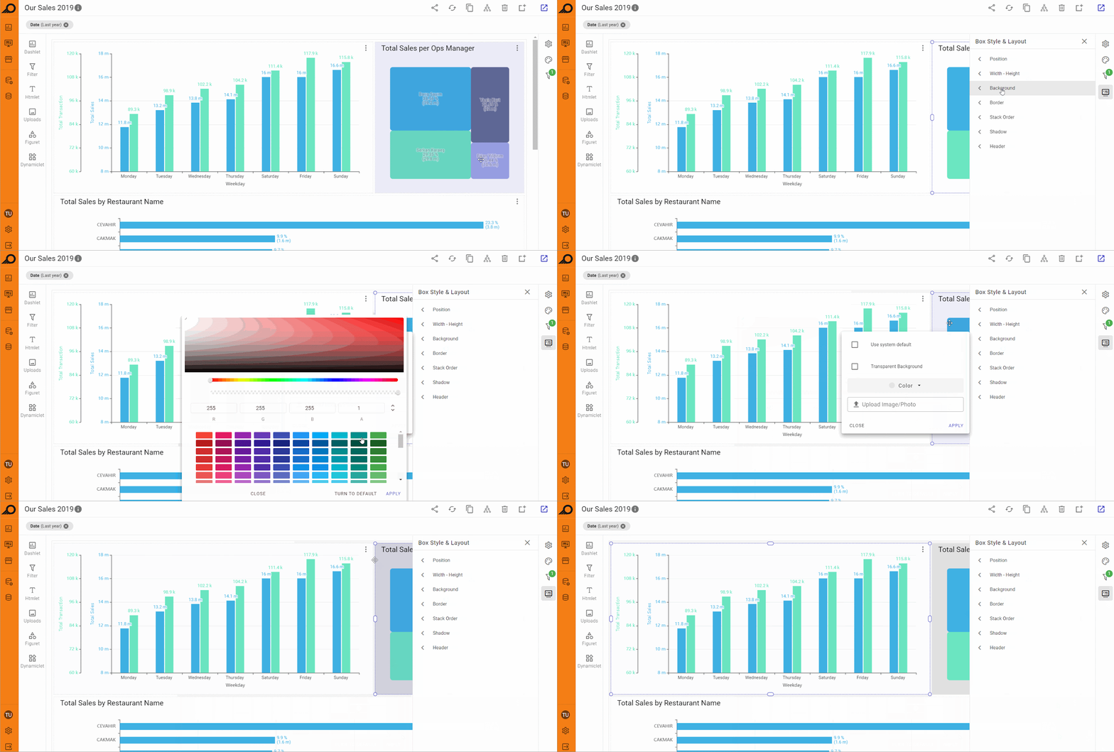
3 “Background” styling options: customize the background of the selected element by choosing from several options. You can use the system default background, select a transparent background, apply a solid color, or upload an image from your device to set as the background. This flexibility allows you to tailor the look and feel of individual elements to align with your dashboard's design and branding.
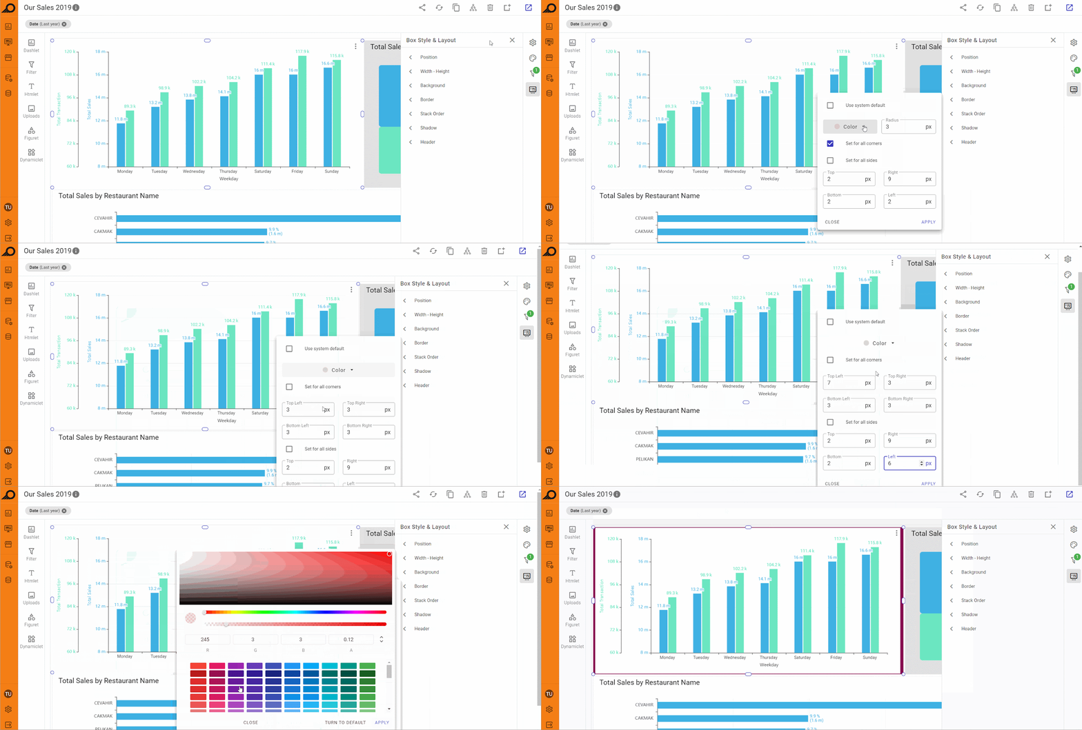
4 “Border” styling options: this feature allows you to add a border around the selected element and adjust its color, thickness, and corner radius. You can apply different styles to each side of the border (e.g., different colors or thicknesses), or use a uniform style for all sides. Additionally, you can set whether the corners should be sharp or rounded, allowing for greater customization of the element’s appearance.
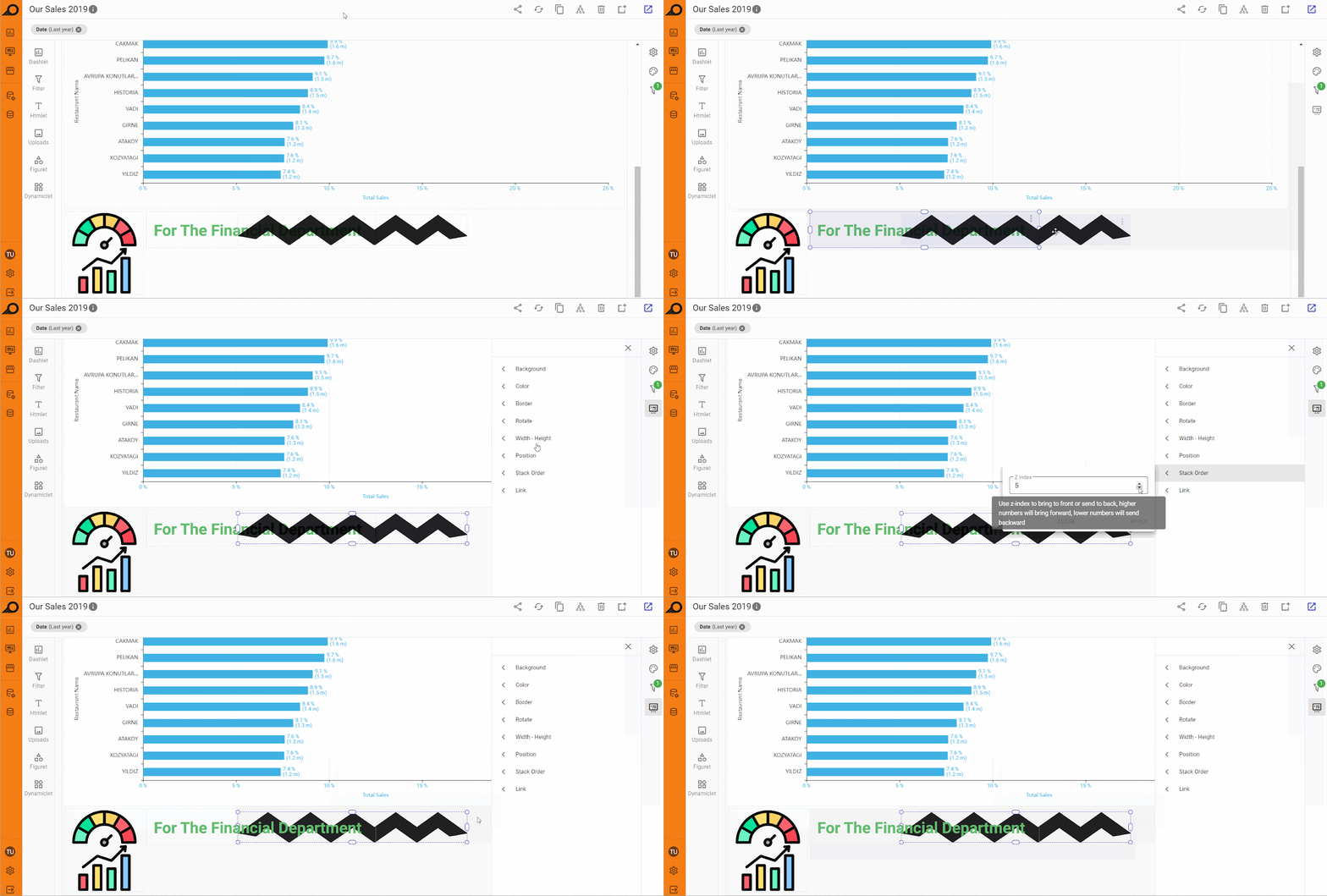
5 “Stack Order” options: when this option is selected, the “Z Index” field appears in the side pane. This setting controls the layering of the element relative to others. A higher Z Index value brings the element to the front, while a lower value pushes it to the back. This is especially useful when dealing with overlapping elements, transparent images, or backgrounds, ensuring the correct layering and visibility of important content.
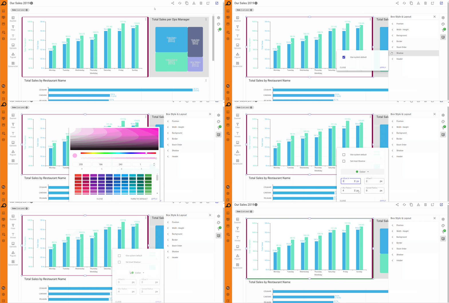
6 “Shadow” styling options: the shadow options pane includes two checkboxes: “Use system default” and “Set Inset Shadow”. If the “Use system default” box is unchecked, users can manually adjust the shadow settings. This includes selecting a shadow color and adjusting parameters such as Offset X, Offset Y, Blur Radius, and Spread Radius (all in pixels). These controls give you detailed customization over the shadow effect, allowing you to enhance the element’s appearance and depth.
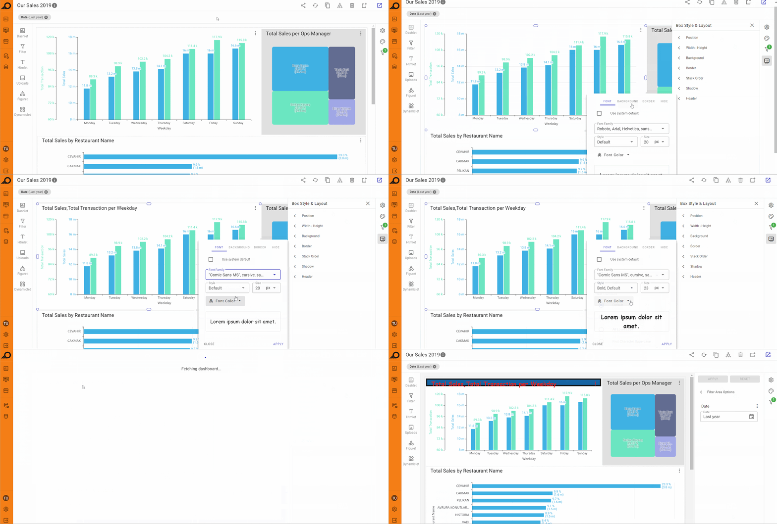
7 “Header” styling options: this option primarily applies to elements like dashlets that have a title or header. Users can customize the font color, size, and style of the title, and also adjust the border around the header in terms of color, thickness, and corner radius. Additional background options for the header include choosing between transparent, system default, or a solid color. A checkbox is also available to toggle the visibility of the header.
Dashlets Settings Inside Dashboards
Dashlets that are added to the dashboard can be managed through the ellipsis menu available at the right-top corner of the dashlet area. Users can apply several actions on the dashlet as below:
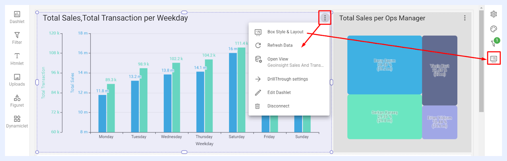
1 Box Style & Layout: when selected, it opens the “Box Style & Layout” pane at the right side of the Dashboard “Edit” window.
2 Refresh Data: when selected, it will refresh the data cache for the relevant dashlet.
3 Open View: when selected, it opens the related view edit window to allow the user to edit the nodes and manage the settings of the relevant view.
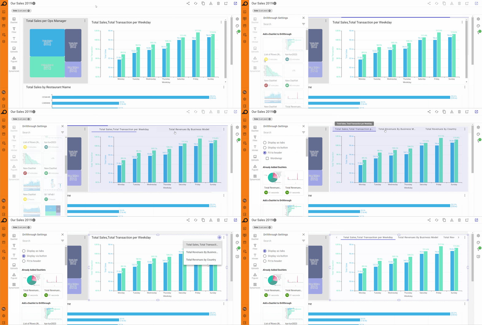
4 DrillThrough Settings: when selected, it allows applying horizontal leveling and grouping several dashlets horizontally together either as tabs with the option to fit them all on the dashlet header, or navigating between them using a clickable arrow button, or as a drop-down list at the right-top of the main dashlet area. DrillThrough is generally preferred if your dashboard has multiple dashlets and looks vertically too long or requires much scrolling or has multiple pivot tables. When applied, all the added dashlets will appear at the top of the relevant dashlet and viewed by navigating between them as tabs or using the arrow button to open them as a drop-down menu.
5 Edit Dashlet: when selected, the dashlet edit window opens to allow the user to edit the dashlet if required.
DISCONNECT button: to remove the dashlet from the dashboard.
When a dashlet has dynamic measure(s) configured, each dynamic measure has its own Settings Menu (accessible via the ellipsis icon on the dashboard). From this menu, designers can configure measure-specific limitations (min/max value ranges), axis title position, and a non-default chart type for that specific measure independently.
Designers can also add a configurable Action Button to any dashlet's ribbon on the dashboard. The button can link to another dashboard, a showcase, or an external URL, with options to transfer the current filter state to the destination and to open in a new tab.
Dashboards for End-Users
Benefits and Features
TURBOARD dashboards serve as a crucial tool for businesses to efficiently analyze data. As the primary interface for end-users to access, comprehend, and use business data, they expedite the decision-making process.
The end-user dashboard provides various navigation options and quick action function buttons and icons to enable users to:
-
Quickly navigate to the desired data with minimal clicks, promoting ease of use and understanding.
-
Customize the data by using filters and drill-down, selecting and modifying the chart type, or utilizing the cloning feature.
-
Facilitate communication and sharing of data across different departments, mediums, and users, fostering collaboration towards a common objective.
-
Offer real-time insights into the data with the capability to refresh and update it as needed.
How to view a Dashboard in TURBOARD?
1 From the “Navigation Sidebar Menu” > Click on Dashboards.
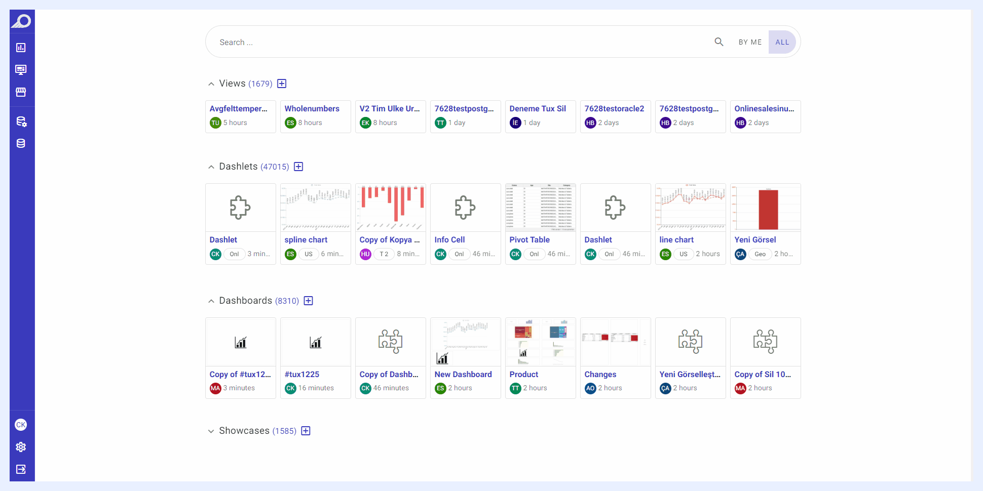
2 The dashboards’ listing window will open where all the shared dashboards with the end-user will be listed in boxes or cards. Click on the required dashboard to open its view mode or click the dashboard’s ellipsis menu and select View option.
3 Alternatively, you can access the dashboards’ listing window from TURBOARD “Start Page”.
Note
Designer users (with “Edit” access) can directly view the dashboard by clicking the View dashboard icon in dashboard “Edit” mode. Additionally, when a designer user clicks on the dashboard from its listing view window, it will open it directly in “Edit” mode instead of “View” mode.
Below are several actions that end-users can utilize on the dashboard to streamline navigation, gain insights, and customize data in accordance with their analysis and business needs.
Dashboard Filters
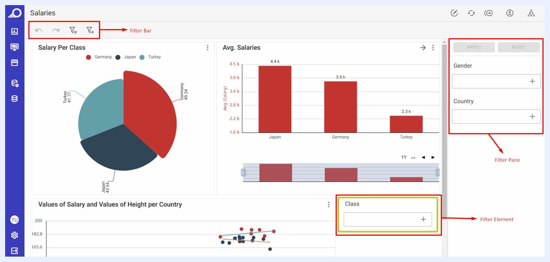
Designer users can customize the filters and how they are displayed to end-users. Those filters may appear to end-users as:
Right/Left Side Filter Pane: end-users can select the required filter/s > click SEARCH button. Alternatively, RESET button will remove the applied filters to allow the user to start new filtering.
Left-top Filter Bar: end-users can click Add Filter icon > select the required filter/s > click APPLY button. Other available icons allow users to Reset and remove the applied filters, navigate through the previously applied filters through the Undo and Redo icons.
Filter Element on the Dashboard’s PG: end-users can click + icon on the filter element > select the required filter/s > click APPLY button. To remove the applied filters, users can click X icon.
Note
when a user applies filtering using the Filter Pane, the resulting search can be saved for the user as a personal bookmark that can be accessed by the same user any time by clicking MY SAVED SEARCHES button.
End-users can add multiple dynamic measures and dimensions to a dashboard using the ADD + capability without designer intervention. Multiple measures can be layered side by side for comparison, and additional dimensions can be added to pivot tables as rows or columns, turning the dashboard into an ad-hoc report builder for exploring data from different angles.
Dashboard Quick Actions Ribbon
At the top-right side of the dashboard “View” window, several icons are available to apply general actions directly on the dashboard.

| Dashboard View Action Icons Explained | |
|---|---|
| JAS Explain: | analyzes the dashboard or individual dashlets and generates a natural-language narrative of the data. Three built-in AI Personas are available — Action-Oriented Manager, Strategic Executive, and a customizable persona — each producing a different explanatory style suited to the audience. |
| Add a clone: | the “Clone” feature is TURBOARD’s patented solution to easily compare changes in dashboards’ visualizations by presenting these changes side-by-side with synchronized vertical scrollbar only (no horizontal scrolling). By cloning a dashboard vertically within the same interface/medium, it significantly eases the process of comparing the changes on different criteria and directly exploring the effects of different filters. End-users can create up to 4 clones and analyze the data with different filter settings in each one. When a clone is added, an icon to Remove it automatically appears next to the Clone icon. Note that in order to clone a dashboard, at least one filter must be added to the dashboard. |
| Edit: | to open the dashboard in “Edit” mode to modify its elements, designs and settings. This option will appear to users whose dashboard is shared with them with “Can Edit” privileges only. Viewer users will not be able to edit the dashboard but only view it. |
| Refresh dashboard and dashlets data cache: | to update the data displayed on all the dashboards of the showcase and their components (dashlets) by reloading the temporary storage location (cache) where data is stored. |
| Change theme: | to modify the color palette and overall appearance of the dashboard and use a different theme than the default applied for TURBOARD's general elements and designs, and/or the theme selected by the designer. This customization option allows you to view your dashboard according to your preferences. |
| Export: | end-users can export the whole dashboard as PDF, Excel, Word, or PPT (Presentation) or send it to a recipient via the “Send to E-mail” feature. The format(s) and the export options that are allowed for end-users are determined and configured by the dashboard’s designer. The exported formats are designed to best suit the needs of users. For example, when exporting the dashboard in Excel format, the auto-generated Excel file will be named according to the dashboard name and the applied filters (if any). Its first sheet will have the dashboard’s URL link and a list of the applied filters. When the dashboard is exported via “Send to E-mail” option, the default recipient e-mail address will be that of the user and can be changed to any other e-mail address, the dashboard will be attached as a PDF file in the sent e-mail, and the e-mail design will be according to the configurations and settings in “Administration” > “Other Settings” > “SMTP Settings”. |
| Share meta info: | when clicked, a pop-up window opens listing the related data source(s), the view(s) of the dashlets added to the relevant dashboard, in addition to the showcases where this dashboard is added to. These elements are also clickable to allow the user to navigate directly to them. It can also be accessed from the dashboard ellipsis menu in the dashboards’ listing window, namely the “Meta Info” option. This option will appear to Designer users only. |
Dashlet Options for End-Users
End-users can also apply several actions on the dashlet level. These options are available though the dashlet’s ellipsis right-top menu.
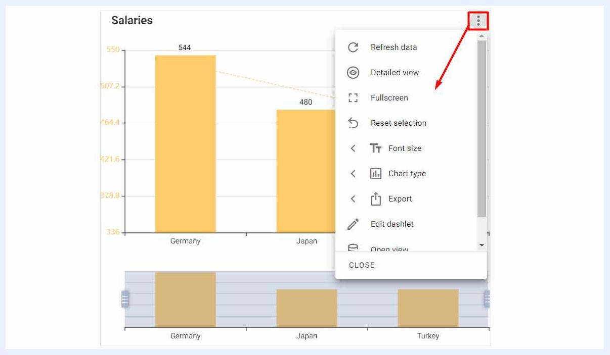
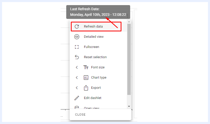
Refresh data: to update the data of the selected dashlet by reloading the temporary storage location (cache) where data is stored. On hover, the last refresh date and time are displayed to users.
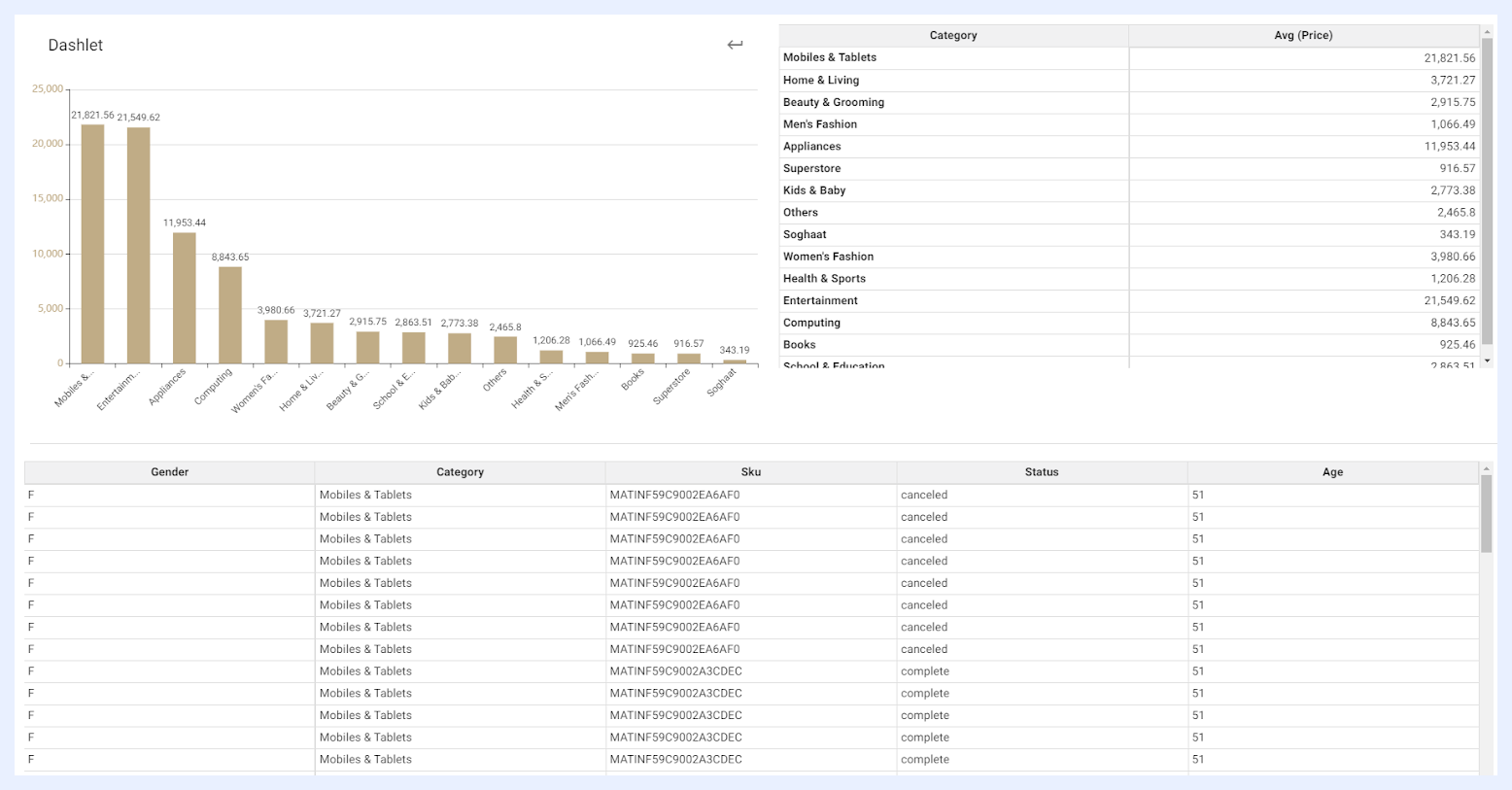
Detailed view: when selected, the dashlet will open in a new window showing its detailed table according to its relevant view, the pivoted table with the default datacells, and the original dashlet (chart, gauge, info cell, map or PT).
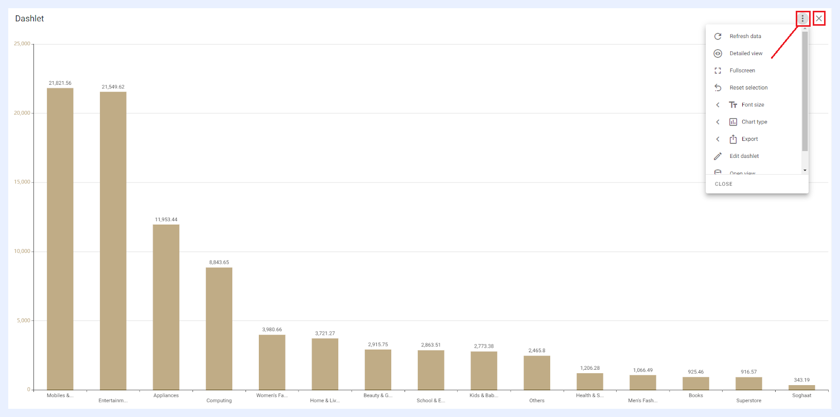
Fullscreen: when selected, the dashlet will open in a mode that covers the entire screen, replacing the current dashboard. To return to the dashboard, the user can close the dashlet window using the X icon button. The ellipsis menu will also be available to the user in the fullscreen mode.
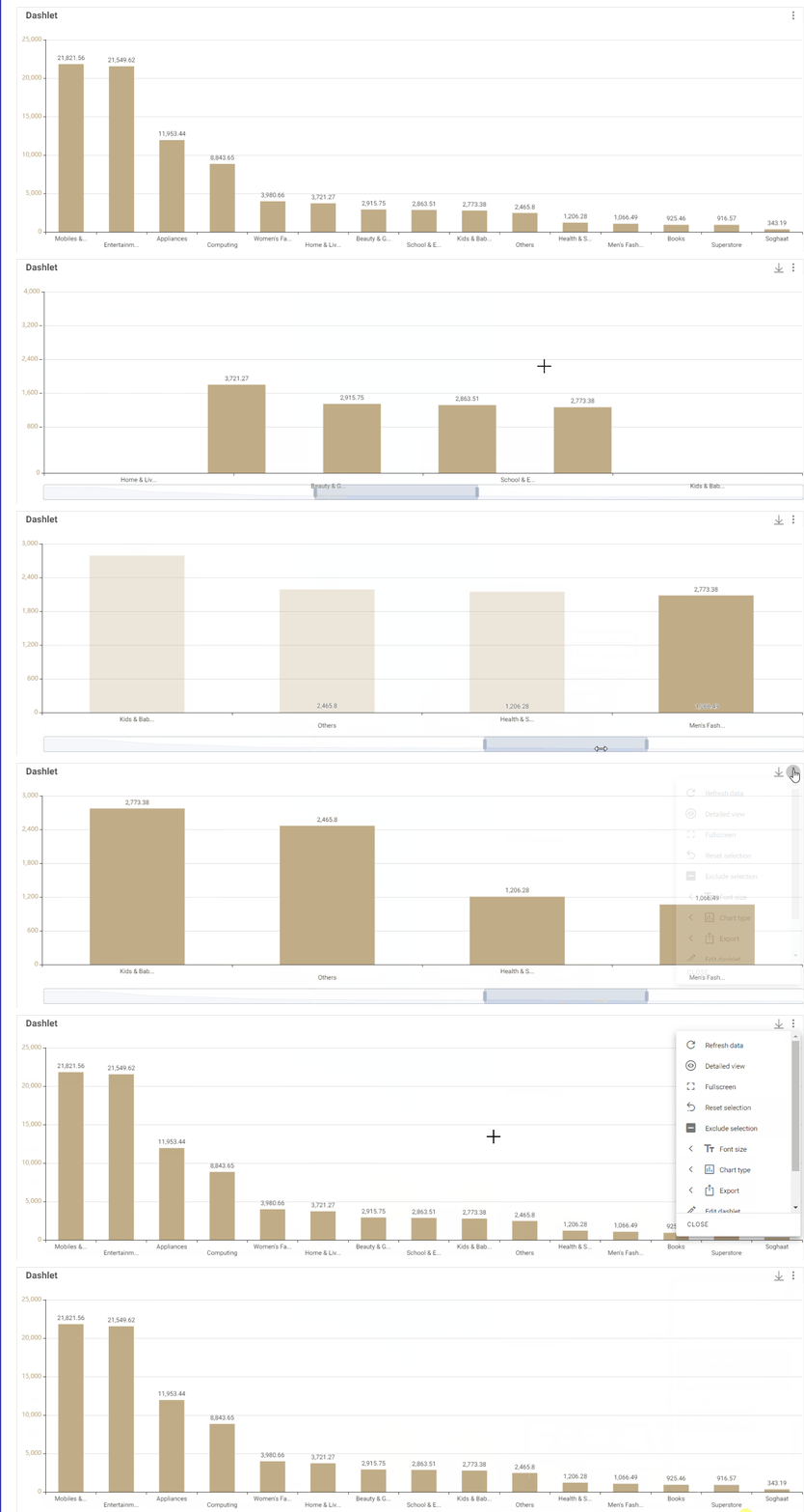
Reset selection: if the end-user has made a selection on the dashlet, using this option allows resetting the selection to the default.
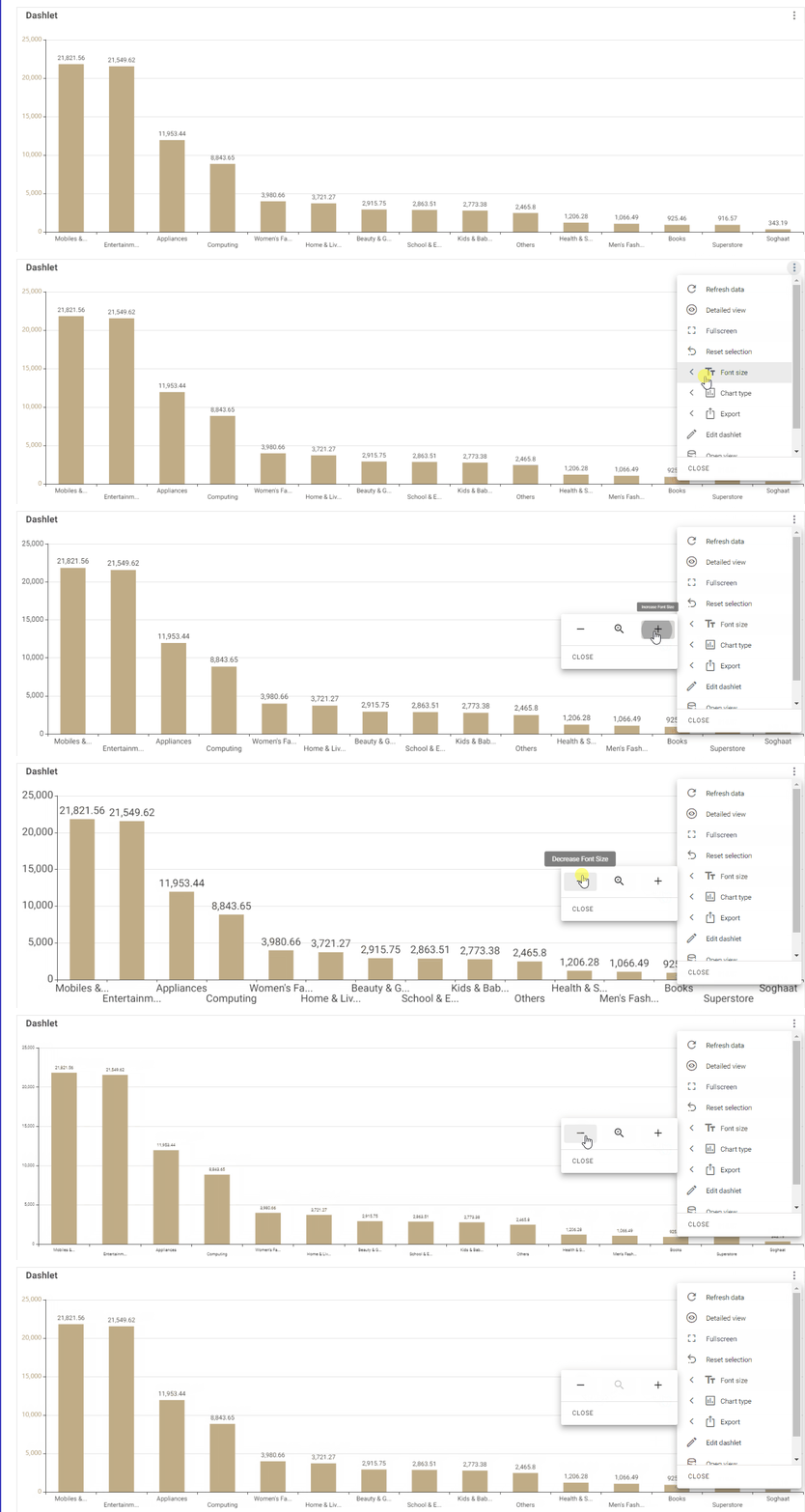
Font size: end-users can manipulate the font size of all the texts of the relevant dashlet using this option. You can enlarge or reduce the font size and reset it as needed.
Export: end-users can export a single dashlet (not only the whole dashboard) in different file formats and can print it out as well. The format(s) and the export options that are allowed for end-users are determined and configured by the dashboard’s designer.
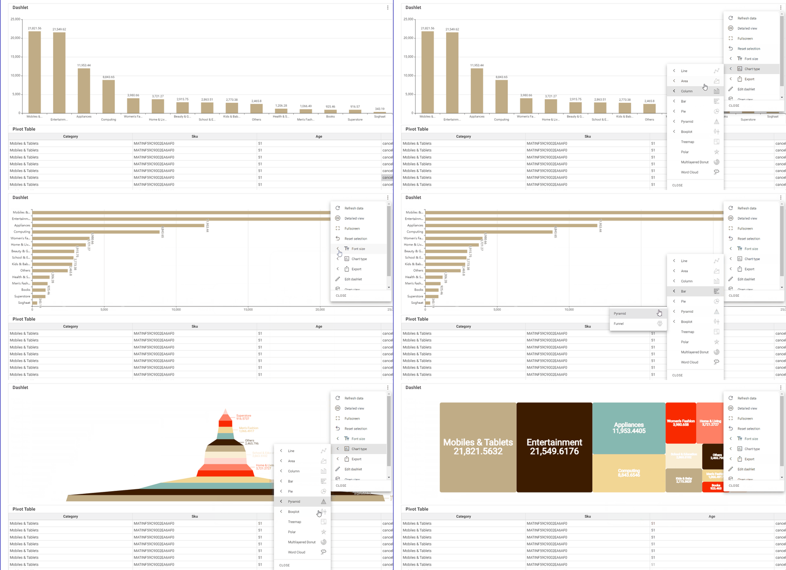
Chart type: using this option, end-users can directly change the chart type in the UI without affecting the original dashlet type for other users. End-users may realize that a certain chart may not be the best one to visualize its data. For example, a pie chart with data labels may not fit the specified area well. In this case, users may try other options and explore other types of charts in the UI directly with a click of a button. The changes made in the UI are not saved, and only that user can see the updated charts. This feature is only available for dashlets of type “Chart” and will not appear in the relevant ellipsis menu for other dashlet types.
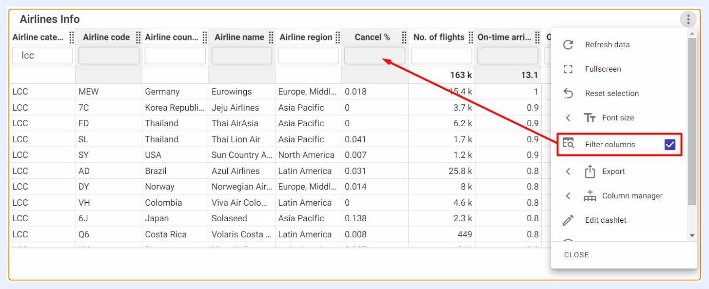
Filter column: when selected, it allows the user to filter the results in unpivoted table dashlets using search filters for each column in the table. This feature is only available for dashlets of type “Pivot Table” and will not appear for pivoted tables nor in the relevant ellipsis menu for other dashlet types.
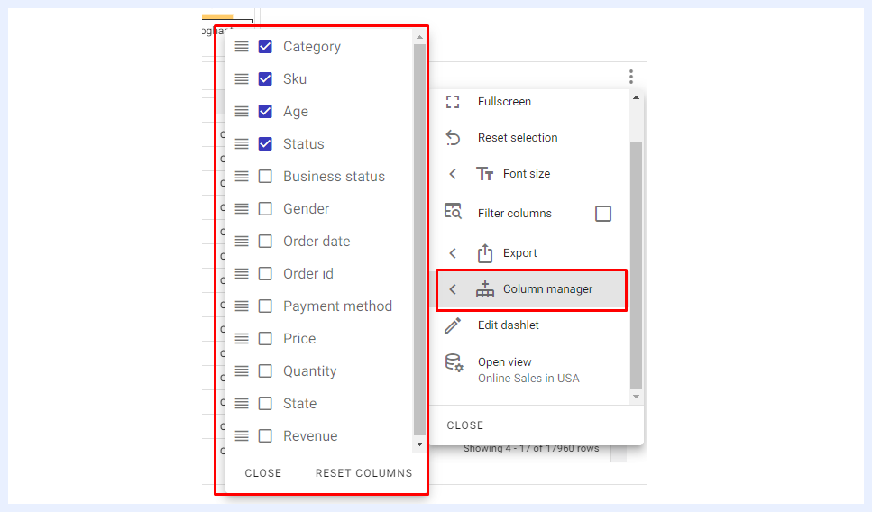
Column manager: to remove some columns from unpivoted table dashlets if needed. This feature is only available for dashlets of type “Pivot Table” and will not appear for pivoted tables nor in the relevant ellipsis menu for other dashlet types.
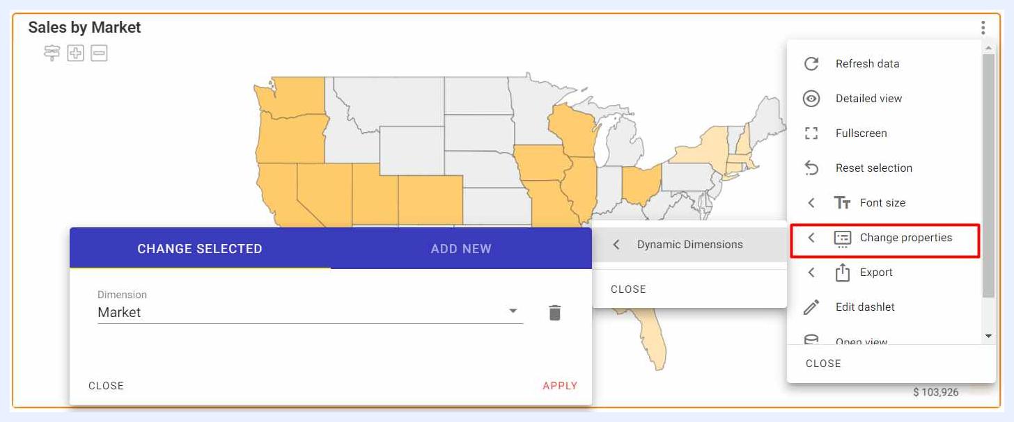
Change properties: using this option and if a regional map dashlet has Dynamic Measure(s) and/or Dynamic Dimension(s), end-users can change these nodes directly in the UI without affecting the original dashlet for other users. This feature is only available for dashlets of type “Regional Map” and will not appear in the relevant ellipsis menu for other dashlet types.
Edit dashlet: to open the dashlet in “Edit” mode to modify its elements, designs and settings. This option will only appear to users whose dashlet is shared with them with “Can Edit” privileges.
Open view: to open the relevant view in “Edit” mode to modify its nodes, data tables and any other required settings. This option will only appear to users whose view is shared with them with “Can Edit” privileges only.