Dashlets
Dashlet Types
A “Dashlet” is a unit/component of visualization and/or functionality. It can be a chart, a pivot table, an SVG or a GIS map, an info cell or gauge. Dashlets are at the heart of the whole process.
When Designer users create dashlets, they will be listed and displayed to authorized users under “Dashlets” section and they can be edited and/or shared with other users through the dashlet’s ellipsis menu – according to users’ permissions. This also allows designer users to add the dashlet to their dashboards and/or work on its design as a team.
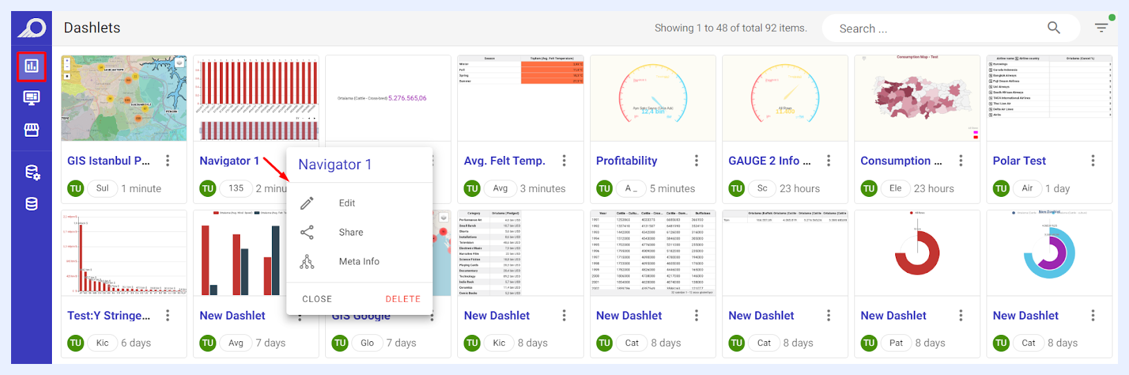
TURBOARD has 5 dashlet types where each presents the data in a different form. Some dashlet types are data dependent. For example, the GIS map requires a geospatial or latitude-longitude field(s).
Chart Dashlets
When creating a chart, its default will be a column chart with its measure as the count of the rows of the table.
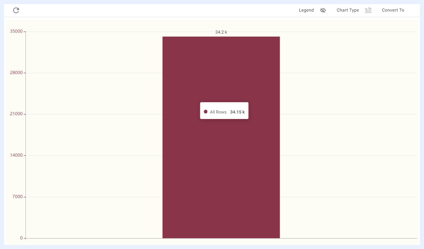
TURBOARD has a rich library of charts that can be used to display data in various ways.
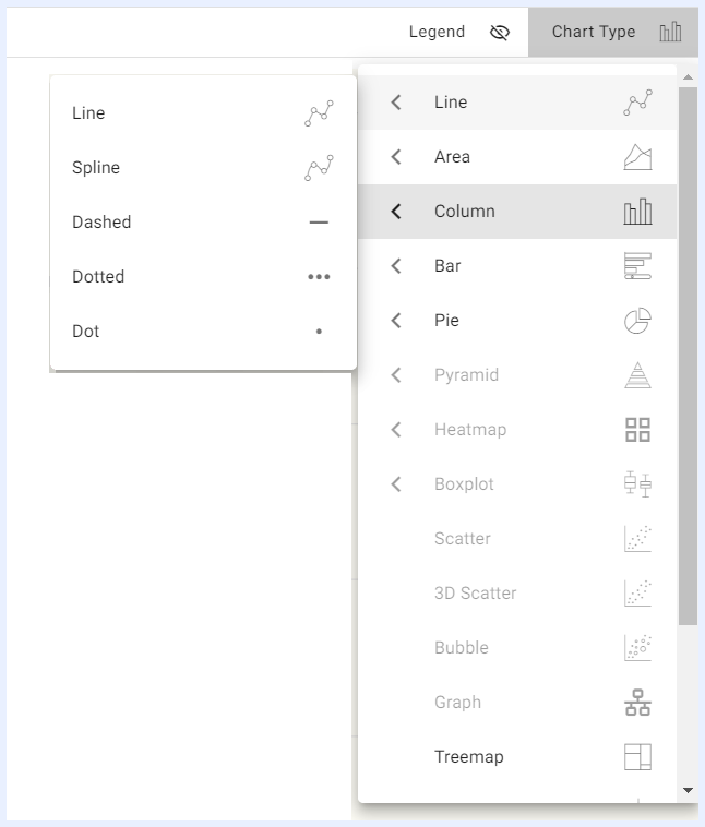
One of the features of TURBOARD is that users can change the chart type directly in the playground section of the platform while working on their dashlet.
When a user selects the required dimension(s) and measure(s), TURBOARD will automatically activate the appropriate chart type or types based on the number of dimensions and measures that have been selected. This helps users choose and find the chart type that works best for their data.
Pivot Tables
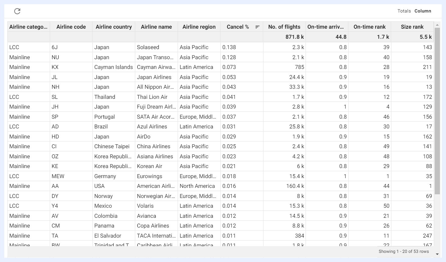
Pivot tables are a type of table that allows users to summarize and analyze large amounts of data by grouping, sorting, and filtering it in various ways.
In a pivot table, data can be presented in a tabular form that is organized into columns and rows, with each cell representing a specific data point. Pivot tables allow users to select both column and row dimensions separately, and these dimensions can be grouped together in various ways to create different views of the data.
One of the key advantages of pivot tables is that there is no limit on the number of dimensions or measures that can be used. This allows users to analyze complex datasets with many variables and to create custom views of the data that best suit their needs.
While charts visualize data in a graphical format, pivot tables organize data in a tabular format, allowing for more detailed analysis and manipulation of the data. Pivot tables allow data to be viewed in a different layout by changing the rows and columns, making it easier to see relationships, totals, averages, percentages, and other summarized information in large data sets.
Info Cells and Gauges
Info cells are often used in dashboards to provide at-a-glance summaries of key metrics or performance indicators, and can be customized to show different colors, fonts, and other visual elements to make them more visually appealing and to help the user quickly identify trends or patterns in the data.
An info cell is a small, rectangular-shaped box that contains a single metric or value, along with some visual indication of whether the value is good, bad, or neutral. The metric or value displayed in an info cell can be a number, a percentage, or some other type of measure, depending on the needs of the dashboard user.
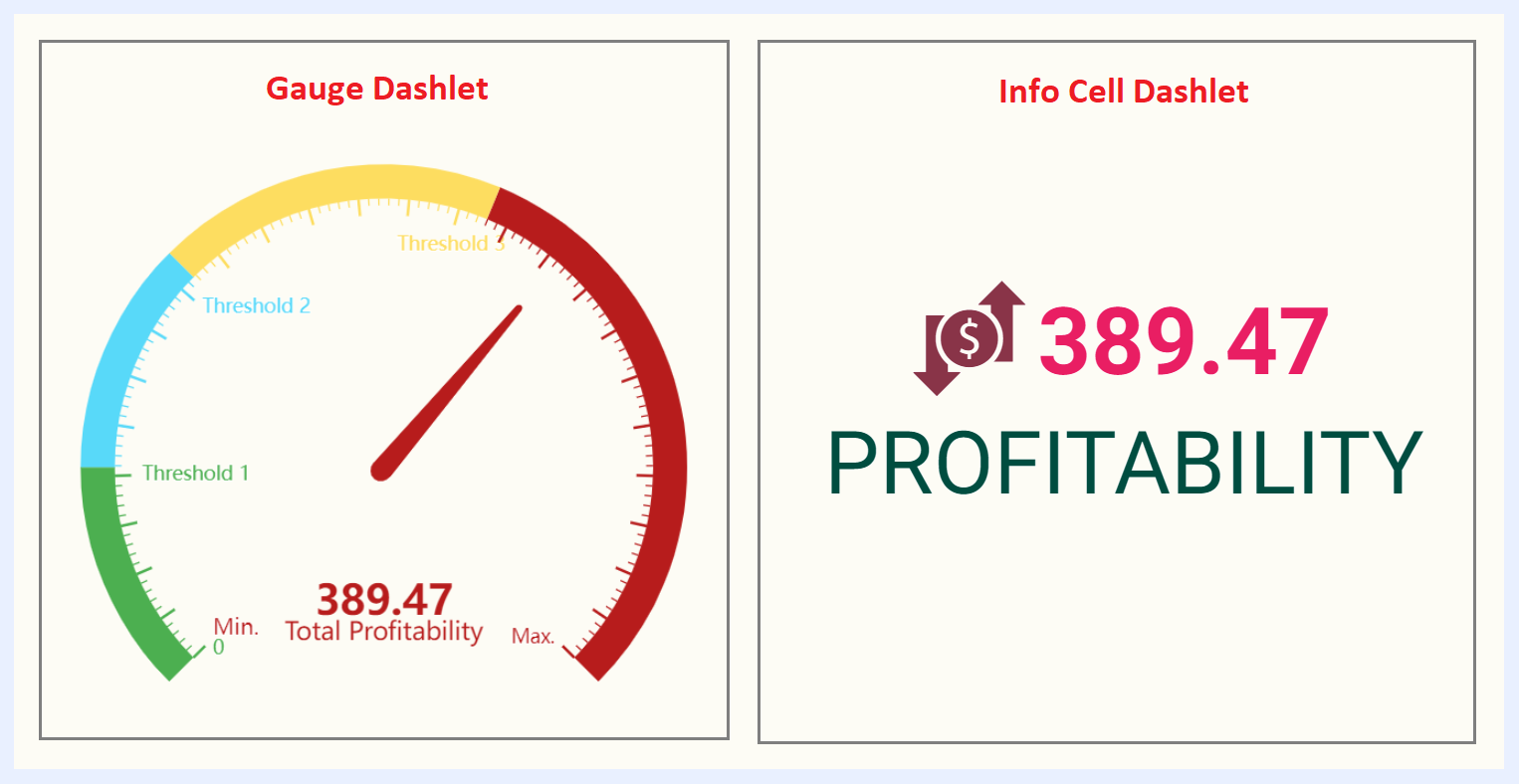
In TURBOARD, an info cell can be converted into a gauge, which is a circular or semicircular dial that is divided into segments or zones, with each segment or zone representing a different range of values. It has a pointer or needle that indicates the current value of the metric being measured. The pointer or needle can be colored or otherwise highlighted to draw attention to values that are outside of normal or expected ranges.
Gauges are often used in dashboards to display metrics such as speed, temperature, or progress towards a goal. They are typically designed to be simple and easy to understand at a glance, with clear indicators of whether the metric is in a good or a bad range.
Info Cell and gauge dashlets can be customized in TURBOARD in various ways to suit the needs of the dashboard user in the dashlet playground (PG) sections.
Regional (SVG) Maps
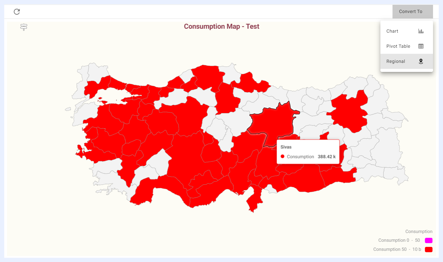
Regional maps are useful in data visualization when you have location information but not specific coordinates (latitude and longitude) or a defined boundary (polygonal region information). They are displayed using SVG (Scalable Vector Graphics) technology, which allows for interactive features such as hover-over tooltips, clickable regions, and other visual elements.
By using a regional map, you can create dashboards or other data visualizations that compare different territories or regions within a dataset as it allows you to create an interactive map dashlet.
For example, if you have a dataset with energy consumption information broken down by state, you could use a regional map to display the consumption data for each state as a color-coded heat map. Users could then interact with the map by hovering over individual states to see more detailed information about the consumption in that region.
Note
The SVG maps that are needed for your data visualizations are uploaded and configured in TURBOARD in “Administration” > “Maps” > “Regional Maps” section.
Geographical (GIS) Maps
A GIS (Geographic Information System) map is a digital map that uses layers of data to represent geographic information. It can include information such as roads, buildings, land use, and demographics, and can be used in an interactive way for analysis, and decision making. It is a toolset for visualizing and analyzing geo-spatial data by showing data points in exact locations using visualizations that are most suited to a map.
To visualize data using GIS in TURBOARD, an add-on module called (GIS-S) is required. This means that only TURBOARD clients who have purchased the GIS-S module will be able to use the “Geographical” dashlet types to create and analyze their data.
Note
GIS maps and basemaps that will be used by designer users to overlay the data points when working with geographical dashlets are configured in “Administration” > “Maps” > “GIS Maps” section.
Visualization Types on Geographical (GIS) Maps
1. Clustered Pin Map:
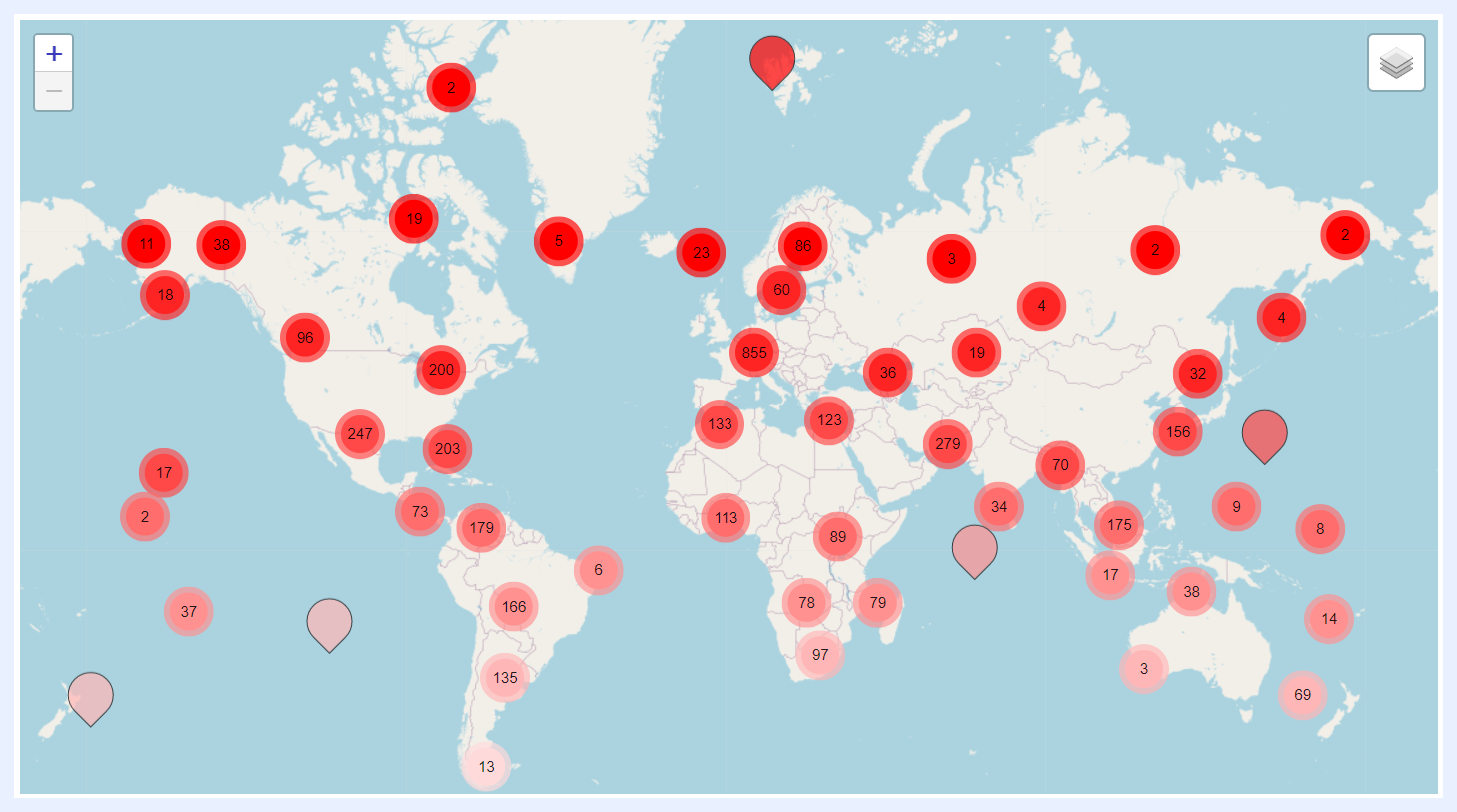
Shows clusters of data points densities that are located in close proximity to each other as pins. This can be useful when there are a large number of data points on the map and it becomes difficult to distinguish between individual points.
It also allows displaying different types of data on different layers within the map (using basemaps). For example, one layer might show the locations of retail stores, while another layer shows the population density in the surrounding area. By layering different types of data, it becomes easier to see patterns and relationships between different variables.
2. Heat Map:
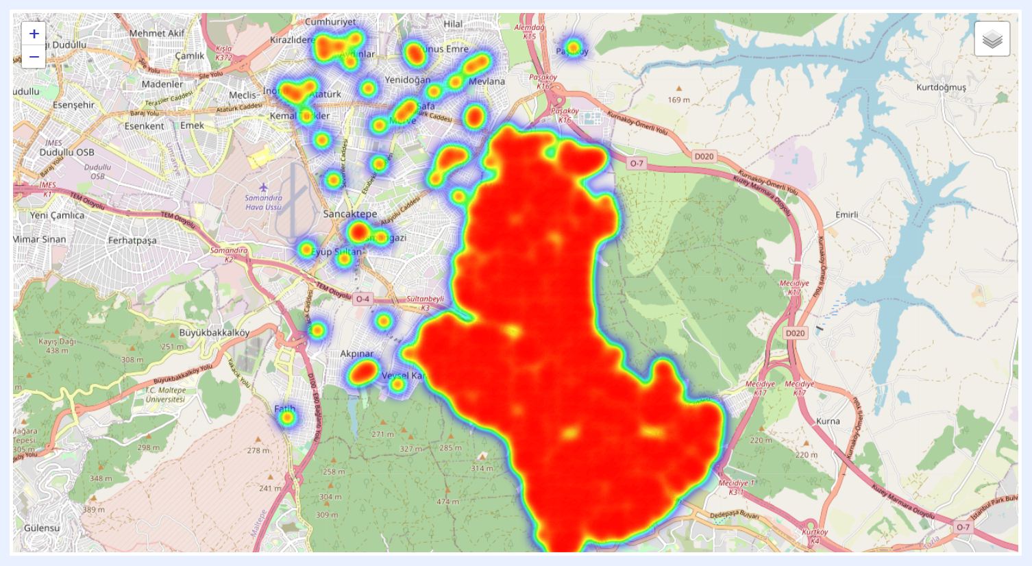
In a Heat Map, areas with high data density are represented by warmer colors, such as red or orange, while areas with low data density are represented by cooler colors, such as blue or green.
Heat Maps are particularly useful for displaying datasets that have a large number of data points distributed over a geographic area. By using color to represent data density, a Heat Map can provide a quick visual summary of where the data is concentrated and where it is more sparse.
How to Create a Dashlet?
1 From the “Navigation Sidebar Menu” > Go to Dashlets > click + Create New Dashlet.
2 An overlay window will open. Select the dashlet type from the available options (Chart, Pivot Table, Info Cell, Regional, or Geographical).
3 Select the related view from which the dashlet will be created. All added views will be listed under “Select View” drop-down menu.
4 Give a name to your dashlet in “Title” field. Alternatively, you can leave it empty and click Auto dashlet title icon button.
5 If needed, enter a “Description” for the dashlet and/or a “Tag” in the relevant fields. Tags are useful for organizing and searching for content, as they allow you to quickly filter and find items that have been labeled with the same tag. When you label dashlets with specific keywords or terms, it will help find those dashlets grouped upon “Search” in their view listing main page.
6 Click CREATE button. Your dashlet will be created and opened with its playground so you can configure its settings.
Alternatively, dashlets can be created and edited through JAS by describing the visualization in plain language from the JAS pane. JAS generates the dashlet and opens it in the playground for review, where follow-up commands can refine the chart type, sorting, or other settings. Multi-step commands are supported in a single prompt.
Note
Make sure to review the configurations and settings of your selected view before creating your dashlet. This includes checking the aliases, setting custom colors, changing formatting options, and more. For instance, if you plan on creating a “Regional” dashlet that displays geospatial data, it's important to configure the map settings in advance.
Dashlet Playground (PG) Sections
The page where the dashlet is configured (add/edit mode) is called the playground (PG) in our terminology.
There are several layers to configure the visual on the PG where these layers generally share the same location and general features in the PG for all the 5 types of dashlets as below. Some features and settings are specific to certain types of dashlets than others. I.e. they will appear on the playground of the related dashlet type only, or they have different functionalities according to the dashlet type.
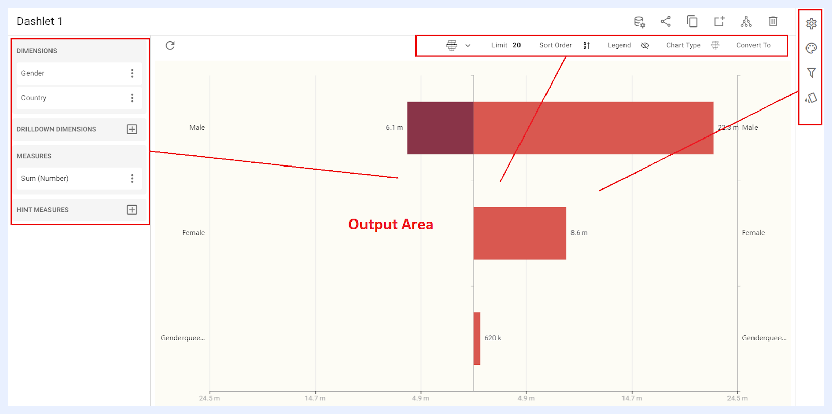
The shared sections that have common functions for all dashlet types are: Output Area, Quick Action Ribbon, and Dashlet and Playground Toolbar.
Other sections that have chart type-dependent features and functionalities will be demonstrated according to each chart type, and they are namely: Nodes Pane, Dashlet Settings and Configuration Panel (Settings, Styling, Filters and Conditional Formatting).
What is the Nodes Pane in Dashlet PG?
Nodes Pane is the section located on the left side of the PG, where the nodes of the view are listed as dimensions, measures, datacells in addition to the custom-added expressions. They are grouped according to the node types as determined in the view and according to the dashlet type.
The user can add a node to the dashlet by clicking the + right-corner icon for the related node type then clicking ADD button for the selected node.
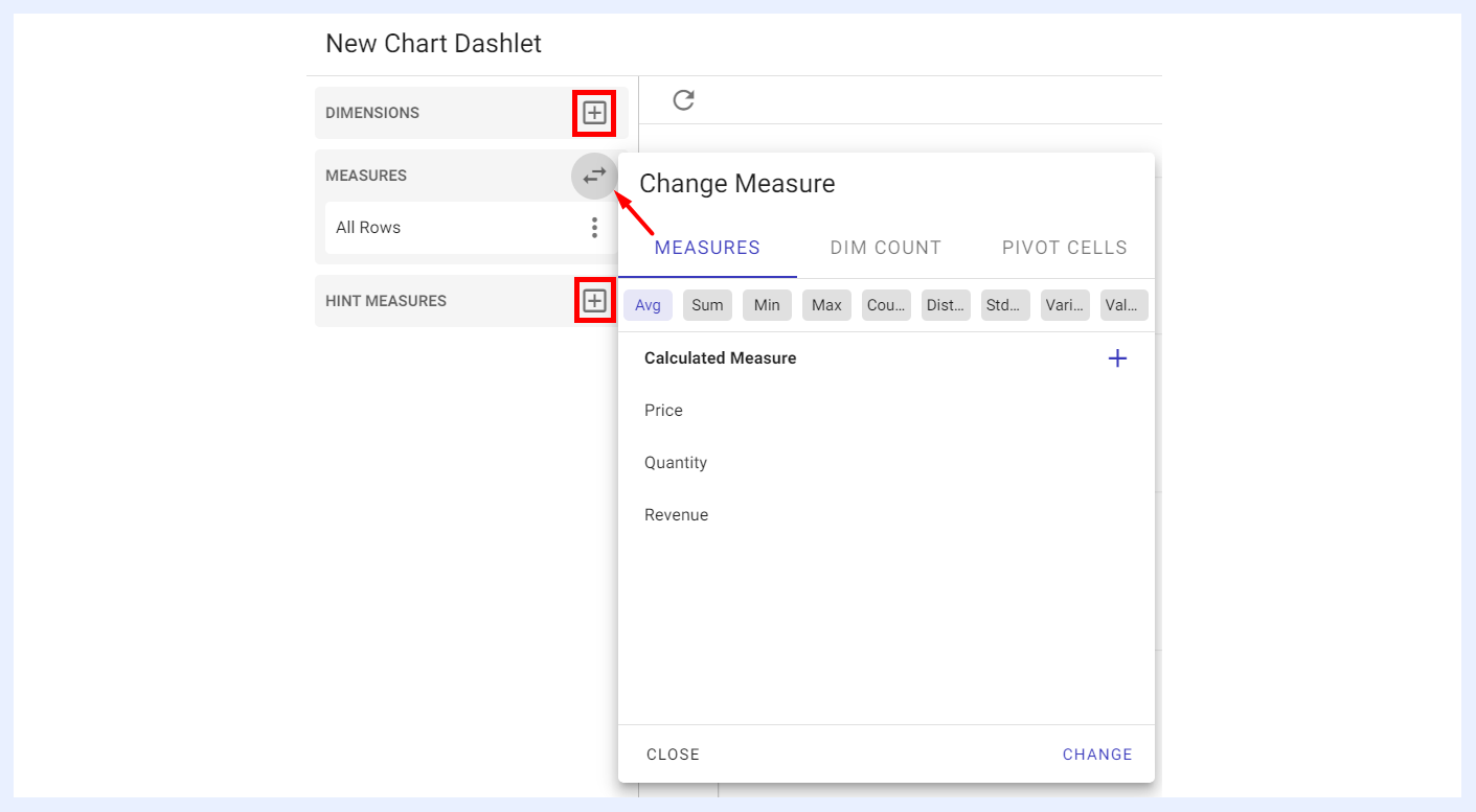
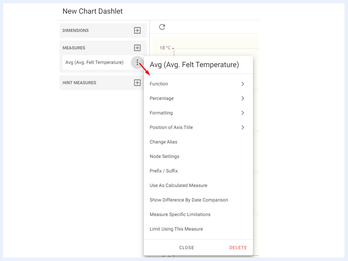
The added node(s) will be listed under “Nodes Pane” in which you can change its settings and edit its preferences by clicking the ellipsis menu for the added node. Those settings and preferences are dashlet type-dependent as well.
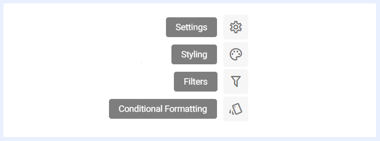
Settings and Configurations Menu Options
Dashlet Settings and Configurations are located as a panel at the right-side of the dashlet PG, a menu panel is available for all dashlet types to allow managing the dashlet’s advanced settings, changing its styling, design, and aesthetics, adding/editing filters and applying conditional formatting. Some of these settings and preferences may differ according to the dashlet type.
Settings Panel General Definition
“Settings” panel offers a set of configurable options available for each dashlet type within TURBOARD. These settings provide users with the ability to personalize and fine-tune the behavior and appearance of their dashlets according to their specific needs and preferences.
Each dashlet type comes with its unique set of settings, allowing users to control features such as auto-refresh behavior, highlighting specific data elements, applying logarithmic scales, and more. You can explore these settings in detail by referring to the explanations in the corresponding section dedicated to dashlet type settings.
Don't Show Without Filter: when enabled, the dashlet remains hidden until the required filter(s) are applied. An additional option, Show if Any Selected Filter is Applied, makes the dashlet visible as soon as at least one of the required filters is applied, rather than requiring all of them. This gives end-users more flexibility when querying dashlets with multiple required filters.
Styling Panel General Definition
TURBOARD offers flexibility and customization options available for chart dashlets' styling and appearance. By default, all dashlets adhere to TURBOARD's styles and themes, ensuring a consistent look and feel throughout the platform. However, designers may have unique preferences, and we empower users to personalize their dashlets using the various customization options provided for each specific dashlet type.
To learn more about these options and how to leverage them effectively, refer to the detailed explanations in the corresponding section dedicated to dashlet type styling.
The font library available in dashlet styling includes many options organized into four categories — sans-serif, serif, monospace, and fantasy — with the most popular fonts listed first in each group for quick access. A safe fallback font is automatically applied if the primary font fails to load in the user's browser.
Filters Panel Definition & Settings
“Filter” panel contains all the nodes that were assigned as filters in the related view. The user can configure the settings of any selected filter as below.
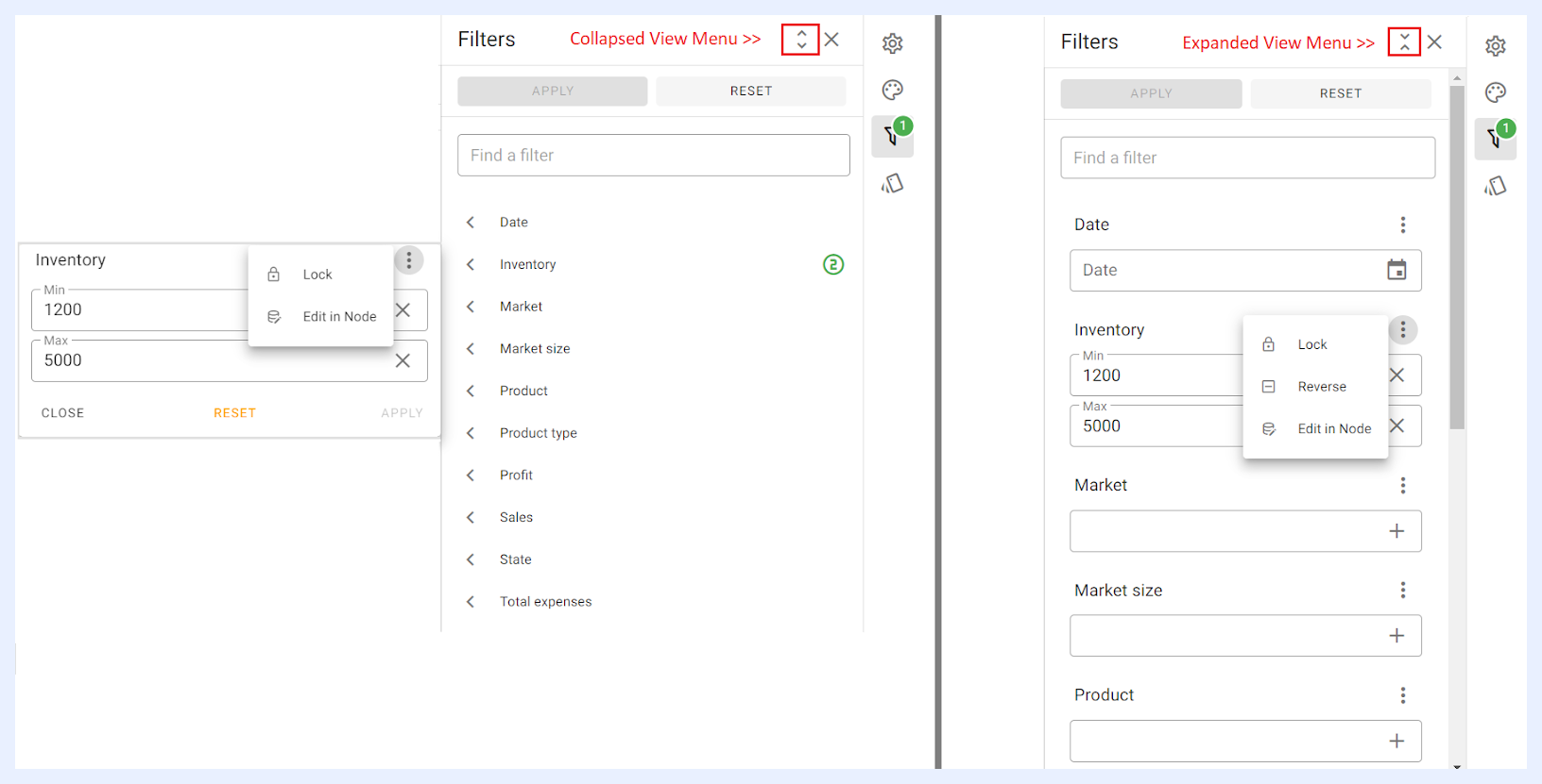
Lock: unless the selected filter is locked, filtering does not affect the dashlet at the end-user side. Locking a filter will result in displaying the dashlet with that filter applied wherever it appears in the related dashboard(s) and/or showcase(s).
Reverse: once a value is selected and entered for the related filter, it can be reversed through “Reverse” option from the filter’s ellipsis menu. When “Reverse” is applied, filters in the resulting dashlet will be reversed, meaning they will be excluded from the displayed data instead of being used to filter the data. These reversed filters will be highlighted in red with a cross icon.
Edit in Node: if selected, it will open the “Edit” window for the node in its related view to allow the user to edit or change the settings of the filter if needed.
Filter value dropdowns use lazy loading (infinite scroll). As users scroll to the bottom of a filter list, the next page of values loads automatically, so values beyond the initial page limit can be reached without typing in the search bar.
Note
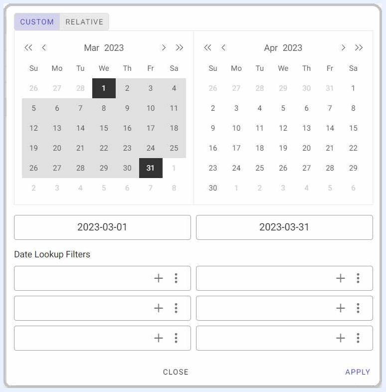
date filters can be configured with distinct filter inputs for different date and time units that will appear for the user to choose from in “CUSTOM” tab. In addition to predefined date shortcuts, users can customize date selection through the options available in “RELATIVE” tab as it allows the user to configure the date range (Start and End). See image below.
Conditional Formatting Panel General Definition
Conditional formatting is used to easily highlight certain values in the dashlet or make particular values easy to identify. End-users will easily notice the difference between the visualized values using this feature.
To learn more about how to configure the conditional formatting, refer to the detailed explanations in the corresponding section dedicated to each dashlet type.
Output Area
The output area is the result of the dimension(s) and measure(s) combinations – which differs according to each dashlet type. It interactively responds to the designer's selections.
There is no save or update button as all the actions are auto-saved. This means that whenever any setting is changed and/or a configuration is selected, the changes are automatically saved and directly applied to the resulting dashlet in the output area.
Quick Actions Ribbon
At the top-right side of the dashlet’s add/edit window, several icons are available to apply general actions on the dashlet. The quick actions ribbon is available for all dashlet types, and always available at the same location.

| Dashlet Quick Action Icons Explained | |
|---|---|
| Edit data view: | to go to the “View” from which the dashlet is connected to. This option directly opens the Edit View page in a new window as you may need to edit or change the nodes’ settings while working on your dashlet. |
| Share: | to share the dashlet and make it available to either for public or with defined user(s) and/or group(s). When a dashlet is shared with “Can View” privilege, shared users will only be able to view the dashlet. When it is shared with “Can Edit”, shared users can apply changes to the dashlet settings as well. This option can also be accessed from the Dashlet’s ellipsis menu in the Dashlets’ listing window. |
| Copy: | to duplicate and copy the dashlet with the same settings but under a different name, where you have the option to open it in the current window or in a new tab/window. |
| Add to the selected dashboard: | to add the dashlet to an existing dashboard by selecting the required dashboard in the overlay window that opens then clicking ADD button, or to add it to a new dashboard through + CREATE A NEW DASHBOARD button that is available in the same overlay window. |
| Share meta info: | when clicked, a pop-up window opens listing the related data source, the view that the dashlet depends on, in addition to the dashboards and the showcases that this dashlet is used in (if not a newly created dashlet but opened in “Edit” mode). This option can also be accessed from the Dashlet’s ellipsis menu in the Dashlets’ listing window, namely the “Meta Info” option. |
| Remove: | to delete the dashlet. |
Dashlet and Playground Toolbar
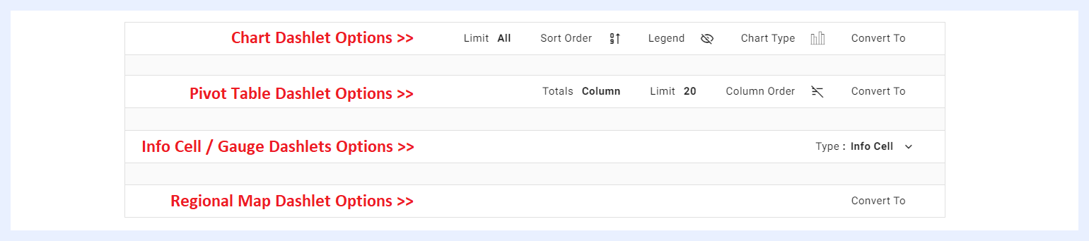
Located just above the output area, it provides the designer with the most common/needed view options on the Dashlet.
Some of these options are available for all deshlet types, while others are type-dependent as below.
| Dashlet and Playground Toolbar Options Explained | |
|---|---|
| Convert to: | some dashlet types can be converted into another type directly in the dashlet PG area. A chart can be converted into a pivot table and vice versa, and a regional dashlet can be converted into either a chart or a pivot table. However, if the number of dimensions and/or measures in the dashlet exceeds the maximum allowed for the targeted type, TURBOARD will notify the user and offer alternative options for converting the dashlet to the required type. |
| Limit: | to limit the number of displayed results if needed. This option is only applicable to chart and pivot table dashlets. |
| Sort Order: | to sort the resulting values in descending, ascending or alphabetical order. This option is only applicable to chart dashlets. |
| Legend: | to show the legend on the chart and determine its relative location. This option is only applicable to chart dashlets. |
| Chart Type: | to change the chart type from the available other types. This option is only applicable to chart dashlets. |
| Column Order: | to sort the columns in the table and arrange their order from left to right in descending, ascending or alphabetical order according to the names/values of the columns. This option is only applicable to pivot table dashlets. |
| Totals: | when applied, the totals for all the columns that have numeric values (such as price, quantity, etc.) can be displayed either at the top of the table or at the bottom. This option is only applicable to pivot table dashlets. |
| Type: | an info cell dashlet can be converted to a gauge or vice versa. |