Forms Companion Module
What is FOR-S Companion Module?
TURBOARD's FOR-S Companion Module, often referred to as “TURBOARD Forms”, is an integral tool designed for data collection. As an extension to TURBOARD's main offerings, which encompass advanced dashboards, detailed analysis, and integration capabilities with varied data sources, the FOR-S Companion Module serves as a connection between efficient data collection and in-depth business analysis.
Organizations frequently encounter challenges in collecting relevant data. They often grapple with an over-reliance on external sources or navigate complex manual data collection processes. Whether you operate within sectors like healthcare, education, manufacturing, or local governance, the FOR-S Companion Module provides a solution. TURBOARD developed the FOR-S Companion Module to help organizations capture, customize, and effortlessly integrate their data into the broader TURBOARD analytical framework, all within the same platform.
Why FOR-S Companion Module?
The FOR-S Companion Module was developed by TURBOARD to address the pivotal challenges organizations face in data collection, ensuring both efficiency and adaptability across diverse sectors. It enables businesses to:
-
Craft and adapt any form to match specific data collection needs, including modifying and customizing the various settings of fields’ input.
-
Integrate collected data into TURBOARD's analytical tools for immediate analysis.
-
Use different methods for collecting data, such as post-validation, allowing repeated form submissions, and employing other custom methods.
-
Schedule future publish dates for forms and determine their expiry dates, ensuring timely availability and relevance.
-
Convert and save collected data directly into Excel files for further processing or sharing.
-
Automate notifications, alerting users when necessary through SMS and/or email.
-
Maintain the highest level of confidentiality and integrity, as all data is securely housed within the TURBOARD ecosystem.
-
Access and complete forms on the go using mobile devices due to the module’s mobile compatibility.
-
Employ FOR-S data collection features across a spectrum of business scenarios, catering to the unique requirements of various sectors and industries.
User Roles and Integrated Workflow
Thanks to its mobile compatibility and automatic notification system, the FOR-S Companion Module offers a clear and straightforward workflow. With specific roles for Admins, Respondents, and Confirmers and their respective permissions, the module ensures a smooth process from data collection to analysis.
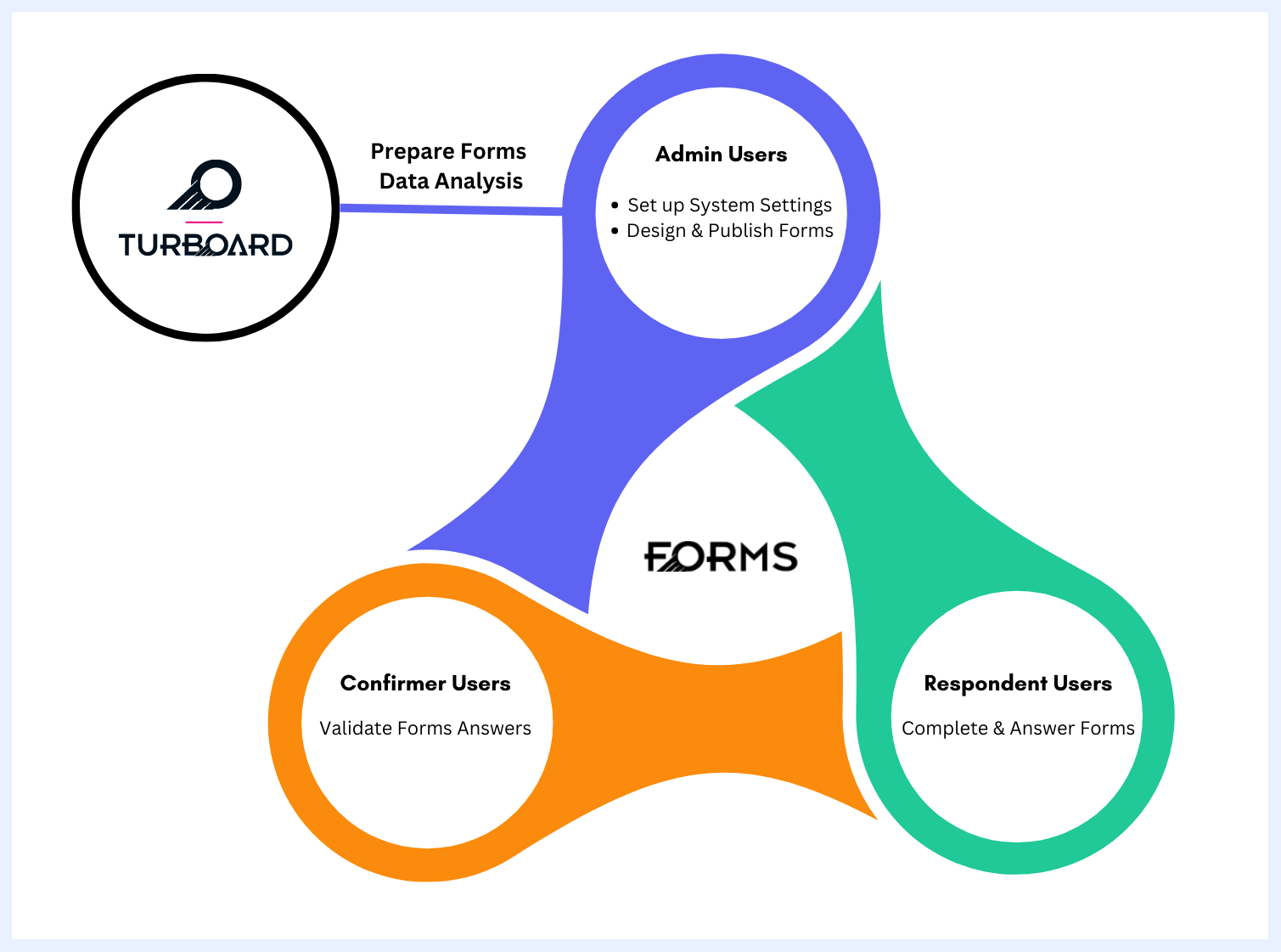
| User | Role | Where | |
|---|---|---|---|
| Admin User | ✔ Set up and manage system settings such as default appearance, logos, users and groups, and notification configurations. | ✅ System “Settings” & Configurations | ⬇ |
| Admin User | ✔ Design and customize forms, including fields’ display and input settings, as well as publish and expiration dates. ✔ Determine submission rules, including allowing multiple submissions and mandating approvals. ✔ Assign confirmer users for forms that require mandatory approvals. ✔ Distribute (publish) forms to respondent users. |
✅ “Create New Form” Tab | ⬇ |
| Respondent User | ✔ Receive notifications for new forms. ✔ Access and complete forms on mobile or computer. ✔ View their past form submissions. |
✅ SMS/E-mail ✅ “Forms” Tab ✅ “Responses” & “Past Responses” Tabs |
⬇ |
| Confirmer User | ✔ Review and validate form responses, with the options to approve, reject, or remove them. | ✅ “Responses” & “Past Response” Tabs | ⬇ |
| Admin User | ✔ Monitor and oversee the entire form response collection. ✔ Integrate form responses into TURBOARD dashboards for analysis. |
✅ “Forms” Tab > Ellipsis Menu > “Edit Form” Option ✅ “Forms” Tab > Ellipsis Menu > “TURBOARD Report” Option |
⬇ TURBOARD Integration: All collected, verified, and approved form responses automatically flow directly into TURBOARD for real-time reporting, visualization, and dashboard analytics.
General Features of Interface Navigation
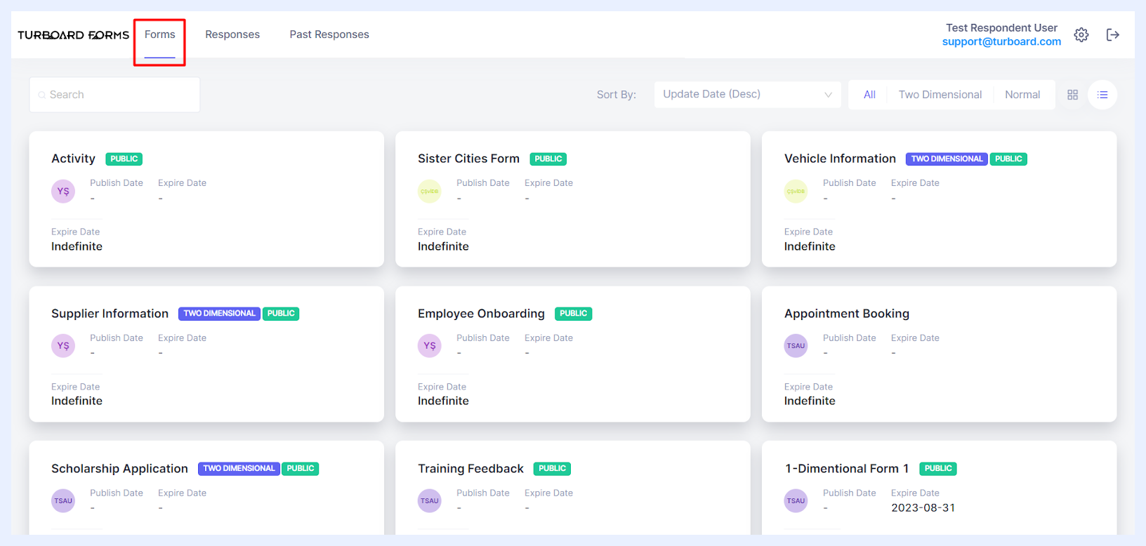
Upon logging into TURBOARD Forms, users are welcomed to a well-arranged start page that showcases three primary tabs. To its complement, a logo resides at the top-left, serving as a quick link back to the start page when clicked. Moreover, the “Settings” icon, positioned at the top-right corner, provides direct access to key functionalities. Next to it, the “Logout” icon ensures a secure exit from the module.
Forms Tab
Serving as the default screen, it showcases all the forms created in the system according to user roles and permissions.
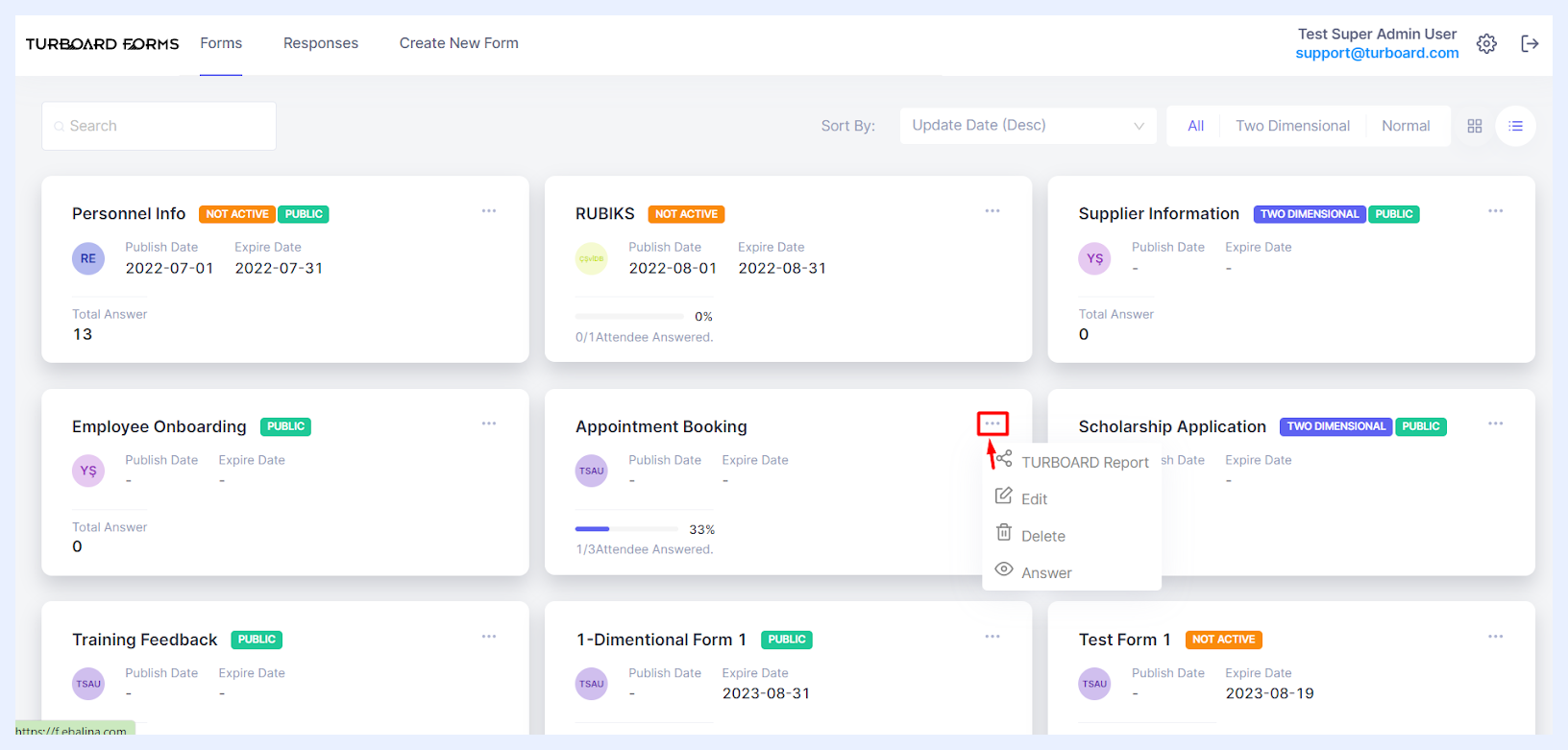
For example, Admin users can see every form within the system and have the ability to edit or delete them, ensuring all form-related activities can be managed as required. Other users can view and answer the forms allocated to them and any public forms available for response.
At the top of the listed forms, users will find:
-
Search Bar: to quickly locate specific forms by entering keywords.
-
Sort By Options: to arrange forms based on criteria like creation date, update date, and/or form name.
-
Form Type Filters: to choose to view “All” forms, or One Dimensional (“Normal”) or “Two Dimensional” forms.
-
Form Cards View Options: to personalize the viewing experience by toggling between “Detail Card” and “Image Card” views, allowing for a customized interface interaction.
These tools ensure that users can efficiently navigate and manage their forms, regardless of the number present.
Forms Options for Admin Users
Responses Tab
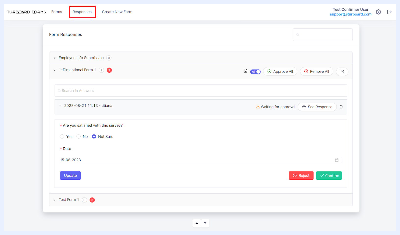
This tab, accessible to all users, displays a summary of submissions from active forms. Respondent users can view their previous answers in a non-editable format. Confirmer users, on the other hand, have the ability to see responses from forms assigned to them, including public ones, and can approve or reject specific answers assigned to them. Meanwhile, Admin users have the capability to view and manage all responses, encompassing the task of assigning confirmer roles and even deleting responses.
Responses Options for Confirmer Users
Past Responses Tab
Available primarily to Respondent users, this tab offers a summary of submissions from expired forms. Respondent users can review their past answers in a view-only mode. Confirmer users can also access all responses from forms they're linked with, including public forms, and have the authority to approve or reject specific answers given to them.
Create New Form Tab
As creating forms and publishing them are exclusive to Admin users, this tab remains hidden for others, streamlining the interface.
With access to this tab, Admin users are offered a dual-layered customization experience. They can tailor forms at both the individual field level and the broader overall form level, ensuring a meticulous and well-rounded design process.
Field-Level Customizations
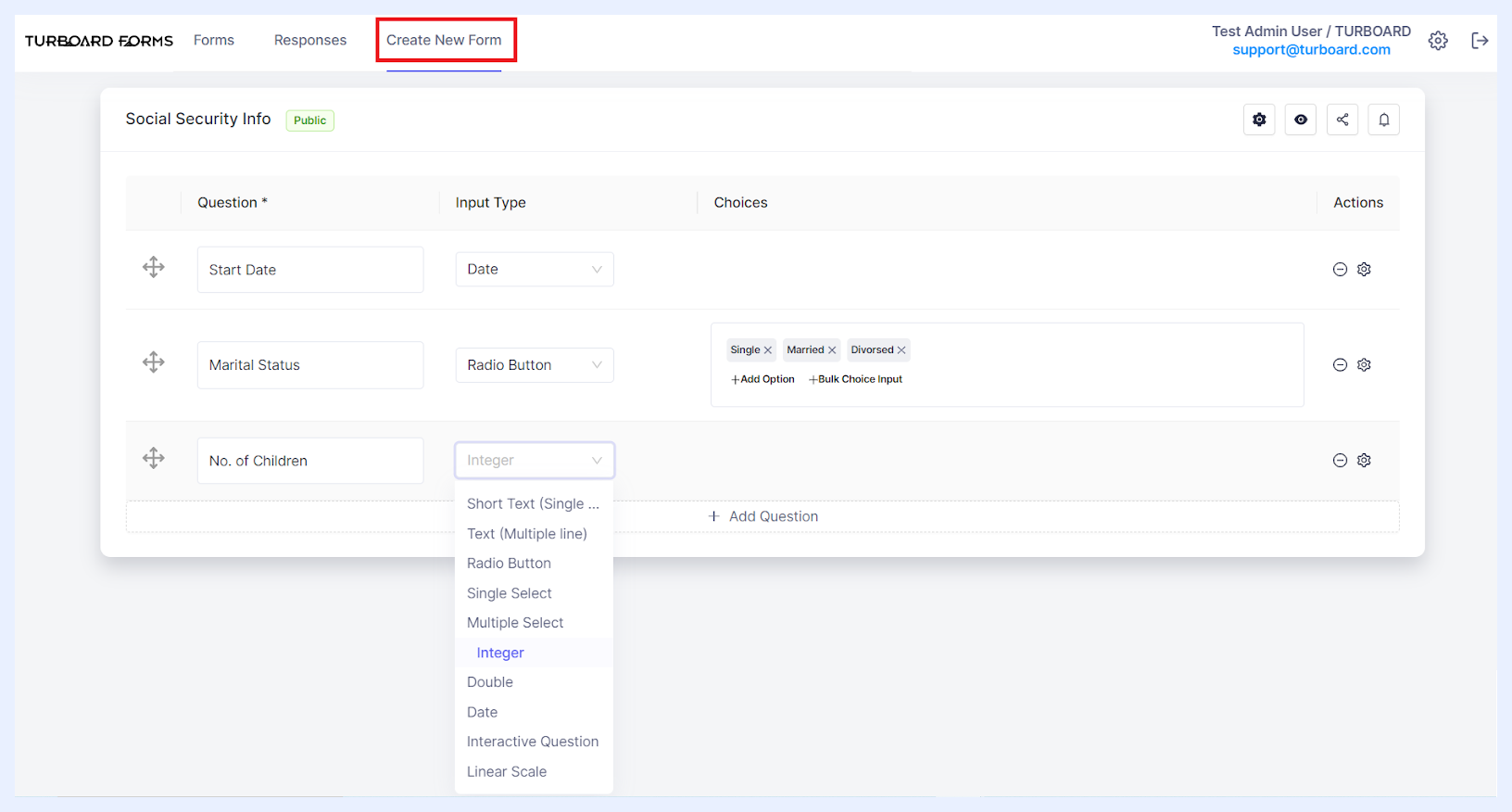
At the field level, admins can select specific input types, such as radio buttons, multi-line text, or interactive drop-down lists. They have the flexibility to set input limits to cap the number of characters, mark fields as either mandatory or optional, and add user-friendly tooltips or placeholders. Furthermore, they can set conditions to restrict certain answers, thereby enhancing the quality of responses.
Form-Level Adjustments
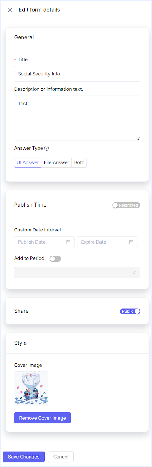
At the overall form level, admins possess a variety of options to optimize the user experience. These options include setting a dedicated publish date, incorporating post-answer validations, and determining whether multiple submissions from a single user are allowed, among other advanced configurations.
Form Types
In the evolving landscape of data collection and business intelligence, it's no longer sufficient to just gather data; the structure and granularity of the data have become equally critical. TURBOARD's FOR-S Companion Module stands out in this space, offering distinctive form types that not only collect data but do so with precision and context. These aren't mere forms; they are structured pathways designed to direct information flow in a manner most beneficial to businesses.
One Dimensional Forms
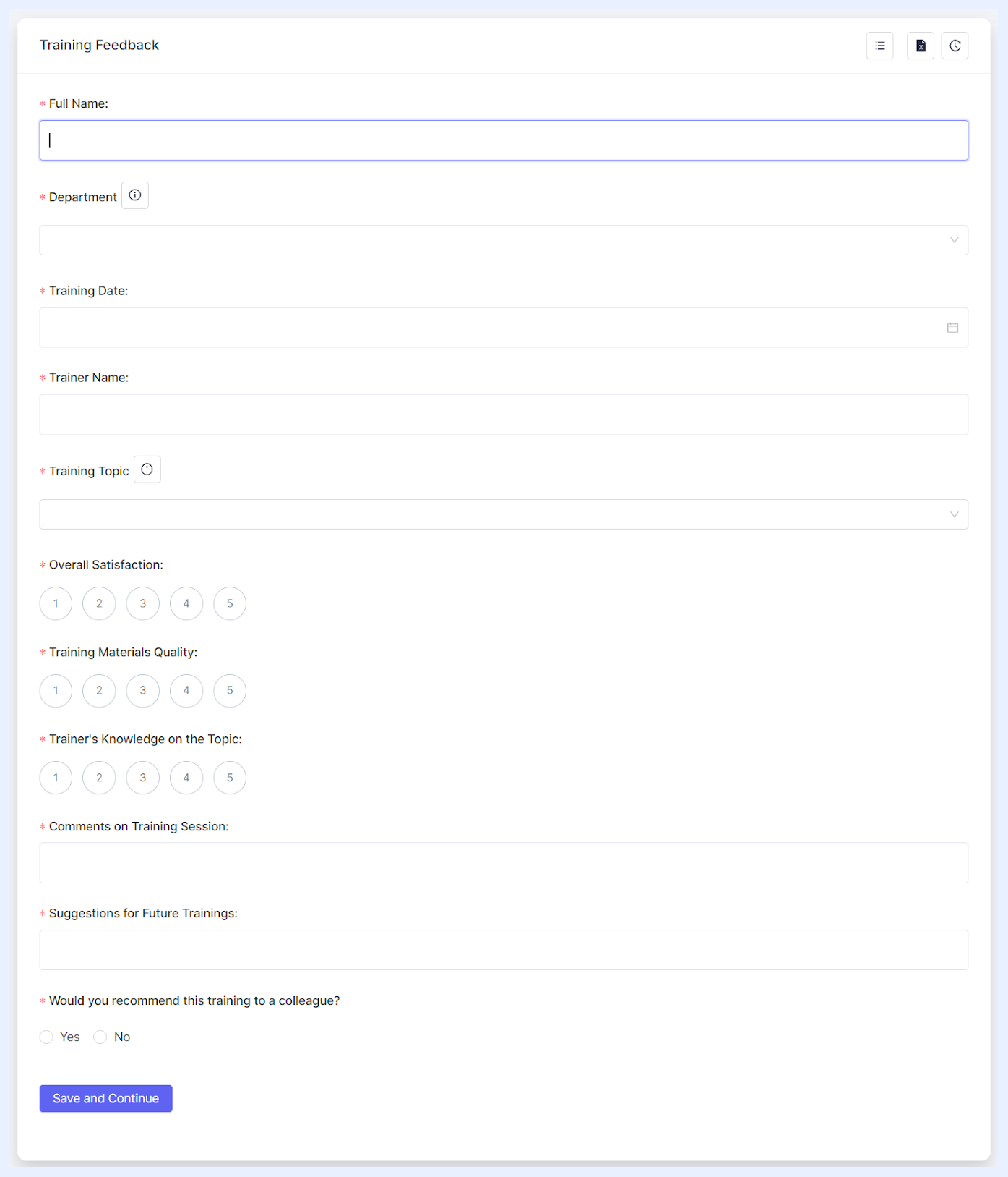
Nature: One dimensional forms are designed for collecting linear data, much like a single row or column. Picture them as lists, where each entry is an individual data point, with no ties to other entries. They provide a straightforward, one-way, and intuitive approach, making them ideal for situations that don't need complex relational data.
Advantage: Their simplicity is their strength. They ensure clarity, reduce respondent errors, and are efficient for rapid data collection. These forms are also highly adaptable, boasting flexibility in data input and accommodating a wide range of field types. This ensures that regardless of your data collection needs, you can design a One Dimensional form tailored perfectly to your requirements. In contexts where data needs to be uncomplicated and straightforward, yet highly customizable, the One Dimensional forms truly shine.
Ideal Use: When capturing linear trends, feedback on specific topics, or list-like entries, these forms provide a clean, streamlined process. Whether it's capturing feedback on various topics, registering event attendees, monitoring basic inventory lists, or enumerating daily tasks, these forms offer a clean and efficient way to gather diverse information from numerous users. Their uncomplicated and flexible design ensures that respondents can swiftly and accurately provide their inputs without the potential confusion that more intricate structures might introduce.
1 Dimensional Form Sample
Two Dimensional Forms
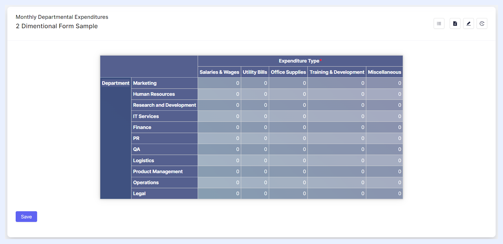
Nature: Imagine a chessboard. Every square on that board has a distinct coordinate made up of its row and column position. Two Dimensional forms operate similarly, making them capable of capturing complex, multi-faceted data. Each entry isn't just a data point but a relationship.
Peculiarity: What sets these forms apart is their ability to establish connections between data points. Instead of a linear capture, they provide a matrix-style structure, enabling the representation of data in two dimensions. This not only captures more intricate data but also offers a spatial context to it.
Advantage: Depth and relation. They facilitate a comprehensive understanding of data by allowing intersections of information as the data is collected in a grid format where data entries in rows represent unique entities or events, while the columns detail attributes related to that row. This is invaluable when analyzing trends, patterns, or correlations in TURBOARD, ensuring that data insights are multi-layered and rich.
Ideal Use: When there's a need to map out interdependent data, like budget allocations across departments over months, or product sales by regions and seasons, the Two Dimensional forms are the go-to choice.
2 Dimensional Form Sample
Differences Between Form Types
To better understand the differences between 1 Dimensional and 2 Dimensional forms, refer to the table below. It breaks down their distinctions, offers practical business use cases, and illustrates how they can be analyzed in TURBOARD Business Intelligence.
| Overview | 1-Dimensional Form | 2-Dimensional Form |
|---|---|---|
| Concept | One-dimensional forms are analogous to a single vector of data. Each piece of data is independent and does not rely on other entries for context. Think of it like a single list or a line of unrelated items. | Two-dimensional forms are more like tables where each row is an entity and columns are attributes or properties of that entity. The intersection of a row and column gives specific information about that entity's attribute. |
| Input Data | Allows for versatile data entry types such as text, numbers, radio buttons, dropdowns, checkboxes, etc. Each entry is typically captured in its own distinct field or space. | Primarily structured for numeric inputs. Each intersection of a row and column expects a number (either an integer or double). Textual descriptions or selections are typically not permitted for respondents within the main grid but can be added as row or column headers by the form designer (the admin user). |
| Use Cases | ➤ Feedback Surveys: Consider a retail store collecting feedback on different aspects such as ambiance, customer service, product variety, etc. Each feedback item is distinct and doesn’t necessarily depend on the other. ➤ Event Check-In: At a conference, attendees might register their presence by ticking off their names. Each tick is independent of the other. |
➤ Inventory Tracking: Consider a warehouse that logs items. Each row represents a product, while columns might detail attributes like quantity, supplier, date received, etc. ➤ Sales Record: In a retail setting, every sale could be a row, with columns detailing the item sold, customer details, sale date, and amount. |
| BI Analysis | ➤ Measures: Given their simplicity, data from one-dimensional forms often becomes a measure in BI tools. Using our feedback survey example, the number of positive responses could be aggregated as a measure. ➤ Dimensions: Data points here might not often be used as a dimension, but can be associated with dimensions present in other data sources (e.g., the “time” of the feedback or “location” of the store). |
➤ Measures: Many of the columns in two-dimensional forms can be aggregated as measures. In our sales record example, the “amount” column can be totaled to give monthly sales figures. ➤ Dimensions: Rows in two-dimensional forms often represent dimensions. Using the inventory example, each “product” would be a dimension. Columns can also represent dimensions, particularly when they detail categorical data (e.g., the “supplier” or “product type”). |
Creating Forms
How to create a 1-Dimensional Form?
1 Select the Create New Form tab to open the “Create New Form” window.
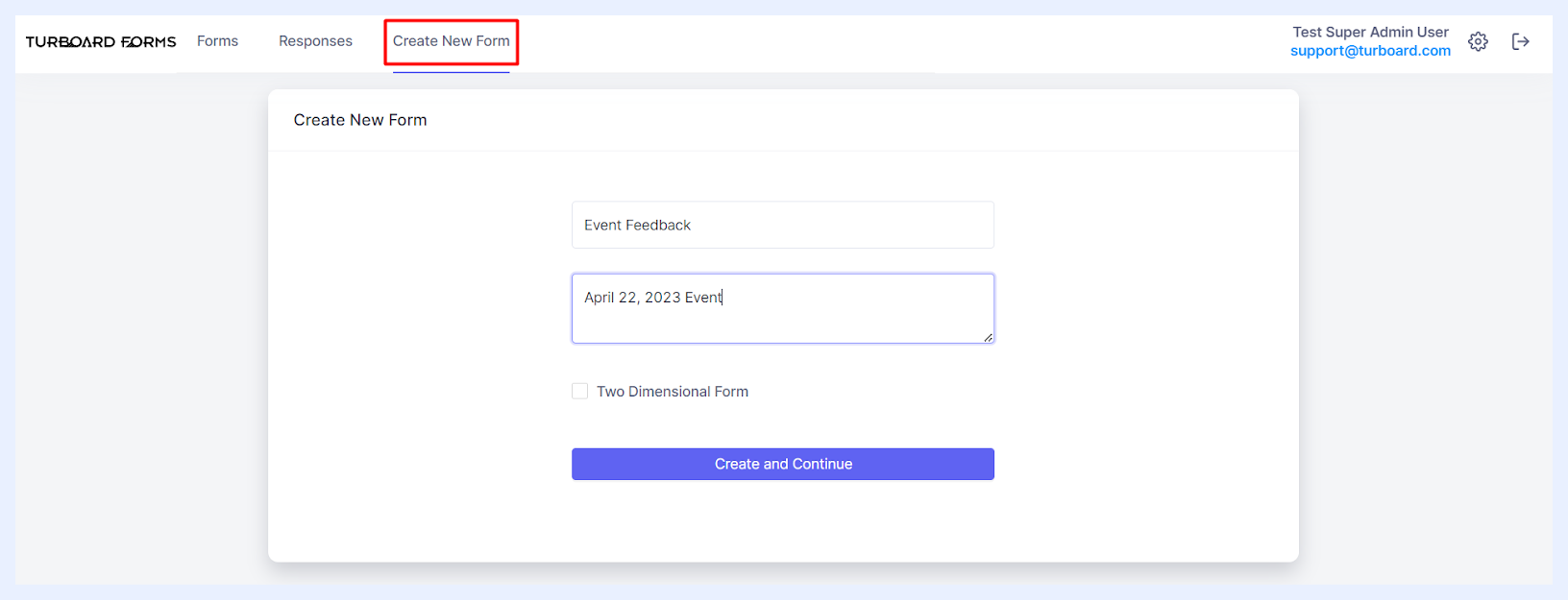
2 Enter the desired form name into the “Title” field.
3 Optionally, you can add a description or informational text in the “Description or information text” multi-line field. This description will be displayed beneath the form title for respondents and will also appear as a tooltip when users hover over the form title on the main “Forms” listing page.
4 Click the Create and Continue button. This action will bring you to the form creation main window.
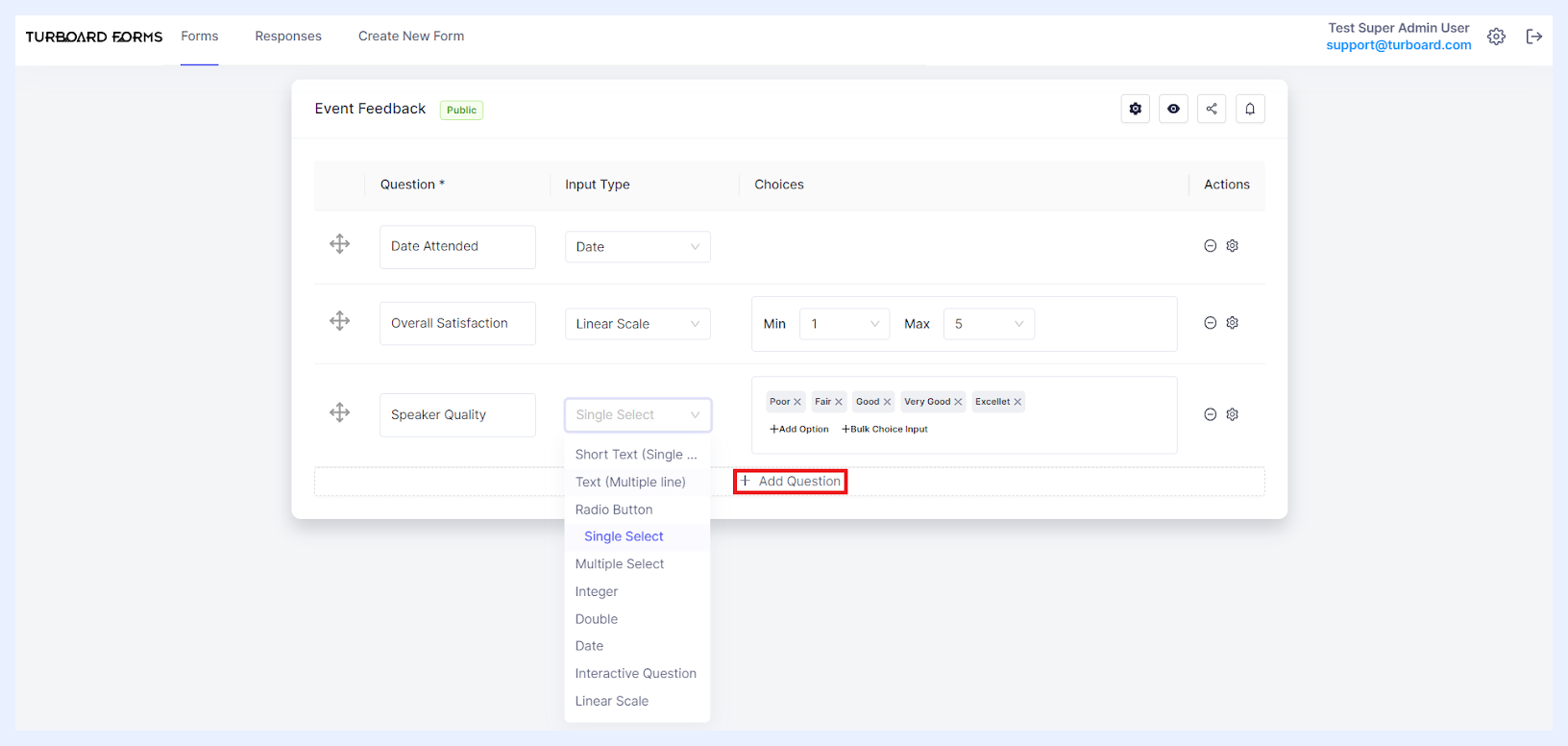
5 Begin designing your form by adding the necessary questions (fields to be completed and answered) using the + Add Question button and determine the details of each added question as below.
1-Dimensional Fields Settings & Options
“Question” text field: this is where you input the wording of your question – think of it as the prompt that guides the respondents on what information you're seeking from them.
“Input Type” drop-down list: choose the type of response format you'd like to use from the dropdown list. Each type is suited for different kinds of answers:
Short Text (Single Line): ideal for concise answers, like names or titles.
Text (Multiple Line): use this for longer responses, like feedback or descriptions.
Radio Button: lets respondents choose one option from a set of choices displayed in the form as radio buttons.
Single Select: offers a dropdown list of options, of which only one can be chosen. You can specify these options in the “Choices” field.
Multiple Select: a dropdown list, but respondents can select multiple options from the choices you determine in the “Choices” field.
Integer: to allow for whole number answers.
Double: for answers with decimal values.
Date: if selected, respondents will be presented with a calendar from which they can select a date.
Interactive Question: you can select it when you need answers from a predefined set of options. The name of the dropdown list and its options are previously set up in the “System Settings and Administration” section under the “Interactive Questions” tab. All the added “Interactive Questions” will become available as a list for the admin user to choose from.
Linear Scale: allows for rating-style answers.
“Choices” Field: Activated when an “Input Type” that needs further specification is chosen. For instance, if you opt for “Linear Scale”, you'll specify the minimum and maximum values of the scale. Similarly, for “Radio Button”, you'll list out the potential choices for respondents.
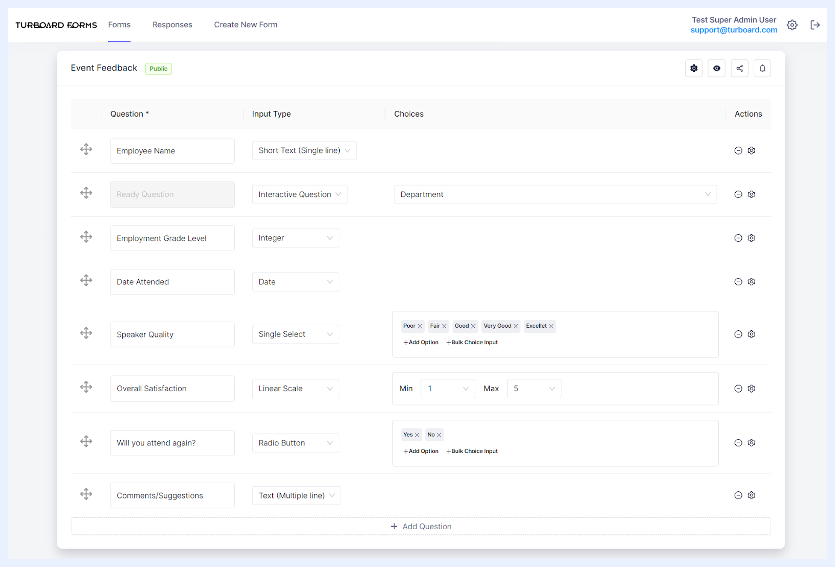
Setting up Different Input Types & Choices for Form Questions
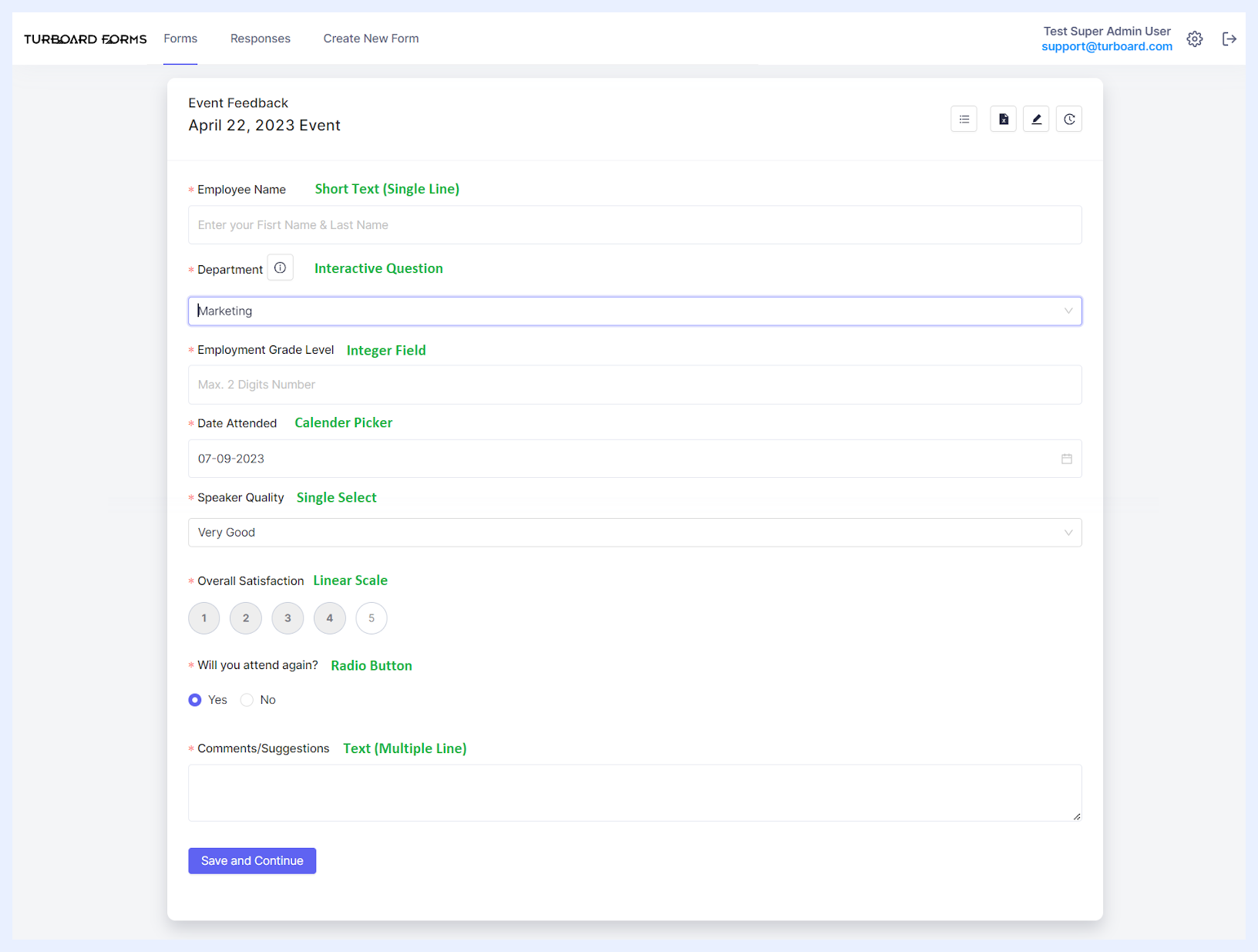
How Questions Appear to Respondents According to Input Types & Their Choices
Additional Question-Level Settings & Options
| Question-Level Actions & Options Explained | |
|---|---|
| Reordering Questions: | Click on the icon and use drag-and-drop to rearrange the sequence of questions as desired. |
| Deleting Questions: | To remove a question, simply click on the respective icon. |
| Accessing Question Settings: | Click on the designated icon to open the “Question Options” side panel, where you can adjust further settings for the selected question, as detailed below. |
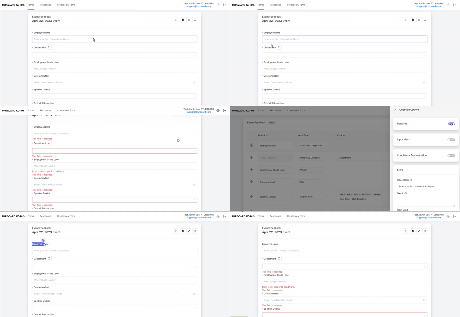
Required: by default, when you add a question, the “Required” option is activated. This ensures that respondents must answer or complete this field. Should they attempt to submit the form without addressing this mandatory field, a prompt will appear with the message “This field is required,” preventing form submission until the requisite information is provided. If you wish to allow respondents the option to leave the question unanswered, simply toggle this setting to “Off”.
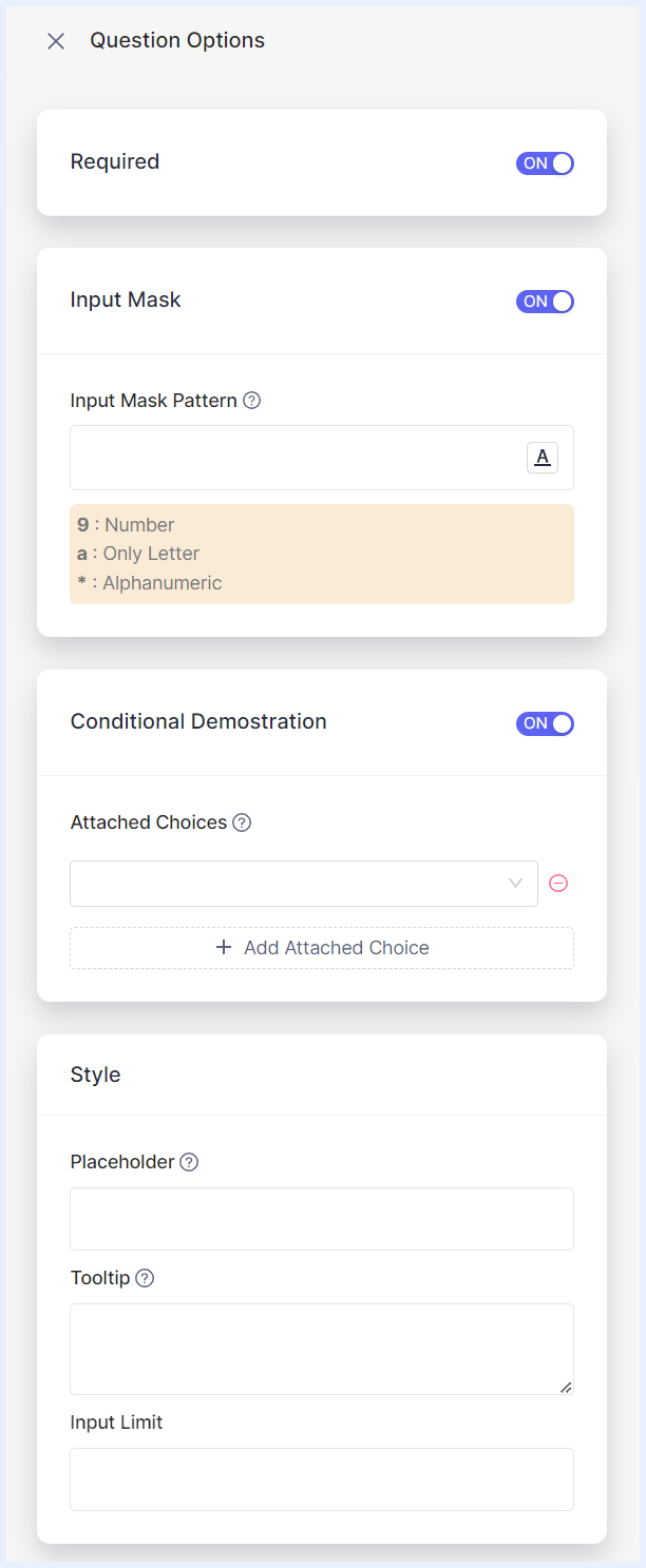
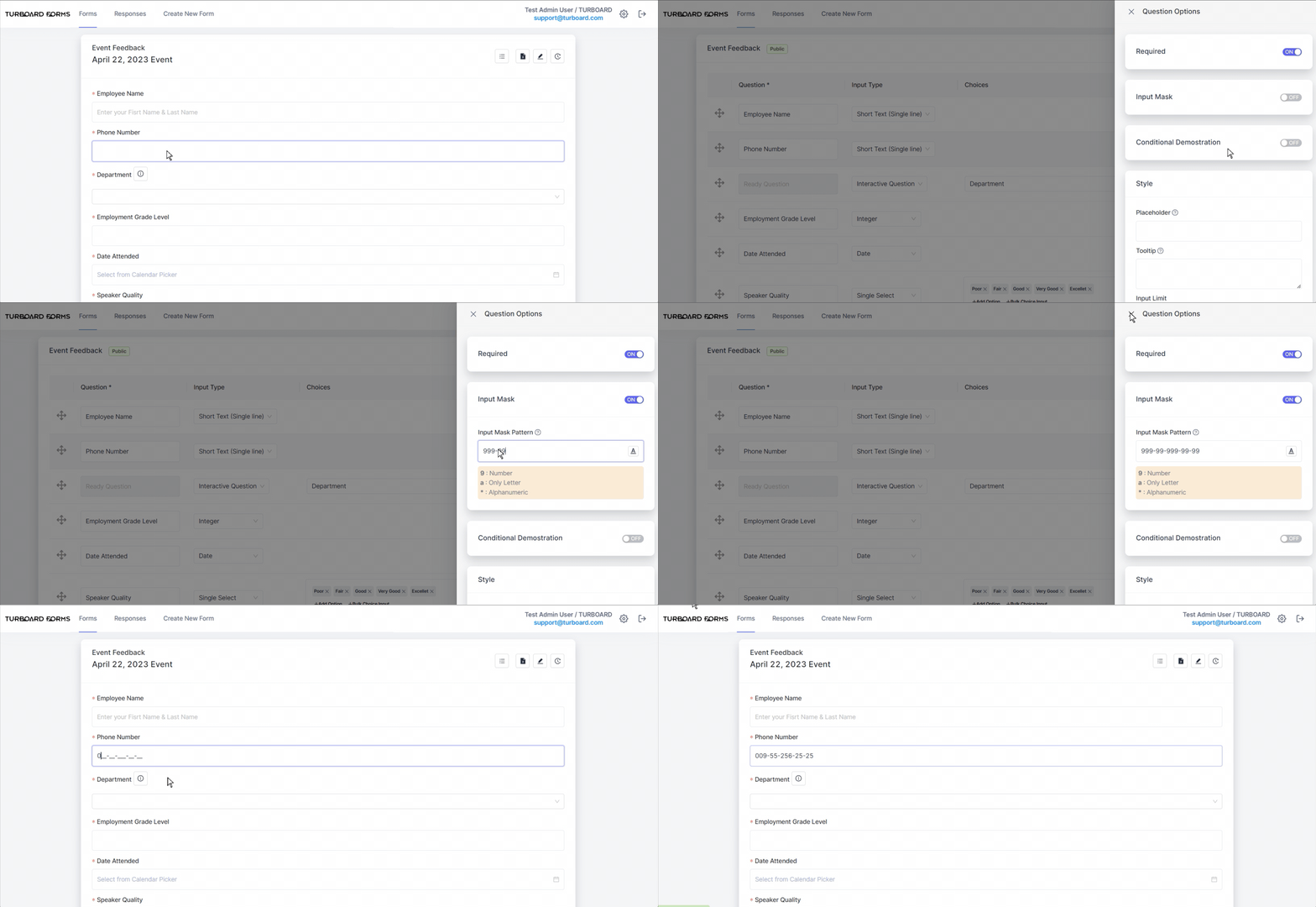
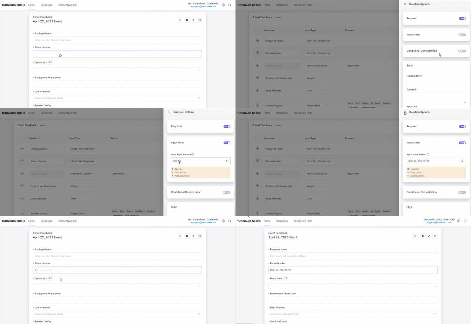
Input Mask: available only for the “Short Text (Single Line)” input type, this feature allows you to specify the format in which the response should be entered. An input mask is a guideline that ensures data is entered consistently. For instance, if you want phone numbers to be entered in a particular format, you can set an input mask for that pattern.
Conditional Demonstration: when activated, this option hides the question initially. The question will then appear based on specific conditions related to responses from another question.

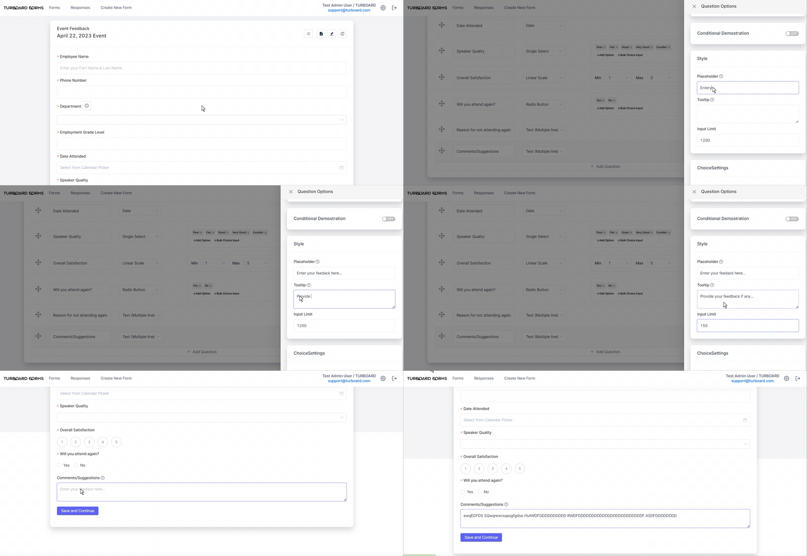
Style: allows you to customize your question's appearance and behavior using these settings:
Placeholder: displays a brief hint in the input field before respondents type in their answer. This text gives a suggestion about the expected response format or nature.
Tooltip: the text you enter here is a brief explanatory note that emerges when respondents hover over the question icon next to the question. It's intended to provide additional clarification or context to guide users in answering the question correctly.
Input Limit: applicable to input types where answers aren't predetermined, this limits the number of characters a respondent can input. If an answer surpasses this threshold, a notification message will appear to respondents. In multi-line fields, respondents are prevented from typing beyond the limit.
Note
Any additions, modifications, or updates made to the form, its details, or its questions' settings will be instantly saved and automatically reflected for the respondents to view.
How to create a 2-Dimensional Form?
1 Select the Create New Form tab to open the “Create New Form” window.
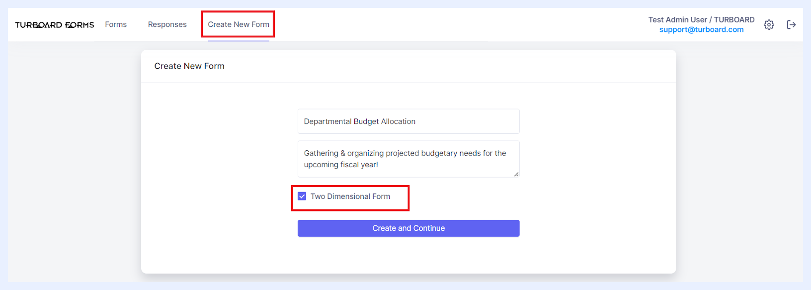
2 Enter the desired form name into the “Title” field.
3 Optionally, you can add a description or informational text in the “Description or information text” multi-line field. This description will be displayed beneath the form title for respondents and will also appear as a tooltip when users hover over the form title on the main “Forms” listing page.
4 Tick “Two Dimensional Form” checkbox.
5 Click the Create and Continue button. This action will bring you to the form creation main window.
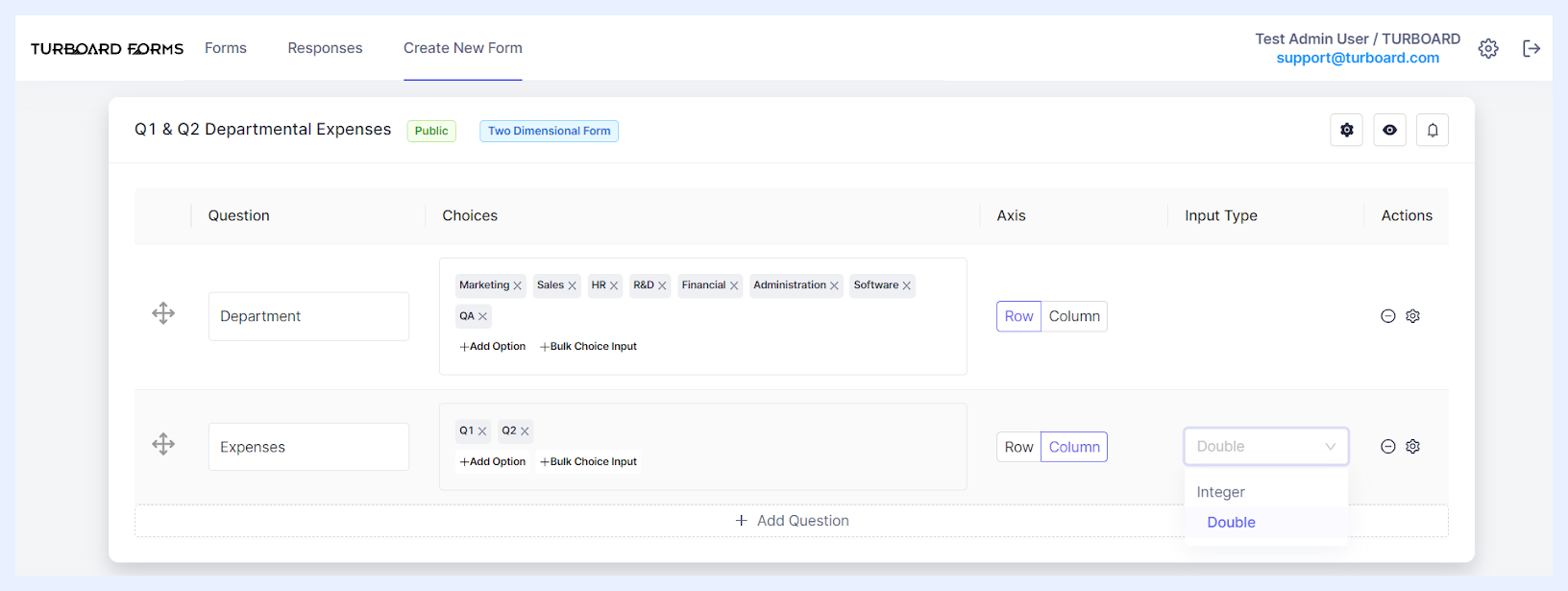
6 Begin crafting your form by adding the necessary rows and columns. To do this, click on the + Add Question button and determine the details of each added element as below.
2-Dimensional Fields Settings & Options
“Question” text field: enter the primary title or label of the data you wish to collect. Think of this as the main topic or theme. Respondents will enter data related to this question under specific sub-categories (or choices) that you set.
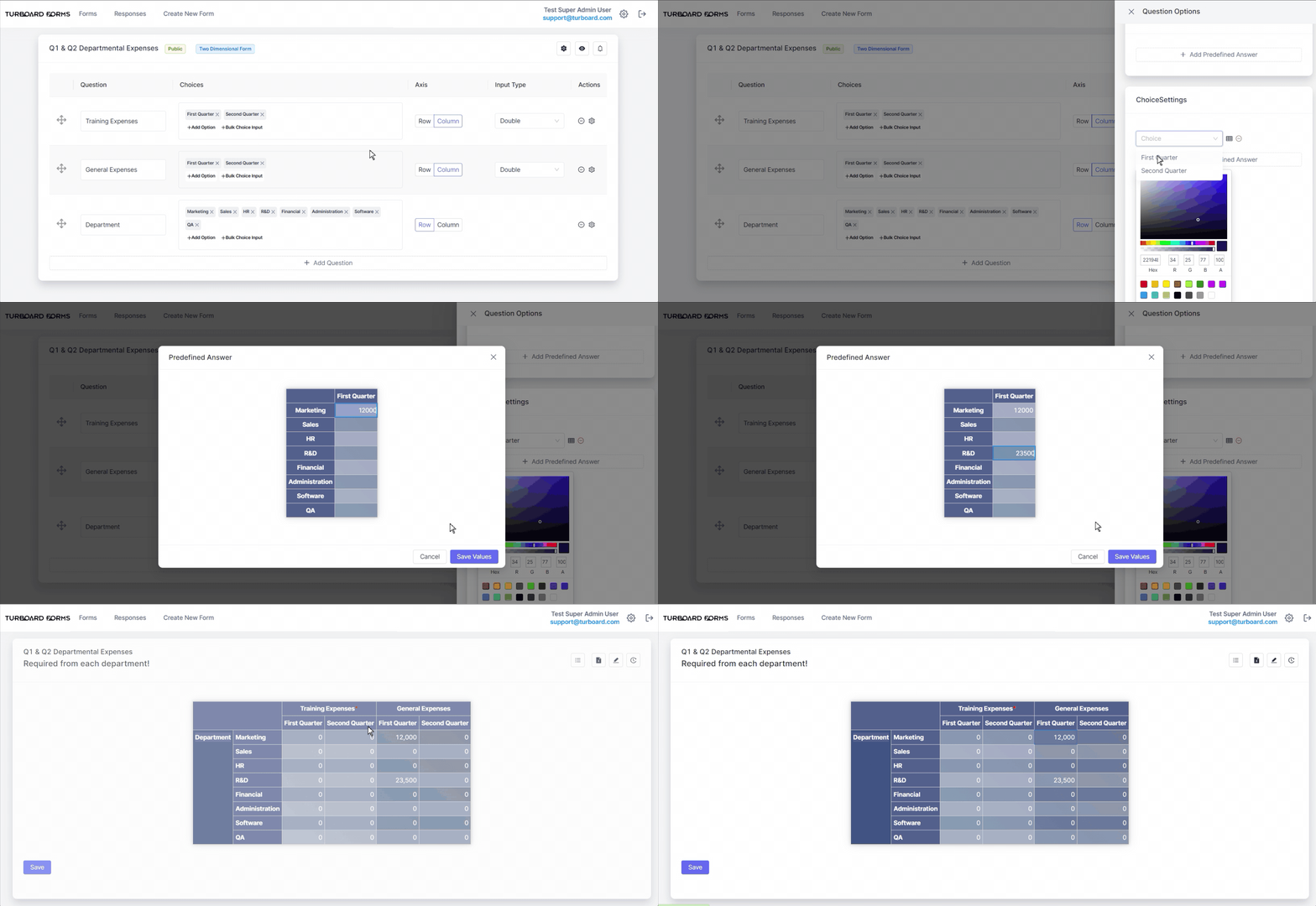
“Choices” Field: this feature allows you to detail or specify aspects pertaining to the primary question. For a row-oriented question, every choice you enter signifies a separate row beneath the main question label — the same principle applies for columns.As an example, if your principal query is “Expenses”, choices could include intervals like “Weekly”, “Monthly”, or “Annually”, or specific categories such as “Office”, “Cafeteria”, or “Auditorium”. Depending on the “Axis” selection below, these choices will be organized as rows or columns. Respondents are then tasked with providing values for each designated choice.When you add a choice to the form, clicking on it will prompt a color picker pop-up, enabling you to modify the background highlight color for that specific choice.
“Axis” Field: decide how you want your data label (question) and its choices to appear in the form:
Row Option: if chosen, the main question acts as the primary label for the row. The choices become sub-labels (second level labels). Only note that if one choice is set, it will become the main row label.
Column Option: if selected, the main question and its sub-categories (choices) will be column headers. Below these headers, respondents can enter numerical values.
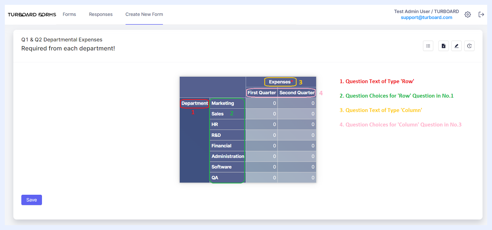
Questions Details as applied on the Form Answer Mode
“Input Type” drop-down: when a “Column” is set in the Axis field, this option gets activated. It lets you specify the kind of number respondents can enter: either “Integer” to allow for whole number answers, or “Double” for numbers with decimal values.
Additional Question-Level Settings & Options
| Question-Level Actions & Options Explained | |
|---|---|
| Reordering Questions: | To adjust the sequence of rows and columns, simply click on the designated icon and drag to your preferred location. Rows shift vertically based on their new positions, while columns realign from left to right. |
| Deleting Questions: | To remove a question, simply click on the respective icon. |
| Accessing Question Settings: | Click on the designated icon to open the “Question Options” side panel, where you can adjust further settings for the selected question, as detailed below. |
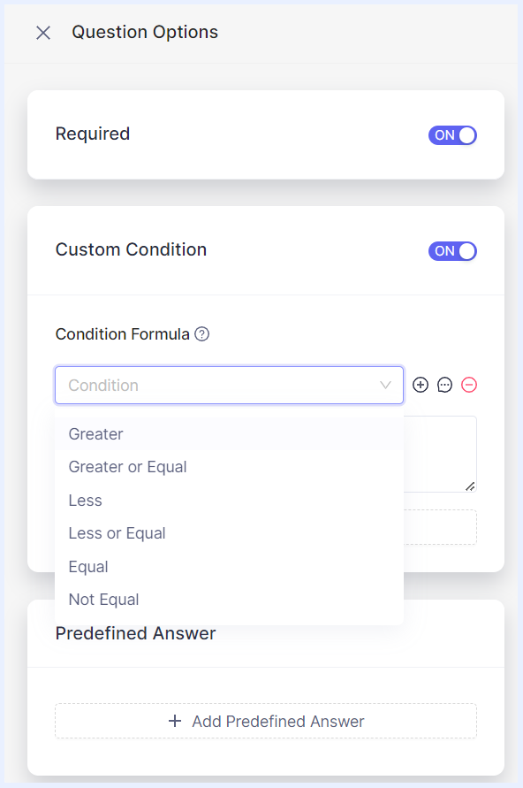
 Required: this feature designates certain columns as compulsory for respondents to complete. By default, it's toggled to “On”, signified by a red asterisk adjacent to the column label in the Form Answer window. While respondents might leave the corresponding values empty, they can still submit the form.
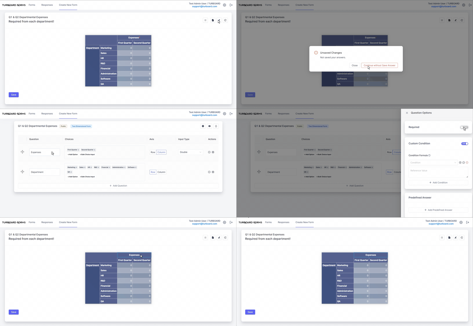
 Custom Condition: to ensure data consistency by setting specific conditions for input values. Use the
 + Add Condition button to choose a criterion from: Greater, Greater or Equal, Less, Less or Equal, Equal, Not Equal. Then click on the Add Condition icon to reference values from other questions, making your form dynamic.
Additionally, if a respondent’s entry doesn't meet the set condition, prompt an error notification. This can be customized by entering a message in the “Error Message” pop-up that appears when you click the Message icon.
For instance, if you wish for a value in one field to always exceed the value in another, this feature facilitates that verification.
At any time, you may remove the condition that you set through the Remove Condition icon.
Choice Settings: utilize this feature when your form questions have predefined answer options. It enables you to assign a default value, which will be automatically populated in the relevant data cells for the corresponding row and/or column.
Note
Any additions, modifications, or updates made to the form, its details, or its questions' settings will be instantly saved and automatically reflected for the respondents to view.
Once you've set up your form questions and their configurations – whether for your 1-Dimensional form or 2-Dimensional form, you can adjust the main settings of the form, such as its publication date, expiration date, designated respondents, and more. Detailed explanations of these options are provided in the “Managing Forms” section.
Also note that anytime you need to make changes or updates to your form questions and their settings, you can easily do so by selecting the “Edit” option from the ellipsis menu located next to the form in the “Forms” Tab listing.
Managing Forms
After crafting your form, whether 1 Dimensional or 2 Dimensional, it's crucial to ensure its settings align with your data collection objectives. The Forms Module offers a vast array of form-level settings, enabling you to customize respondent interactions, data collection methods, form availability, and more.
Editing Form Main Settings
1 Within the form's “Edit” interface, click on the Edit form details settings icon.
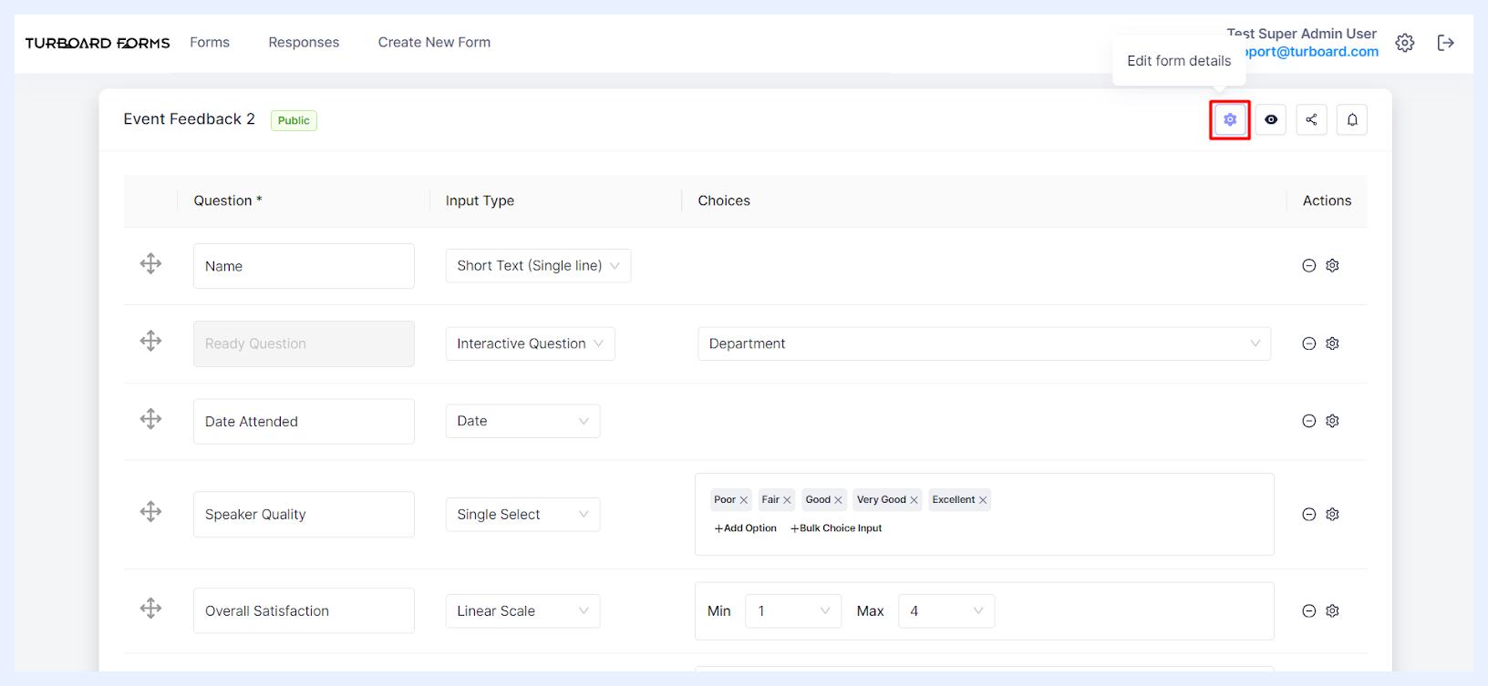
2 The “Edit form details” side panel will appear, allowing you to modify various form attributes:
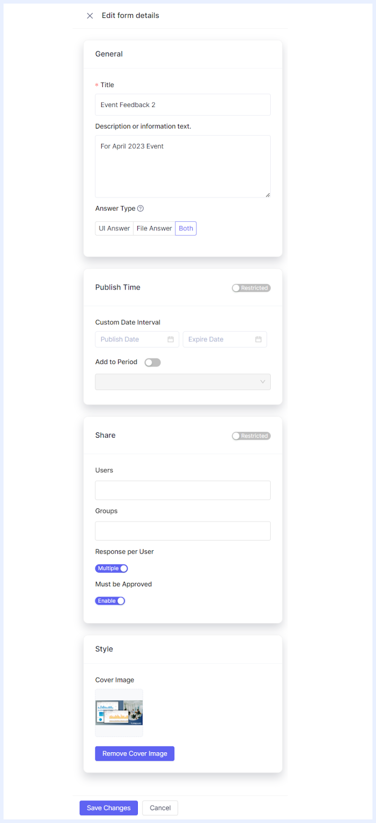
Title: Update the form's title if you wish to change it from what you initially set.
Description or Information Text: Modify the form's description or any supplemental information. This can be updated or added even if none was provided during the form's creation.
Answer Type: Define how respondents should engage with the form by selecting one of the following options:
-
UI Answer: If chosen, this signifies that respondents will complete the form directly through its online interface.
-
File Answer: With this selection, respondents will need to download the form's questions as an Excel template using the “Use Template” icon. They'll fill out this Excel sheet offline and then upload it to the form. In this mode, the form's online interface will not display fields for direct input. Instead, guidance text will instruct respondents on the download/upload procedure, reading as: “This form is set up to be answered by download/upload template files only”.
-
Both: This option lets respondents decide between completing the form online or using the Excel template method. By default, the “Both” option is set when the form is first created.
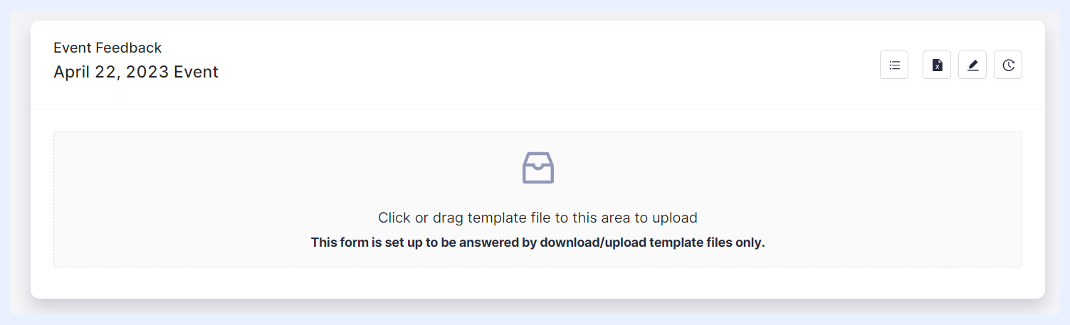
How a form will appear to Respondents when selecting “File” Answer Type
“Use Template” Icon Explained
The “Use Template” functionality facilitates downloading the form's questions into an Excel file format. If a respondent hasn't yet answered the form, the downloaded file will contain blank fields for their responses. Conversely, if the form permits multiple submissions or necessitates mandatory approval and confirmation before closing response edit and submission, the file will include the respondent's most recent set of answers.
Opting to allow respondents to answer forms via Excel or CSV file uploads and downloads brings several significant benefits:
-
This method enables respondents to input data in large quantities, enhancing efficiency, particularly when dealing with substantial data sets or numerous entries. It's especially beneficial since many are already familiar with Excel.
-
The feature also supports offline data entry. Users can download the template, complete it without an internet connection, and upload it once they regain online access.
-
Additionally, it reduces repetitive manual data entry. Respondents have the option to retain or copy their previous answers in the template, streamlining the process.
Note
For 1 Dimensional forms, the “Use Template” icon is visible only for forms that allow multiple answers. When answering is restricted to a single submission, respondents can readily fill and submit their responses through the UI interface.
Further insights into how respondents interact with forms, depending on the chosen “Answer Type,” are detailed in the “Forms for Respondents” section.
Forms Publish Settings
Publish Time: By default, upon creation, a form is set to “Always”, signifying its perpetual visibility to respondents. However, if you wish to limit the form's accessibility, you can change the setting from “Always” to “Restricted,” allowing you to specify the desired duration of availability:
-
Custom Date Interval: This option lets you handpick the form's “Publish Date” and “Expiry Date” using calendar pickers.
-
Add to Period: The module's main “Settings” let you define specific periods, which then populate as a drop-down list in this section. Administrators can easily choose from these pre-configured periods to set the form's accessibility. For instance, an organization conducting quarterly reviews could pre-define periods like “Q1 2023” or “Q2 2023”. This streamlines form availability for specific quarters, ensuring consistency and minimizing manual input.
Note
If a form's visibility is confined to a predefined period, notifications are automatically dispatched to the assigned users at the commencement of that period, as per the “Notification Settings” configured in the “System Settings” section.
Sharing Forms with Respondents
Share: By default, a new form is set as “Public,” allowing all respondent users within the system to view it. If you prefer to keep the form hidden from users until its details are finalized, you can switch its status from “Public” to “Restricted.” Additionally, for more specific control, you can determine individual access by selecting certain users via the “Users” drop-down list or choosing entire groups through the “Groups” drop-down list.
Note
Once a form is published or specific users/groups are designated for a form (meaning it's no longer hidden), the system will automatically send notifications to the respective users via e-mail and/or SMS (according to the determined “Notification Settings” in “System Settings” section). Additionally, the admin user retains the capability to send notifications manually using the “Notify” option.
Further customization can be done under the “Share” section with the following options:
-
Response per User: This option appears for 1 Dimensional Forms only as 2 Dimensional Forms allow multiple responses by default. In 1 Dimensional Forms, the “Unique” setting ensures that each user can answer the form only once. In contrast, the “Multiple” setting allows users to respond multiple times until the form's expiration.
-
Must be Approved: This can be toggled between “Disabled” and “Enabled”. When enabled, confirmer users have the authority to review and approve form responses, adding an extra layer of verification.
Note
During system setup, each user is assigned a specific confirmer user. Only this assigned confirmer user will have the privilege to see and review the responses submitted by their respective user(s).
Forms Styling
Style: Personalize the appearance of your form card as it's displayed to users in the “Forms” tab for “Image Card” views by uploading a cover image. To do this, click the +Upload button and select the desired image file from your computer. If you wish to revert to a default look or choose another image, use the Remove Cover Image button.
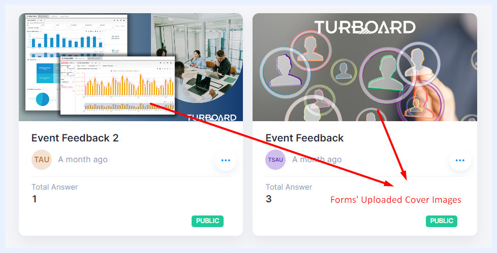
How forms will appear in “Forms” tab with their uploaded Cover Image
Once you're satisfied with all your form's settings, finalize them by clicking the Save Changes button.
Additional Form-Level Settings & Options
When fine-tuning your form for respondents, the form editing interface presents a series of action icons located at the top-right. These icons provide quick and convenient access to specific functionalities, ensuring a smoother management process.
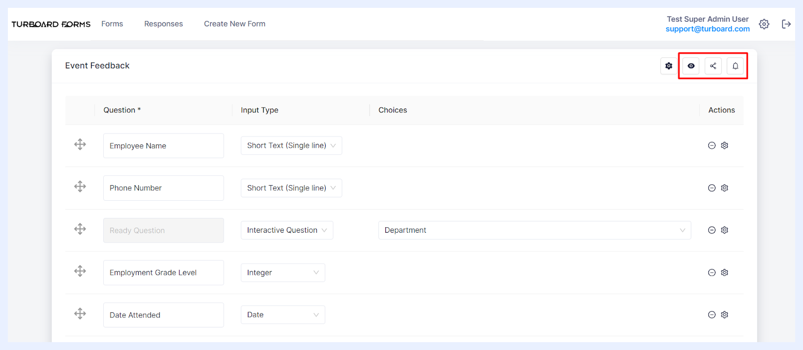
 Answer:
By clicking the “Answer” icon, the form's answering mode/window will open. This action opens the answering window, allowing the admin user to fill out the form.
However, if the form isn't set to public and the admin user isn't among the designated respondents, the Save and Continue button will be inactive. Hovering over the button will show a tooltip/notification: “Not Authenticated: To reply to non-public forms, you must be in the list of attendees”. Further information is available in the “Forms for Respondents” section.
 TURBOARD Report:
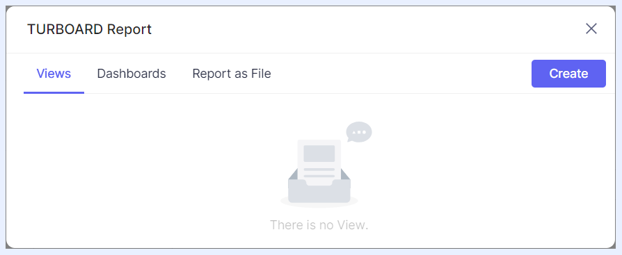
The “TURBOARD Report” icon enables the admin user to set up how the collected form answers/data will be collected, reported and analyzed. More on this feature is provided in the “Forms Reports & Data Analysis” section.
 Notify:
The “Notify” icon, when clicked, opens the “Notify” pop-up window. Here, the admin user has the option to send notifications to the form respondents.
This feature is particularly useful for informing respondents about new forms, reminding them of pending submissions, or updating them about changes or important announcements related to the form. It ensures timely communication and promotes active participation from the respondents.
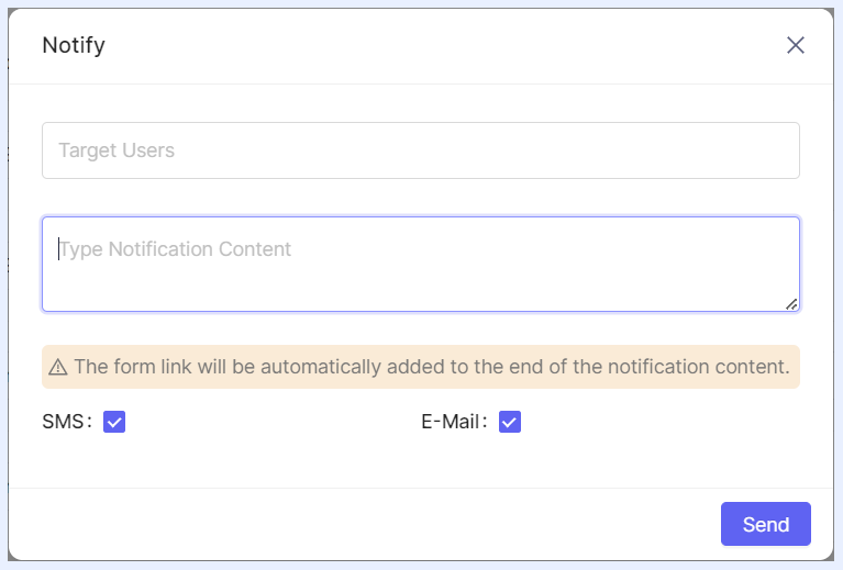
Target Users: This field lists all authorized users (for Restricted forms) in a drop-down as well as an “Everyone” option. The admin can choose to notify all authorized users by selecting “Everyone” option or selectively multi-pick specific authorized respondents for the form.
Note
If the form is set to “Public”, the “Target Users” field will be left blank, indicating that the form will be sent to every user in the system.
Notification Content: A multi-line field dedicated for the admin to write the message that recipients will see in their emails and/or SMS.
Tooltip: A note clarifies: "The form link will be automatically added to the end of the notification content." This ensures recipients have direct access to the form link.
Notification Method: Admins can choose to send notifications via “SMS” or “E-mail” or both by checking the required option/s.
Note
To use the “Notification” feature in TURBOARD Forms, ensure the necessary configurations for SMS and SMTP are set in the system's “Settings” section.
Forms for Respondents
Accessing Forms
Respondents can easily locate forms either assigned to them or those available publicly for all users within their “Forms” tab. To access a form, they can click on the form’s title or its cover image (when using the “Image Card” view). This action opens the form’s answer window.
In addition, depending on the “Notification Settings” configured by the administrative user, respondents are promptly informed via SMS and/or email when a new form requires their attention or if a submitted response needs to be revisited and resubmitted. These notifications conveniently include a direct link to the form’s response page, facilitating immediate access and action.
Answering Forms
The method by which respondents can answer a form depends on the “Answer Type” settings established by the form creator.
UI Answer Method
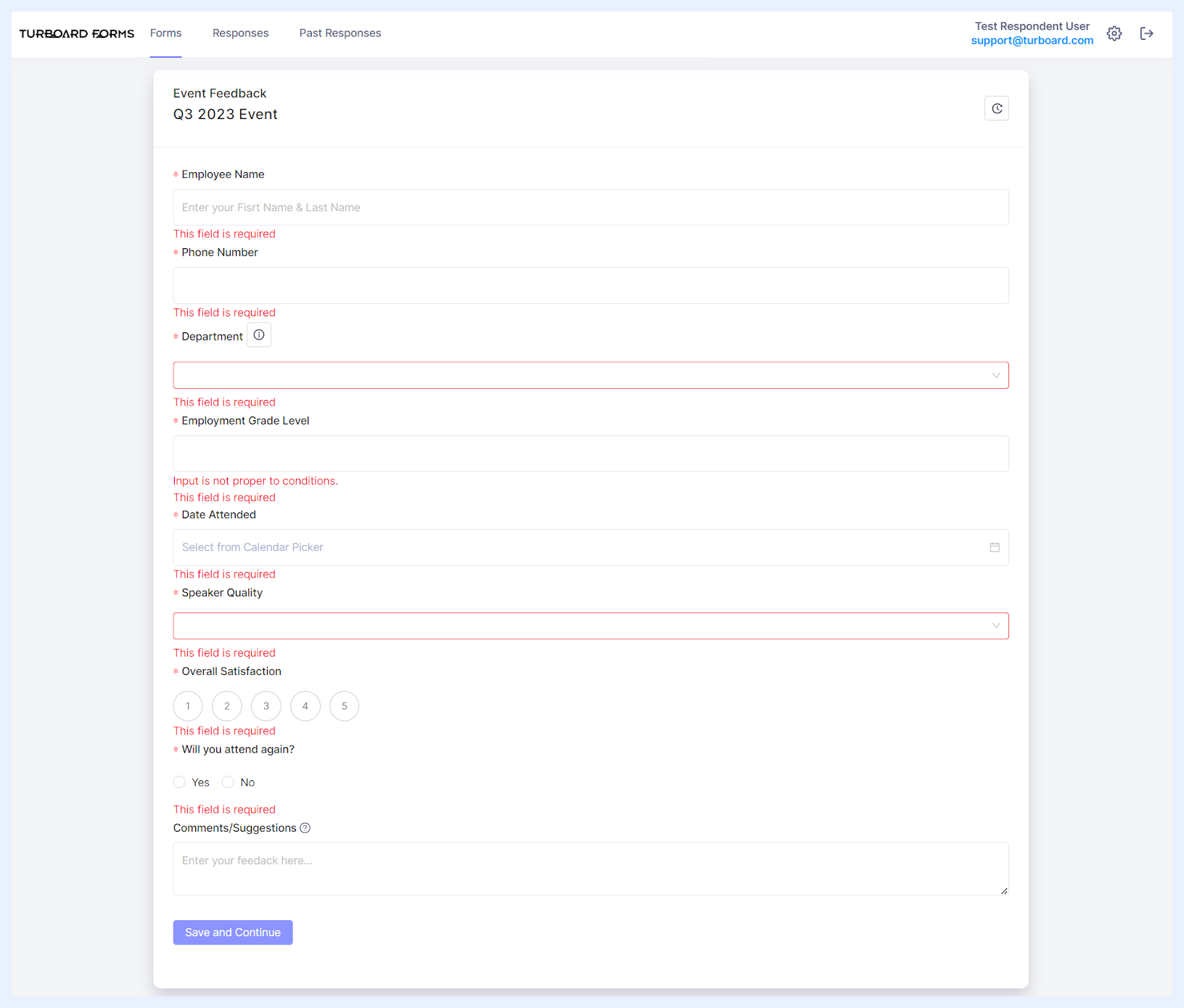
If the “UI Answer” option is set, the answering interface with the required fields appears directly within the system. Here, respondents can input their answers directly into the online form. Upon completion, clicking the “Save and Continue” button submits their responses.
Note
The system performs checks when the “Save and Continue” button is clicked, ensuring all mandatory fields are completed and verifying if any data are entered incorrectly. Notification messages will alert respondents to any errors or missing information.
File Answer Method
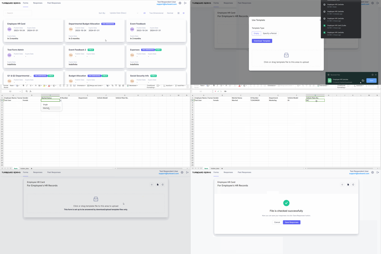
In situations where only the “File Answer” method is permitted for a form, the answer window will display instructions on how to handle the file download and upload process. The text guiding the respondents will be: “This form is set up to be answered by download/upload template files only”.
File Answer 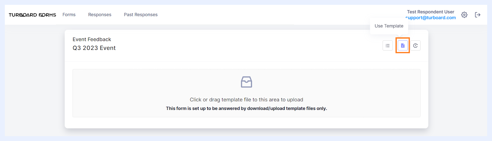
How to Answer a Form using the File Answer Method?
1 Click on Use Template icon  at the top-right of the Answer page.
2 A pop-up window titled “Use Template” will open.
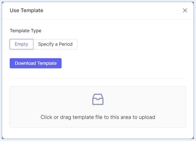
3 Choose Empty option and press Download Template button.
Note
The Specify a Period option is useful for forms tied to a certain predefined period and previously answered by the respondent. Selecting this option downloads the template containing the latest submitted responses, aiding in revising or re-answering the form efficiently.
4 The form will download to your computer. Open it and enter your answers.
Note
Cell formats in the template automatically align with the answer type settings. For instance, if a question requires choosing an answer from a drop-down list, the corresponding cell in the template will feature a drop-down menu with available answer choices.
5 Once completed, return to the form answer window and upload your file.
Note
After uploading, the system will check for missing mandatory fields or wrong formats. If there are any errors, it will notify you to make corrections.
6 Correct any errors in your file if necessary and upload it again.
7 Once everything is correct, click Save Responses button to submit your answers.
Both Answer Method
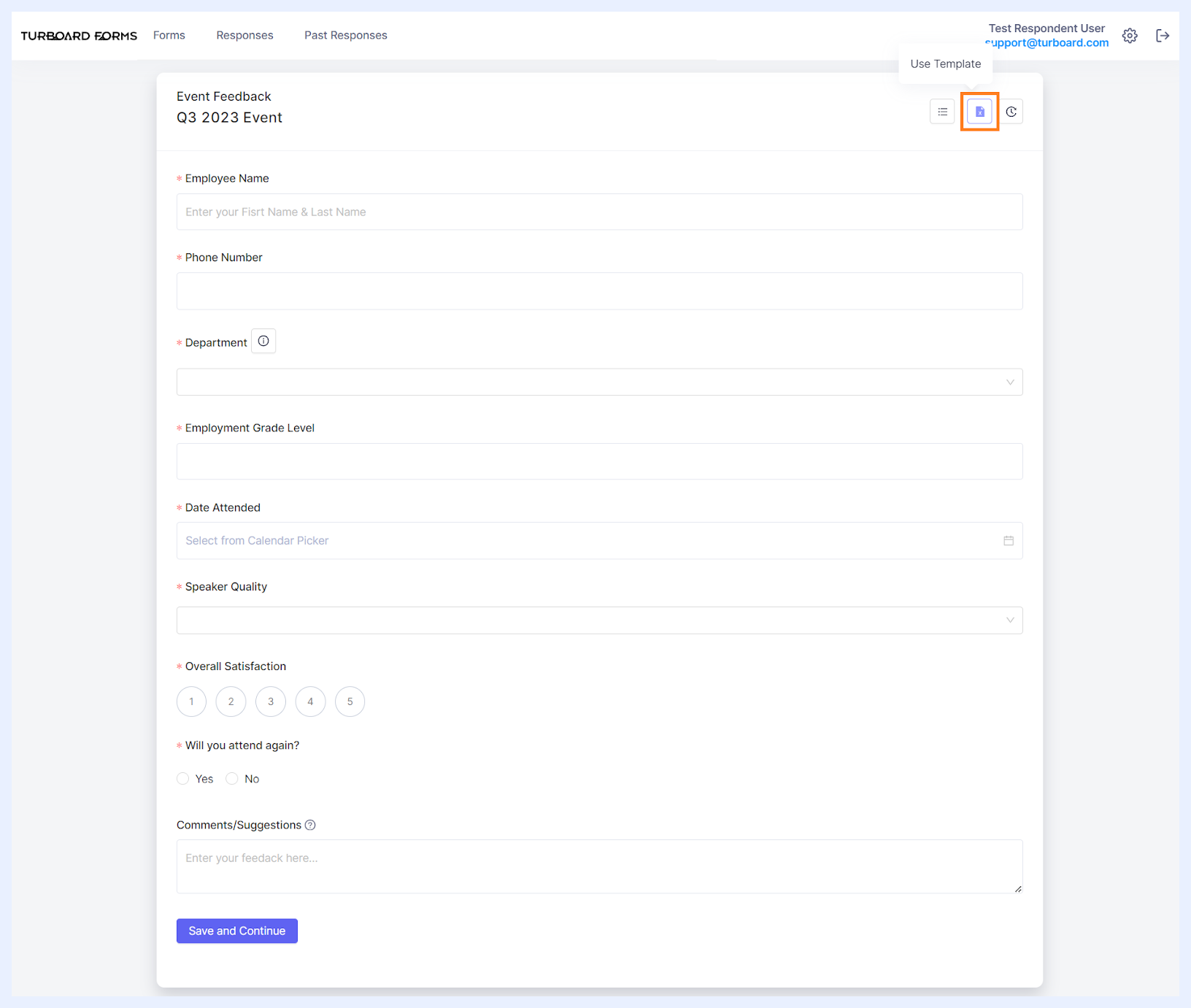
When the “Both” answer option is enabled, the form will open with an interface showing all the required fields for direct input.
Additionally, a “Use Template” icon will be available at the top-right corner of the answer window. This feature allows respondents to alternatively download the Excel template of the form, complete it, and then upload the filled template back into the system. Click here for more on this answer method.
Other Options for Respondents
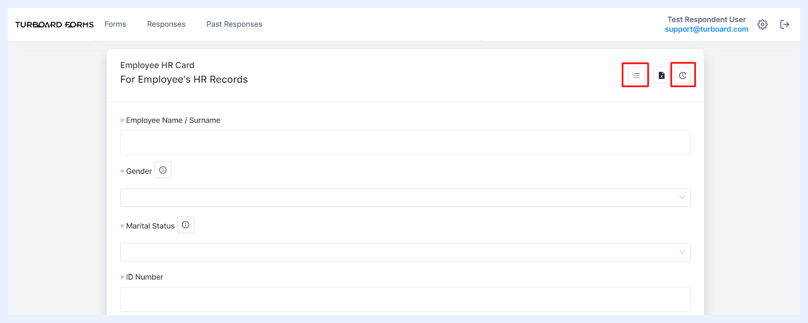
In addition to the primary answering methods, respondents have access to several auxiliary features situated at the right-top of the answer window. Alongside the “Use Template” icon, the “Download Questions” and “Responses” icons provide further options to manage and streamline the form-filling process.
Download Questions:
Accessible only in forms enabling answers through download/upload (File Answer) methods, the “Download Questions” icon lets users download the form's questions in an Excel format, along with their last set of submitted answers.
This feature is particularly handy for reviewing previous submissions or preparing updates to submitted answers.
Responses:
Interacting with the “Responses” icon unveils a drop-down menu offering multiple functionalities:
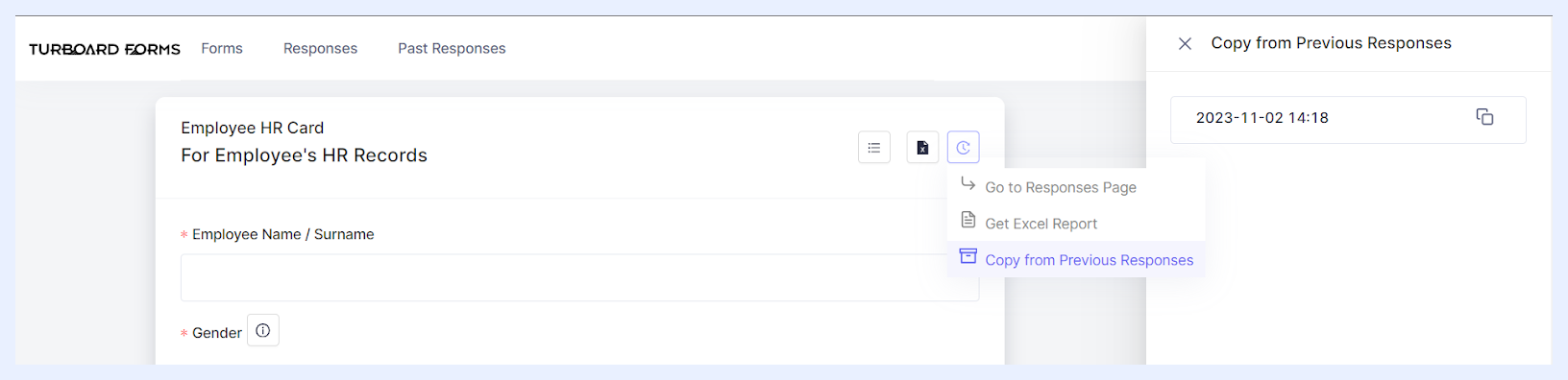
Go to Responses Page: when selected, it leads the user to the “Responses” tab. Here, users can gain an overview of their interaction history with various forms, simplifying the tracking and management of their submissions.
Get Excel Report: when selected, it enables users to download a comprehensive report in Excel. This report compiles all past submissions, neatly detailing each response’s submission date and time, along with the username of the respondent.
Copy from Previous Responses: when selected, a side window opens displaying all past submissions, each timestamped. By clicking the copy icon beside a submission, users can conveniently replicate these responses into a new form submission. This option streamlines the process for forms requiring regular or repetitive data entries and is available exclusively for forms answerable through the UI interface (UI Answer).
Managing Form Responses
The “Responses” tab in the FOR-S module is the core for post-collection data management. This pivotal area is where users of varying roles engage with form responses, offering an aggregated view of submissions and a suite of management tools.
Interface General Features
Forms Listing: The “Responses” tab organizes forms with their titles into a list view, arranged by the default order specified within the system “Settings” under the “Defaults” section.
General Display: Beside each form's name, the count of submitted responses is displayed inside a gray circle, offering a quick indicator of engagement.
Attention-Required Responses: For responses that require further action from the user, an additional count is displayed in a red circle next to the normal response count. This visual distinction draws attention to responses needing immediate attention or action. This system of response indicators ensures that all user types can quickly identify and prioritize tasks within the “Responses” tab, enhancing efficiency and response management.
-
For Respondent Users: If a response is rejected by a Confirmer User, the red circle displays the number of rejected responses (e.g., a red circle with a '1' inside it). Hovering over this circle reveals a tooltip stating: “Your 1 response(s) were not accepted by the Administrator. You can correct your answer and resubmit”.
-
For Confirmer Users: The red circle indicates the number of responses awaiting their review and approval. As an example, the accompanying tooltip might state: “There are 2 answers pending your approval”.
-
For Admin Users: Similarly, rejected answers are highlighted in a red circle to assist Admins in identifying responses that may require deletion or further review.
Search Functionality: At the top-right of the tab, a search bar is available, enabling users to swiftly locate forms by their titles, streamlining the process of filtering through numerous forms.
Navigation and Pagination: For ease of use, navigation arrows are situated at the bottom of the page, allowing users to move through the list of forms, especially when the quantity surpasses the set pagination limits.
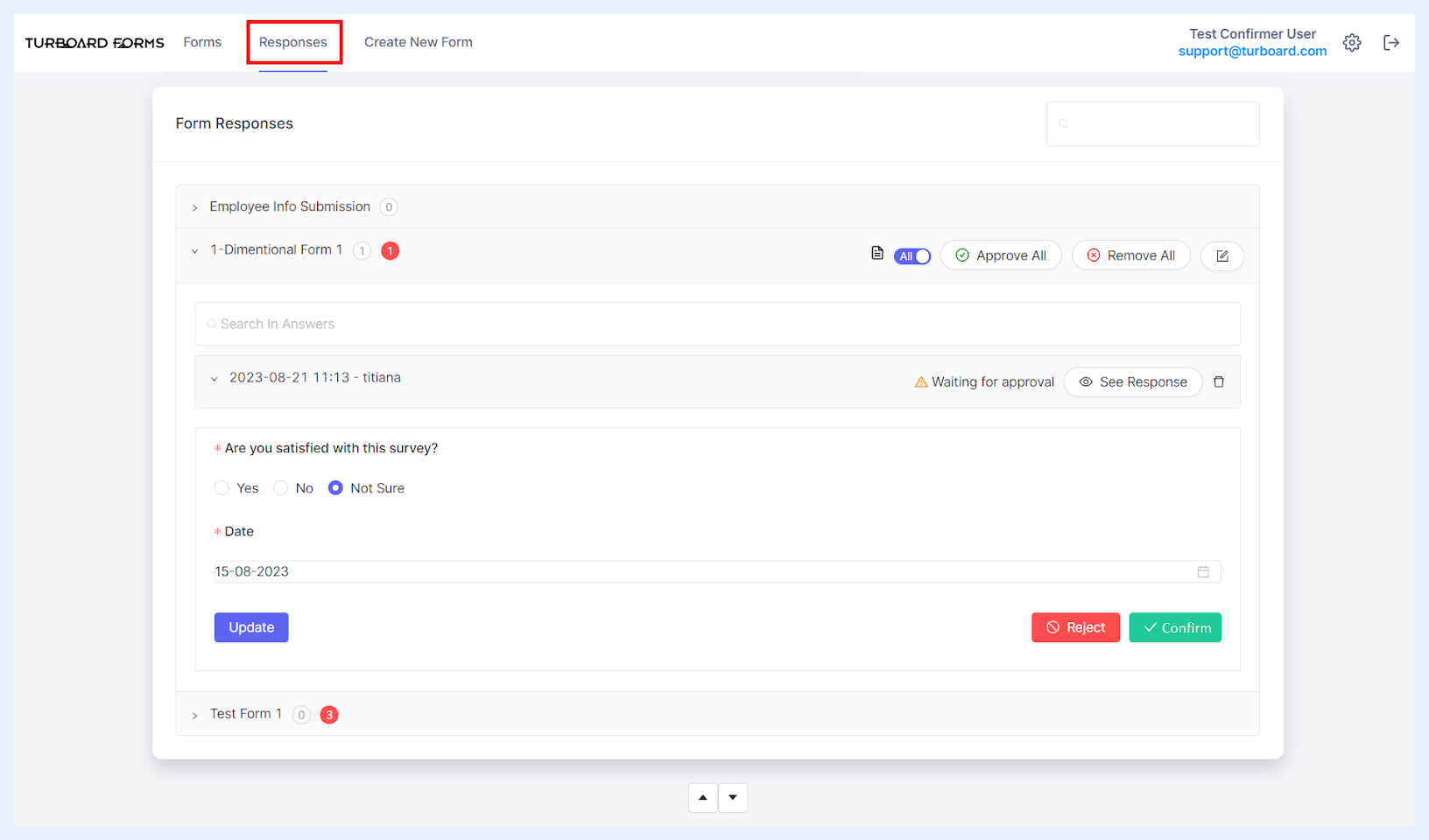
Expandable Form Responses: For forms with answer submissions, adjacent to each form title, an arrow icon beckons users to unveil additional details. Clicking on this arrow expands the form's section to show a sub-list of submissions, each entry representing an individual response. This feature provides immediate access to various actions and tools that can be applied to the form as a whole or to specific responses.
The responses are organized in reverse chronological order, showcasing the most recent submissions first. Each response entry is labeled with the submission's date and time, as well as the respondent's username.
To examine each response, users have the option to either directly click on a response or use the See Response button. This action reveals the complete set of answered fields, offering a comprehensive breakdown for meticulous review or further action.
Note
Forms that have no responses submitted yet are visually indicated by being distinctly faded in gray and presented as unclickable within the list. This visual cue indicates to users that these forms are awaiting their input and remain active for submission.
Responses Management According to User Types
Selecting a form from the list activates a contextual menu of functionalities, tailored to the user's type and assigned permissions. These features are meticulously designed to empower users with the ability to manage responses in a manner consistent with their role within the system.
1. Respondent Users:
Upon accessing the “Responses” tab, Respondent users will encounter a list of all active forms – those which have not yet expired – that are specifically assigned to them, as well as those that are publicly available. Forms not assigned to them or those that have expired will be concealed from their view.
The forms for which the respondent has already submitted one or more responses – where the multiple response option is enabled—are designed to be expandable, granting the user the capability to review their submissions via the “See Response” button or by clicking on the form response row.
Each form features an “Export to Excel” icon, located at the top-right corner, enabling users to download a comprehensive record of their responses into an Excel document.
For forms that allow multiple submissions, an “Answer” icon is prominently displayed next to the export feature. By selecting this icon, users can swiftly re-enter the answer window to submit additional responses as necessary.
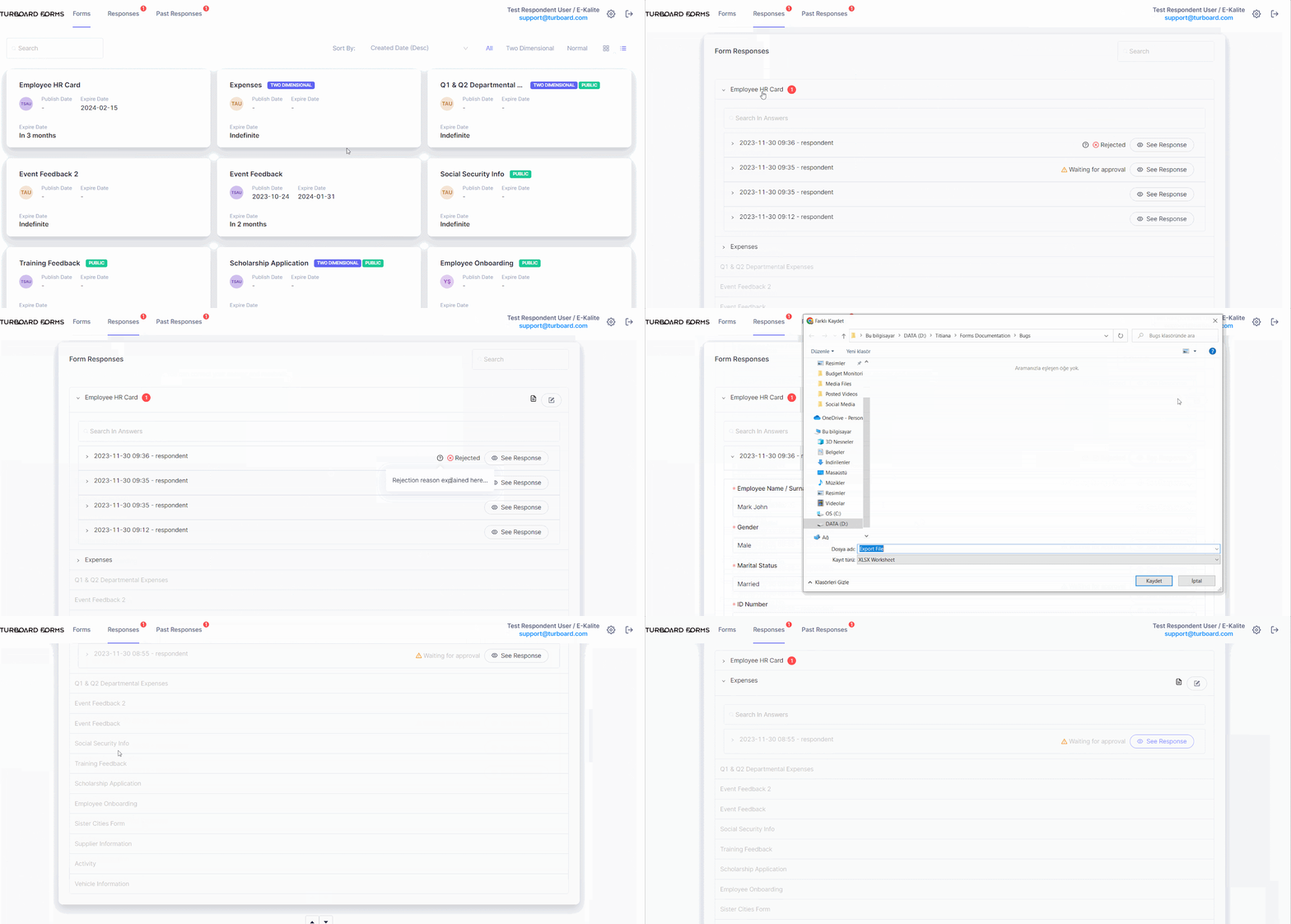
Options & Features in “Responses” Tab for Respondent Users
Note
Forms that have expired but were assigned to a respondent user and have received submissions from them are still accessible for review in the “Past Responses” tab.
2. Confirmer Users:
For Confirmer Users, the “Responses” tab provides a specialized interface for overseeing and taking action on form submissions that require their approval. This section is specifically designed to align with their role in the data validation process.
Upon accessing the “Responses” tab, Confirmer Users will encounter a list of forms containing responses awaiting their review and approval. These typically include submissions from Respondent Users assigned to them for confirmation.
Responses that require the Confirmer User’s attention are highlighted with a red circle, displaying the count of such responses for easy and quick identification.
Responses Review Options
Confirmer Users can expand each form to access individual responses. The available management options for these submissions include:
View Response: By clicking the “See Response” button next to each response, Confirmer Users can view the detailed answers provided.
Approve: This option allows Confirmer Users to approve a response, indicating its adherence to required standards or criteria.
Reject with Feedback: If a response fails to meet the necessary requirements, Confirmer Users can reject it and provide a reason for this decision. This feedback will be displayed as a tooltip (marked with a “?” icon) for the relevant Respondent User and the Admin users upon reviewing their response.
Delete Response: Confirmer Users have the ability to completely remove a response from the system if necessary.
Withdraw Approval: This function permits Confirmer Users to retract approval of a response, in case a reassessment is needed.
Export to Excel: To facilitate responses review and audit outside the FOR-S platform, Confirmer Users can export the responses into an Excel file. This feature, located at the top-right corner of each form, allows for the efficient handling and sharing of collected data.
Response Bulk Management Tools
At the form level, a switch button enables Confirmer Users to filter responses based on their status, choosing to view either “All Responses” or only those “Waiting for Approval”.
To facilitate efficient handling of responses, Confirmer Users can utilize options such as “Approve All” or “Remove All”, allowing for quick bulk action within a form.
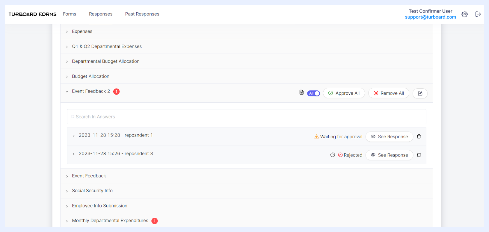
Options & Features in “Responses” Tab for Confirmer Users
3. Admin Users:
Admin Users have unrestricted access to all form responses within the “Responses” tab, regardless of the form's status or user assignments. This universal visibility ensures that Admin Users can maintain a holistic view of data collection across the platform.
The available management options for Admin users include:
View Response: Admin Users can review the details of any submission by clicking the “See Response” button available next to each response. This action provides a detailed view of the submitted answers for thorough examination.
Delete Response: Reflecting their elevated system privileges, Admin Users can delete any response. This capability is crucial for maintaining data quality and removing any irrelevant or incorrect submissions.
Export to Excel: To facilitate data analysis or reporting outside the FOR-S platform, Admin Users can export the responses into an Excel file. This feature, located at the top-right corner of each form, allows for the efficient handling and sharing of collected data.
Admin Users do not have the Approve/Reject functionalities, as these tasks are typically within the purview of Confirmer Users. Instead, their role focuses on broader data management and system maintenance, ensuring that all aspects of the form responses are in line with the organization's data strategy and compliance requirements.
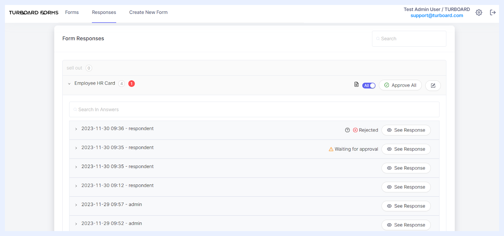
Options & Features in “Responses” Tab for Admin Users