Showcases
Creating Showcases
A “Showcase” is a powerful feature that allows for the easy sharing of multiple dashboards as one unit. It is especially useful for businesses and organizations that need to provide a comprehensive view of data to their end-users.
Designer users can create, design and customize showcases that are well-suited to the requirements of their analysis and are visually engaging and informative to the end-users who will be using them.
Showcase Properties
With a showcase, end-users can:
-
Easily navigate between different dashboards, which are grouped hierarchically for greater clarity.
-
One of the key features of a showcase is the ability to display dashboards with different theme options, providing a customized and personalized experience for users.
-
Additionally, filters can be easily moved between dashboard transitions, allowing for greater flexibility and control.
-
The showcase also comes with two different navigation displays, ensuring that end-users can choose the most suitable option for their needs.
-
Furthermore, a showcase is easy to embed, making it a convenient and accessible tool for sharing data and insights with others.
-
Users can mark any showcase as a Favorite for one-click access. Favorited showcases appear in a dedicated section of the main navigation menu.
How to Create a Showcase?
1 Go to Showcases > click + Create New Showcase.
2 Give a proper name to the showcase in the overlay window that opens.
3 Optionally, you may add a “Description” to the showcase.
4 Optionally, you may add a “Tag” in the relevant field. Tags are useful for organizing and searching for content, as they allow you to quickly filter and find items that have been labeled with the same tag. When you label showcases with specific keywords or terms, it will help find those showcases grouped upon “Search” in their view listing main page.
5 Click CREATE button. A new window will open to start adding dashboards to your new showcase.
6 Click Add Dashboard Or Menu button and select:
-
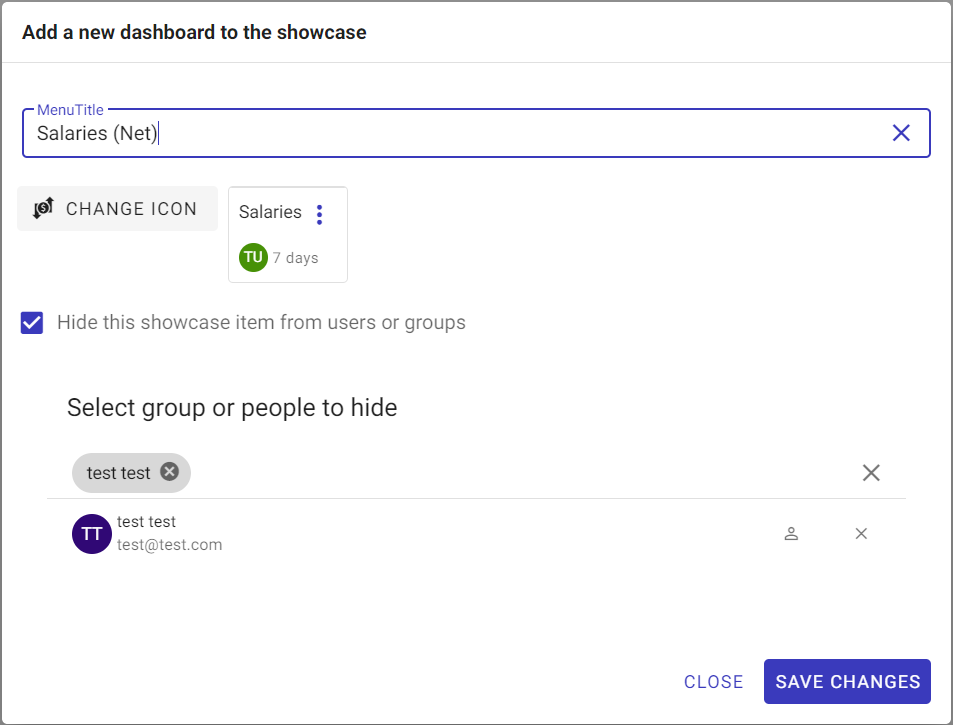
Add Dashboardblue icon: when selected, an overlay window will open listing all the dashboards shared with the user in which the user can select one dashboard to be added to the showcase. ClickADDbutton after selecting the required dashboard. -
You can change the name of the dashboard on the dashboard menu display while its main title will remain the same on the dashboard itself.
-
You can assign an icon to the dashboard menu display.
-
You can hide the dashboard from specific users and/or groups.
OR alternatively,
Add Menublue icon: when selected, an overlay window will open to allow the user to create a drop-down menu and list/group several dashboards under it or even other sub-menus with several dashboards under each.

Managing Showcases
Upon successful creation of the showcase, its “Edit” window will open automatically with four main sections in order to allow the user to manage its settings and features as needed.
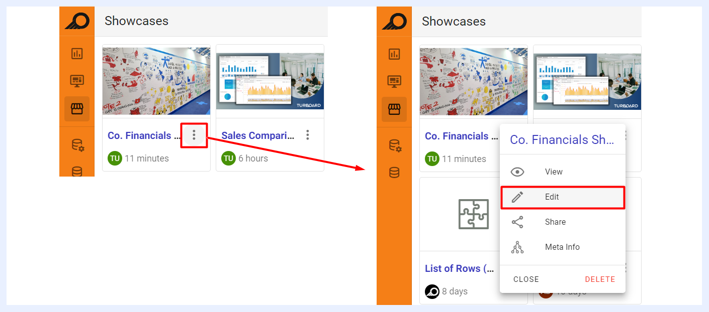
Additionally, a showcase can be edited anytime by selecting the “Edit” option from the showcase ellipsis menu in the showcase’ listing window.
Showcase Title & Details
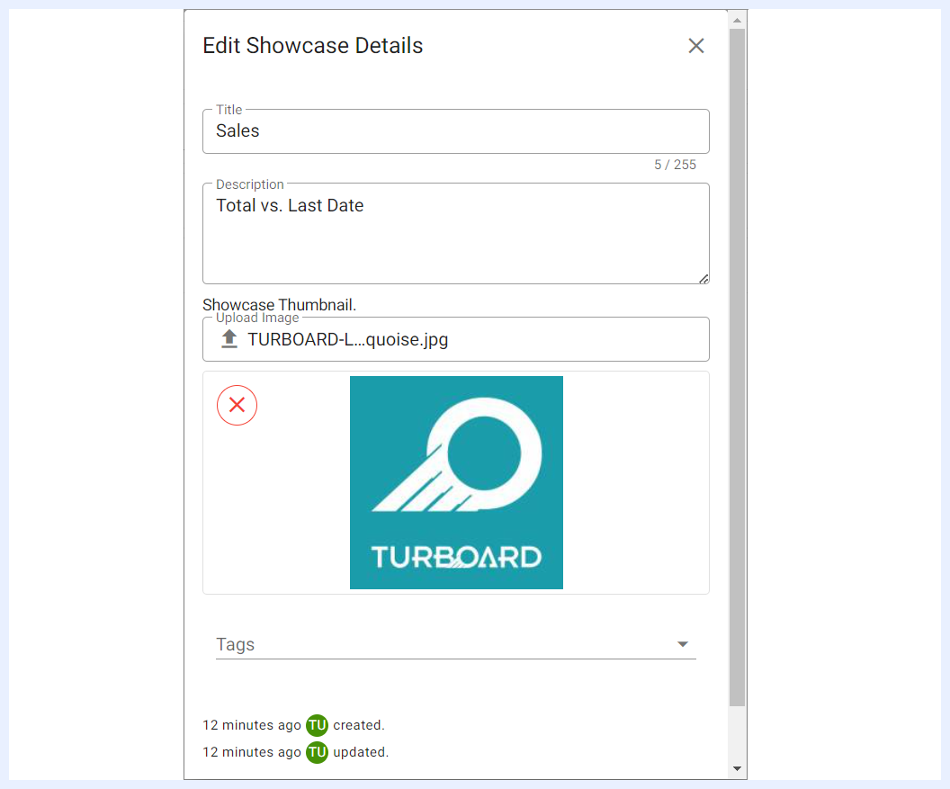
The showcase title and details can be edited/changed by clicking on the “Edit Showcase” icon available at the Quick Actions Ribbon. Or, alternatively by clicking on the title of the showcase > Edit option. An overlay window will open to allow the user to:
-
Change the name of the showcase in “Title” field,
-
Add/Edit the “Description” of the showcase,
-
Add/Edit the “Tags” of the showcase,
-
Assign a “Thumbnail” to the showcase (image file format) and/or change it. The thumbnail will appear on the Showcase card in the showcase view listing page.
Quick Actions Ribbon
At the top-right side of the showcase “Edit” window, several icons are available to apply general actions on the showcase.

| Showcase Quick Action Icons Explained | |
|---|---|
| Change theme: | to modify the color palette and overall appearance of the showcase and use a different theme than the default applied for TURBOARD's general elements and designs. This customization option allows you to create a unique visual style for the selected showcase only, while other showcases in TURBOARD will continue to use the default theme. |
| Edit Showcase: | to change the name of the showcase in the “Title” field, add/edit the “Description” of the showcase, add/edit the “Tags” of the showcase, and/or assign a “Thumbnail” to the showcase. |
| Share: | to share the showcase and make it available to either for public or with defined user(s) and/or group(s). When a showcase is shared with “Can View” privilege, shared users will only be able to view the showcase. When it is shared with “Can Edit”, shared users can apply changes to the showcase settings as well (open its “Edit” mode). This option can also be accessed from the showcase ellipsis menu in the showcase’ listing window. |
| Refresh dashboard and dashlets data cache: | to update the data displayed on all the dashboards of the showcase and their components (dashlets) by reloading the temporary storage location (cache) where data is stored. |
| Share meta info: | when clicked, a pop-up window opens listing the related data source(s), the view(s) of the dashlets added to the relevant dashboards, in addition to the dashboards that this showcase depends on. This option can also be accessed from the showcase ellipsis menu in the showcase’ listing window, namely the “Meta Info” option. |
| Remove: | to delete the showcase. |
| View showcase: | to view the resulting showcase (View mode) and how it will be displayed for end-users. |
Showcase Items
Each dashboard or group of dashboards (menu) under the showcase is called a “Showcase Item”. The dashboards that were added by the designer user when creating the showcase will be listed in the main “Edit” window of the showcase under “Showcase Items”. The user can apply several settings and changes to the showcase items as below:
| Showcase Item Actions Explained | |
|---|---|
| Add a New Showcase Item: | to add more dashboards to the showcase, either individually or as grouped menus. |
| Edit dashboard: | to open the “Edit” window of the dashboard. |
| Disconnect: | to remove the dashboard from the showcase. |
| Drag Item: | to rearrange the order of the dashboards and relocate them within a showcase and manipulate their hierarchical order by clicking and dragging the items to a new location. |
| Change Icon: | by clicking on the icon of a menu or a dashboard, which is located on the left side of the menu item, the user can modify it and select a different icon than the default/previous one. |
Editing Showcase Items

When you click on the “Showcase Item” title, you can directly rename it, or click the Edit icon to apply the following:
-
Change the name of the item (whether a dashboard or a menu) in “Title” field,
-
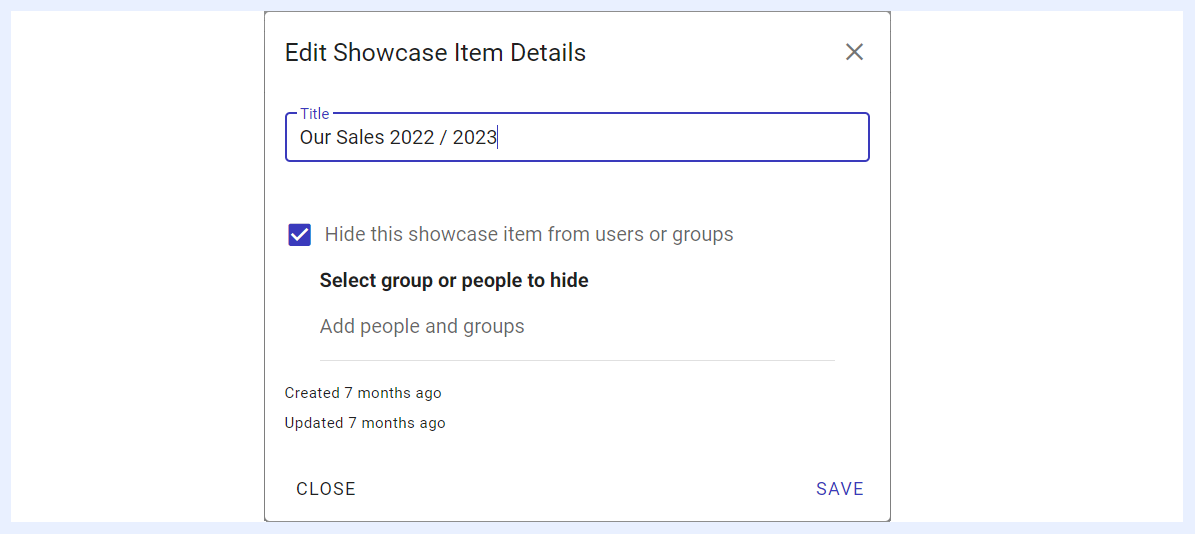
Hide the dashboard from specific users and/or groups, or change the users and/or groups that the showcase will be hidden from them.
Storyboard Menu Display Options
When dashboards are added as menu items and set to display as a “Storyboard”, the designer user can customize the way they will be displayed to end-users and their locations on the showcase as below. This means that these options (radio buttons) will only appear when “Storyboard” check box is selected in “Settings Panel” for “Menu Items”.
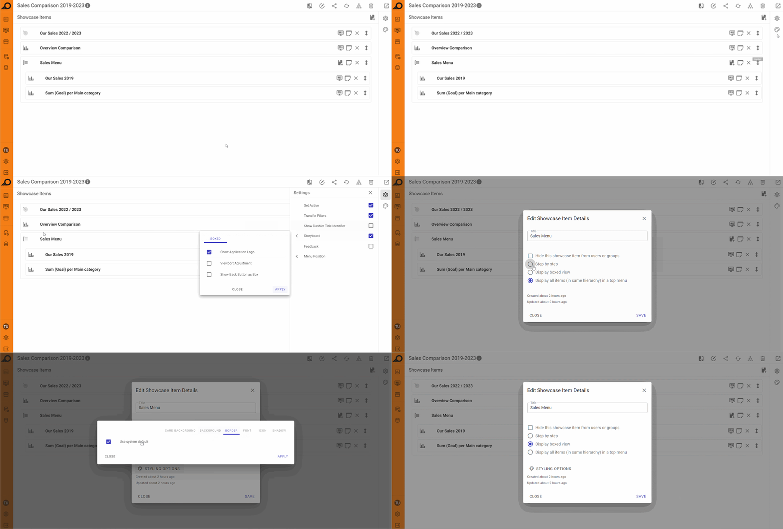
“Step by step” radio button: when selected, will display the dashboards under the relevant menu one after another as tabs on the top of the showcase. The tabs will be displayed in the same hierarchical order that they were added, and users can navigate between them using left and right arrow buttons. This option allows users to view multiple dashboards one at a time in a step-by-step fashion.
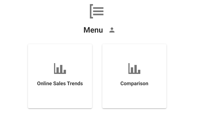
“Display boxed view” radio button: when selected, will display the dashboards under the relevant menu as boxes or cards instead of tabs. This allows users to see a summary or preview of each dashboard before selecting the one they want to open. The boxes or cards may contain information such as the menu title, the dashboard's title and its icon as a thumbnail image. Users can select the required dashboard by clicking on the corresponding box or card. This option is useful when users have multiple dashboards and need a visual representation of each one to quickly select the one they need.
“Display all items (in same hierarchy) in a top menu” radio button: when selected, the dashboards under the relevant menu will be displayed as tabs on the top of the showcase as a sub-menu or drop-down menu.
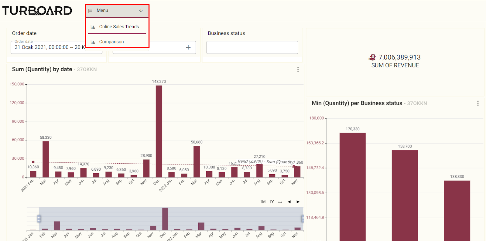
Settings Panel
The settings panel in the showcase provides various options to customize the display of dashboards and improve user experience. Users can hide a showcase from other users, choose the location of showcase items, apply filters to multiple dashboards, display unique dashlet codes, and enable storyboard navigation for a sequential view of dashboards.
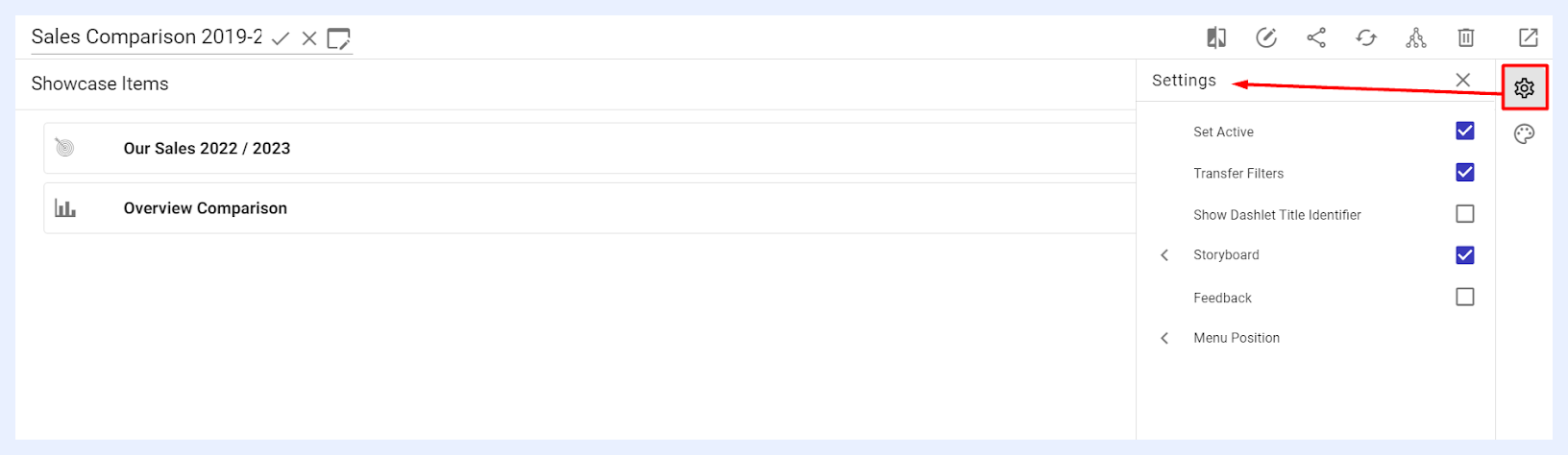
“Set Active” check box: this feature controls the showcase's visibility to other users. When activated, the showcase is accessible to users it's shared with. If deactivated, the showcase becomes hidden from all end users. Notably, making a showcase inactive does not limit users' ability to view its dashlets and dashboards when shared as separate visualizations or when these elements are included in other active showcases.
“Transfer Filters” check box: when checked, it enables the filter applied in one dashboard to be applied to all other dashboards. This means that if you add a filter to a dashboard within a showcase, that filter will automatically apply to all other dashboards within the same showcase.
Radio-type filter widgets can be configured with Navigate on Click — when a user selects a value from the widget, they are automatically taken to the next dashboard in the showcase with that filter value applied.
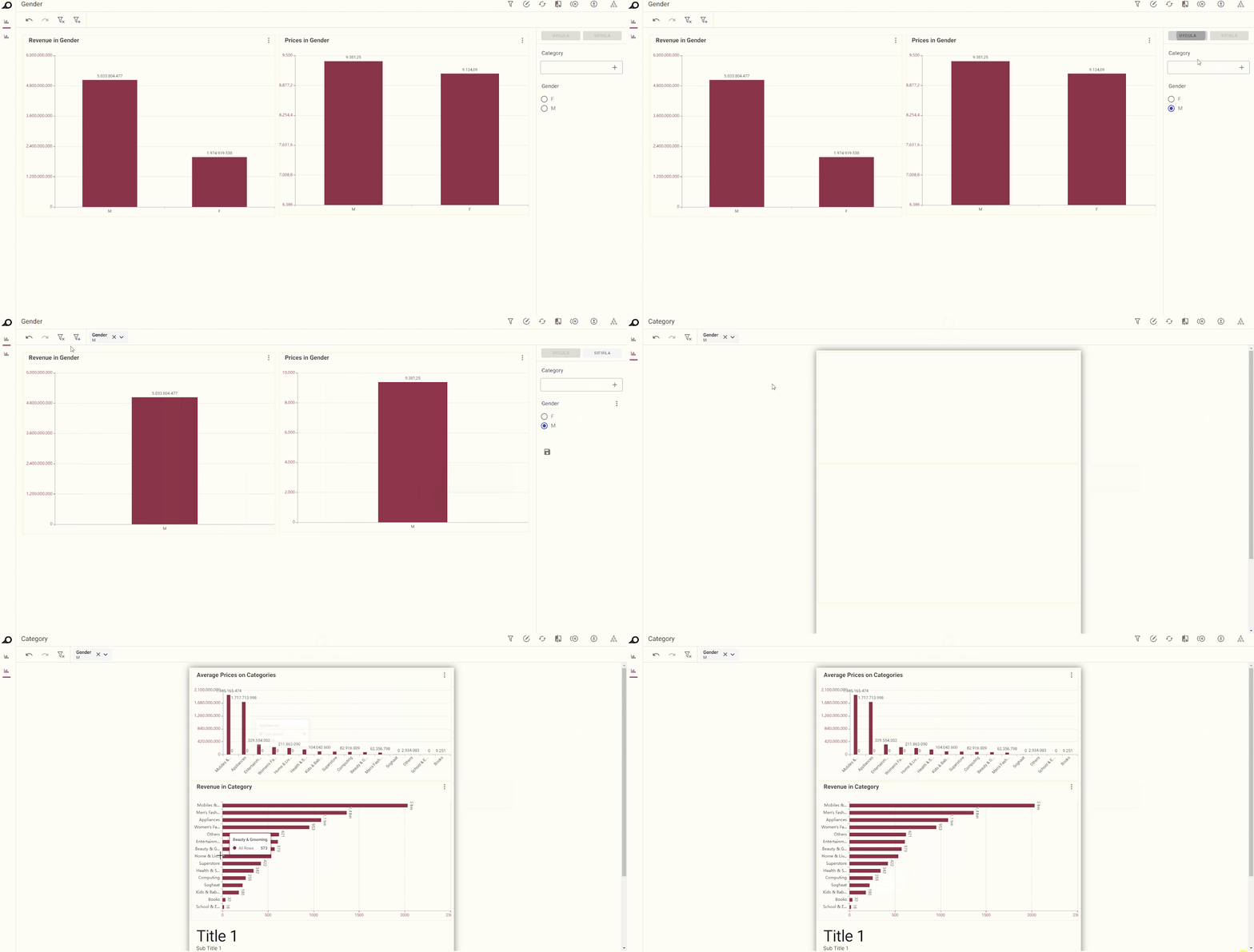
Effect in Showcase “View” Mode when “Transfer Filters” is applied
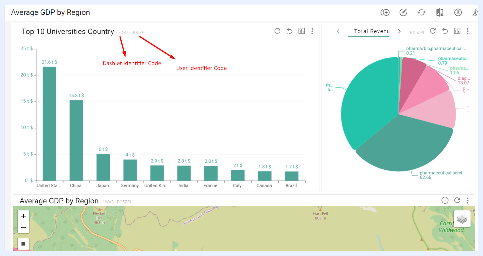
“Show Dashlet Title Identifier” check box: when checked, a unique code assigned for each dashlet namely “Dashlet Identifier” will appear on all the dashlets next to their titles in the relevant showcase at user-end side (showcase “View” mode). This code along with the User Identifier Code helps tracking user activities.
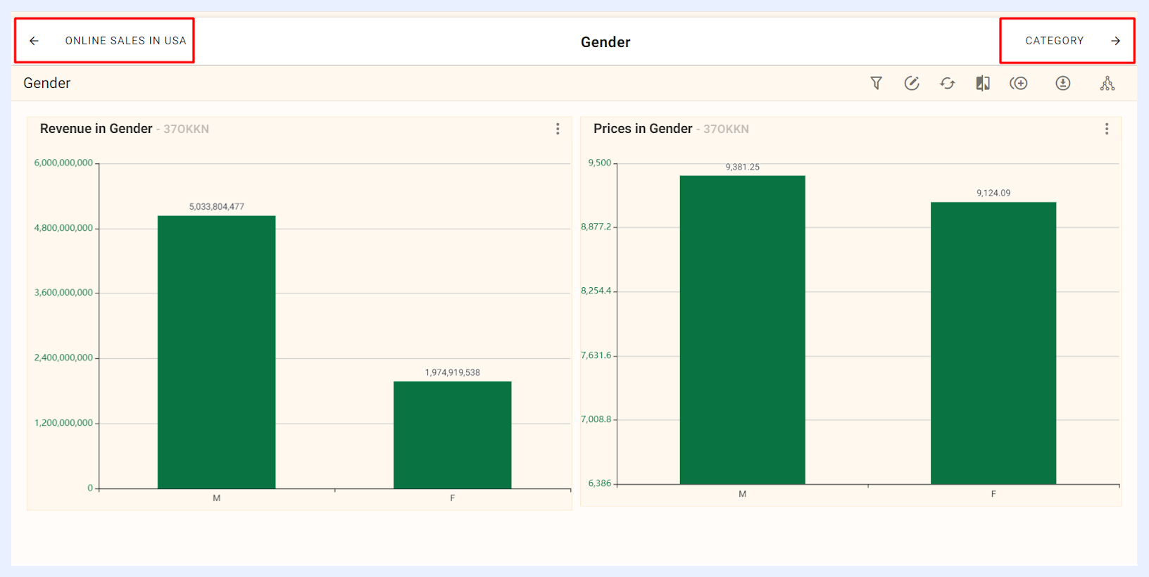
“Storyboard” check box: when selected, dashboards and menu items in the showcase are displayed as boxes or cards instead of tabs or menus. Users navigate through Previous/Next arrow buttons at the top of each dashboard. Designers can adjust the following settings:
“Show Application Logo” check box: shows or hides TURBOARD logo (the application logo as set in Administration >> Logo and Branding) at the top-left, which directs users to the main Showcases page when clicked.
“Viewport Adjustment” check box: when selected, when selected, allows users to choose between two display options: Fit, which arranges all boxes in a single line, or Overflow, which moves any excess boxes onto additional lines, providing flexibility in how the showcase items are displayed on the screen.
“Show Back Button as Box” check box: displays the “Back” button as a box, placed at the top of the showcase, replacing the previous arrow.
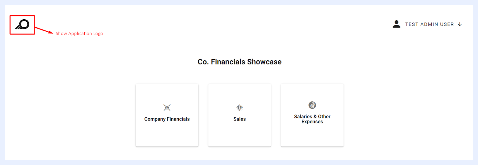
Effect in Showcase “View” Mode when “Show Application Logo” is applied
Note
When “Storyboard” option is enabled, the “Storyboard Menu Display Options” become available for each menu item, with the default option to display all items in a top menu. These options can be adjusted in the menu item's edit window.
The Storyboard option can be useful in showcases when you want to present a series of dashboards in a specific order or sequence, such as when you are giving a presentation or demonstrating a workflow. It helps you to present your data in a more organized and meaningful way, making it easier for your audience to understand and follow the story that you are trying to tell.
“Feedback” check box: when selected, an icon appears on the showcase's quick action ribbon, allowing end-users to send feedback. The feedback message is sent to an email address configured in the backend system settings, determined by TURBOARD client. Upon clicking the feedback icon, end-users can write a message in a pop-up window and click the SEND button. The feedback is sent as a no-reply email, including a link to the showcase where the feedback originated.
A Notification Bell icon is also available in the showcase ribbon in view mode. It tracks and summarizes recent changes to the showcase, including dashlet and dashboard additions or removals and filter and measure modifications. Changes are displayed with relative timestamps and can be filtered by Today, Last week, or Since last login.

“Menu Position” options: when selected, it allows the user to set the location of the showcase items relative to the main showcase screen. The dashboard menu/tabs can be displayed either at the top or in the left upper corner of the showcase. When positioned in the left upper corner, the user can choose between showing the full menu or hiding it until hovered over, where only the menu icons will appear until the mouse is placed over them.
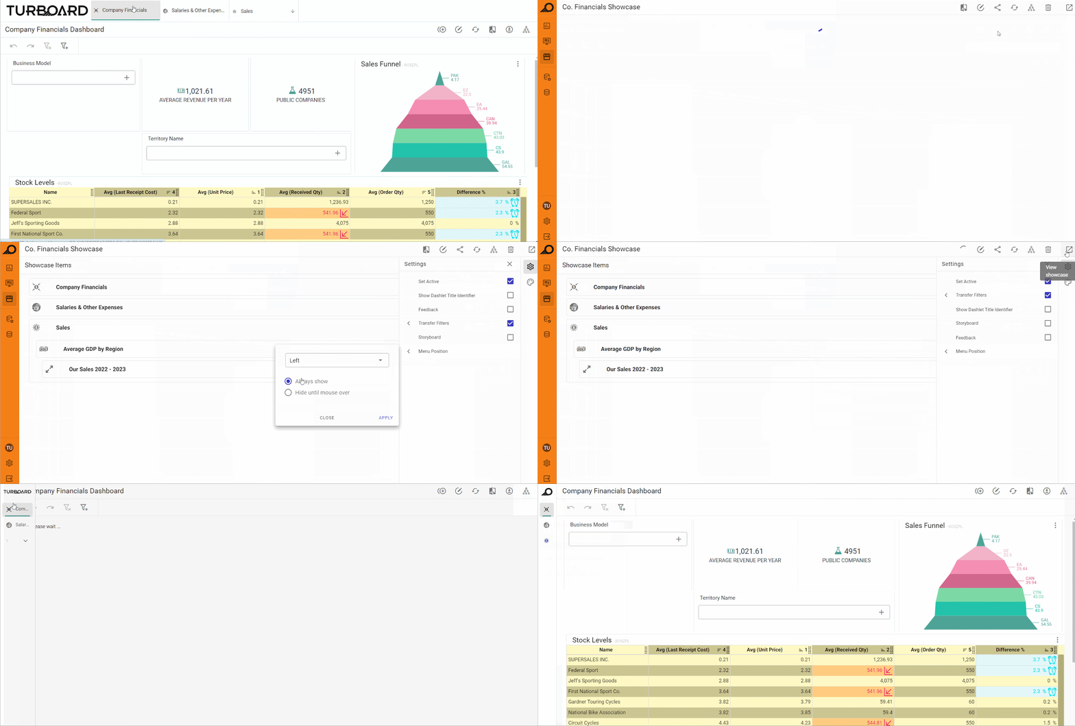
How “Menu Position” is changed from “Top” to “Left” with “Hide until mouse over” option
Styling Panel
The Styling Panel allows designer users to customize the appearance and layout of showcase menus, including the top menu, sub-menus, and selected menu items. Designers can adjust menu fonts (type, size, color, and style), shadows, borders, background colors, divider colors, and menu heights. All these options are initially set to “Use Default” with checkboxes. When deselected, additional fields appear, enabling further customization of each styling aspect.
If the “Show Back Button as Box” setting is enabled (as described in the Storyboard settings), designers can also customize its appearance. Options include modifying the card background, border width, color, radius, font design (color, size, type), and the icon size and color. This allows full control over how the back button integrates visually with the rest of the showcase.
Showcases for End-Users
The showcase items/dashboards will be displayed to end-users on the showcase (in “View” mode) according to the the settings and menu display options determined by the designer user.
However, the end-user has various options and quick action function buttons and icons at the showcase level as below:
| Showcase View Action Icons Explained | |
|---|---|
| Change theme: | to modify the color palette and overall appearance of the showcase and use a different theme than the default applied for TURBOARD's general elements and designs, and/or the theme selected by the designer of this showcase. This customization option allows you to view your showcase according to your preferences. |
| Share meta info: | when clicked, a pop-up window opens listing the related data source(s), the view(s) of the dashlets added to the relevant dashboards, in addition to the dashboards that this showcase depends on. This option can also be accessed from the showcase ellipsis menu in the showcase’ listing window, namely the “Meta Info” option. |
Other function buttons and icons are made available on the dashboard level, i.e. they are applied on the selected dashboard only. They are explained in this section.

Replicating Showcases
In TURBOARD, users can export (through “Share” option) any TURBOARD element, starting from views, dashlets, dashboards and up to a whole showcase into an external file (a “.tur” custom file format specific to TURBOARD application) compressed inside a (.zip) folder.
This allows users to replicate such elements – instead of creating them from scratch, applying their analysis to another data source, and/or copy some elements into another TURBOARD environment – through importing the same file into TURBOARD again.
A designer user may sometimes need to share similar showcases that analyze similar data but from different data sources, i.e. provide the same type of analysis and visualizations on the same type of data but for data that is available on another data source or another database.
Instead of creating a similar showcase manually and preparing its dashlets and dashboards from newly created datasets in the other data source, TURBOARD allows replicating the entire showcase with its design and structure from a master showcase and applying its analysis on another similar dataset available on another data source.
The replicating process can be easily applied and the new showcase with all its related entities (views, dashlets, and dashboards) will be automatically created in TURBOARD within a few seconds.
The feature of replicating a showcase can be used for different use cases such as:
You may need to analyze historical data and compare it with the latest data, but if your historical data is stored in another data source or database, the showcase can be duplicated so that it works from the new database.
You may need to share the same type of analysis and visualization with different customers, each customer data has the same data tables and structure but is stored on a different database.
One condition is required to complete the replication successfully: the data tables in the new data source must have the same name and structure (fields) for the elements/entities that are connected to the master showcase.
How to create the same showcase from another data source?
1 Prepare the showcase that you want to replicate in TRBOARD following the below steps:
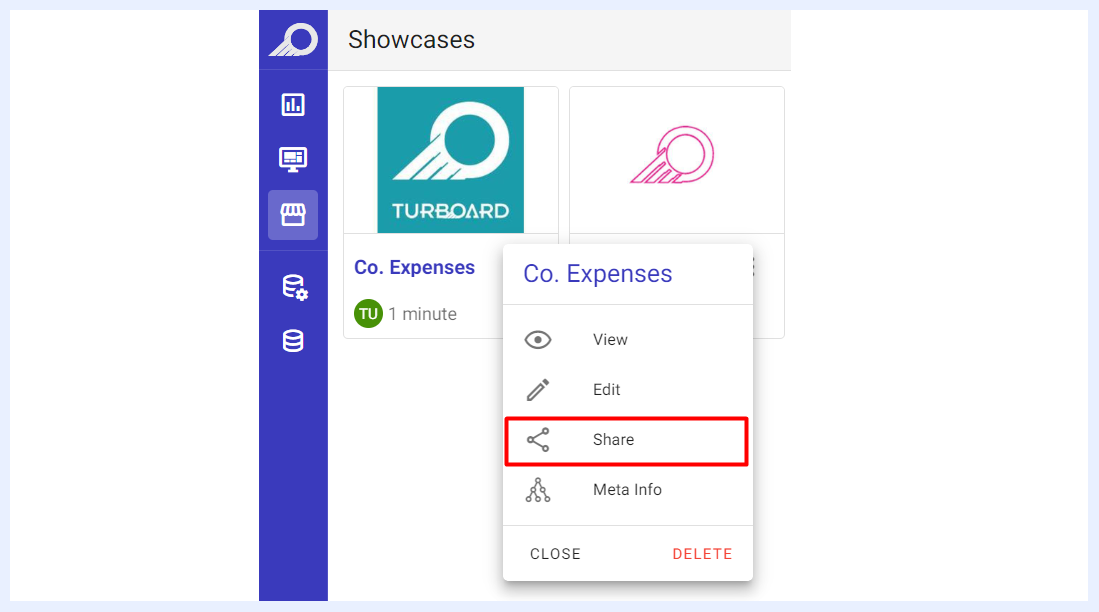
Go to “Showcases” view/listing page > click on the “Showcase” burger menu > click on the Share option.
In the “Share” overlay window that opens, click the “Export” additional menu and choose Export With Related Objects option.
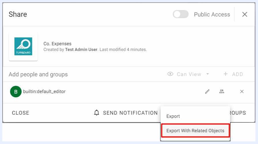
The showcase and all its elements and objects will be downloaded to your computer device as a compressed folder (.zip file).
2 Create the new showcase by importing its elements from the exported file of the master showcase following the steps below:
-
Go to
Showcases> click+ Create New Showcase. -
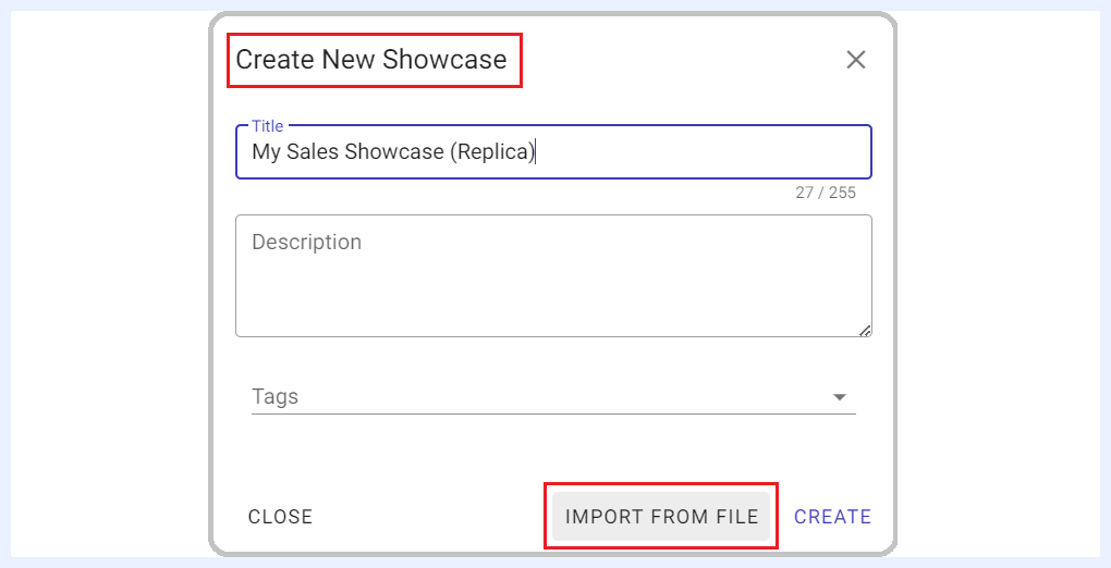
Give a proper name to the showcase in the overlay window that opens. Optionally, you may add a description to the showcase and tags.
-
Click
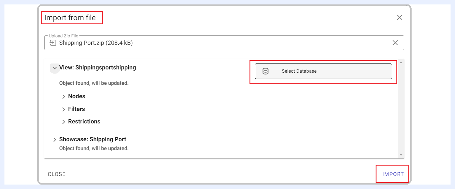
IMPORT FROM FILEoption and upload the .zip folder that you exported from your computer device by clicking Upload Zip File in the “Import from File” overlay window that opens.
TURBOARD will automatically detect the tables and the data structure from the uploaded file.
-
Click
Select Databasebutton for the relevant view/s to determine the required data source that you want to link the replicated showcase to. -
Click
IMPORTbutton. The new showcase will be created and linked to the selected database/s.