Chart Dashlets
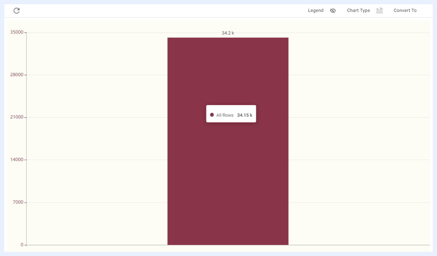
When creating a chart, its default will be a column chart with its measure as the count of the rows of the table.
Available Chart Types in TURBOARD
TURBOARD has a rich library of charts that can be used to display data in various ways.
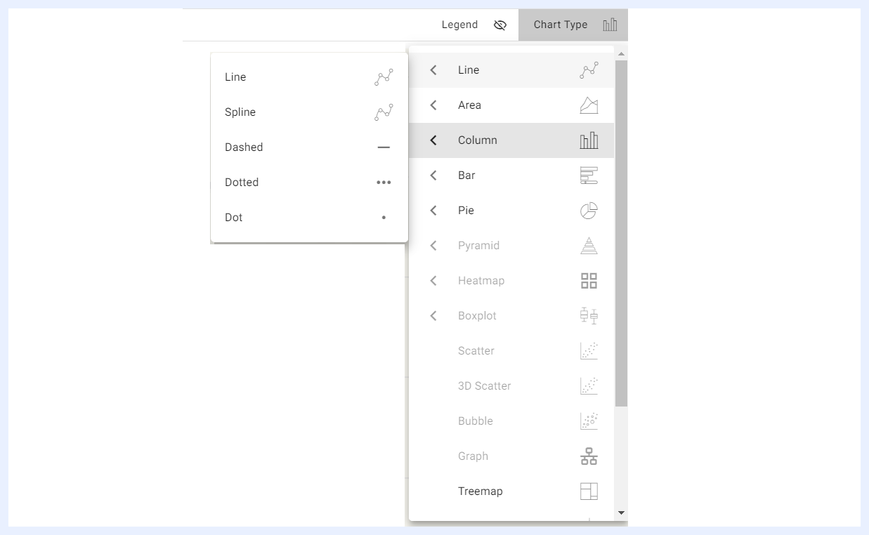
One of the features of TURBOARD is that users can change the chart type directly in the playground section of the platform while working on their dashlet.
When a user selects the required dimension(s) and measure(s), TURBOARD will automatically activate the appropriate chart type or types based on the number of dimensions and measures that have been selected. This helps users choose and find the chart type that works best for their data.
Line Chart
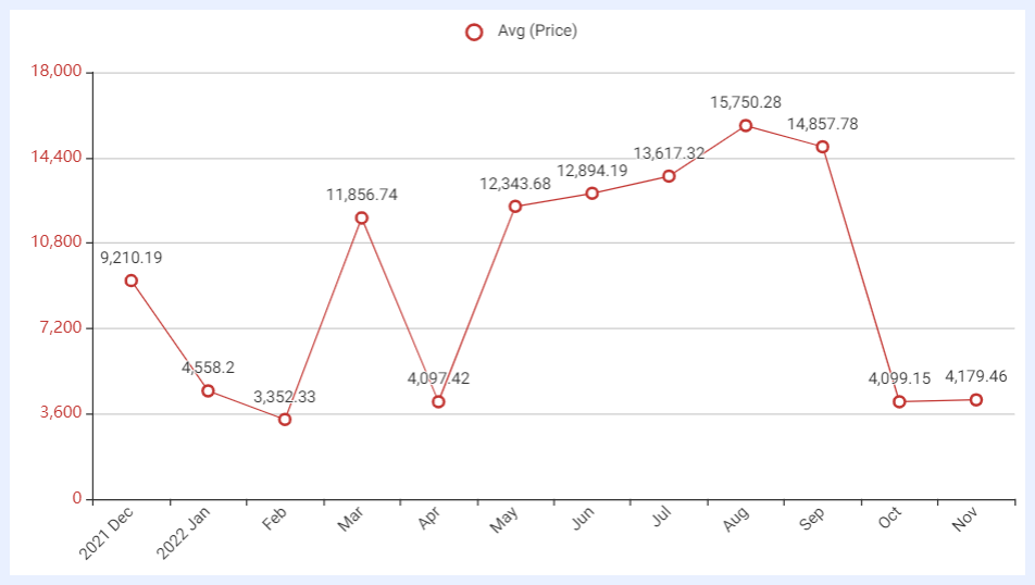
Definition: a line chart is a chart that displays data points as a series of connected data markers in the form of a line.
Uses: tracking trends and changes over time; comparing two or more data series over time; showing the correlation between two variables; highlighting peaks and valleys in the data; displaying data with a clear upward or downward trend.
Examples: visualizing stock market trends; tracking website traffic; monitoring sales figures; displaying scientific data such as weather patterns or disease outbreaks over time.
Dimensions and Measures: 2 dimensions with one measure, or 1 dimension with several measures.
Variances: Spline Line Chart, Dashed Line Chart, Dotted Line Chart, Dot Chart.
Area Chart
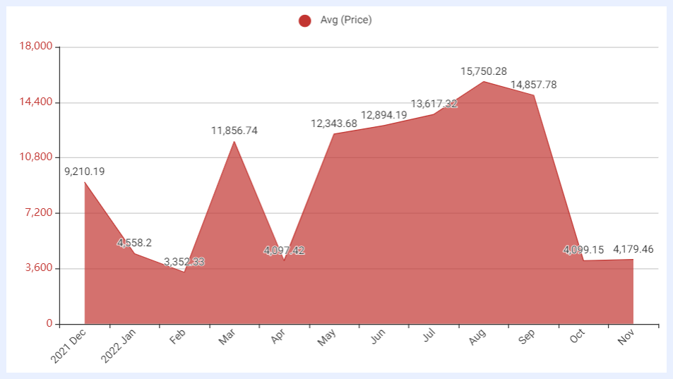
Definition: a chart that displays data points as a series of connected data markers, similar to a line chart, but with the area below the line filled in with color or shading to help emphasize the magnitude of the data over the selected dimension.
Uses: to show how a particular dataset changes over time in relation to the whole, or to compare the changes in two or more datasets over time. Often used in various scenarios where it is necessary to show changes in data over time, while also highlighting the magnitude of the changes.
Examples: visualizing changes in website traffic; showing changes in market share over time; displaying the progress of project milestones; tracking changes in the number of people affected by a disease outbreak; depicting changes in revenue or sales over time; visualizing the changing composition of a population or workforce over time; comparing the performance of multiple products or services over time.
Dimensions and Measures: 2 dimensions with one measure, or 1 dimension with several measures.
Variances: Stacked Area Chart, Area Spline Chart, Stacked Area Spline.
Column Chart
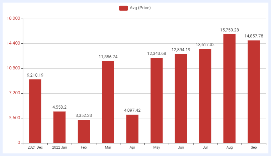
Definition: a graphical representation of data using rectangular bars arranged vertically, where the length of each bar represents the magnitude of a specific category or data point.
Uses: to display, compare or identify trends/patterns in data over a period of time or across categories. The time period is relatively long or the number of categories are numerous, which in some cases, using a navigator comes handy on the chart to choose and display a specific part of it, change the data segments and easily navigate through them. The data type can be nominal, ordinal, or quantitative.
Examples: tracking sales over time; presenting demographic data, such as the breakdown of a population by age, gender, or ethnicity; comparing data from different categories or groups.
Dimensions and Measures: 2 dimensions with one measure, or 1 dimension with several measures.
Variances: Stacked Column Chart. For Stacked Column Charts, the Order By Stack option allows sorting by a specific measure within the stack rather than only by the total stack value.
3D Column Chart
Definition: a column chart variant that visualizes data with two dimensions and one measure in a three-dimensional perspective. The Bar Colors option allows columns to be colored based on a selected dimension, providing clearer visual differentiation across categories.
Uses: comparing category values with an added sense of depth; highlighting dimensional groupings through color.
Dimensions and Measures: 2 dimensions with one measure.
Bar Chart
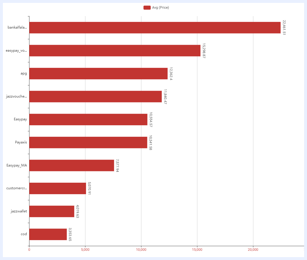
Definition: a graphical representation of data using rectangular bars arranged horizontally, where the length of each bar represents the magnitude of a specific category or data point.
Uses: a suitable alternative to column charts, particularly when the category names are lengthy. They are particularly helpful when the main focus is on highlighting the differences in values rather than the categories. They are also ideal for comparing negative and positive values.
Examples: comparing the performance of different entities, such as sports teams, companies, or stocks; product comparison as it is easier to see the relative differences in values between the products; survey results as the longer category names become easier to read.
Dimensions and Measures: 2 dimensions with one measure, or 1 dimension with several measures.
Variances: Stacked Bar Chart, Symmetrical Double Bar Chart.
Pie Chart
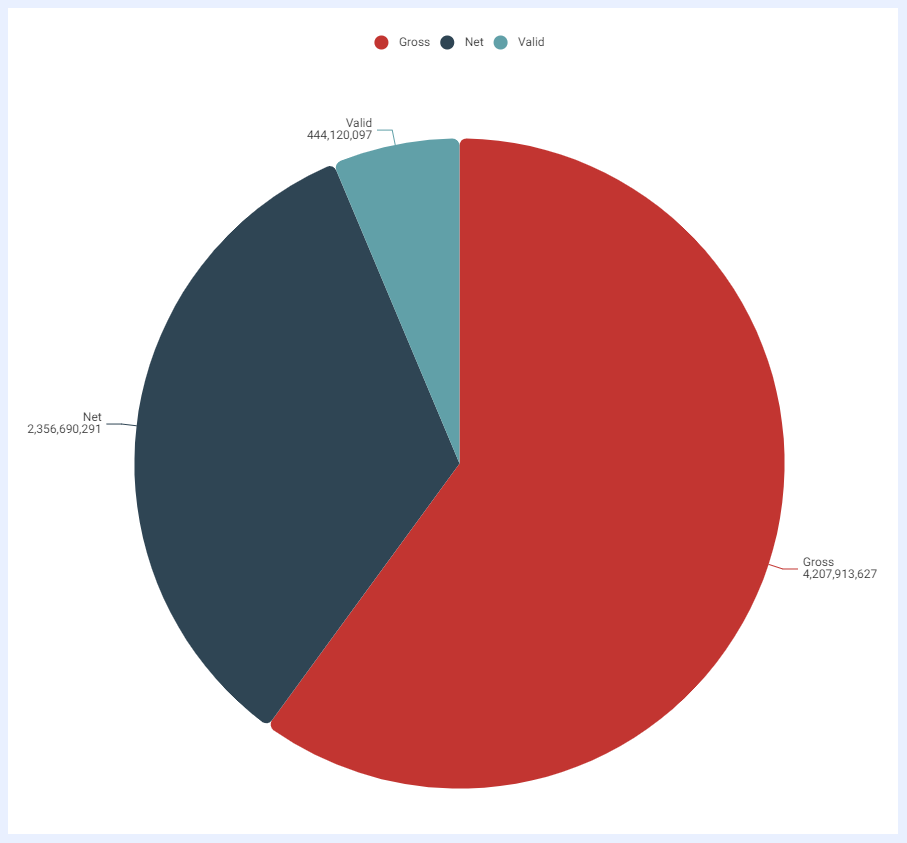
Definition: a circular statistical graphic that is divided into slices to illustrate numerical proportion. The arc length of each slice is proportional to the quantity it represents.
Uses: comparing the proportions of different categories within a single dataset in which this dataset has a small number of categories (2 to 5); representing these proportions as a percentage of the whole dataset.
Examples: showing the market share of different companies or products; showing the percentage of time spent on different tasks during a workday, or the percentage of a website's traffic that comes from different referral sources; visualizing how a budget is allocated.
Dimensions and Measures: up to 2 dimensions with 1 measure only.
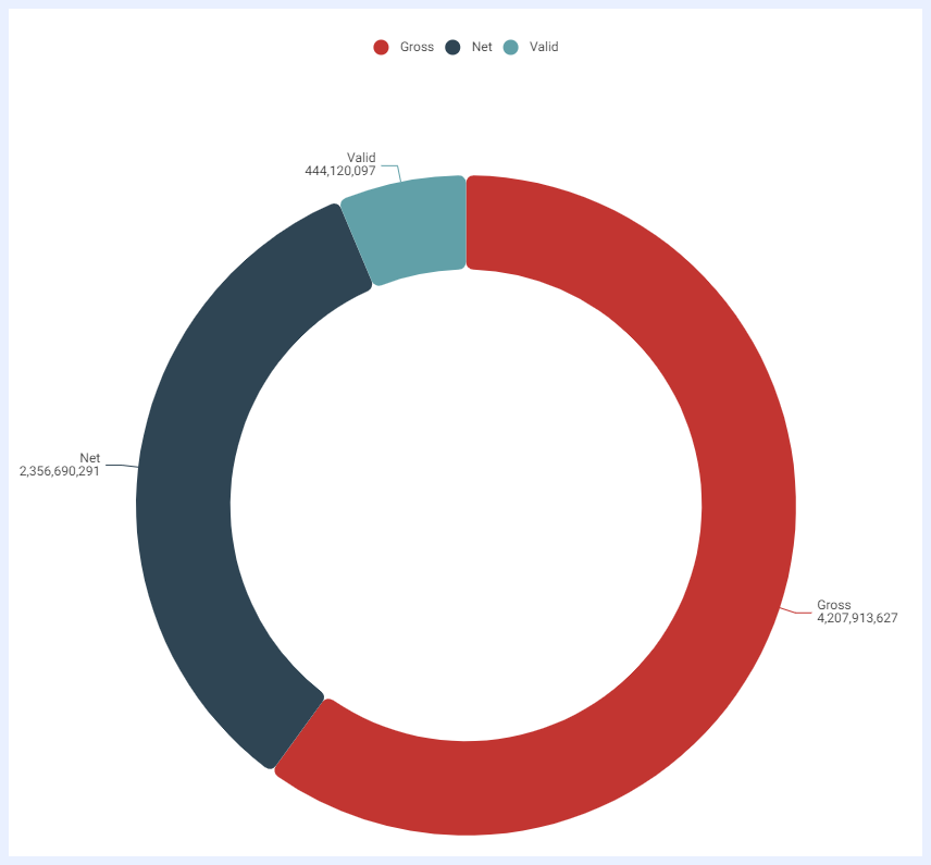
Donut Chart
Definition: a circular statistical graphic with a hole in the center and the circle is divided into slices to illustrate numerical proportion. The arc length of each slice is proportional to the quantity it represents, and the hole in the center can be used to show the whole dataset as a whole, and its relation to the sum of the individual slices.
Uses: its general use is similar to that of a pie chart, as it is also used to show the relationship between different parts and a whole.
Examples: showing the percentage of sales for each product category, with the empty center space showing the total sales for the period being analyzed, showing the percentage of a company's budget that is allocated to different departments, with the center space showing the total budget amount; showing the percentage of students enrolled in different academic programs, with the center space showing the total number of students enrolled.
Dimensions and Measures: up to 2 dimensions with 1 measure only.
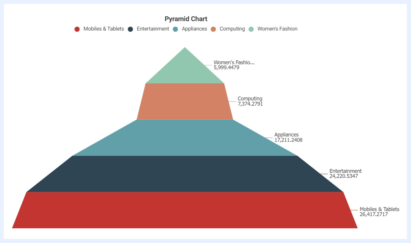
Pyramid Chart
Definition: a graphical representation of data that is shaped like a pyramid and displays data in a hierarchical structure with the largest or most important category at the top of the pyramid and smaller or less significant categories at the bottom.
Uses: to show the distribution of a dataset across different categories; ideal for explaining and visualizing categories, rankings or groupings of information;
Examples: commonly used in marketing and sales to show the distribution of customers or products by age, gender, or other demographics.
Dimensions and Measures: 1 dimension and 1 measure only.
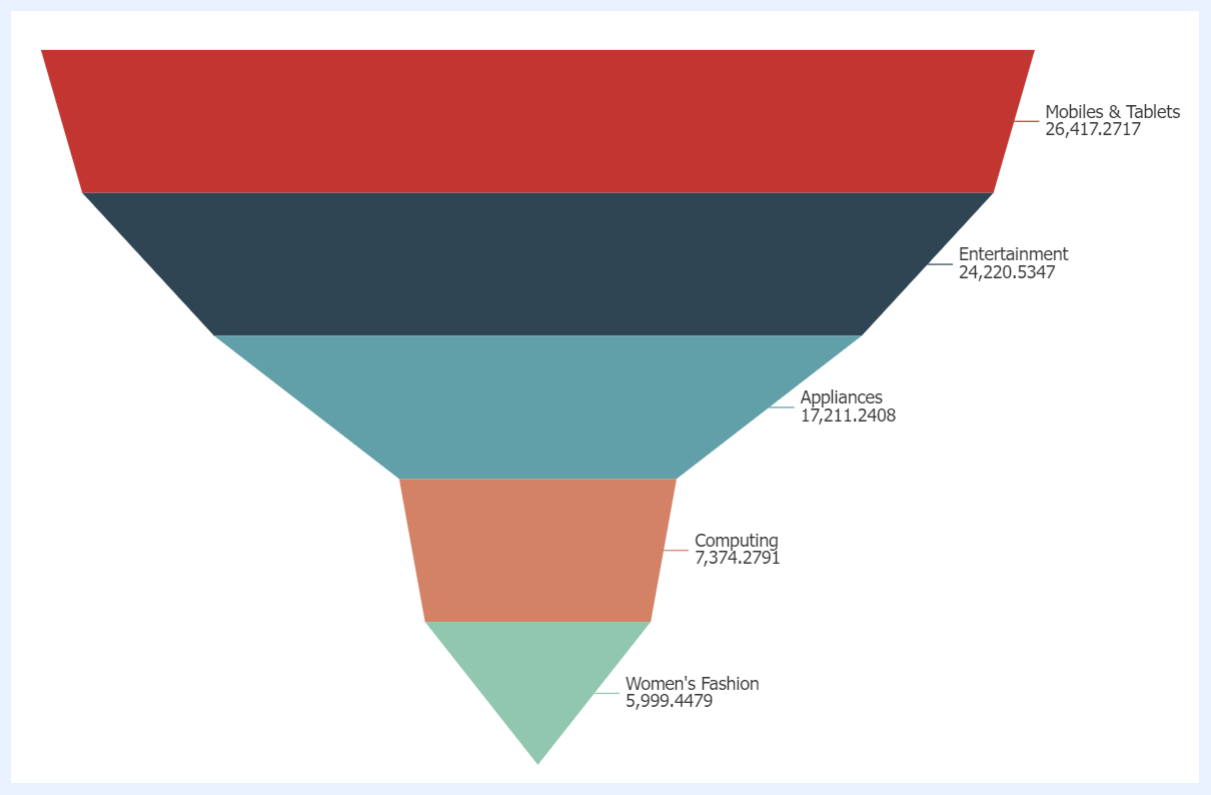
Funnel Chart
Definition: a graphical representation of data that is shaped like a funnel and displays data in a sequential order, with the top of the funnel representing the initial number of potential customers or opportunities and the bottom of the funnel representing the final number of successful conversions or outcomes.
Uses: commonly used to show the progression of data through a sequential process (represents a journey), such as a sales or a marketing funnel.
Examples: visualizing how many potential customers enter each stage (for example: awareness, interest, consideration, intent, and purchase) of the marketing funnel and how many ultimately make a purchase; visualizing the number of leads that enter each stage (such as lead generation, lead qualification, proposal, negotiation, and closing) of the sales funnel and how many of those leads ultimately convert to a sale.
Dimensions and Measures: 1 dimension and 1 measure only.
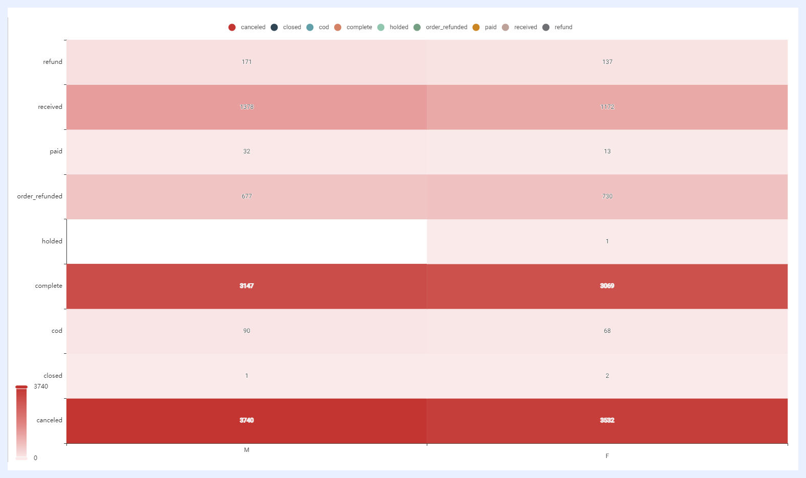
Heatmap Chart
Definition: a graphical representation of data where values are represented as colors in a color-coded matrix which allows to quickly and easily understand patterns and trends within the data by simply interpreting the gradient of these colors.
Uses: to show the distribution of data across different categories or dimensions and identify where values are concentrated and where they are more sparse; to visualize the relationship between two or more variables, helping to identify correlations and potential areas of interest.
Examples: analyzing user behavior, engagement, and conversion rates for social media marketers; visualizing user behavior and interaction with website elements such as buttons, links, and forms for website traffic analysis; visualizing the performance of players or teams for sports analysis.
Dimensions and Measures: 2 dimensions with 1 measure only.
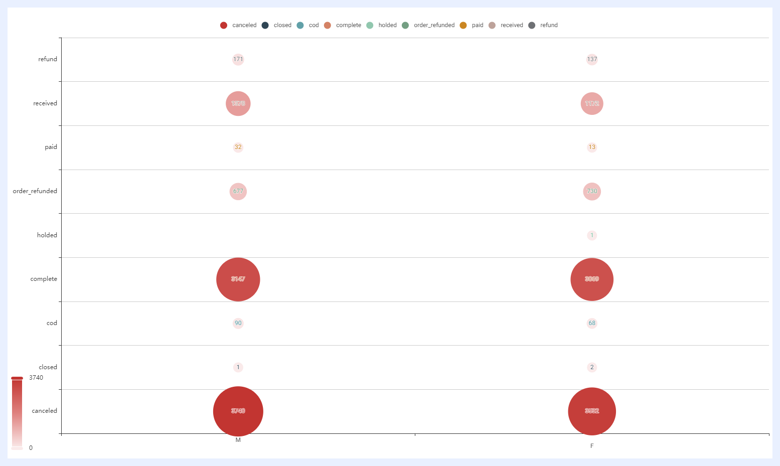
Punch-card Chart
Definition: a visualization tool that uses a grid of small circles, rectangles, or other shapes to represent data values. Each circle can be “punched” or left blank to indicate whether a particular value is present or absent. They represent the count or frequency of a particular event or status associated with each data point.
Uses: to visualize categorical data and track the frequency or occurrence of specific events or statuses; useful for tracking data over time or for comparing different categories or groups.
Examples: tracking attendance; monitoring production output; monitoring voting results; monitoring inventory and stock levels; analyzing survey responses; monitoring the severity or frequency of patient symptoms.
Dimensions and Measures: 2 dimensions with 1 measure only.
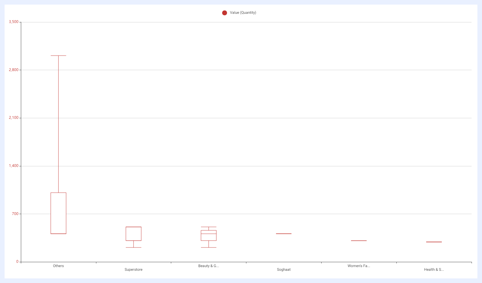
Boxplot Chart
Definition: a visualization tool that provides a visual summary of the distribution of a dataset. It displays a box with “whiskers” extending from the box to indicate the spread of the data.
Uses: commonly used to identify outliers, show the range of the data, and compare different datasets; particularly useful for displaying data with a large number of observations, or for identifying potential issues with the data, such as skewness or multimodality.
Examples: comparing the price range of different stocks, with each box representing a specific stock and the whiskers indicating the spread of the data; distribution of temperature or precipitation data over a given time period, with the box representing the interquartile range (IQR) and the whiskers indicating the minimum and maximum values; comparing the distribution of test scores for different groups of students, such as males vs. females or students from different schools.
Dimensions and Measures: 1 dimension only and several measures.
Variances: Horizontal Boxplot.
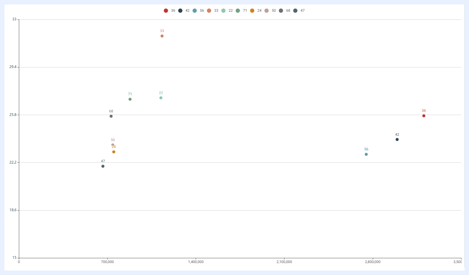
Scatter Chart
Definition: a diagram in which the values of two variables (2 measures) are plotted along two axes, the horizontal x-axis and the vertical y-axis. Each point on the scatter plot represents a pair of (x, y) values, where x is the value of one variable and y is the value of the other variable.
Uses: to understand or reveal the relationship between the two variables; to show how a change in one variable affects another; to reveal outliers and anomalies in the data. The two variables shall be continuous, i.e. can take on any value within a certain range unlike discrete or categorical that can only assume specific values or categories.
Examples: correlation analysis as in analyzing the relationship between a student's study time and their test score or the relationship between temperature and product defects for quality issues, or the relationship between revenue and expenses for financial analysis, or the relationship between a person's age and their income.
Dimensions and Measures: 1 dimension and 2 measures only.
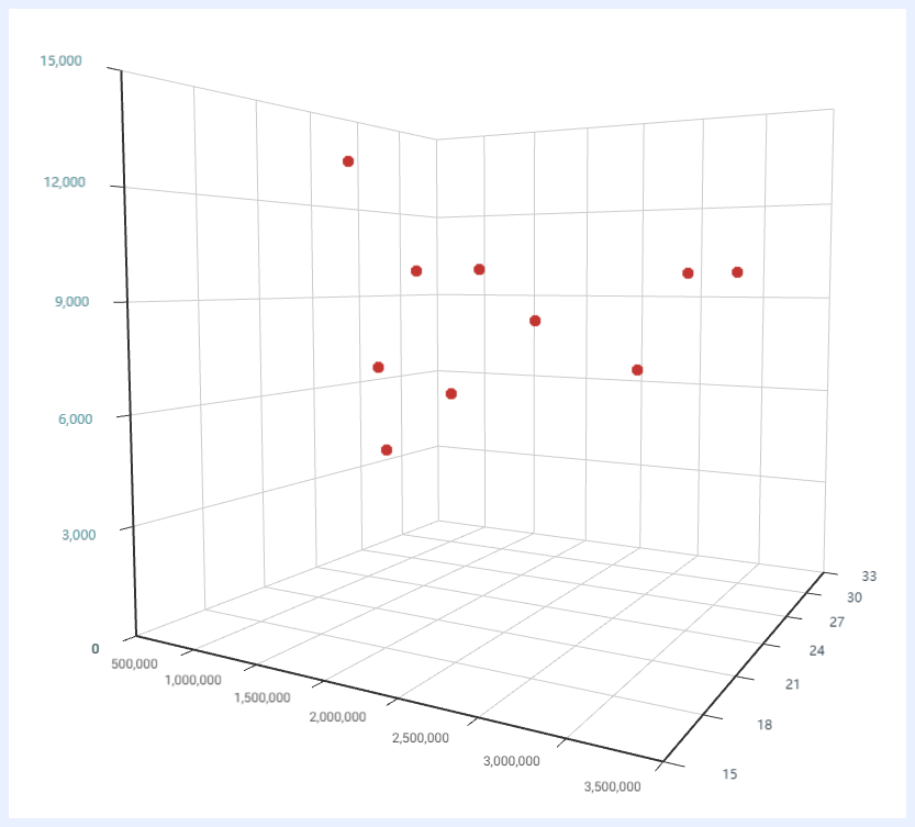
3D Scatter Chart
Definition: instead of just two variables as in a scatter chart, a 3D scatter plot displays values for three variables (3 measures) where the third variable is represented by the size or color of the points. This allows showing the third variable and its relation with the other two by adding a visual depth to the plot.
Uses: to understand or reveal the relationship/correlation between the three variables; to show how a change in one variable affects another; to reveal outliers and anomalies in the data. The three variables shall be continuous, i.e. can take on any value within a certain range unlike discrete or categorical that can only assume specific values or categories.
Examples: engineering analysis to help optimize the performance of mechanical systems by visualizing the relationship between three variables, such as speed, torque, and power; environmental analysis to help develop appropriate interventions by visualizing the relationship between three variables, such as temperature, humidity, and air pollution levels; medical research to identify risk factors for certain health conditions and to develop appropriate treatment plans by analyzing the relationship between three variables related to patient health, such as age, blood pressure, and cholesterol levels.
Dimensions and Measures: 1 dimension and 3 measures only.
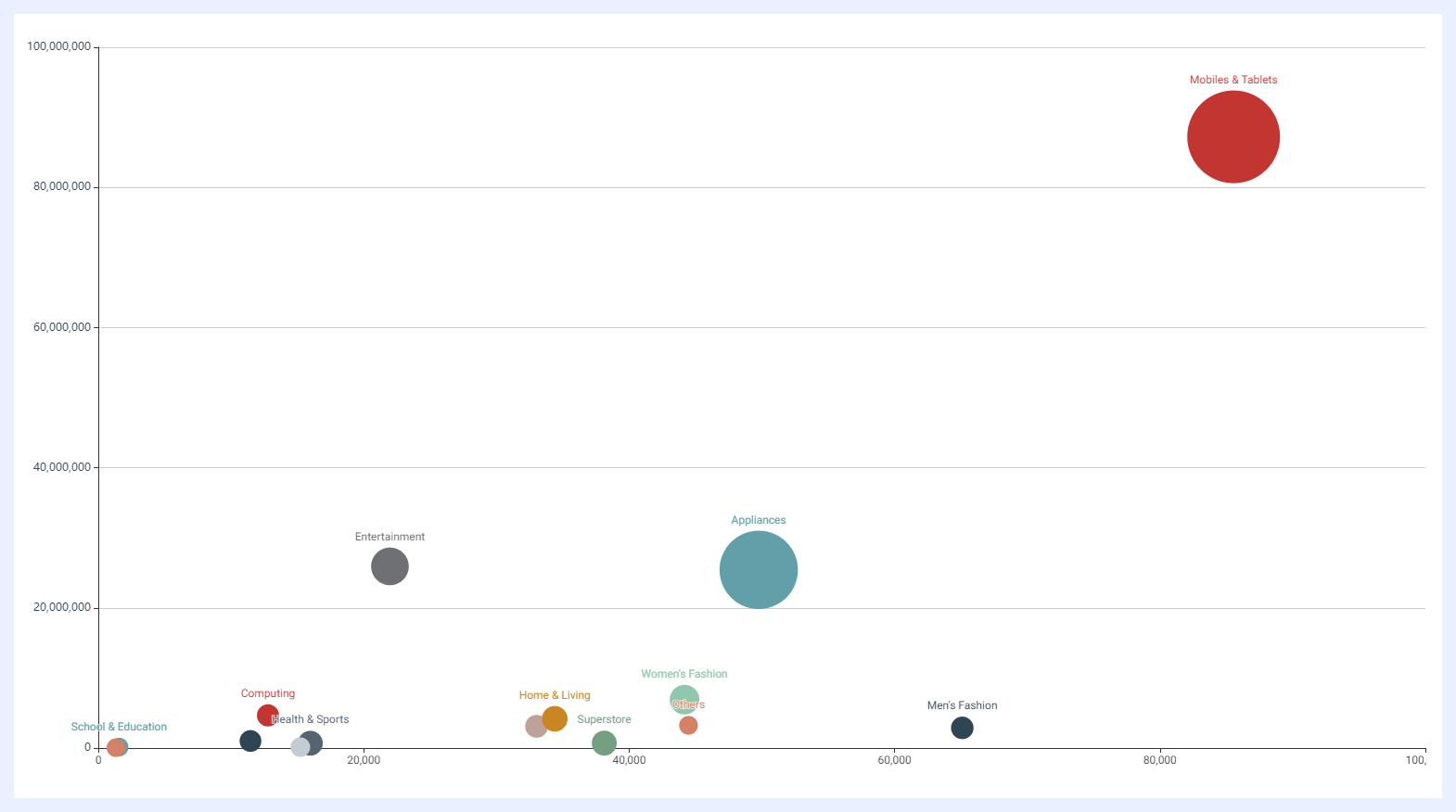
Bubble Chart
Definition: a visualization tool that displays data points as bubbles, with the size and color of the bubbles representing additional variables beyond the two plotted on the x and y axes. The dimension is represented by the x-axis, and three measures are represented by the y-axis, the size of the bubbles, and the color of the bubbles. The x-axis represents the primary variable being compared, while the size and color of the bubbles provide additional context and information about the data points being displayed.
Uses: often used to display complex data with three variables, such as market share or population data as they are particularly useful for comparing large numbers of data points and identifying patterns or trends within the data.
Examples: displaying the population of different countries, with each bubble representing a specific country and the size of the bubble representing the population size; comparing the market share of different companies, with each bubble representing a specific company and the size and color of the bubble representing additional variables such as revenue or profit; displaying demographic data for a geographic region, with each bubble representing a specific area and the size and color of the bubble representing different demographic variables such as age or income.
Dimensions and Measures: 1 dimension and 3 measures only.
Opacity: for Bubble, Scatter, 3D Scatter, and 3D Column charts, opacity can be set to Auto (adjusts dynamically based on data density) or Manual (a fixed value for cleaner visuals in dense or overlapping data scenarios).
Graph Chart
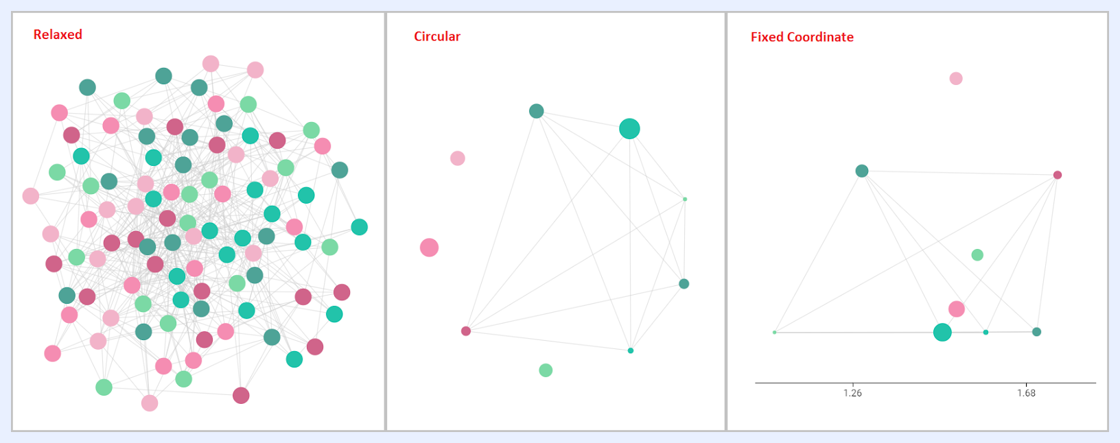
Definition: a visualization tool that represents connections between entities. It is also known as a “Network Graph” and offers three view options: fixed coordinates, relaxed, or circular layouts. In a Network Graph, nodes represent entities, and edges represent the connections between them. The layout options help visualize the relationships between entities in different ways, allowing for better analysis of complex networks.
Uses: commonly used to visualize relationships and connections between entities, such as social networks, organizational structures, or any interconnected data. It is particularly useful for identifying clusters, communities, or central nodes within a network.
Examples: visualizing the relationships between products or branches of a company. Each node represents a product or branch, and the edges represent the connections between them. The layout options can help identify clusters of related products or branches, as well as central products or branches within the network.
Dimensions and Measures: 1 dimension only and 2-3 measures.
Treemap Chart
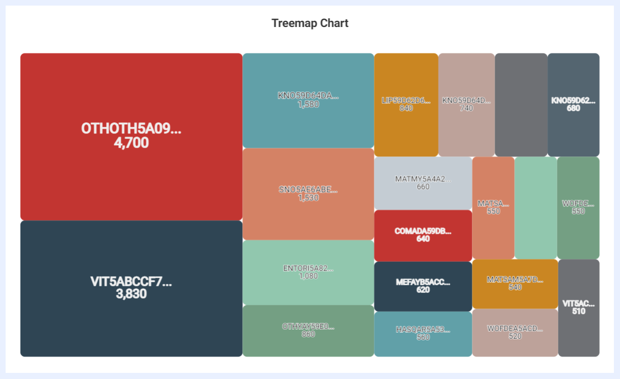
Definition: a chart that displays a wide range of hierarchical data as nested rectangles, where each rectangle represents a group or category of information, and its size is proportional to the data they represent to immediately perceive which categories are the most significant or insignificant.
Uses: useful for displaying large amounts of data in a compact, space-efficient way, while still allowing viewers to easily compare and understand the relative sizes of different categories; particularly effective for displaying data with many levels of hierarchy in a clear and concise way.
Examples: visualizing market share data to quickly see which companies or products dominate the market and which are smaller players, visualizing financial data (such as portfolio allocations or budget breakdowns) to see the proportions of different investments or expenses and how they are distributed across different categories, displaying geographic data, where each rectangle represents a region or country and its size represents a statistic such as population, GDP, or energy consumption.
Dimensions and Measures: up to 2 dimensions with 1 measure only.
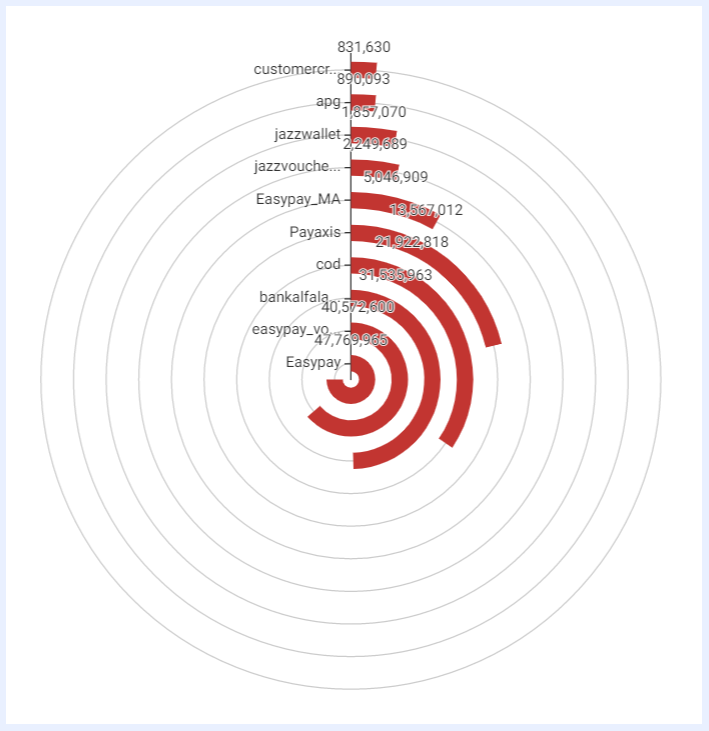
Polar Chart
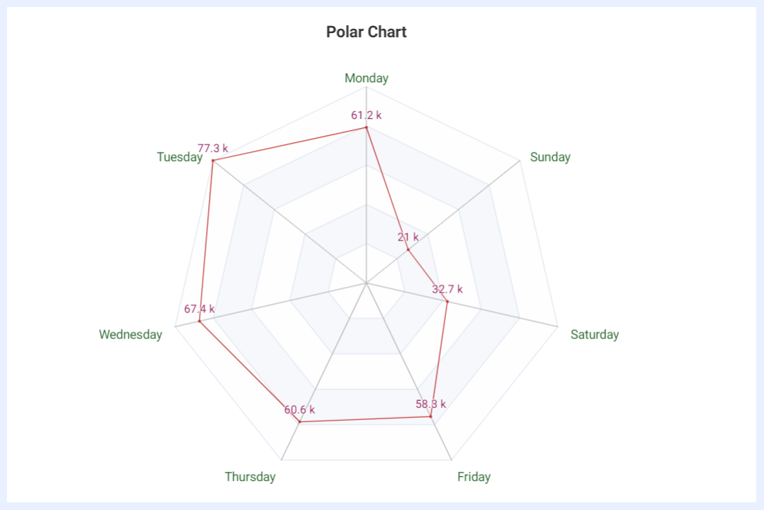
Definition: a chart that displays multivariate data on dimensions with three or more quantitative variables using axes that start from the same point, arranged in a circular manner around the center, resembling a compass or radar screen.
Uses: comparing multiple variables and seeing how they relate to each other, as well as identifying patterns and trends in the data.
Examples: for quality control by comparing multiple production lines or factories on different performance indicators; for market research by comparing the distance of multiple data points for each brand or product; for performance evaluation to compare the performance of departments or employees by plotting different performance metrics on separate axes.
Dimensions and Measures: 1 dimension and 1 measure only.
Multilayered Donut Chart
Definition: a type of donut chart that displays multiple datasets in layers, each represented by a different ring within the chart. Each layer represents a percentage or proportion of the total dataset, and the size of each ring is proportional to the data it represents.
Uses: to visualize complex datasets with multiple categories or subcategories as they can effectively convey how each category or subcategory contributes to the overall dataset.
Examples: visualizing sales by product category with each layer of the chart representing a different category; displaying the effectiveness of different marketing campaigns with each layer representing a different campaign.
Dimensions and Measures: 1 dimension only and several measures.
Word Cloud Chart
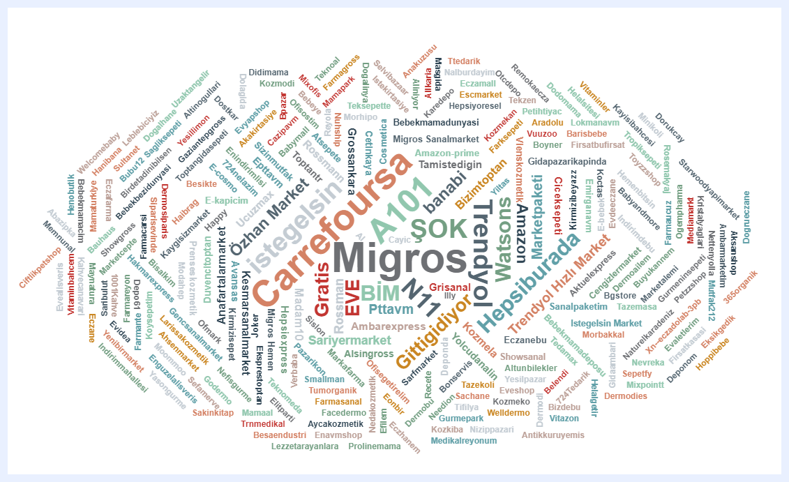
Definition: a visualization technique (also known as a “Tag Cloud”) that represents text data in a visual format. The words in the text data are arranged in a cloud-like shape, with the most frequently used or prominent words appearing larger and bolder than less frequently used words.
Uses: often used to analyze large volumes of text data and identify the most commonly occurring words or themes.
Examples: analyzing customer feedback and identifying the most commonly mentioned topics or issues; analyzing social media posts and identifying the most commonly used hashtags or keywords; analyzing survey responses and identifying the most commonly given answers or themes.
Dimensions and Measures: 1 dimension and 1 measure only.
Sankey Chart
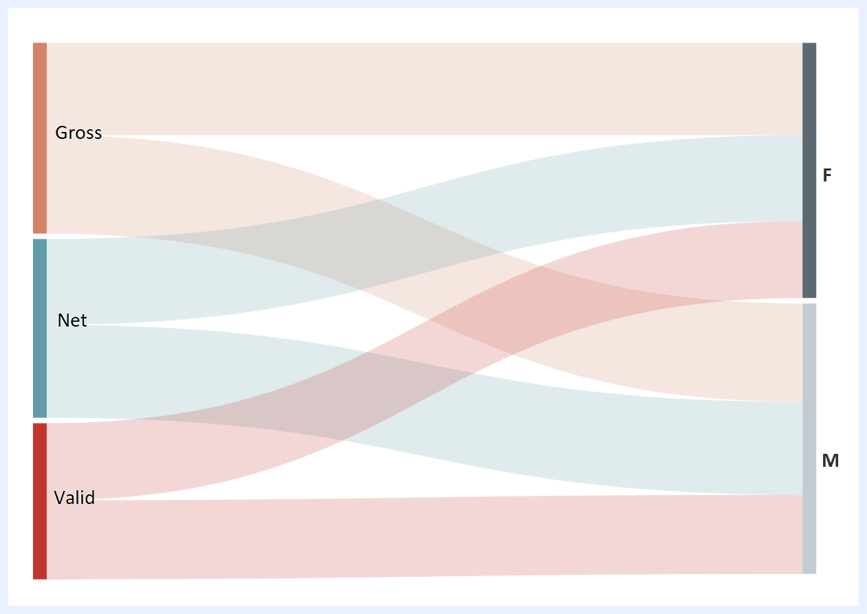
Definition: a type of visualization (also known as a “Flow Diagram” or a “Process Map“) that represents the flow of data, information, or materials through a system. The chart uses a series of arrows or flow lines of varying widths to show the direction and magnitude of the flow. It helps examine the correlation of flow type data. Sankey charts typically have two dimensions: a source dimension and a target dimension, which represent the origin and destination of the flow. They also have one measure, which is the magnitude of the flow. The width of the flow lines in the chart represents the magnitude of the flow with wider lines indicating a larger flow.
Uses: often used to analyze and visualize complex systems, such as supply chains, energy usage, or customer journeys. They can help identify inefficiencies, areas for improvement, and opportunities for optimization within a system.
Examples: visualizing the flow of energy through a building or a city, showing how energy is produced, distributed, and consumed; visualizing the flow of materials, products, and information through a supply chain, showing where delays or bottlenecks occur; visualizing the flow of customers through a website or an app, showing how they move from one page or feature to another.
Dimensions and Measures: 2 dimensions and 1 measure only.
Nodes Pane
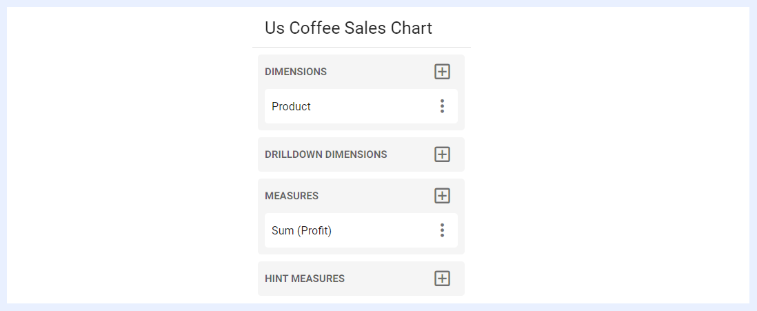
All the nodes of the chart view are listed under this pane. Dimensions, measures, expressions can be selected and added to the chart by clicking + icon next to their related pane.
“DIMENSIONS” Pane
“DIMENSIONS” pane lists all the nodes that can be added as dimension(s) to the chart, from which the user can add/select the required one(s) by clicking + icon located next to the pane.
“DIMENSIONS” tab lists all the nodes of type “Dimension” as set in the related view.
“EXPRESSIONS” tab lists all the expressions that were added using SQL to the view as virtual dimensions. When added to the chart, its data will update and filter according to the selected dimension expression.
“HISTOGRAM” tab allows adding a histogram to a dimension in a chart, which means that the chart will display a graphical representation of the distribution of the values of that dimension. A histogram is a bar graph that shows the frequency or count of values within a certain range of values. For example, if you have a chart that shows the sales data for different products, and you add a histogram to the product dimension, the chart will show the frequency of sales for each product. The histogram will display bars of varying heights, with each bar representing a range of sales values. The taller the bar, the greater the frequency of sales for products within that range.
“HINT DIMENSIONS” Pane
“HINT DIMENSIONS” pane lists nodes of type “Dimension” other than the main selected dimension(s), and when a dimension is added as a “HINT DIMENSION”, this dimension will appear as a hint or tooltip when the user hovers over the chart's data points, providing additional information about the data being displayed.
“DRILLDOWN DIMENSIONS” Pane
“DRILLDOWN DIMENSIONS” pane lists nodes of type “Dimension” other than the main selected dimension(s), and when a dimension is added under this option, the chart will update to show and drilldown the data for the selected dimension.
“MEASURES” Pane
“MEASURES” pane lists all the nodes that can be added as measure(s) to the chart, from which the user can add/select the required one(s) by clicking + icon located next to the pane.
“MEASURES” tab lists all the nodes of type “Measure” as set in the related view.
“EXPRESSIONS” tab lists all the expressions that were added using SQL to the view as virtual measures.
“DIM COUNT” tab allows for the addition of unique variables or dimensions that can be used as measures to display data.
“HINT MEASURES” Pane
“HINT MEASURES” pane lists nodes of type “Measure” other than the main selected measure(s), and when a measure is added as a “HINT MEASURE”, it will appear as a hint or tooltip when the user hovers over the chart's measures, providing additional information about the data being displayed.
“DRILLDOWN MEASURES” Pane
“DRILLDOWN MEASURES” pane lists nodes of type “Measure” other than the main selected measure(s), and when added under this option, the chart will update to show and drilldown the data for the selected measure.
Measures Settings and Preferences
Under the “Nodes Pane”, all “Measure” nodes are grouped together, along with any expressions that were added as measures.
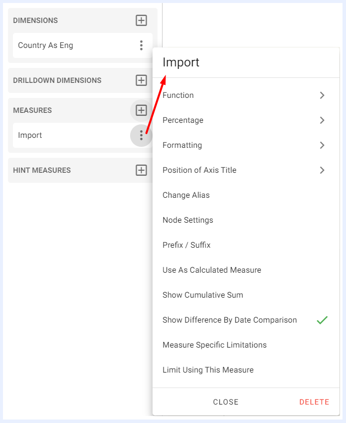
When selecting a measure to be added or aggregated in a dashlet, its settings, functions, and features can be managed from the ellipsis menu associated with that selected measure.
Measures Function Settings
1. Function
The selected function is applied to aggregate the measure. The set of available functions are:
Avg: calculates the average of all values in the selected measure.
Sum: calculates the sum of all values in the selected measure.
Min: returns the minimum value in the selected measure.
Max: returns the maximum value in the selected measure.
Count: counts the number of values in the selected measure.
Distinct: counts the number of unique values in the selected measure.
StdDev: calculates the standard deviation of the values in the selected measure.
Variance: calculates the variance of the values in the selected measure.
This feature is available for charts, pivot tables, info cells/gauges and regional maps dashlets.
2. Percentage
Used to convert the displayed value to percentage, or to display the results as both value and percentage. If there are two dimensions, the “Percentage” sub-menu displays 2 options: Percentage on dimension 1 to display the percentage for the first applied dimension, or Percentage on dimension 2 to display the percentage for the second applied dimension. This feature is available for charts and regional maps dashlets as well.
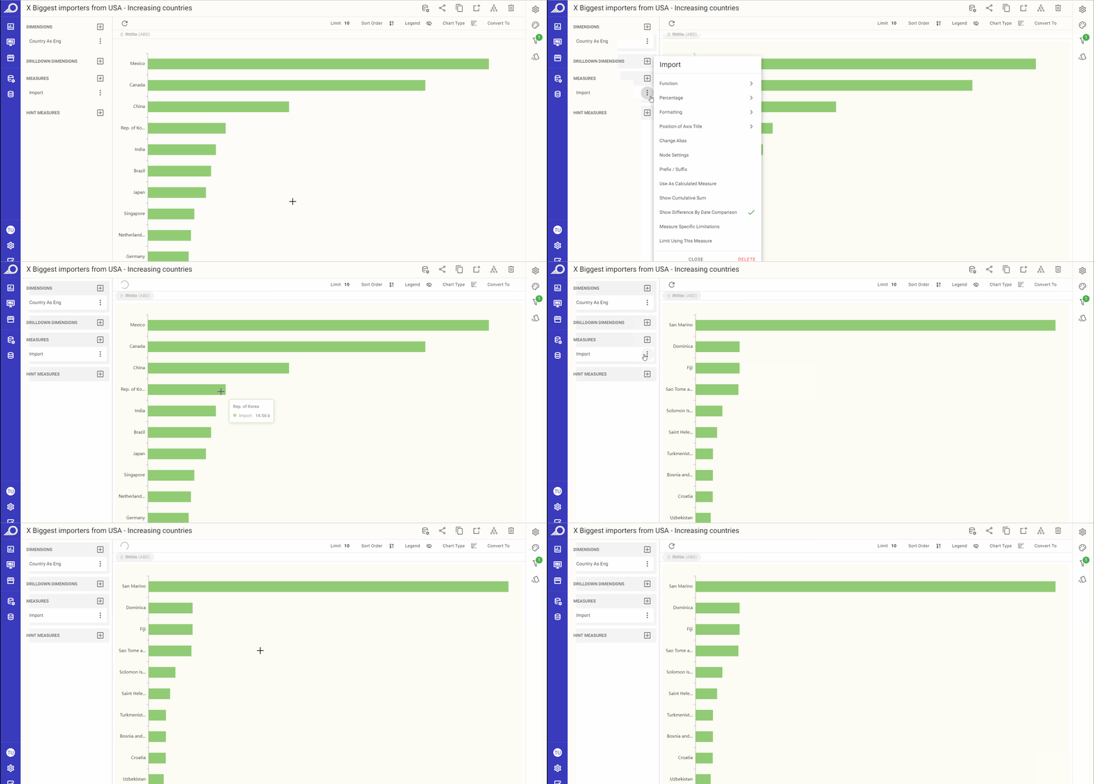
Value <> Percentage Conversions in a Chart Dashlet
3. Formatting
Advanced numeric formatting options are available under “Formatting” menu and by default are abbreviated (if not changed at node in the “View” level).
This feature is available for charts, pivot tables, info cells/gauges and regional maps dashlets.
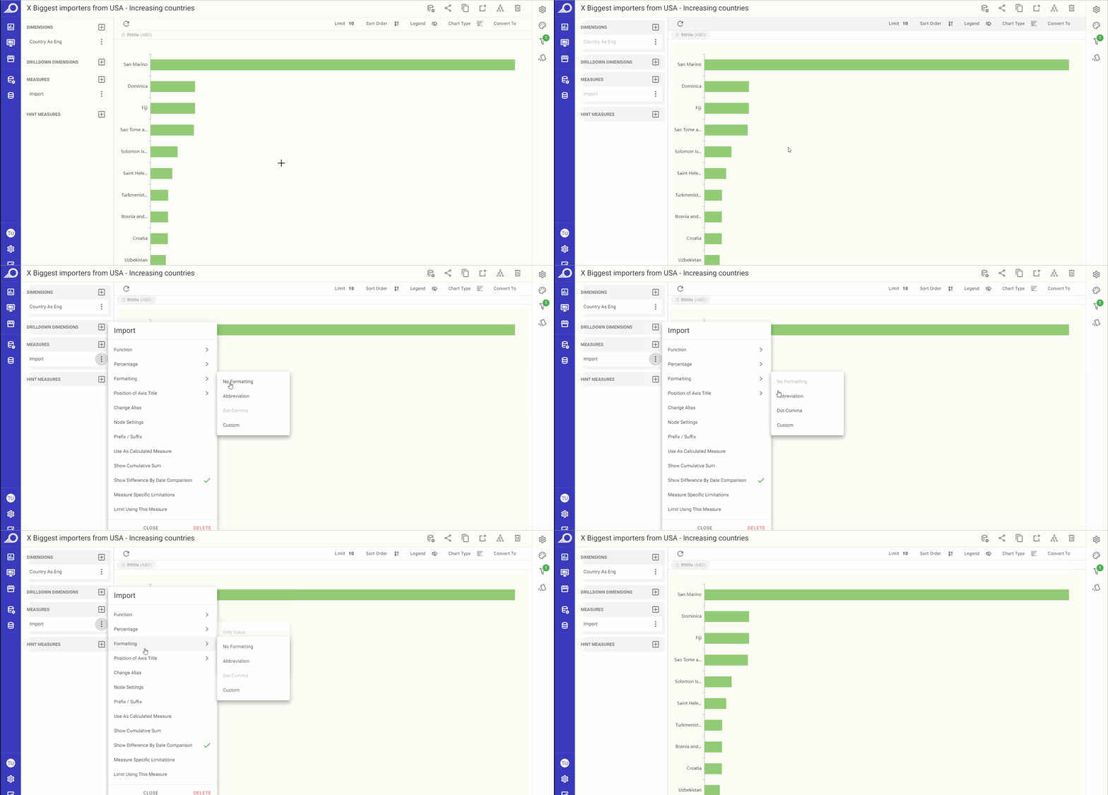
Measure Value Formatting Options
Note
TURBOARD applies the configured settings following priority as: Measure settings at the dashlet PG > Node settings at the view > Super User settings at admin pages > Default Application Settings.
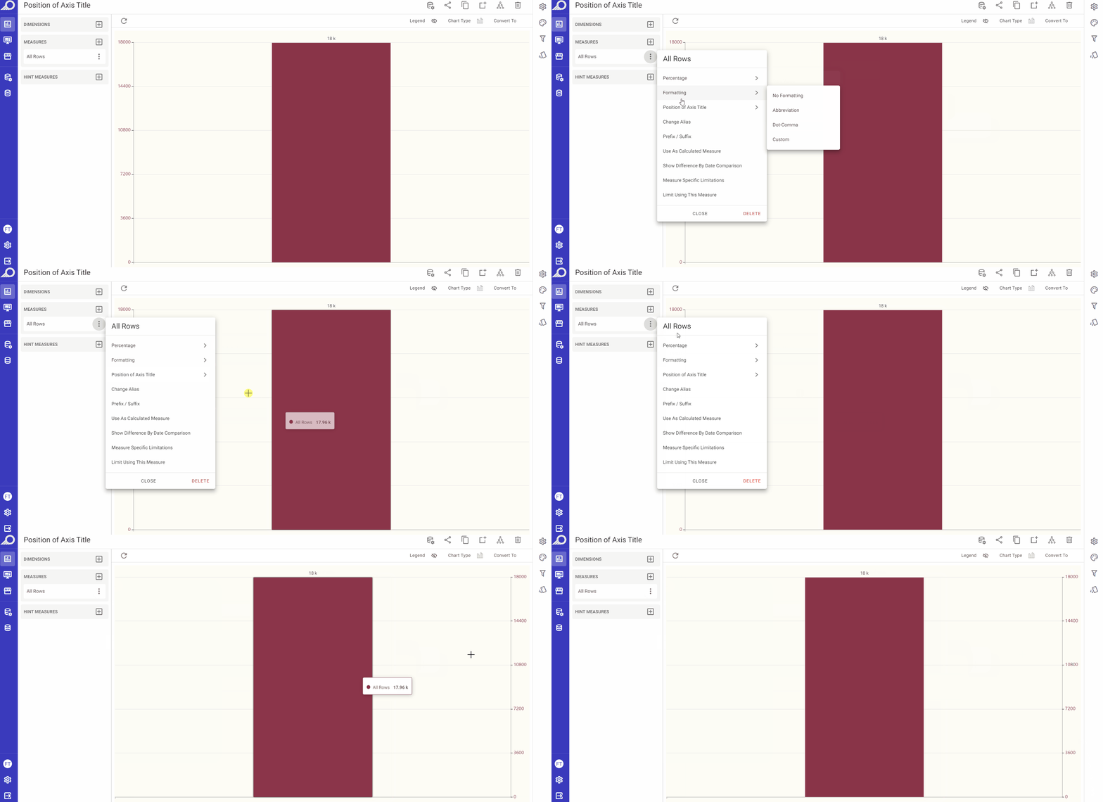
4. Position of Axis Title
This feature is available for chart types where the values are plotted on axes only in order to allow the user to determine the position(s) of the axes as in, for example, column, bar, area and line charts.
“Default” is selected when the dashlet is first created where the Y axis will be displayed on the left side of the resulting dashlet.
When selecting “Opposite”, the Y axis will be displayed on the right side. For dashlets with multiple measures with diverse ranges, right side located axes (Opposite) may be used.
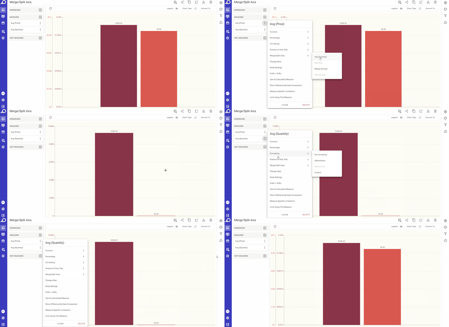
5. Merge/Split Axis
This feature is available for dashlet types where the values are plotted on more than one axis (more than one measure) in order to allow the user to merge or split the axes (all together or only the selected ones) on the resulting dashlet.
6. Change Alias
With this feature, the user can modify the title of a measure and assign it a different alias than the one assigned to its node. However, the modified alias will only be implemented in the dashlet, and won't alter the original alias of the measurement as a node in its respective view/dataset.
This feature is available for charts, pivot tables, info cells/gauges and regional maps dashlets.
7. Node Settings
When selected, the View Edit window for the selected measure will open to allow the user to make any necessary changes on the node settings.
This feature is available for charts, pivot tables, info cells/gauges and regional maps dashlets.
8. Prefix / Suffix
In some cases, adding prefixes or suffixes to a measure can enhance its meaning and provide more valuable insights. Typically, these options are used with currencies or percentages, when the unit is already known.
For instance, when displaying temperature data as a measure, a suffix such as “°C” can be added to inform the user about the unit of measurement.
By utilizing the “Prefix / Suffix” option available in dashlets, users can add a prefix and/or suffix that will be displayed before or after the selected measure value in the resulting dashlet. Note that these modifications will only affect the dashlet and won't alter the measurement's node settings for its respective view. This feature is available for charts, pivot tables, info cells/gauges and regional maps dashlets.
Calculated Measures Using Pandas Functions
This feature is used to display the measure value for dashlets (charts, pivot tables, info cells, gauges, and regional maps) as a customized calculation using Pandas functions and Pandas DataFrames – A python powered structure with a toolset to flexibly organize and work with data.
When to Use Calculated Measures
While expressions at the view level are ideal for creating standardized and reusable calculations across multiple dashlets, calculated measures using Pandas functions are best suited for dashlet-specific scenarios. This approach allows for more dynamic and interactive data manipulation directly within the dashlet, leveraging the powerful capabilities of the Pandas library. It is particularly useful when:
You need to perform instant data analysis and transformations without querying the database repeatedly.
You require specific calculations that are unique to a particular dashlet and do not need to be reused across multiple dashlets.
You want to experiment with different calculations without altering the underlying view as it allows for flexibility in analysis and visualization within the dashlet.
You aim to reduce the load on the database server by offloading calculations to the client side, resulting in improved performance and faster dashboard responsiveness.
Practical Use Cases for Calculated Measures Using Pandas Functions
Calculated measures using Pandas functions can be used for different use cases such as:
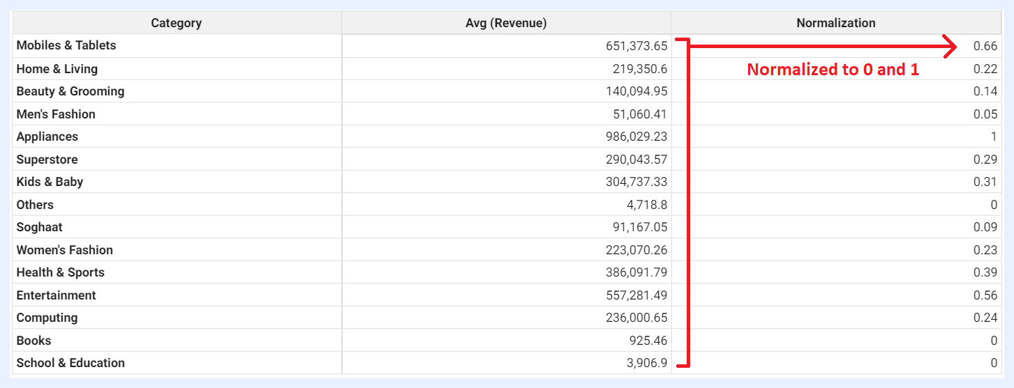
9. Normalization:
Definition: to normalize a measure and adjust its values to different scales. For example, you can normalize a measure to 0 and 1 and round it to 2 decimal digits as below sample image.
Used Function: ((COL("Measure Name")-COL("Measure Name").min())/(COL("Measure Name").max()-COL("Measure Name").min())).round(2)
Sample Result
10. Imputation:
Definition: to replace missing or null values with a specific value. For example, you can write proper no-data messages and choose to write something like “No Data” when there is no data (null values) for that cell.
Used Function: COL("Measure Name").fillna("Your Replaced Message")
11. Labeling:
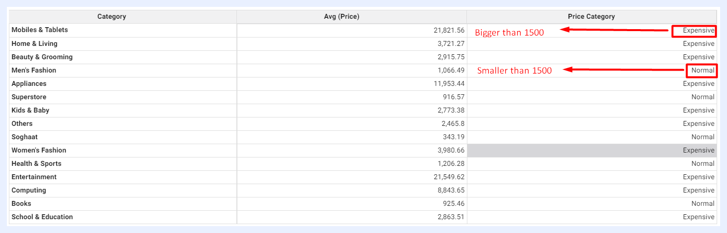
Definition: to assign labels or set specific tags to your data based on the values of a particular measure. For example, if the values are bigger and/or smaller than a specific threshold, certain labels can be assigned to them for comparison reasons as in the sample image below.
Used Function: COL("Measure Name").apply(lambda x: "Tag 1" if x > 0 else "Tag 2")
Sample Result
12. Absolute:
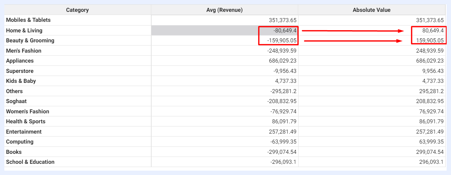
Definition: to display all values in absolute format (the non-negative value of measure without regard to its sign).
Used Function: COL("Measure Name").abs()
Sample Result
13. Comparison:
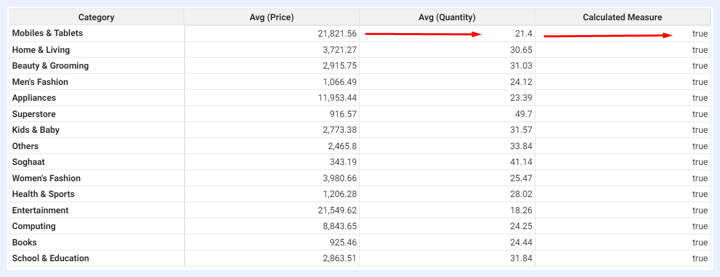
Definition: to compare two measures with “greater than” or “less than” parameters.
Used Function: COL("Measure Name 1").lt(COL("Measure Name 2"))
Sample Result
14. Replacement:
Definition: to translate or replace some values systematically.
Used Function: df['Measure Name'].replace({"Value 1": "Value Replacement 1", "Value 2": "Value Replacement 2"})
15. Clipping:
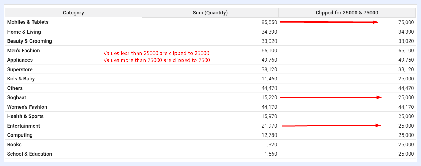
Definition: to clip some values and set a threshold to limit your residual values. It helps limit the range of values in a column to a specified minimum and maximum value.
Used Function: COL("Measure Name").clip(00, 01)
Sample Result
16. Validation:
Definition: to mark some values as valid (True/False) and check them among possible choices.
Used Function: df["Measure Name"].isin(["Value 1", "Value 2", "Value 3"])

Sample Result
17. Backfilling:
Definition: to autofill missing values with their corresponding previous period values.
Used Function: COL("Measure Name").bfill()
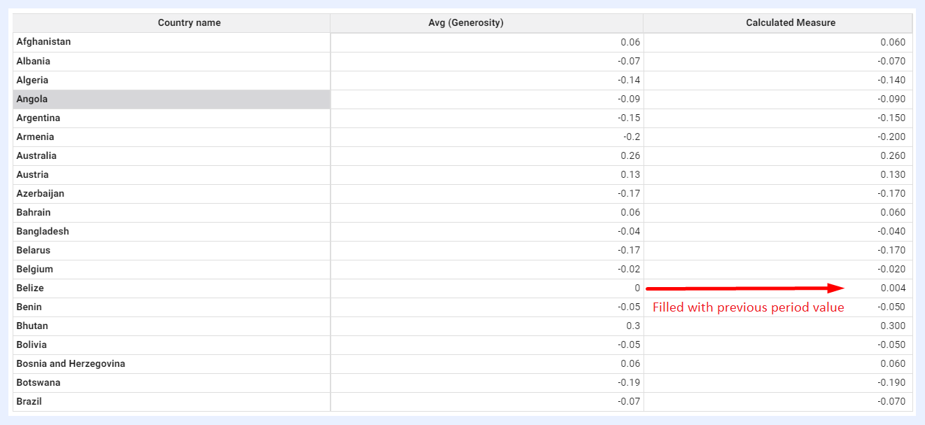
Sample Result
Note
Exceptions: do not use Pandas functions starting with “plot” (as they are for plotting something), or “to” (as they intend to export to external files). Avoid functions that would change order such as “cumsum” and “diff” as TURBOARD will execute sort operations afterwards.
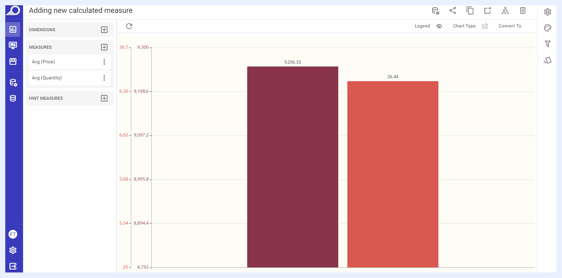
How to add a Calculated Measure?
1 Click + Add Measure icon button located next to the “Measure” left pane > select Calculated Measure + option > click ADD button.
2 An overlay window will open. Write the required Pandas function DataFrame in “COL(x)=” field and click APPLY button.
3 The new calculated measure will be listed under “Measure” left pane. Give your new measure a name by selecting Change Alias option from its ellipsis settings menu.
4 Any time needed later on, you can edit the added calculated measure using Edit Calculated Measure option from its ellipsis settings menu.
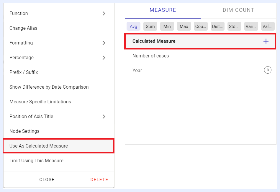
How to change an existing Measure into a Calculated Measure?
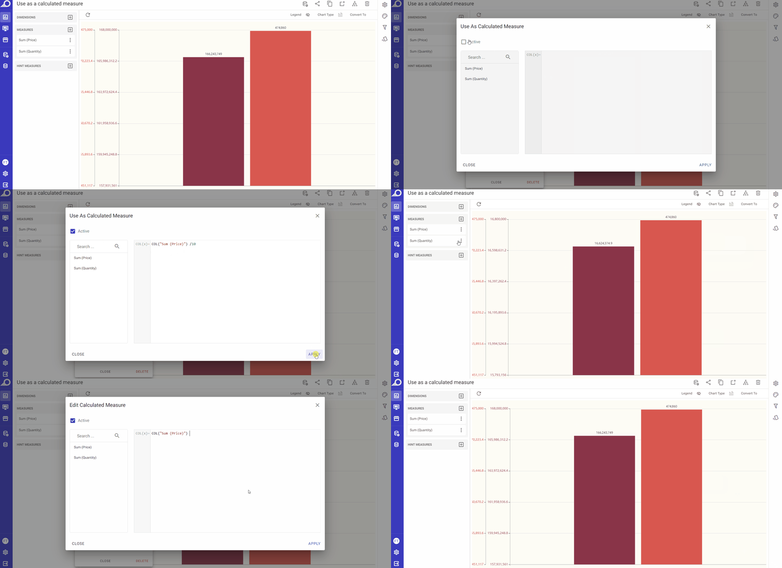
1 Click on the ellipsis settings menu for the required measure to open its functions and settings drop-down list.
2 Choose Use As Calculated Measure option from the list.
3 An overlay window will open. Check “Active” check box, and write the required Pandas DataFrame structure in “COL(x)=” field, then click APPLY button.
Note
You cannot use Python (or libraries like SciPy and NumPy) directly for security reasons. Refer to this CheatSheet for a full list of Pandas functions.
Other Settings for Measures
18. Show Cumulative Sum
If selected, the chart will display the running total of the selected measure over time, rather than just the individual values. For example, if you have a chart showing the daily sales revenue for a business, selecting “Show Cumulative Sum” for the “Sales Revenue” measure will cause the chart to display the total revenue earned up to each day, rather than just the revenue for each individual day.
You can show the original single values on the chart through “Show Single Values” option that will automatically replace “Show Cumulative Sum” when selected.
This feature is available for charts, pivot tables and regional maps dashlets.
19. Show Difference By Date Comparison
This feature enables you to compare data for different dates and analyze the changes over time. It specifically helps to identify the historical variances in your data, such as the differences between values for the previous month and the current month. It applies to the date dimension in your data, which organizes data by date.
This feature is available for charts, pivot tables, info cells/gauges and regional maps dashlets.
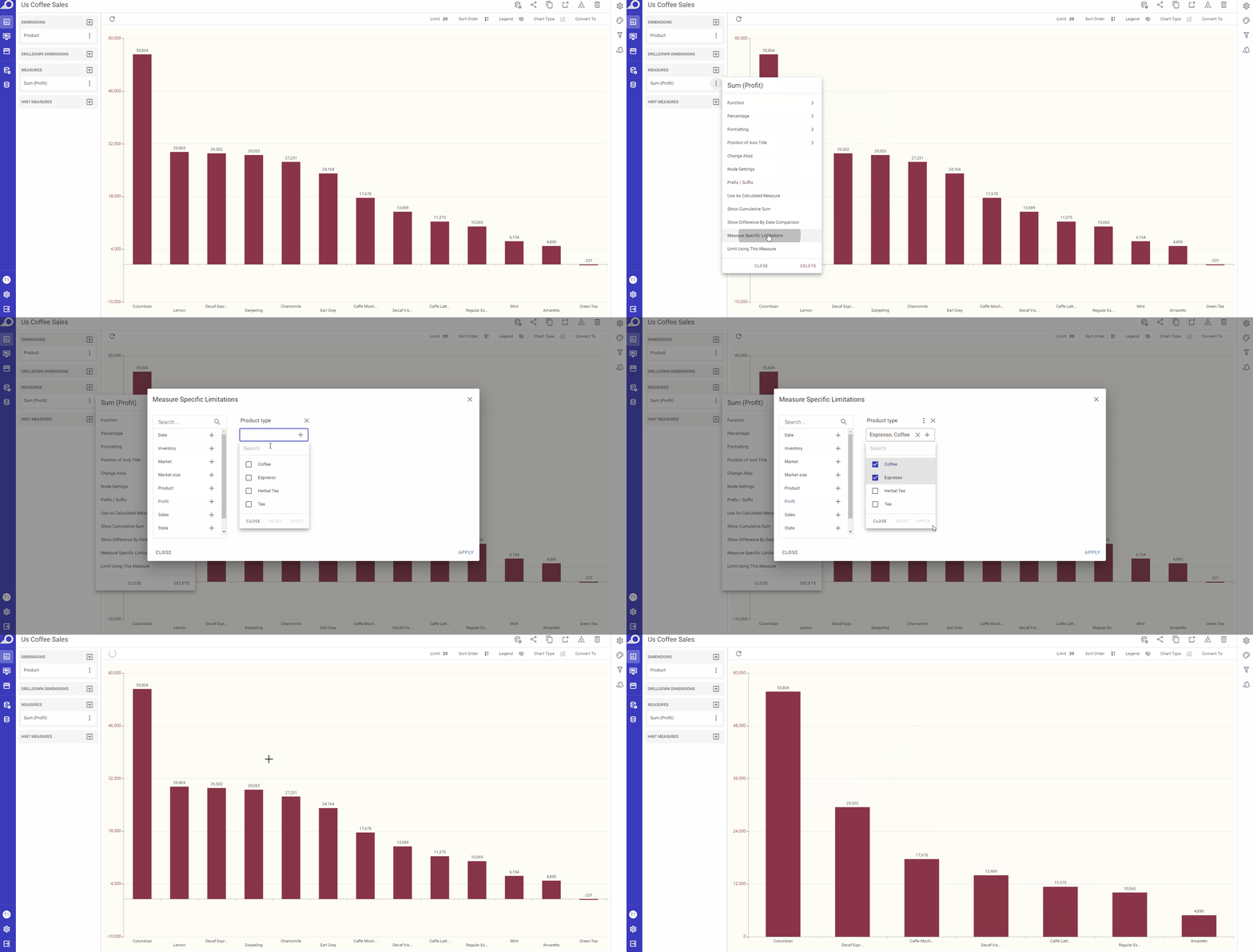
20. Measure Specific Limitation
This feature is used to set measure-specific constraints as a rule to limit the fetched data or prevent some values from occurring. In simpler words, it works as an internal filter for the selected measure and only fetches the data according to the selected limitation.
Measure limitation can be applied on any node that is set as a filter. You may limit the fetched data according to values within a certain range, or fetch the data according to selected periods, dates, or even anchored dates through “Relative“ option.
This feature is available for charts, pivot tables, info cells/gauges and regional maps dashlets.
21. Limit Using This Measure
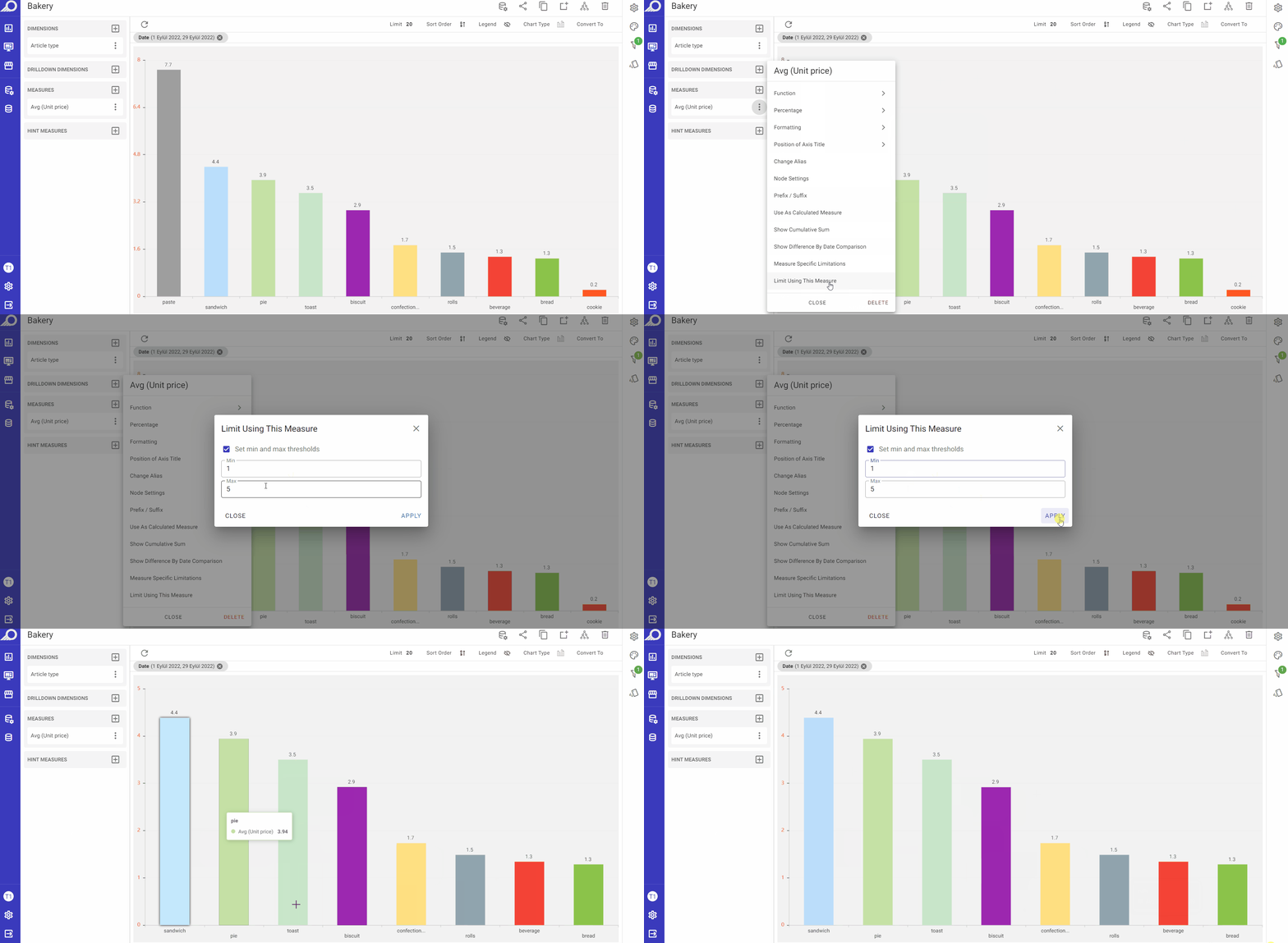
This feature only appears on chart dashlets. It allows the user to restrict a measure with values thresholds.
Settings Panel
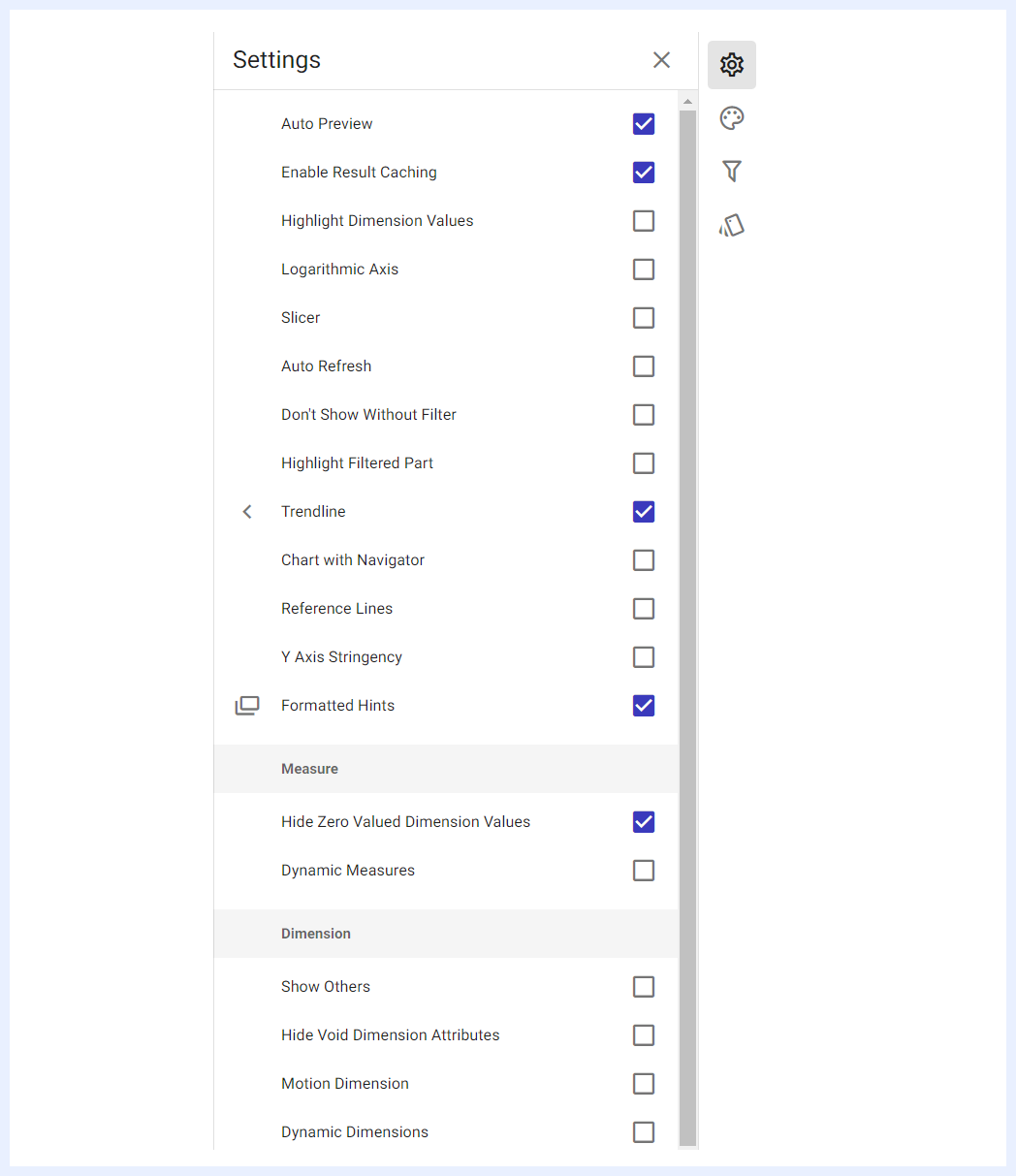
The Settings Panel in TURBOARD provides a variety of customization options to enhance the functionality and visual appeal of your dashlets. These settings allow you to tailor the behavior of dashlets to meet specific analytical needs, optimize performance, and improve the clarity of your visualizations. Below is an overview of the key settings available in this panel, each of which can be enabled or configured to refine how data is displayed and interacted with in your dashboards.
Auto Preview
When the “Auto Preview” check box is enabled, it will display the dashlet on the dashboard to automatically respond to any changes made on that dashboard. This means that the data in the dashlet will be refreshed and updated as changes are made. If the option is not selected, the dashlet data will only be refreshed when the refresh button is clicked. It's important to note that this feature only applies to the current dashlet and will not affect other dashlets on the related dashboard(s).
Enable Result Caching
When the “Enable Result Caching” check box is enabled, the data retrieved from the server will be cached in memory, allowing for faster response times for subsequent selections. The cached data is automatically refreshed.
Highlight Dimension Values
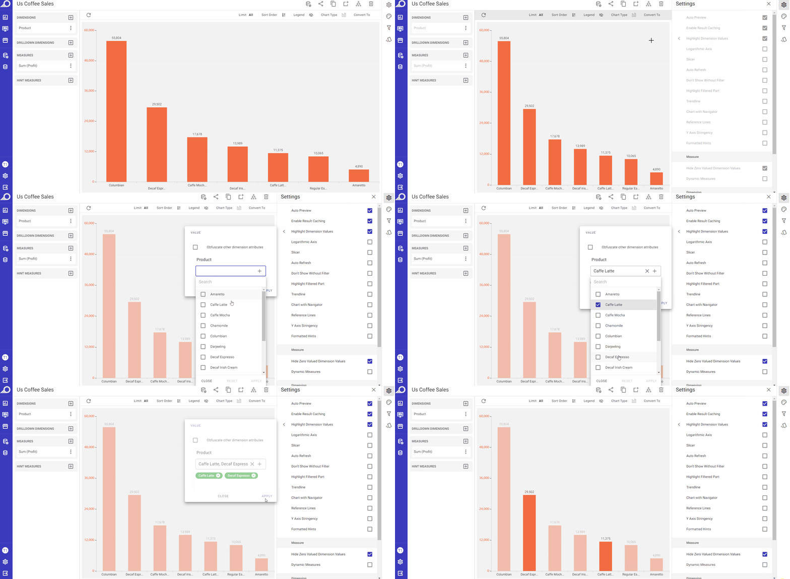
This option is useful when dealing with complex datasets, where multiple dimensions are present in the chart. When using this option, it allows the user to emphasize specific values within a dimension on the chart. When this option is enabled, the selected values of the relevant dimension are highlighted with a brighter color, while other values are faded out or dimmed. The “Obfuscate other dimension attributes” check box in the slide-out window allows obscuring or hiding the attributes of other dimensions that are not currently being highlighted to further enhance the clarity of the chart.
Logarithmic Axis
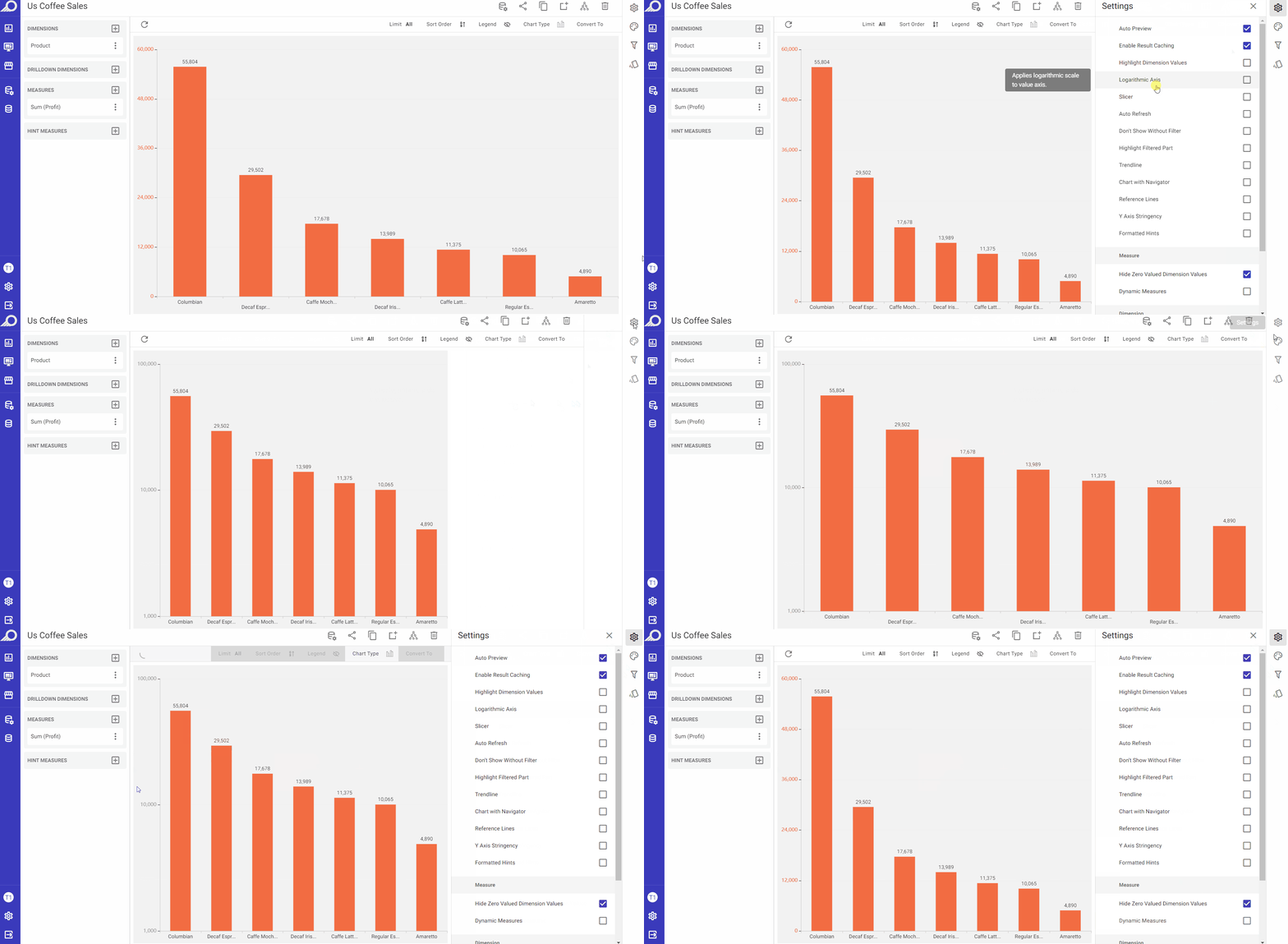
This option helps visualize data that spans a wide range of magnitudes, particularly when some values are much larger or smaller than others. When enabled by checking its check box, it will apply logarithmic scale to the value axis of the chart and will convert the scale of the axis from a linear scale to a logarithmic scale. For example, if the axis represents values from 1 to 10, each increment would be 1. In contrast, in a logarithmic scale, the values on the axis increase exponentially with each increment.
Slicer
When the “Slicer” check box is enabled, clicking on a value in the dashlet in its related dashboard will apply that value as a filter to the whole dashboard. If “Just highlight the selection” check box is checked, it will not act as a filter but will only highlight the selected value.
Auto Refresh
When the “Auto Refresh” check box is enabled, the related dashboard will automatically refresh at the specified intervals (in seconds), allowing you to set the desired duration for each renewal.
Don’t Show Without Filter
When the “Don’t Show Without Filter” check box is enabled, the dashlet will not display data without a filter being selected. In the overlay window that opens, “Any Filter” can be selected, or specific filter(s) can be chosen.
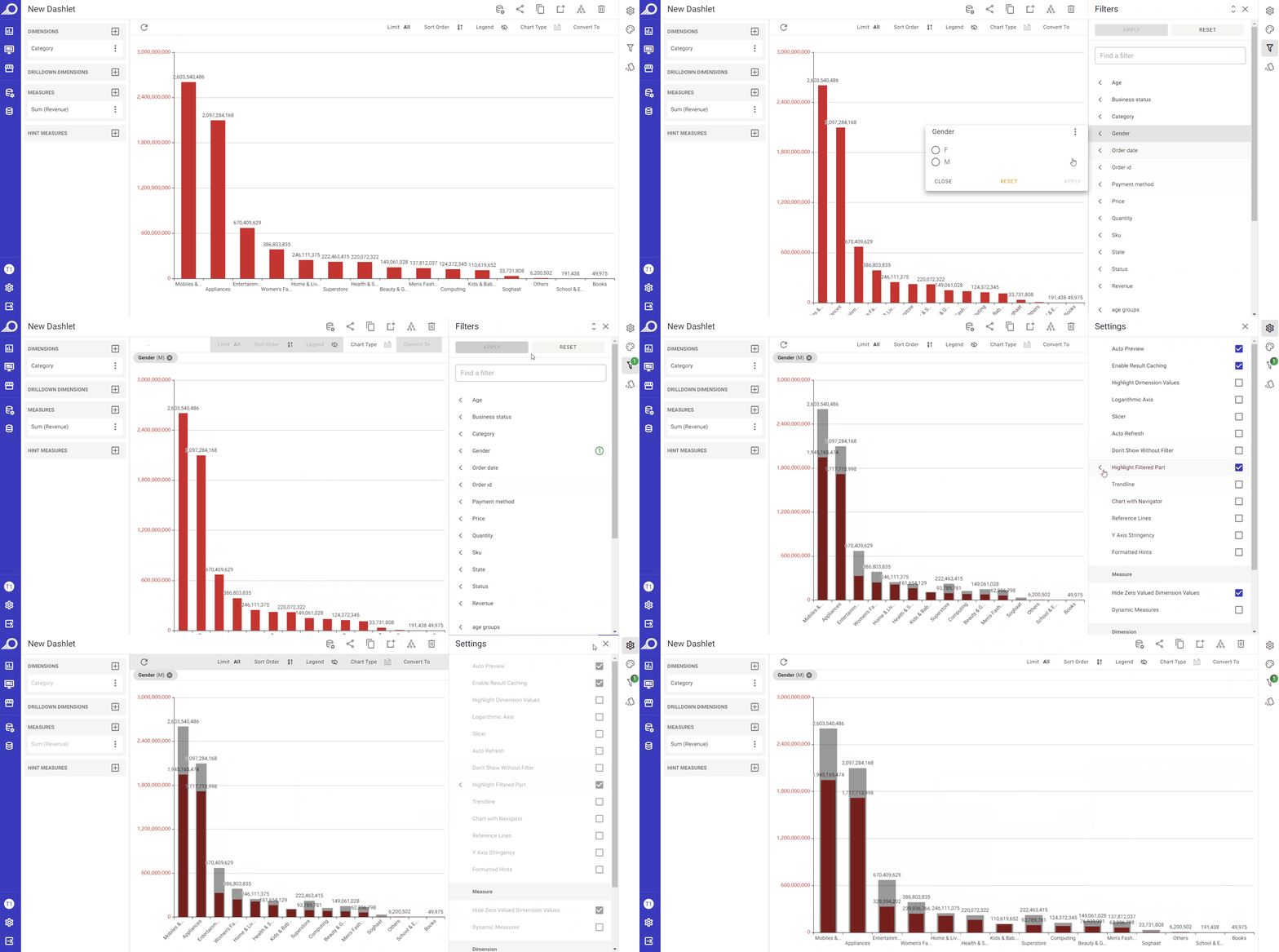
Highlight Filtered Part
This option allows the user to focus on a subset of data that is filtered, while also maintaining a view of the unfiltered data. When this feature is enabled, the unfiltered data is displayed in a faded color, while the filtered part is highlighted in bold. This allows the user to see the difference between the filtered and unfiltered data more easily.
Trendline
This option allows adding a linear or a moving average trendline to the chart. A trendline is a line that represents the general direction of a set of data points. It can be useful in identifying patterns or trends in the data, and in making predictions about future values. When the “Trendline” option is enabled by checking its check box, the user can choose between a linear trendline “Trendline” or a “Moving Average” trendline. The linear “Trendline” shows the overall change in value over time, and may have an “Opaque Background” to make it more visible. For the “Moving Average” trendline, the user can also specify the period over which the moving average is calculated.
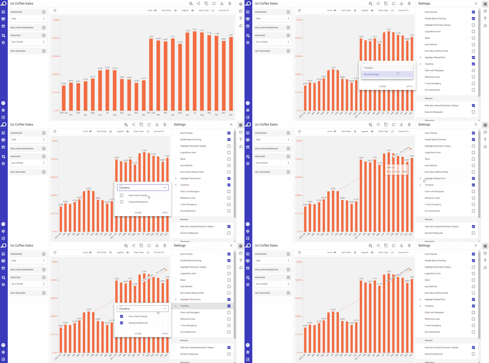
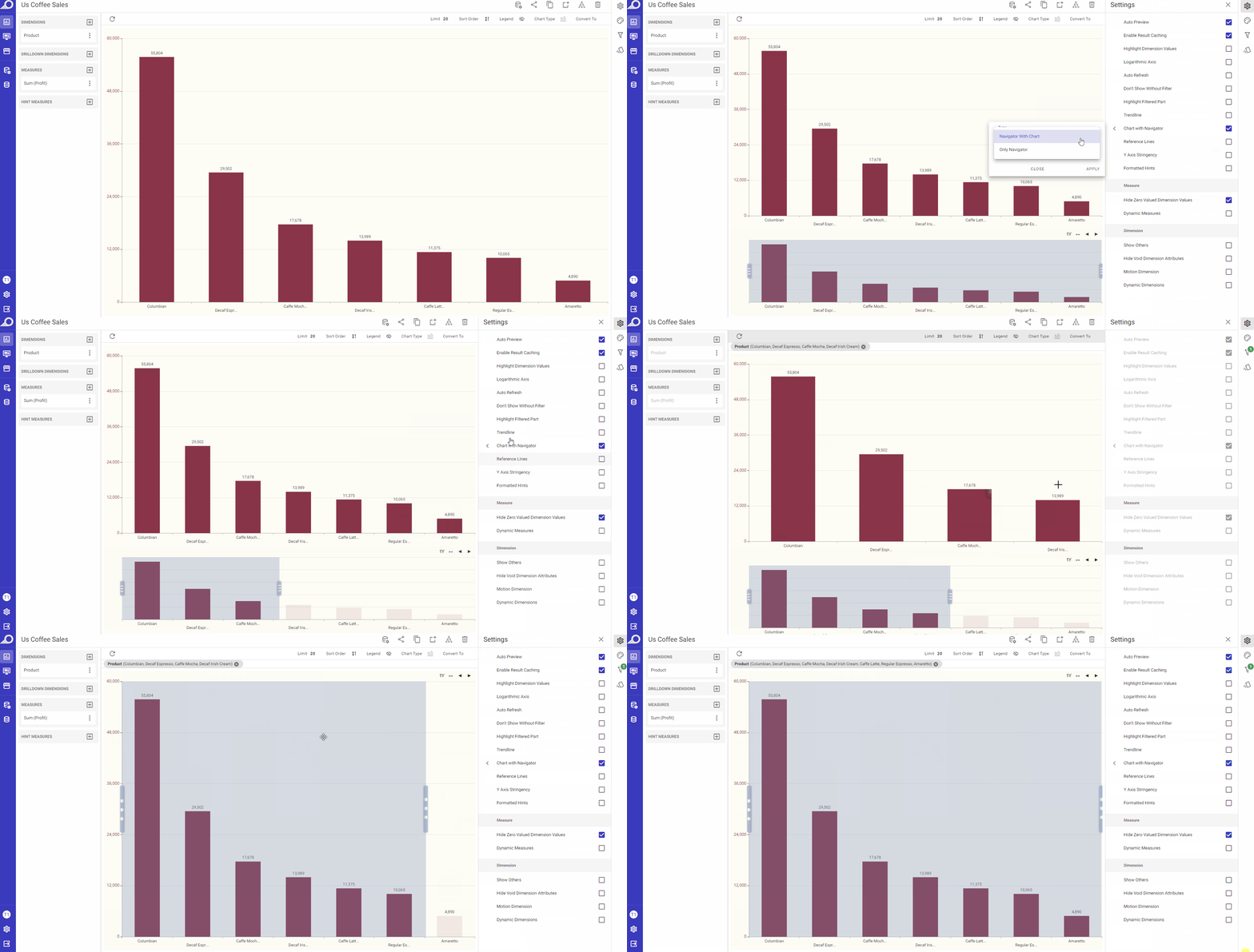
Chart with Navigator
The navigator of a chart is a smaller chart or graphical element that provides an overview of the entire dataset being displayed in the main chart. It is typically used to allow users to quickly and easily navigate through large amounts of data. Therefore, it is best used for situations where the data is huge and the user needs to come closer or filter a specific part quickly and make inferences clearly.
A “Chart with Navigator” allows choosing and displaying a specific part of the dashlet, and also allows using different metrics on the navigator such as 1M (1 Month), 1Y (1 Year), etc. to change the data segments and navigate through them.
It offers a filter feature based on the first selected size. The default when a chart is created is “No Navigator”.
When the “Chart with Navigator” check box is checked, a slide-out menu will become available in which the user can:
1 Select the navigator “Type” form its drop-down menu:
-
Navigator with Chart: when selected, the chart will appear as dual dashlets where the satellite is filtered according to the navigator and the navigator always shows the selected range.
-
Only Navigator: when selected, the resulting dashlet will be a visual that always shows the entire data range, with the constraint region changing according to its filter only.
2 Determine “Minimum Range” for the navigator. A minimum range for the navigator means that the navigator is set to always display a minimum range of data, regardless of how much data is being displayed in the main chart.
3 Click APPLY button when the preferences are determined.
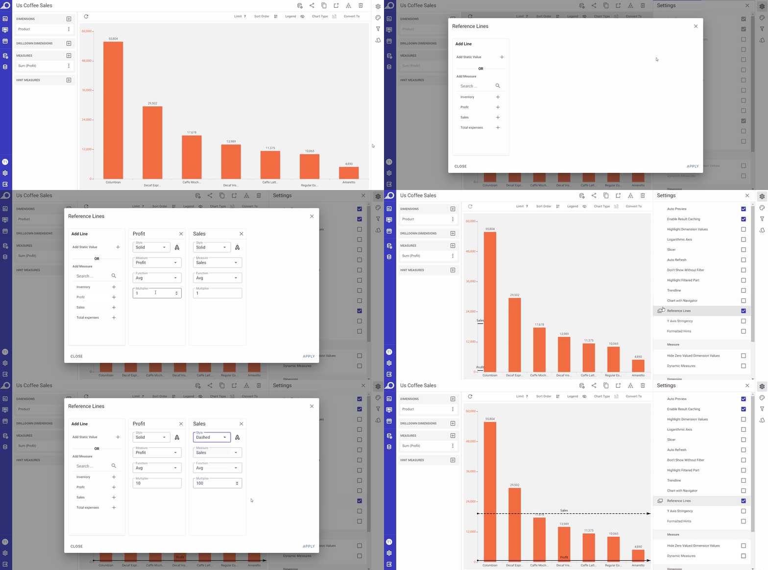
Reference Lines
When the “Reference Lines” check box is checked, it allows adding one or more reference lines to the chart in the correspondent overlay window that opens. These lines can be used to indicate a specific value or threshold that is relevant to the data being displayed. The user can set the value of each reference line, either as a static value or by using a measure value. A static value would be a fixed number chosen by the user, while a measure value would be a value calculated based on the data in the chart. Additionally, the user can also choose the color of each reference line, which can help distinguish them from other lines in the chart.
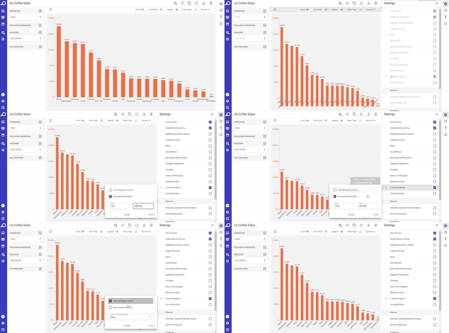
Y Axis Stringency
This feature is available for chart types where the values are plotted on axes only. When enabled by checking its check box, it allows changing the default vertical margin between the top positions of the bars or columns in a chart. The stringency levels are automatically determined in “Auto-Stingency Levels” and the user can “Manually Set Min-Max” levels. Additionally, Axis Stringency can be selected from “Zero, Stringent or Loose”. These options likely determine the degree of compression or expansion of the chart data along the vertical axis, as for example, “Loose” option can be used to accentuate minor differences as the vertical margins between the bars or columns will be expanded, resulting in a chart that appears less compressed, which can make it easier for viewers to distinguish between values that are close together and identify small differences between them.
Hide Zero Valued Dimension Values
When the “Hide Zero Valued Dimension Values” check box is checked, any values for the selected dimension in the dashlet that contain zero values will be eliminated.
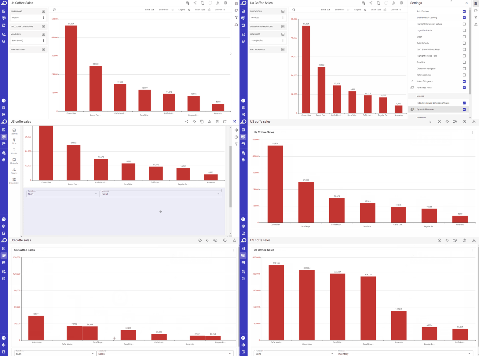
Dynamic Measures
When the “Dynamic Measures” check box is enabled, any measure can be assigned as a “Dynamic Measure” in the overlay window that opens. The effect of this feature is applied on the dashboard level. When the dashlet is added to a dashboard, those dynamic measures will be shown at the dashboard and the data displayed on the dashlets of that dashboard can be changed by selecting one of those added dynamic measures. This allows dashboard users to change the measures on the dashboard on the fly, without having to manually update the dashlet/s structure. It allows them to easily add and switch between different measures within a dashboard, providing greater flexibility and control over the displayed data.
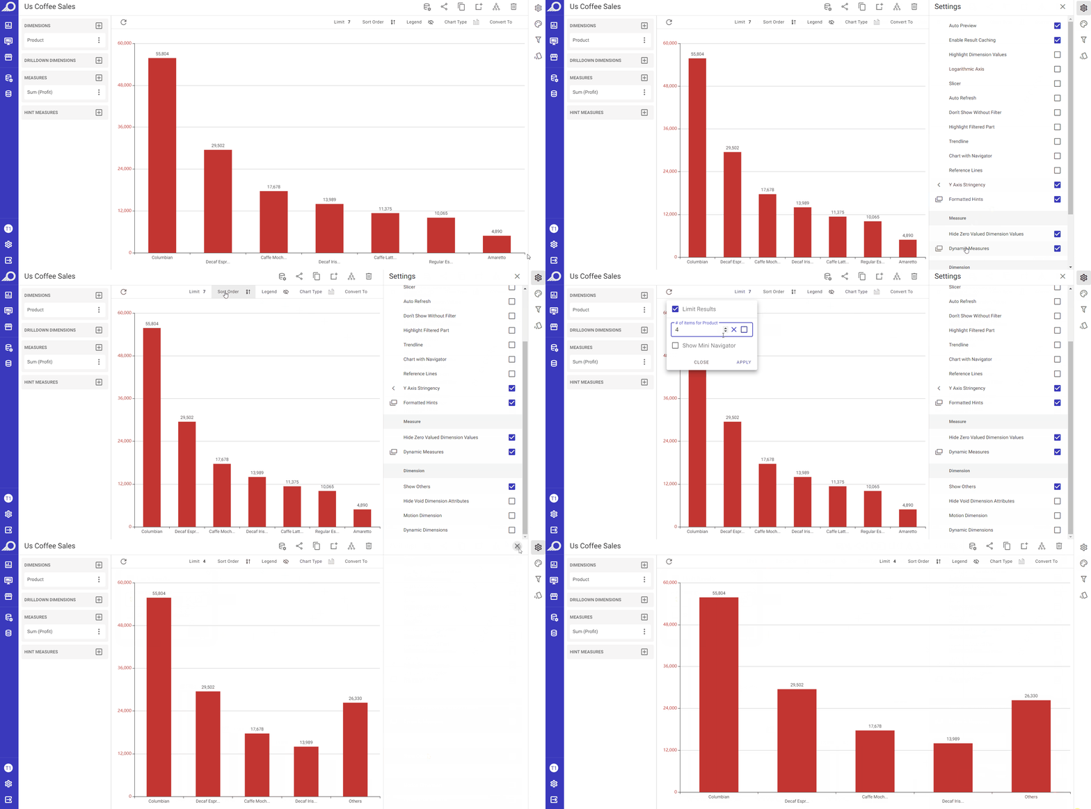
Show Others
When the “Show Others” check box is enabled, it will show the measure figure for the dimension attributes except those selected in Limit results section and the result will be grouped as one data point namely “Others”.
Hide Void Dimension Attributes
When the “Hide Void Dimension Attributes” check box is enabled, any data cells in the dashlet that have empty dimension values will not be shown.
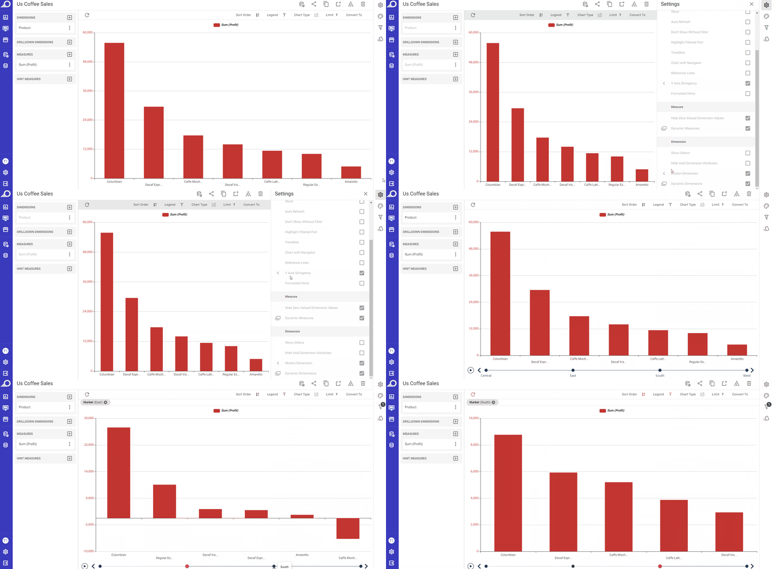
Motion Dimension
When the “Motion Dimension” check box is enabled, a control can be added to switch between dimension attributes. When the user clicks on the Play button in the control area, motion is added to the dashlet. This means that the dashlet will animate the changes in the dimension attribute over the selected attribute and according to the set “Time Interval”, allowing the user to see the data in a more dynamic and interactive way.
Dynamic Dimensions
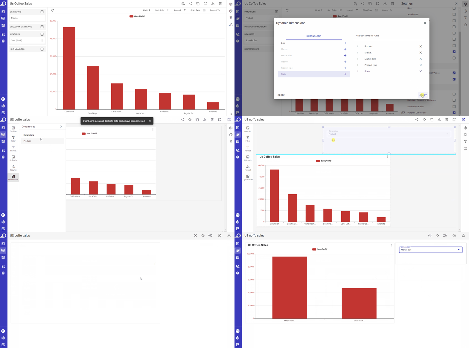
When the “Dynamic Dimensions” check box is enabled, any dimension can be assigned as a “Dynamic Dimension” in the overlay window that opens. The effect of this feature is applied on the dashboard level. When the dashlet is added to a dashboard, those dynamic dimensions will be shown at the dashboard and the data displayed on the dashlets of that dashboard can be changed by selecting one of those added dynamic dimensions. This allows dashboard users to change the dimensions on the dashboard on the fly, without having to manually update the dashlet/s structure. It allows them to easily add and switch between different dimensions within a dashboard, providing greater flexibility and control over the displayed data.
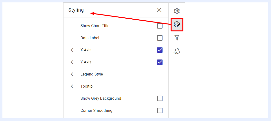
Styling Panel
The styling and appearance of chart dashlets can be customized to suit the preferences of the designer. By default, chart dashlets follow the styles and themes of TURBOARD, but users can modify them using the available options.
These customization settings can enhance the visual appeal, legibility, and accessibility of the chart, making it easier for users to comprehend and analyze the data presented. It can also highlight specific information or organize data in a way that facilitates comprehension. Custom colors and styles can also be utilized to reinforce brand identity and ensure that the dashboard has a consistent and professional appearance.
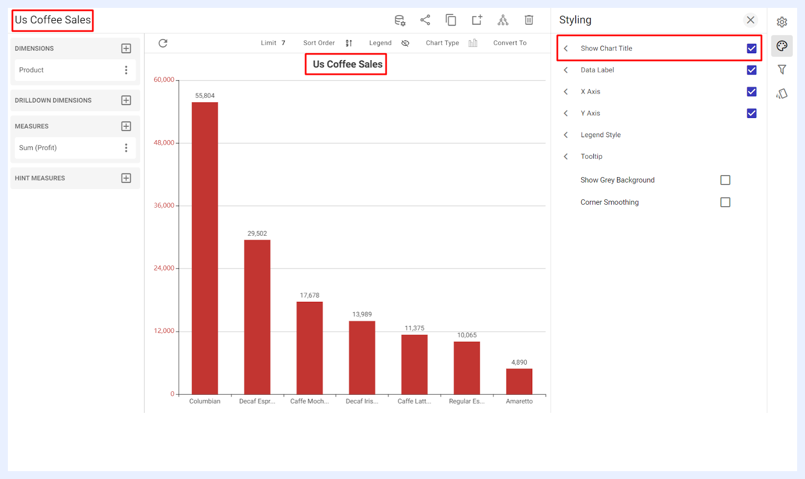
Show Chart Title: when enabled by checking its check box, the dashlet name will be displayed at the center-top of the chart in which the user can adjust its formatting and styling including the font type, size, style (bold and/or italic) and color as desired.
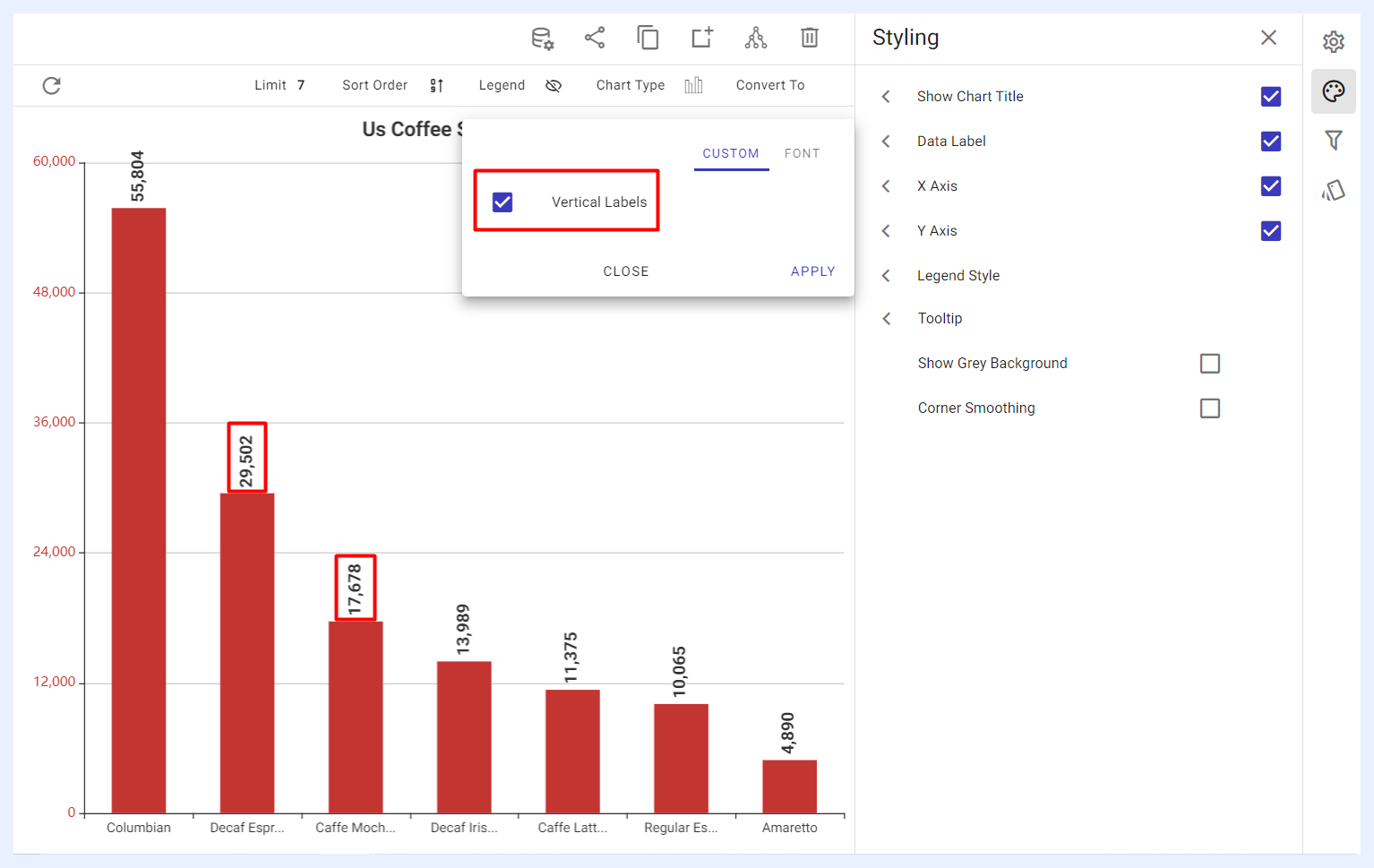
Data Label: when enabled by checking its check box, the user can adjust the labels on the chart in terms of their text alignment (horizontal or vertical), font type, size, style (bold and/or italic) and color.
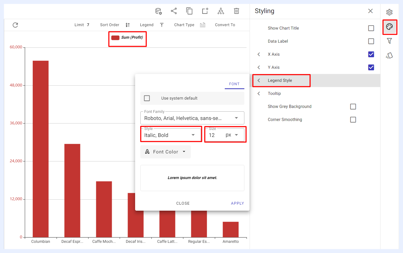
Legend Style: when enabled by checking its check box, it allows the user to customize the texts describing the legend if it was displayed on the chart. The user can adjust the font type, size, style (bold and/or italic) and color of the legend texts.
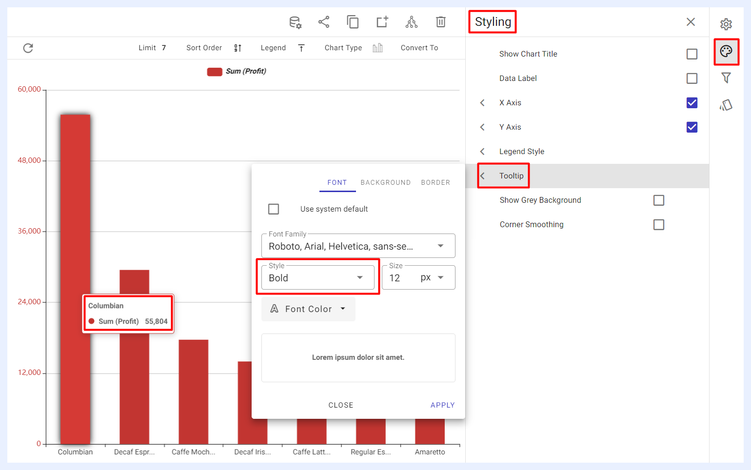
Tooltip: when enabled by checking its check box, it allows the user to customize the appearance of the tooltips that are displayed when hovering over the elements of the chart. The user can adjust the font, background, and border colors, as well as the overall style of the tooltips according to his/her preferences. For Bar, Column, and Area charts, a Cursor Line can also be enabled — a dynamic visual indicator that follows the cursor and connects hovered data points to their axes. The pointer type (Line, Shadow, or Cross) and styling controls (opacity, color, width, and line pattern) are configurable.
Show Grey Background: when enabled, this option adds a radiant grey background behind the bars or columns, enhancing the visual contrast for bar or column charts.
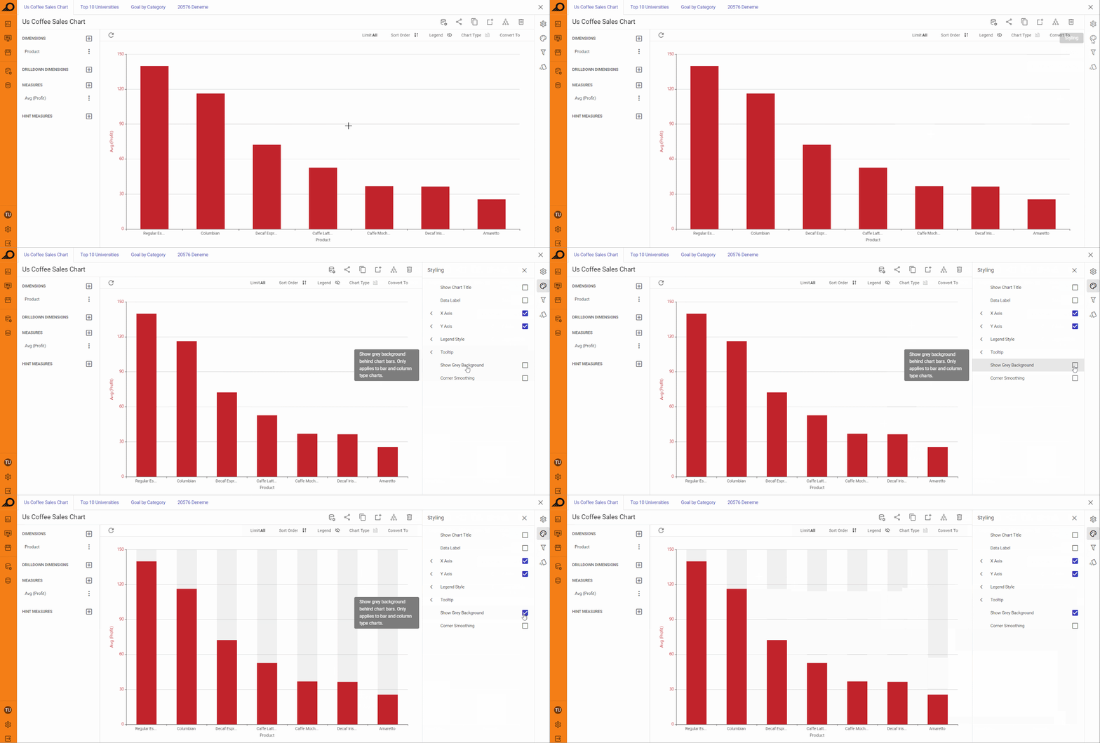
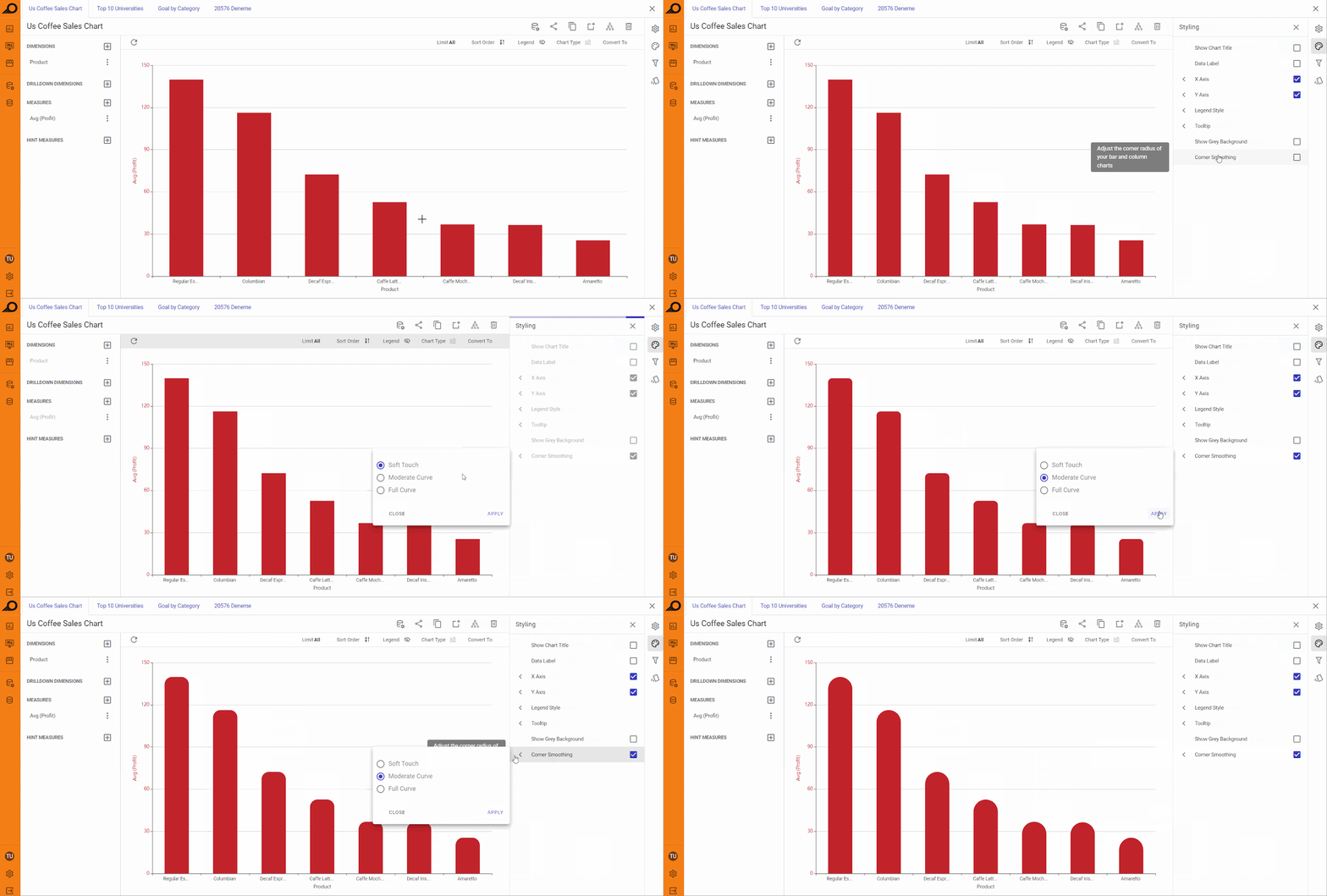
Corner Smoothing: when enabled, this option softens the corners of bars or columns in the chart. The designer can choose between three levels of smoothing (Soft Touch, Moderate Curve, or Full Curve) to control the roundedness of the corners.
Other Styling Options
The styling options available for a chart may vary depending on the type of chart and its visualization elements. For example, chart types that use axes (such as Bar, Column, Area, and Line charts) provide users with the ability to customize the aesthetics and styles of the X and Y axes by enabling corresponding feature check boxes. This includes options to show or hide the axis name, adjust font size, style and colors, and customize the appearance of axis labels.
In contrast, chart types such as Pie charts provide users with options to customize the aesthetics and styles of the pie area, rather than axes. Similarly, Polar charts or Multilayered Donut charts provide users with the ability to customize the polar axis, including options to adjust its styling and appearance.
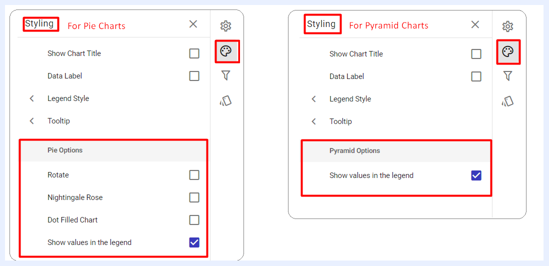
Samples of the Different Styling Options According to Chart Type
Filters Panel
“Filters” panel contains all the nodes that were assigned as filters in the related view. The user can configure the settings of any selected filter as in this link.
Conditional Formatting Settings
Conditional formatting is used to easily highlight certain values in the dashlet or make particular values easy to identify. End-users will easily notice the difference between the visualized values using this feature.
Color Scales: a gradient of up to three colors can be applied across chart values for instant visual analysis. Color scales work across Column, Bar, Pie, and Donut charts. An interactive legend allows users to highlight or filter by color band. Custom conditional formatting rules override the color scale when both are applied.
The user can either change the default formatting (font, color, icon) on a whole measure(s) level, or according to specific thresholds and intervals determined for a selected measure(s).
In the second case, the visual appearance of the measure (text colors, background colors, icons) changes automatically for the data cells that contain values which meet those thresholds.
Formatting Options
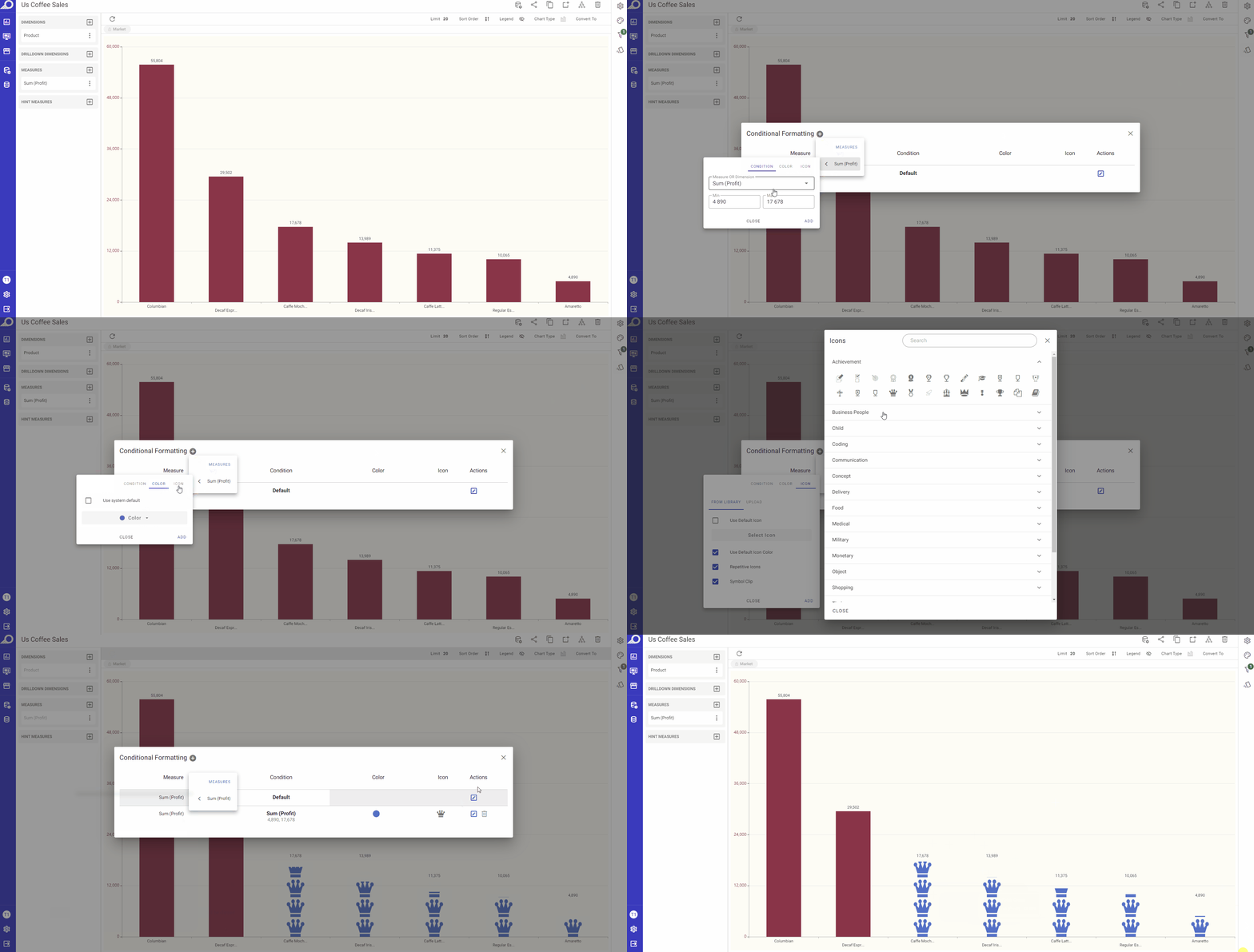
When adding conditional formatting, users can access several formatting tabs in the pop-up window, each corresponding to different customization areas: COLOR, ICON, and LABEL. By unticking the system default checkbox for any tab, additional options become available for customizing the formatting based on the minimum and maximum values set for the selected measure or dimension.
COLOR Tab: adjust the colors of the measures or dimensions to visually highlight specific ranges.
ICON Tab: select or upload an icon, decide its placement (e.g., at the top of a column or on the axis), choose if it should repeat, set its color, and clip it if it exceeds the space.
LABEL Tab: opt to hide or display data labels for values that meet the defined conditions.
These tabs allow precise control over how data is presented based on the conditions applied, helping to visually emphasize key data points.
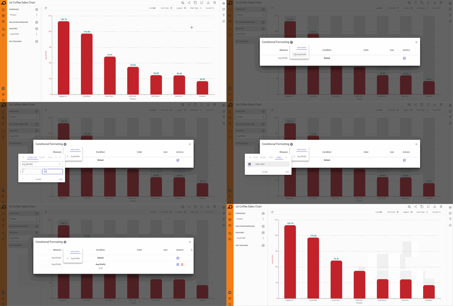
Applying Conditional Formatting on a Chart Dashlet
How to apply conditional formatting on a chart dashlet?
1 Click “Conditional Formatting” icon from the configuration panel at the right.
2 In the overlay window that appears, click + icon next to “Conditional Formatting” window title.
3 Select the required measure and determine its threshold (“Min” and “Max” value ranges), determine your preferred colors, icons and fonts.
4 Click ADD button.